❌

Vue normale

  • ✇Yanko Design
  • Loupe Light Concept Lets Diners Borrow a Magnifier From the Table Lamp
    Dim restaurant lighting can make dinner feel intimate, right up until you have to decipher the menu. Reaching for your phone’s flashlight solves one problem while introducing a rather conspicuous beam across the table. MK-II Studio’s Loupe Light concept offers another option, stacking magnetic light rings into a table lamp that guests can take apart whenever the small print needs some help. Together, the rings form a squat, ribbed shade above a cylindrical base, with warm light spilling around
     

Loupe Light Concept Lets Diners Borrow a Magnifier From the Table Lamp

Par : JC Torres
11 novembre 2026 à 13:20

Dim restaurant lighting can make dinner feel intimate, right up until you have to decipher the menu. Reaching for your phone’s flashlight solves one problem while introducing a rather conspicuous beam across the table. MK-II Studio’s Loupe Light concept offers another option, stacking magnetic light rings into a table lamp that guests can take apart whenever the small print needs some help.

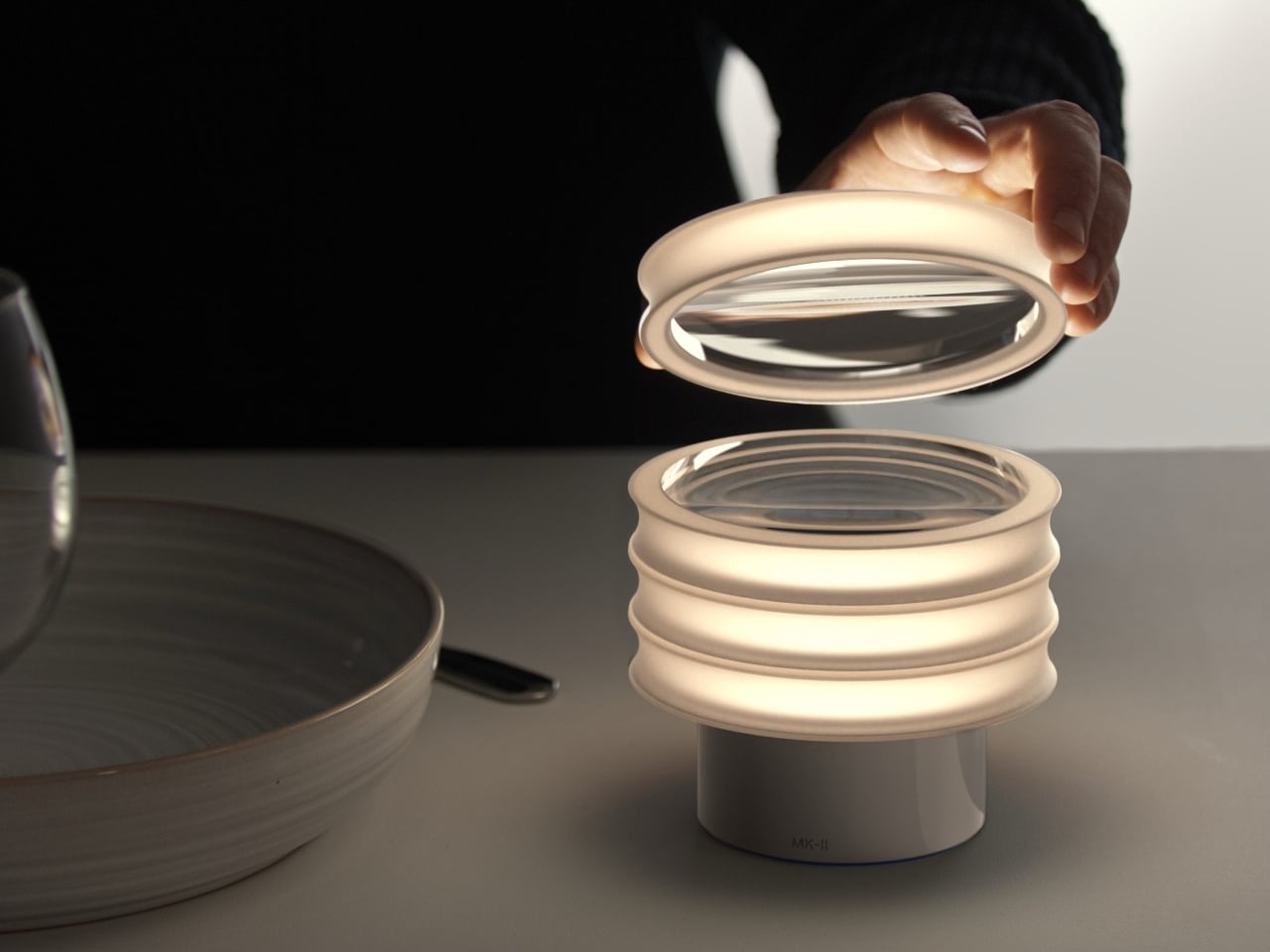
Together, the rings form a squat, ribbed shade above a cylindrical base, with warm light spilling around their edges. The clear center of each ring is actually a magnifying lens, rather than an empty opening. Lift one away, and you have both illumination and magnification in your hand, without switching on a screen or asking someone else to read the menu aloud.

Designer: Andrew Ferrier (MK-11 Studio)

That ring shape gives the reading aid a different character from a conventional magnifying glass. There’s no handle announcing a separate tool, just a rounded edge to hold as you move across the page. The lens is intended to sit above the paper, maintaining focus while keeping its surface clear of the menu, rather than rubbing directly against whatever you’re trying to read.

The idea follows the meal beyond choosing what to eat. When the bill arrives, you could borrow a ring to check the total or make sense of a line of charges. Someone else could reach for another without waiting for a shared flashlight, while the remaining rings stay on the base. The table’s reading aids and centerpiece would occupy the same spot.

The stack can also change with the table. The proposal allows rings to be added or removed for different table sizes, so a couple wouldn’t necessarily need the same arrangement as a larger group. Repetition gives the lamp its appearance, but also provides a way to distribute several reading aids without introducing a collection of unrelated accessories among the glasses, plates, and cutlery.

Restaurant staff have a part in this arrangement, too. The concept specifies cordless, sealed construction and inductive charging, intended to simplify wiping everything down between seatings. Avoiding a cable across the table makes sense around drinks and dishes. Returning the rings to a common base would also give staff a place to check that the set is together before the next guests arrive.

Loupe Light remains a concept, with magnification strength, brightness, and battery runtime still unspecified. Those details would determine how well it serves different diners, rather than simply how good it looks beside a plate. A lens that works for one person’s menu reading might not suit another, while the light needs to illuminate the paper without becoming another distraction across the table.

There’s something considerate about making the reading aid part of an object everyone shares. A guest could reach for a ring as casually as reaching for the salt, without asking a server for special equipment. The phone can stay in a pocket, provided the lens does its job. Dinner’s atmosphere wouldn’t have to depend on anyone pretending they can read the menu.

The post Loupe Light Concept Lets Diners Borrow a Magnifier From the Table Lamp first appeared on Yanko Design.
  • ✇Yanko Design
  • Natural Objet Concept Gives a Car Key a Stone-Like Cover
    A car key doesn’t have to advertise its electronics with a shiny shell and conspicuous buttons. Natural Objet is a design concept for smart keys. Its rounded body takes the shape of a pebble and adds a grainy finish, aiming to make something you carry every day feel less like a miniature remote control. The case keeps the original key inside, so this isn’t a replacement remote or an extra layer of smart technology. Instead, it changes the surface your thumb meets. Irregular curved cuts across t
     

Natural Objet Concept Gives a Car Key a Stone-Like Cover

Par : JC Torres
11 novembre 2026 à 12:20

A car key doesn’t have to advertise its electronics with a shiny shell and conspicuous buttons. Natural Objet is a design concept for smart keys. Its rounded body takes the shape of a pebble and adds a grainy finish, aiming to make something you carry every day feel less like a miniature remote control.

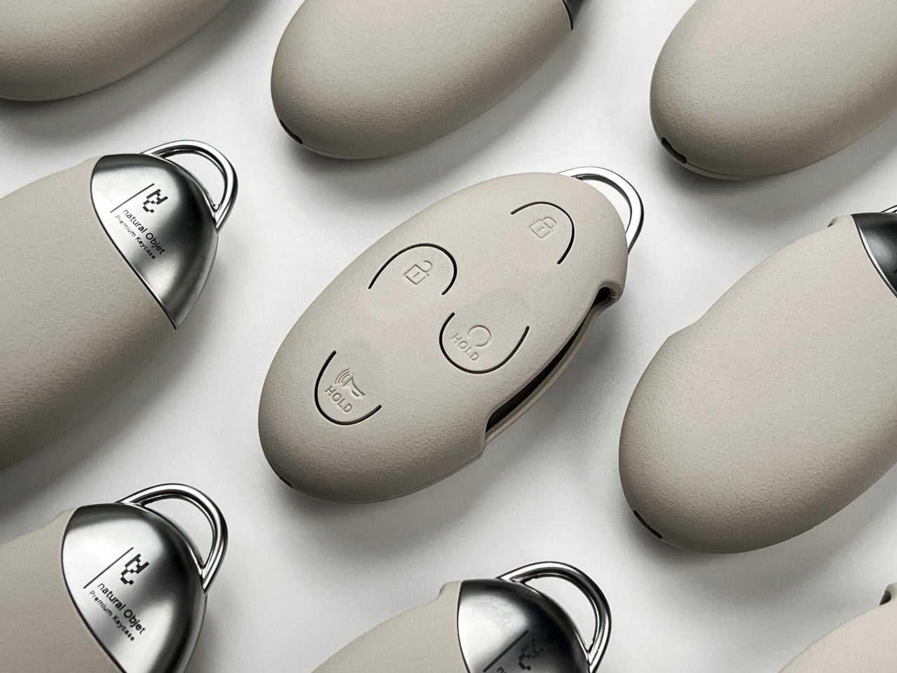
The case keeps the original key inside, so this isn’t a replacement remote or an extra layer of smart technology. Instead, it changes the surface your thumb meets. Irregular curved cuts across the front outline the lock, unlock, remote-start, and horn buttons, interrupting the shell just enough to define each control without bringing back the bold, emblem-like pattern of an uncovered Hyundai key.

Designer: Eunsu Lee

That understated front hides a practical material problem. The button areas need to move, even though the case needs to hold its shape. In testing materials, ABS versions resisted pressing too much, while softer materials didn’t deliver the intended finish. Polycarbonate became the compromise, with repeated changes to the internal contact points intended to improve how each press reaches the key.

The custom coating carries that stone association. It’s intended to recreate a sandy sensation rather than the smoothness you might expect from molded plastic. A rounded edge can suggest a pebble, but a textured surface asks you to notice it with your fingers, too. That could make it easier to distinguish from other smooth objects in a bag before you see the buttons.

Metal breaks up the textured body at the back, where a die-cast zinc-alloy section meets the shell along a sloping edge. The design uses an interlocking connection rather than a merely attached decorative piece, intended to improve durability. A loop extends beyond the top for carrying accessories, giving the otherwise quiet object a small flash of shine when it hangs from a bag.

Warm gray, deep black, and earthy brown keep the palette close to sand, volcanic rock, and soil. A matching wrist loop continues the color beyond the shell, giving you somewhere to hold the key while carrying it between the house and car. Hanging from a handbag, the case could read as an accessory in its own right, rather than exposed automotive equipment.

The packaging gives you a similar sequence of surfaces before the case ever reaches your pocket. A translucent sleeve softens the outline of the object inside, then slides away from a folding kraft box. Its paper texture continues the material theme without copying the case’s coating. The contrast between hazy wrapping and rougher paper prepares you for the mix of surfaces underneath.

Keeping everything visually quiet has a practical consequence. The subtle symbols have less contrast than the original dark buttons, potentially making a quick glance less useful. Their curved borders would have to do more of the work when finding a control by touch. That’s where the pebble idea meets its test, somewhere between enjoying the surface and pressing the right button.

The post Natural Objet Concept Gives a Car Key a Stone-Like Cover first appeared on Yanko Design.

  • ✇Yanko Design
  • This Folding AI Handheld Concept Opens Into a Wildlife Field Guide
    Coming across an unfamiliar bird is often the beginning of a phone search, with a few unrelated notifications along for the ride. The log handheld concept proposes a more focused companion for those moments, pairing a camera with AI-assisted species identification and a personal field log. Its folding screen turns a narrow device into an L-shaped tool for exploring what’s around you. Closed, the device keeps its display folded against the body, leaving a slim rectangle with a distinctive circul
     

This Folding AI Handheld Concept Opens Into a Wildlife Field Guide

Par : JC Torres
11 novembre 2026 à 11:20

Coming across an unfamiliar bird is often the beginning of a phone search, with a few unrelated notifications along for the ride. The log handheld concept proposes a more focused companion for those moments, pairing a camera with AI-assisted species identification and a personal field log. Its folding screen turns a narrow device into an L-shaped tool for exploring what’s around you.

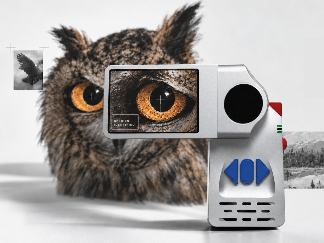
Closed, the device keeps its display folded against the body, leaving a slim rectangle with a distinctive circular joint at one end. Swing the screen outward, and it extends sideways above the grip, separating viewing from holding. That change gives the object a little of the character of an old camcorder, rather than yet another phone-shaped slab pretending to be something completely different.

Designer: Maanit Singh

The silver-colored shell makes the controls hard to miss, with blue directional buttons set into a recessed area and red accents along the side. Their shapes suggest a device you operate by pressing rather than constantly swiping. For someone pausing beside a trail, that could mean keeping navigation under a thumb while the image stays visible on the separate screen above your hand.

An unfamiliar flower or a bird on a branch would give that arrangement something to work with. The proposed interface pairs a photograph with identification information, then organizes encounters in a field log. Instead of leaving every sighting buried among screenshots and lunch photos, you’d have a dedicated collection to revisit, turning a short walk into something you can keep exploring afterward.

1

1

The proposed electronics include an ESP32-S3 controller, a camera module, a 2.8-inch TFT display, and a 4,000mAh battery. A speaker and two vibration motors suggest sound and tactile feedback could accompany the screen, although their exact behavior isn’t explained. That gives the concept more ways to get your attention than a visual prompt alone, potentially useful while you’re concentrating on something moving.

There’s some physical development behind the concept, including wired electronics, cardboard hinge studies, and a 3D-printed housing. Those experiments focus attention on the moving joint, which has to do more than make the device look unusual. It also needs to support a screen while someone holds the grip, then let the two sections return to a compact shape when the walk is over.

The AI side needs more caution than the friendly hardware suggests. The presentation doesn’t establish identification accuracy or explain whether recognition requires an internet connection. A species name on a screen should be a starting point for learning, not an unquestionable answer. That distinction matters especially with fungi and plants, where recognizing a resemblance isn’t the same as knowing what’s safe.

A dedicated nature gadget still has to earn the pocket space that a phone already occupies. With log, the distinction lies in the ritual of opening a tool built around observing and recording, rather than jumping into another app. You’d still be looking at a screen, of course. The hope is that you’d put it away with a better reason to look up.

The post This Folding AI Handheld Concept Opens Into a Wildlife Field Guide first appeared on Yanko Design.
  • ✇Yanko Design
  • Seagate FireCuda Forge Manages Your Hard Drive and SSD as One Volume
    Keeping a game library on a hard drive and your current favorites on an SSD sounds sensible, until you’re constantly moving things between them. Seagate’s FireCuda Forge puts both types of storage inside one desktop enclosure, promising that its new Alkemi technology will be the one to handle that sorting. It comes with an 8TB or 20TB hard drive, but requires an SSD you supply. That enclosure certainly isn’t trying to disappear behind your monitor. Dark, angular top panels sit above deeply ribb
     

Seagate FireCuda Forge Manages Your Hard Drive and SSD as One Volume

Par : JC Torres
11 novembre 2026 à 09:20

Keeping a game library on a hard drive and your current favorites on an SSD sounds sensible, until you’re constantly moving things between them. Seagate’s FireCuda Forge puts both types of storage inside one desktop enclosure, promising that its new Alkemi technology will be the one to handle that sorting. It comes with an 8TB or 20TB hard drive, but requires an SSD you supply.

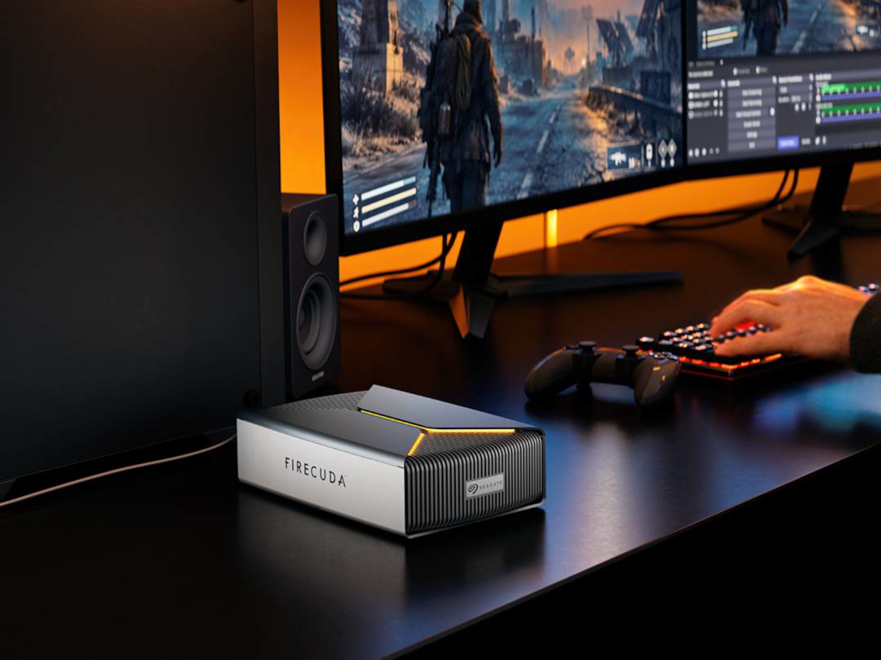
That enclosure certainly isn’t trying to disappear behind your monitor. Dark, angular top panels sit above deeply ribbed surfaces, with programmable RGB lighting picking out their edges. It has more in common with a gaming desktop than a discreet pocket drive, giving the hardware a conspicuous place beside your keyboard. Anyone hoping for an anonymous black box might find the styling rather enthusiastic.

Designer: Seagate

Inside, the SSD works as a cache rather than another storage compartment you manage yourself. Seagate says Alkemi follows usage patterns and prioritizes frequently accessed data on that faster drive, while the hard drive accommodates the broader library. Your computer sees one volume, and the SSD doesn’t add to its capacity. An 8TB model stays an 8TB model after installing flash storage.

That arrangement could suit someone who spends weeks playing one title before returning to something else. Instead of deciding which games deserve the fast drive, you’d let the enclosure respond as your habits change. The same logic applies to a video editor revisiting project files while keeping older footage nearby. The appeal is less digital housekeeping, rather than making every file equally fast.

Before any of that happens, though, there’s some assembly required. Seagate specifies an M.2 2280 NVMe SSD, with PCIe Gen3 or newer connectivity and a 1TB maximum. The mounting screw, thermal pads, and hex screwdriver are included, but the SSD isn’t optional: the system won’t operate without it. Choosing your own flash storage brings flexibility, along with another item on the shopping list.

Over USB4, Seagate advertises read speeds up to 2,500 MB/s and writes up to 2,000 MB/s on compatible systems. Those figures aren’t a promise that a forgotten game buried on the hard drive will suddenly behave like an SSD installation. Seagate itself acknowledges that new data may not immediately benefit from established usage patterns. The cache needs useful activity to learn from.

The Forge also expects a dedicated patch of desk rather than a pocket in your laptop bag. The 8TB unit measures about 9.46 x 5.78 x 2.57 inches and weighs roughly 4.1 lbs. It needs an external power adapter alongside its USB-C cable, too. On the practical side, Seagate makes the hard drive upgradeable, leaving room to expand beyond your initial purchase.

Seagate’s announced prices start at $699 for 8TB and $899 for 20TB, before adding that required SSD. Already owning a suitable spare would make the proposition easier to consider, especially if you’re tired of shuffling files between drives. Otherwise, the automatic management comes with another purchase to make before the system works, despite all that storage already sitting inside its conspicuous enclosure.

The post Seagate FireCuda Forge Manages Your Hard Drive and SSD as One Volume first appeared on Yanko Design.

  • ✇Yanko Design
  • Arrowspace S1 Screwdriver Kit Scans Screws and Lights Up the Recommended Bit
    Tiny screws have a knack for making simple repairs feel surprisingly complicated. You sit down to open a laptop, only to discover that choosing the right bit requires almost as much attention as the job itself. The Arrowspace S1 is a precision electric screwdriver that tackles that familiar pause with a camera, AI-assisted identification, and a case that points out the recommended bit. There’s certainly no shortage of options inside the case, which holds 52 S2 steel bits. Of course, having plen
     

Arrowspace S1 Screwdriver Kit Scans Screws and Lights Up the Recommended Bit

Par : JC Torres
10 novembre 2026 à 21:45

Tiny screws have a knack for making simple repairs feel surprisingly complicated. You sit down to open a laptop, only to discover that choosing the right bit requires almost as much attention as the job itself. The Arrowspace S1 is a precision electric screwdriver that tackles that familiar pause with a camera, AI-assisted identification, and a case that points out the recommended bit.

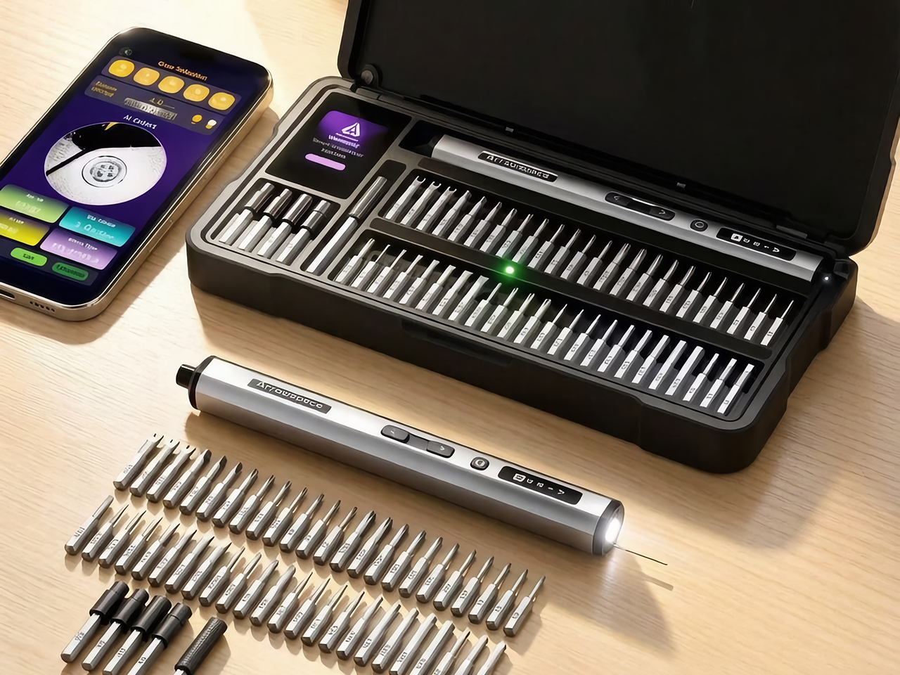
There’s certainly no shortage of options inside the case, which holds 52 S2 steel bits. Of course, having plenty of choices doesn’t automatically tell you which tiny tip belongs in an equally tiny screw. That’s where the S1’s design gets interesting. Instead of leaving the identification step entirely to your eyesight, it gives the tool a dedicated way to examine the fastener before you start.

Designers: Lau Yin, Xu Yu

Click Here to Buy Now: $129 $215 (40% off). Hurry, only 85/1100 left! Raised over $250,000.

The camera sits at the rear, opposite the driving end, alongside a contact probe. Resting that probe against the screw establishes a consistent distance between the lens and its subject. It’s a pleasantly physical answer to a digital problem, giving the recognition software a more controlled starting point. You scan first, then turn the screwdriver around when you’re ready to work.

The actual recognition happens in the companion phone app, which processes screw images locally without sending them to cloud servers. It supports 12 common screw-head profiles and identifies the corresponding size, giving those mysterious little recesses a name. Recognition doesn’t require an internet connection, although the phone still needs a local connection to the tool.

The next step is refreshingly direct. An LED illuminates the recommended bit slot, while a 2-inch TFT display on the case shows identification information. You still pick up the bit and fit it yourself, but there’s less detective work between the result and the tool. That small connection between software and storage makes the case an active part of the repair process.

Getting the bit right is only part of handling delicate hardware. The Arrowspace S1 offers adjustable torque settings, while Auto mode applies a preset matched to the identified screw. Think of it as help choosing a starting point, with the device manufacturer’s instructions still guiding the repair. A laptop’s small fasteners deserve more consideration than simply pressing a button and hoping.

That attention to control carries through to the screwdriver itself. Its slender aluminum-alloy body has physical forward and reverse buttons, while an OLED display keeps the torque level, rotation direction, and battery status visible. Work lights surround the magnetic bit holder at the tip. The layout keeps everyday controls on the object you’re holding, rather than sending you back to a screen for every adjustment.

The case, built around a CNC-machined aluminum-alloy frame, brings a similar sense of order to the bench. Its fitted arrangement gives the driver and bits designated places, an important detail when the guidance system points to particular slots. Keeping everything organized becomes part of how the kit works. It’s an appealing approach for a desk that occasionally doubles as a repair station, without asking you to maintain a permanent workshop.

A game controller one weekend and an RC model the next could present quite different collections of screws. That’s where identification assistance makes particular sense, especially when you haven’t spent years memorizing drive profiles. USB-C charging handles the routine business of replenishing the battery. Meanwhile, the combination of organized storage and guided selection offers a familiar starting point as the projects on your desk change.

There’s still a person at the center of all this, aligning the bit, holding the driver, and deciding how to approach the repair. The Arrowspace S1 puts its extra intelligence around those actions, helping with the small decisions that can interrupt them. With the recommended bit in hand, attention can return to the device on the desk, where there’s usually something more interesting waiting beneath the cover.

Click Here to Buy Now: $129 $215 (40% off). Hurry, only 85/1100 left! Raised over $250,000.

The post Arrowspace S1 Screwdriver Kit Scans Screws and Lights Up the Recommended Bit first appeared on Yanko Design.

  • ✇Yanko Design
  • DIY Steam Deck Rebuild Pairs a Game Boy-Style Body With a Physical Keyboard
    Handheld gaming PCs tend to put their controls on either side of a wide screen, leaving the Game Boy layout to retro machines. This DIY Steam Deck rebuild brings that upright silhouette into PC gaming, with a 5.5-inch display, two thumbsticks, and a physical keyboard squeezed into a 3D-printed body. It’s a different answer to what a portable gaming PC should look like. The trick starts with a Steam Deck motherboard, which is paired with a smaller LCD and parts sourced from a broken Deck. Rather
     

DIY Steam Deck Rebuild Pairs a Game Boy-Style Body With a Physical Keyboard

Par : JC Torres
10 novembre 2026 à 13:20

Handheld gaming PCs tend to put their controls on either side of a wide screen, leaving the Game Boy layout to retro machines. This DIY Steam Deck rebuild brings that upright silhouette into PC gaming, with a 5.5-inch display, two thumbsticks, and a physical keyboard squeezed into a 3D-printed body. It’s a different answer to what a portable gaming PC should look like.

The trick starts with a Steam Deck motherboard, which is paired with a smaller LCD and parts sourced from a broken Deck. Rather than copying Valve’s enclosure, the new shell stacks the screen, keyboard, and gaming controls vertically. The screen itself remains horizontal, of course. It’s the arrangement around it that changes, putting the display above your hands instead of between them.

Designer: LCLDIY

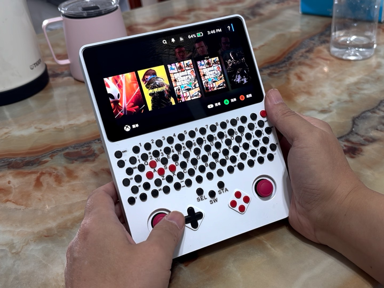
That keyboard is where the project wanders away from a simple nostalgia exercise. Rows of tiny circular keys occupy the space between the display and controller buttons, complete with a number row and letter keys. Red WASD keys stand out among the black ones, making the PC connection hard to miss. This Game Boy relative has considerably more to say for itself.

Having physical keys could make entering a search term, naming a save, or typing a message less dependent on an on-screen keyboard. You wouldn’t have to surrender part of the display just to bring up the letters. Those small, tightly packed buttons don’t promise laptop-like typing, however. They’re better understood as a compact input option than an invitation to write your novel.

Below the keyboard, two red thumbsticks flank a black directional pad and four red face buttons. The white enclosure keeps those clusters visually distinct, despite the unusually busy front. Your thumbs work beneath the screen rather than alongside it, while typing means reaching farther up the body. The layout separates playing and text entry spatially, even though both happen on the same surface.

Building that arrangement takes more than finding an empty shell. The project includes a custom circuit board populated with small switches, along with firmware and a case modeled around the replacement display, using water-soluble printing material for finer detail. Soldering and programming are part of the work, so this isn’t a housing you snap around an otherwise untouched handheld.

The project carries a Windows-oriented title, but the handheld retains SteamOS. That’s an important distinction, since Valve’s Proton compatibility layer lets supported Windows games run on Linux without installing Windows. The build therefore shouldn’t be mistaken for a confirmed Windows conversion. Its familiar Steam interface also says little about frame rates or how individual games handle the revised hardware.

Weight, battery life, and cooling performance aren’t documented, so the upright shape shouldn’t be mistaken for a proven comfort upgrade. There’s more to reach around than on an original Game Boy, especially with that keyboard separating screen and sticks. The nostalgic outline survives, but its simple controls have given way to something your childhood handheld never needed: a place for the Ctrl key.

The post DIY Steam Deck Rebuild Pairs a Game Boy-Style Body With a Physical Keyboard first appeared on Yanko Design.
  • ✇Yanko Design
  • COVANI Fan Concept Looks Like a Shoulder Bag Until You Unfold It
    A handheld fan can be a welcome companion on a hot afternoon, even if it wasn’t invited into your outfit. COVANI tackles that awkward relationship with a portable fan concept dressed as a miniature shoulder bag. Its circular, leather-wrapped body conceals the grille behind a magnetic cover, letting you carry something that looks intentional rather than another gadget you had to make room for. That disguise depends on more than simply putting leather around a conventional fan. The closed body ha
     

COVANI Fan Concept Looks Like a Shoulder Bag Until You Unfold It

Par : JC Torres
10 novembre 2026 à 12:20

A handheld fan can be a welcome companion on a hot afternoon, even if it wasn’t invited into your outfit. COVANI tackles that awkward relationship with a portable fan concept dressed as a miniature shoulder bag. Its circular, leather-wrapped body conceals the grille behind a magnetic cover, letting you carry something that looks intentional rather than another gadget you had to make room for.

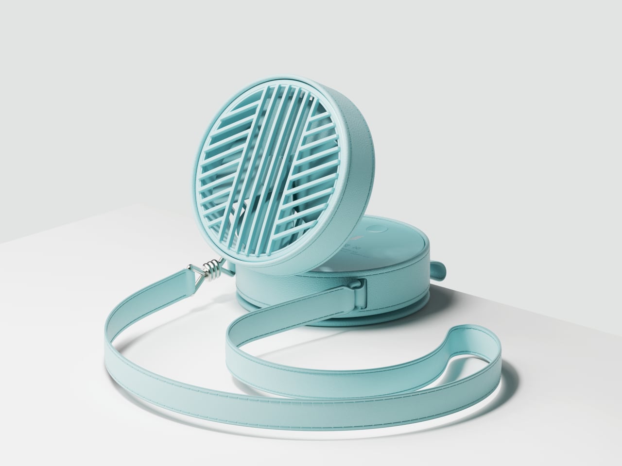
That disguise depends on more than simply putting leather around a conventional fan. The closed body has a broad, uninterrupted front, with stitching tracing its rounded edges and a matching strap completing the bag-like silhouette. The mechanical details stay underneath, so there’s no exposed grille competing with your clothes when you’re walking between shops or heading into an air-conditioned restaurant for lunch.

Designer: Taemin Lee

The strap hardware gets a little attention of its own. A polished metal connector takes the shape of a knotted cord, bringing a jewelry-like detail to the otherwise restrained body. Worn across the torso, the fan could leave both hands free between cooling breaks. The bag resemblance describes its appearance, though, rather than promising somewhere to stash your phone, keys, and wallet.

When the heat catches up, getting a breeze takes a short unfolding routine. Open the magnetic front cover and secure it against the back, then tilt the fan unit away from the body on its hinge. That separation creates room for air to pass through. The leather isn’t supposed to breathe on the blades’ behalf, which is an important distinction beneath the disguise.

Once open, the fan is intended to work in your hand or on a table. You could lift it toward your face while waiting outside, then rest the lower body on a café table and angle the fan upward. That arrangement would free your hands for a drink or a book, without requiring a separate stand to come along for the afternoon.

Opening the body reveals a circular button and a small stack of illuminated bars, keeping the interface out of sight during wear. A small port sits along the lower edge. Those details bring the concept back into gadget territory, although the presentation doesn’t establish runtime, charging speed, or airflow. The fashion treatment explains how you’d carry it, not how powerfully it would blow.

The same round form leaves plenty of room for different personalities. Alongside mint-colored leather, the concept explores a pale version, a dark patterned finish, and a reflective metallic treatment. These variations change the impression without changing the circular silhouette. The shiny option leans toward statement jewelry, while the quieter finishes could sit more comfortably beside everyday clothing and a separate shoulder bag.

Putting it away would mean folding the fan down and returning the cover to the front, rather than searching for a pocket. There are extra steps compared with grabbing a bare handheld fan, of course. But once the breeze isn’t needed, you could let it hang beside your other accessories instead of finding somewhere to hide an awkward piece of summer equipment.

The post COVANI Fan Concept Looks Like a Shoulder Bag Until You Unfold It first appeared on Yanko Design.

  • ✇Yanko Design
  • This Floor Clock Concept Peels a Square Dial From Its Tubular Body
    A metal pipe doesn’t offer much room for a clock face, unless you’re willing to open it up. That’s the idea behind PEEL CLOCK, a standing-clock concept that turns part of its tubular body into a flat, square dial. Rather than hanging on a wall or claiming a spot on your desk, it brings a slim streak of color down to the floor. The construction starts with cuts near the top of a metal tube, where a section is pulled outward and flattened to create the face. The remaining curve stays behind it, m
     

This Floor Clock Concept Peels a Square Dial From Its Tubular Body

Par : JC Torres
10 novembre 2026 à 10:20

A metal pipe doesn’t offer much room for a clock face, unless you’re willing to open it up. That’s the idea behind PEEL CLOCK, a standing-clock concept that turns part of its tubular body into a flat, square dial. Rather than hanging on a wall or claiming a spot on your desk, it brings a slim streak of color down to the floor.

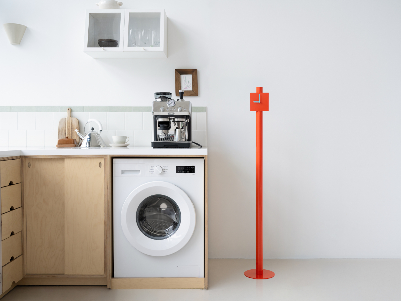
The construction starts with cuts near the top of a metal tube, where a section is pulled outward and flattened to create the face. The remaining curve stays behind it, making the connection between the two shapes easy to follow. There’s no separate clock head perched on a pole, although the circular foot and timekeeping mechanism are still additional parts of the assembly.

Designer: Jaewon Yeo

That transformation gives the clock its character without needing much decoration. The long, narrow stem meets a square face, with a short, open tube projecting above it. Two contrasting hands take care of telling the time, while numbers and hour markers are left out altogether. It’s a sparse arrangement, though anyone who prefers precise minute markings might find it a little too spare.

Color keeps all that restraint from becoming anonymous. The orange version pairs its bright body with pale blue hands, adding a small contrast where your eyes need to land. Blue and burgundy alternatives explore the same silhouette, rather than changing its construction. Against a quiet interior, that tall orange line could provide the accent you’d otherwise get from a floor lamp or sculpture.

The freestanding format also changes where the clock might belong. Beside a sofa, it could leave the coffee table free for books and mugs. Near a kitchen counter, it wouldn’t compete with appliances for surface space or require drilling into a backsplash. Of course, the space it saves above has to come from somewhere, since its circular base still occupies the floor.

Around the back, the simple geometry gives way to a small clock movement mounted directly behind the face. It’s left exposed rather than buried inside an oversized enclosure, preserving the thin profile of the dial. That also gives the object a distinct front and back, something worth considering before placing it out in the room instead of closer to a nearby wall.

A wall clock can be moved, too, of course, but relocating PEEL CLOCK wouldn’t mean finding another hook or nail. Its place could change as the furniture does, provided there’s a suitable patch of floor and a clear view of the hands. In a room already crowded with things, however, a dedicated spot for telling the time is still a deliberate choice.

The post This Floor Clock Concept Peels a Square Dial From Its Tubular Body first appeared on Yanko Design.
  • ✇Yanko Design
  • New PlayStation Portal Adds Storage but Still Can’t Download PS5 Games
    The PlayStation Portal still looks like someone stretched a DualSense controller around a tablet, and Sony’s latest revision doesn’t change that rather peculiar silhouette. Announced on November 9, 2026, for Japan and South Korea, the upcoming PlayStation Portal Player adds internal storage while keeping its familiar screen. What that extra space will actually do, however, is something Sony isn’t ready to explain. The Midnight Black finish brings the curved grips and display bezel together visu
     

New PlayStation Portal Adds Storage but Still Can’t Download PS5 Games

Par : JC Torres
10 novembre 2026 à 04:15

The PlayStation Portal still looks like someone stretched a DualSense controller around a tablet, and Sony’s latest revision doesn’t change that rather peculiar silhouette. Announced on November 9, 2026, for Japan and South Korea, the upcoming PlayStation Portal Player adds internal storage while keeping its familiar screen. What that extra space will actually do, however, is something Sony isn’t ready to explain.

The Midnight Black finish brings the curved grips and display bezel together visually, leaving the screen as the obvious centerpiece. It isn’t a new color, having appeared on the Portal in February 2025. The important physical choice remains those substantial controller grips, with familiar button layouts and thumbsticks that give your fingers somewhere to settle rather than crowding everything onto a flat slab.

Designer: Sony

That screen is still an 8-inch LCD supporting 1080p imagery at up to 60 frames per second, so anyone hoping for OLED won’t find an upgrade here. Adaptive triggers and haptic feedback remain available in compatible games, adding game-specific vibrations and changes in trigger resistance. That keeps things familiar for playing from the sofa while someone else claims the living room television.

Remote Play still connects the handheld to your PS5, while cloud streaming lets eligible PS5 games run on Sony’s servers instead. The latter requires PlayStation Plus Premium, but doesn’t require owning a console. That’s why Sony has dropped “Remote” from this model’s name, acknowledging that the device can serve as someone’s window into PlayStation games rather than an accessory to their television.

That independence isn’t new, though. Cloud streaming entered beta in November 2024 and officially launched in supported markets in November 2025, so this revision isn’t introducing console-free play. The actual hardware change is expanded internal storage, with neither its capacity nor its future purpose disclosed. More space inside the housing doesn’t automatically mean there’s a full library of downloadable PS5 games waiting to move into it.

Sony explicitly says PS5 games can’t be downloaded to the Portal. That leaves the familiar dependency on Wi-Fi, regardless of how much storage this version contains. Moving from the bedroom to a café can work with a suitable connection, but losing that connection means you can’t keep playing. Your hands carry the controls and screen, while the actual game runs somewhere else.

There’s another restriction that has nothing to do with signal strength. Sony specifies the Japanese model for domestic use, with Japanese as its only system language and support limited to Japan-region PlayStation accounts. South Korea gets its own equivalent, restricted to Korean and Korean-region accounts. Importing either version isn’t a straightforward upgrade for an American player, even if the hardware looks reassuringly familiar.

Both versions arrive December 10, 2026, with preorders opening November 13 at 10 a.m. locally. Japan’s price is ¥39,980 (about $252), including tax, with one month of Premium included. Afterward, cloud access needs an ongoing subscription. The storage offers no confirmed benefit yet, making account eligibility and reliable Wi-Fi more useful purchase considerations than whatever Sony might eventually put there.

The post New PlayStation Portal Adds Storage but Still Can’t Download PS5 Games first appeared on Yanko Design.
  • ✇Yanko Design
  • Hollow Clock V Trades a Solid Dial for a Ring of Hidden Gears
    Most clocks give their hands somewhere obvious to stand, usually a solid face hiding the mechanism behind it. Hollow Clock V leaves that space empty, making its hands appear to hover inside a slender ring. This working DIY project uses 3D-printed parts, hidden gears, and magnets to pull off a trick that doesn’t require a transparent panel to work. The minute hand provides the first clue, since its outer end connects to a rotating ring concealed within the frame. Its center supports the hour han
     

Hollow Clock V Trades a Solid Dial for a Ring of Hidden Gears

Par : JC Torres
9 novembre 2026 à 13:20

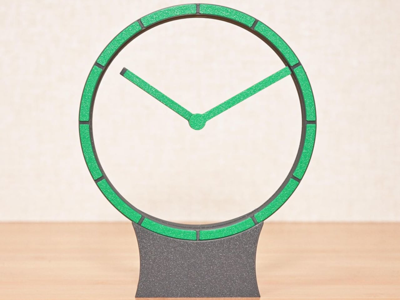
Most clocks give their hands somewhere obvious to stand, usually a solid face hiding the mechanism behind it. Hollow Clock V leaves that space empty, making its hands appear to hover inside a slender ring. This working DIY project uses 3D-printed parts, hidden gears, and magnets to pull off a trick that doesn’t require a transparent panel to work.

The minute hand provides the first clue, since its outer end connects to a rotating ring concealed within the frame. Its center supports the hour hand on a small pivot, so the pair isn’t actually levitating. The hour hand’s position is controlled magnetically by another rotating ring, allowing it to keep pointing at the right hour while the longer hand travels around.

Designer: Shinsaku Hiura

That second ring carries two neodymium magnets, which interact with a third tucked into the hour hand. Their T-shaped arrangement helps keep the hand aligned without adding a connection across the opening. Down in the base, a stepper motor and a combination of worm and bevel gears drive the minute ring 12 times faster than the hour ring, without a bulky central hub.

All that machinery makes the spare appearance deceptive. The ring has a border only about 0.28 inches wide, with hour markers replacing a conventional numbered dial. Screws are kept out of sight when the clock is assembled, apart from the central hand fastener. A rear USB-C connection sends the cable away from the front, leaving the open center to do the distracting.

The finish is also shaped by the way the parts are printed, rather than treated as an afterthought. Front surfaces sit against the printer’s build plate, picking up its texture instead of exposing filament paths across the face. Changing filament during printing gives the markers a contrasting color. It’s a small manufacturing decision that makes the homemade object look a little more deliberate.

Setting the time stays physical, too. You lift the display ring out of the base, freeing it from the drive gears, move the hands to the desired time, and slot it back in. There’s no tiny adjustment knob to hunt for behind the housing. For a clock that hides so much of its mechanism, this particular interaction is refreshingly easy to understand.

Getting to that point takes more effort than the finished clock lets on. The project involves printing, soldering, loading firmware, and assembling the moving parts, although the supplied print orientations don’t require supports. Smooth gear surfaces matter, and the guide includes lubrication and tuning advice. The uncluttered desk ornament is also a small mechanical project, with patience required before it starts keeping time.

The ratchet is designed to compensate for missed motor steps, though it also introduces a reason to think twice about bedside placement. The guide describes removing its hook for quiet operation only when the mechanism runs smoothly enough. On a desk or shelf, that choice comes down to how much of the clock’s engineering you’re prepared to hear as well as admire.

The post Hollow Clock V Trades a Solid Dial for a Ring of Hidden Gears first appeared on Yanko Design.
  • ✇Yanko Design
  • This Modular Building Concept Assembles Homes From Four-Foot-Wide Slices
    Changing a home’s layout usually means working around walls that have no intention of moving. The Segmented Building System concept approaches that problem by treating a building as a series of four-foot-wide sections, rather than one permanent shell. This unconventional architecture proposes a house that could be dismantled and reassembled instead of demolished when circumstances change. Each section is conceived as a slice through a building, combining floor, wall, and roof panels into a comp
     

This Modular Building Concept Assembles Homes From Four-Foot-Wide Slices

Par : JC Torres
9 novembre 2026 à 12:20

Changing a home’s layout usually means working around walls that have no intention of moving. The Segmented Building System concept approaches that problem by treating a building as a series of four-foot-wide sections, rather than one permanent shell. This unconventional architecture proposes a house that could be dismantled and reassembled instead of demolished when circumstances change.

Each section is conceived as a slice through a building, combining floor, wall, and roof panels into a complete or partial profile. Structural insulated foam panels would form these pieces, which could arrive separately or already assembled. The four-foot measurement describes the segment’s width, not the room’s overall span, so the proposal isn’t asking anyone to squeeze into a very narrow little house.

Designer: Michael Jantzen

Repeating those slices would let a building stretch, while combining full and half profiles would allow it to branch sideways. Their varying heights could give a shared living area a taller ceiling and keep adjoining spaces lower. Rather than committing to a single box-shaped module, the idea is to assemble different volumes from related parts, with their rooflines following the changes below.

The more interesting move, however, is to slide neighboring profiles out of alignment. Glass would fill the gaps, turning the joints between sections into narrow openings for daylight. Those openings could continue from the walls into the roof, bringing light into a tall central space. Instead of treating every seam as something to hide, the concept makes some of them part of the architecture.

The exterior isn’t tied to its mustard-yellow finish, either. Metal or cement-composite boards are proposed as cladding options, applied before delivery or after assembly on site. That gives the same underlying system room for different appearances, rather than making one facade part of the deal. Solar panels could also attach to the segments, with off-grid operation among the ambitions for the system.

Of course, rearranging a house wouldn’t be quite as casual as rearranging its furniture. The segments would attach to a prefabricated concrete perimeter foundation shaped for the chosen layout. Moving them elsewhere would still mean preparing a suitable base and reconnecting the building’s services. The proposal describes reusable sections, not a finished home you can simply pick up and drop onto any empty plot.

The point of taking those sections apart would be to use them again, perhaps in a different arrangement at another location. That’s a useful distinction from grinding a demolished building into material for something else. The ambition is to keep a usable building section intact. A change of address or layout wouldn’t require giving up the pieces that already made up your home.

The post This Modular Building Concept Assembles Homes From Four-Foot-Wide Slices first appeared on Yanko Design.
  • ✇Yanko Design
  • HOA A1 Camera Lets You Stay Face-to-Face While Taking Photos
    Taking someone’s photograph often means hiding your own face behind a camera or phone. That’s a rather strange way to capture a shared moment, especially when you’re trying to keep a conversation going. HOA’s upcoming A1 camera takes a different approach, using a large, open frame as its viewfinder so you can look directly at the person you’re photographing with both eyes open. The shape is almost comically simple, leaving a rectangular border, a solid lower section, and a circular lens assembl
     

HOA A1 Camera Lets You Stay Face-to-Face While Taking Photos

Par : JC Torres
9 novembre 2026 à 09:20

Taking someone’s photograph often means hiding your own face behind a camera or phone. That’s a rather strange way to capture a shared moment, especially when you’re trying to keep a conversation going. HOA’s upcoming A1 camera takes a different approach, using a large, open frame as its viewfinder so you can look directly at the person you’re photographing with both eyes open.

The shape is almost comically simple, leaving a rectangular border, a solid lower section, and a circular lens assembly that overlaps the opening. Rather than squeezing a tiny viewfinder into one corner, the body gives you a generous space to look through. The lens still occupies part of that view, of course, but there’s considerably less camera standing between you and your subject.

Designer: Lutra

That could make photographing friends feel a little less like asking them to perform for a gadget. You can keep talking, watch their expressions, and press the shutter without switching your attention to a live preview. Accurate composition is another matter, however. How closely that opening matches the final photograph, particularly as you move it away from your face, still needs testing.

Inside that unusual outline is a Sony 16MP sensor paired with an autofocus lens offering a 26mm-equivalent field of view. That’s a wide-angle perspective suited to keeping some surroundings in the picture, rather than concentrating on a distant face. HOA lists a weight of about 4.9 ounces and a battery rated for up to 90 minutes of continuous shooting on a single charge.

Your phone returns to the process when it’s time to see what you’ve captured. HOA says tapping a smartphone against the camera’s back will let you view photographs, although detailed instructions are still pending. You can shoot without Wi-Fi, so a walk with your camera doesn’t require finding an internet connection first. Getting authentication certificates through the companion app requires going online, however.

Those certificates belong to ShootProof, HOA’s proposed system for checking whether a photograph has changed since capture. The company says a secure chip signs each image’s digital fingerprint, with that record entered into a blockchain registry. That’s a record of the file’s integrity, not a guarantee that the scene was truthful. Photographing something staged doesn’t make it honest, certificate or no certificate.

There’s a more personal kind of signature as well, and this one actually appears in the photograph. An optional Signature mode places your chosen mark in a corner of each shot, much like signing a print. You can leave a little trace of yourself on photographs of friends or familiar places, rather than adding your signature to every individual photograph by hand afterward.

The planned December 21 release is limited to 100 numbered First Edition cameras, priced at $289. That makes the A1 an unusual purchase before its image quality and phone workflow are fully demonstrated. Its open frame offers an appealing way to keep looking at people while photographing them, but the photographs still have to justify carrying another device alongside your phone.

The post HOA A1 Camera Lets You Stay Face-to-Face While Taking Photos first appeared on Yanko Design.

  • ✇Yanko Design
  • Twelve South’s Cablesnap 65W Charger Packs Its Cable So You Don’t Have To
    Chargers have become smaller and more capable, but their cables still have a habit of becoming a tangled mess in our bags. Even remembering to pack one doesn’t guarantee you’ve brought the other. Twelve South’s Cablesnap 65W charger tackles that familiar problem with a retractable USB-C cable, keeping the wire tucked inside its body until you actually need to plug something in. The idea is pretty straightforward, although it addresses a chore that’s easy to overlook. Pull out the USB-C connecto
     

Twelve South’s Cablesnap 65W Charger Packs Its Cable So You Don’t Have To

Par : JC Torres
9 novembre 2026 à 04:15

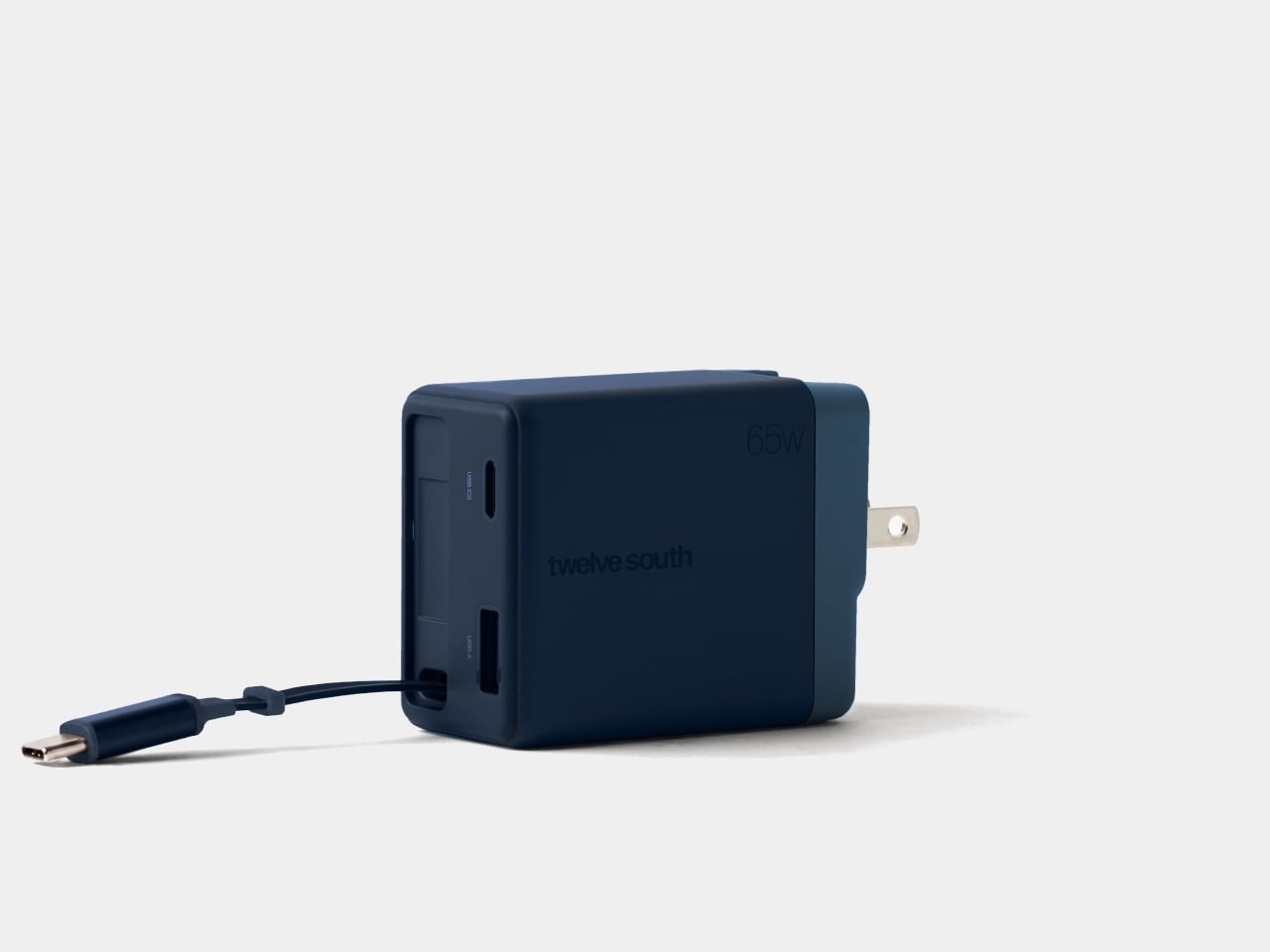
Chargers have become smaller and more capable, but their cables still have a habit of becoming a tangled mess in our bags. Even remembering to pack one doesn’t guarantee you’ve brought the other. Twelve South’s Cablesnap 65W charger tackles that familiar problem with a retractable USB-C cable, keeping the wire tucked inside its body until you actually need to plug something in.

The idea is pretty straightforward, although it addresses a chore that’s easy to overlook. Pull out the USB-C connector and the flat cable extends up to 29 inches, giving you some freedom to position your device. When you’re done, a small tug sends it back into the housing. There’s no need to wrap the cord around the charger and hope it stays put.

Designer: Twelve South

The connector has its own recessed resting place beside the extra ports, so there isn’t a loose tip dangling outside after the cable disappears. That leaves a rounded rectangular body with relatively little visual clutter and a contrasting end section. Coastal blue, Dune, and Slate finishes give it some personality, especially if you’ve grown tired of the usual anonymous black or white chargers.

That disappearing trick does come with a catch, of course. A 29-inch cable works best when the outlet is already reasonably close to where you want your device. A desk socket is one thing; an outlet hidden behind a hotel bed is another matter. You can avoid having extra wire spread across the table, but you can’t pull out length that isn’t there.

Fortunately, the built-in cable isn’t your only connection. An additional USB-C port and a USB-A port let you charge up to three devices together, which could cover a laptop, phone, and wireless earbuds at the end of the day. You’ll still need separate cables for those extra ports, though, so this particular arrangement hasn’t made your entire cable collection obsolete just yet.

The advertised 65W, however, needs a little explanation. That’s the charger’s total available output, rather than what each device receives when everything is plugged in. The USB-A port tops out at 18W, while the overall power budget is shared. Charging a compatible laptop alongside your other gadgets is convenient, but you shouldn’t expect it to receive the full 65W in that particular arrangement.

The US plug folds into the body as well, keeping its prongs from sticking out while the charger is packed away. Included Type G and Type C adapters accommodate compatible UK and European outlets, saving you from sourcing those pieces separately. Between the folding plug and retractable cable, there’s less to arrange before slipping the charger back into your crowded travel bag.

At $49.99, the Cablesnap 65W puts a price on not having to coil a cable every time you move between desks or pack for a trip. The integrated design does raise a question about replacing that cable, something Twelve South doesn’t explain. You still have the spare USB-C port if needed, but using it brings a loose cord back into your bag.

The post Twelve South’s Cablesnap 65W Charger Packs Its Cable So You Don’t Have To first appeared on Yanko Design.
  • ✇Yanko Design
  • This Light-Charging E Ink Frame Gives Your Photos a Home Beyond Your Phone
    Taking photographs has become almost effortless, but getting them off our phones is another matter. There’s always a favorite vacation snapshot that deserves better than being buried between screenshots and receipts. Inkanva is developing a color E Ink canvas that gives those pictures a more permanent place at home, with a paper-like display and indoor-light charging on its two smaller models. The difference starts with what the display doesn’t do. There’s no backlight turning a family portrai
     

This Light-Charging E Ink Frame Gives Your Photos a Home Beyond Your Phone

Par : JC Torres
7 novembre 2026 à 21:45

Taking photographs has become almost effortless, but getting them off our phones is another matter. There’s always a favorite vacation snapshot that deserves better than being buried between screenshots and receipts. Inkanva is developing a color E Ink canvas that gives those pictures a more permanent place at home, with a paper-like display and indoor-light charging on its two smaller models.

The difference starts with what the display doesn’t do. There’s no backlight turning a family portrait into another glowing rectangle in the living room. Instead, E Ink Spectra 6 reflects ambient light and uses six physical pigments to create color. Like a printed photograph, it needs light to be seen, which makes its relationship with the room quite different from a backlit tablet’s.

Designer: Inkanva

Click Here to Buy Now: $159 $239 (34% off). Hurry, only a few left! Raised over $358,000

1

Light also has another job here. The 7.09-inch and 13.3-inch editions include a perovskite photovoltaic component that harvests indoor light to replenish the battery. That’s a rather technical way of addressing a familiar decorating problem: finding somewhere for an electronic object without planning around a nearby power outlet. The component attaches magnetically and can be removed without opening the display housing.

Of course, the room still has a say in how that works. Charging depends on available light and how often you change the picture, so a dim corner isn’t the same as a well-lit shelf. E Ink helps by retaining a static image without continuous display power. The aim is fewer charging interruptions, rather than a promise of unlimited activity.

1

1

Changing the picture follows a routine that should feel familiar to anyone who’s edited a photo on a phone. Choose an image in the Inkanva app, adjust the crop, and send it over Wi-Fi. A trip to the coast could replace last year’s family portrait without another print order, leaving the physical frame where it is while the memory inside changes.

There’s room for less conventional contributions, too. The app offers AI tools that turn spoken ideas or doodles into artwork, giving a quick sketch another direction to explore. A child’s drawing could become the starting point for something new, although there’s no obligation to involve AI at all. Your own photograph can take the same place without being reinterpreted by software.

1

Those who’d rather manage their pictures closer to home have a separate local mode with a browser interface and its own image library. It’s an alternative to app-based management, rather than another remote control running alongside it. Home Assistant support also leaves room for custom routines, such as putting a different artwork on display for the start of the week.

The surrounding frame matters almost as much as the image, especially when it shares a room with furniture you’ve chosen carefully. On the 13.3-inch edition, a separate decorative wood surround can be swapped without replacing the display. Moving it from a study to a living room doesn’t have to mean keeping the same finish, even if the photograph stays exactly as it was.

1

Scale changes that relationship as well. The 7.09-inch canvas suggests a personal photograph beside a desk, while the 13.3-inch version gives an image more presence on a shelf or wall. There’s also a 28.5-inch edition for a larger wall composition, although it doesn’t include the light-harvesting panel.

A photograph doesn’t need to change every morning to deserve a place on the wall. It might stay there for months, gathering the sort of familiarity that makes a room feel like yours. Inkanva leaves that decision with the person living beside it. When another picture finally earns the spot, you can change what’s inside without taking down the frame.

Click Here to Buy Now: $159 $239 (34% off). Hurry, only a few left! Raised over $358,000

The post This Light-Charging E Ink Frame Gives Your Photos a Home Beyond Your Phone first appeared on Yanko Design.

  • ✇Yanko Design
  • Micro Journal Rev.2.1.MINI Writing Laptop Pairs a Wide Screen With Just 48 Keys
    Opening a laptop to write a paragraph can quickly turn into checking messages, rearranging windows, and forgetting the sentence you had in mind. The Micro Journal Rev.2.1.MINI, nicknamed Baby Shark, puts writing at the center of a small, folding computer instead. Its wide screen and compact mechanical keyboard give your words their own space, while Linux supplies the editing tools beneath that colorful clamshell. The chunky enclosure doesn’t try to resemble a slim aluminum laptop. A bright red
     

Micro Journal Rev.2.1.MINI Writing Laptop Pairs a Wide Screen With Just 48 Keys

Par : JC Torres
7 novembre 2026 à 18:30

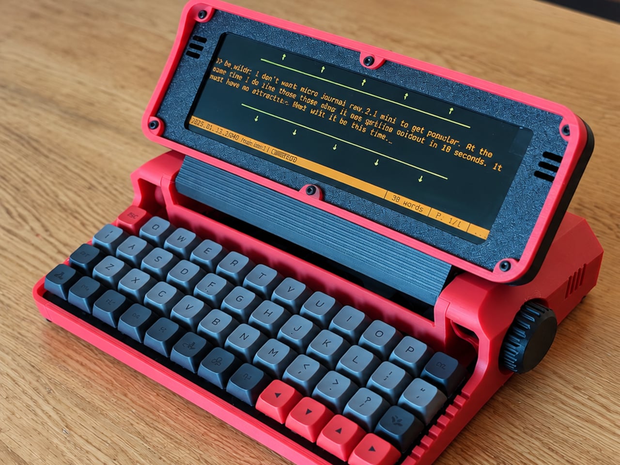
Opening a laptop to write a paragraph can quickly turn into checking messages, rearranging windows, and forgetting the sentence you had in mind. The Micro Journal Rev.2.1.MINI, nicknamed Baby Shark, puts writing at the center of a small, folding computer instead. Its wide screen and compact mechanical keyboard give your words their own space, while Linux supplies the editing tools beneath that colorful clamshell.

The chunky enclosure doesn’t try to resemble a slim aluminum laptop. A bright red shell, dark panels, exposed screws, and ridged side knobs give it the character of a little workshop instrument. Its hinged display folds down over the keyboard when you’re finished. The 3D-printed construction makes color part of the customization, rather than limiting everyone to another black rectangle in their bag.

Designer: Un Kyu Lee

The 8-inch LCD is unusually wide and shallow, with a 1280×400 resolution that stretches a document across the device. It leaves space for your passage without offering the vertical expanse of a conventional laptop screen. That’s a useful distinction for drafting: there’s room to work through a sentence, but reviewing several pages still means scrolling rather than shrinking everything into an overview.

The keyboard makes a similar trade. Its 48 keys form a four-row, 12-column grid, rather than the staggered rows most typists know. Numbers and additional symbols live on layers accessed by holding another key, which keeps the footprint small while asking your fingers to learn new combinations. Vial software lets you remap assignments, and hot-swappable switches let you change the feel without soldering.

A Raspberry Pi Zero 2 W runs Linux inside, with WordGrinder and nano available for drafting and editing. That gives you somewhere to revise yesterday’s work as well as start today’s entry. Files can leave through a USB flash drive or a browser-based interface on your local network, so a writing session doesn’t have to end with retyping everything on your main computer.

Portability also depends on what you put inside. Baby Shark takes up to four replaceable 18650 cells, sold separately, or runs directly from USB power. The connector is USB-C, but the documented setup requires a USB-A charger and a USB-A-to-USB-C cable, not USB Power Delivery. That means the charger already serving your laptop may not be the one this little writing machine needs.

Linux brings a pause before the writing starts: the seller estimates about 30 seconds to boot. This isn’t an instant-on notebook, and closing the screen isn’t a substitute for shutting the system down properly. On the other hand, published enclosure files, circuit-board designs, and firmware give owners ways to repair or modify it, instead of treating the device as a sealed appliance.

Baby Shark is sold as a DIY project even when ordered assembled, with no seller warranty. Later batches are planned without the Raspberry Pi, leaving buyers to supply it themselves. There’s considerable room to make both the hardware and software your own, provided that adjusting the keyboard doesn’t become another way to postpone the paragraph you originally sat down to write. There’s also a Purple Black Mint Green, nicknamed Witch, version inspired by the EVA-01 from the famed anime, Evangelion.

The post Micro Journal Rev.2.1.MINI Writing Laptop Pairs a Wide Screen With Just 48 Keys first appeared on Yanko Design.

  • ✇Yanko Design
  • Aina’s AI Ring Puts an OLED Screen and Joystick on Your Finger
    Reaching for your phone to pause a song can easily turn into reading messages you weren’t planning to open. Aina Ring proposes keeping those small decisions on your hand instead, with a display and thumb-operated control built into a substantial titanium band. The upcoming wearable is designed to handle quick commands and AI suggestions while your iPhone stays tucked away in your pocket. The design doesn’t pretend to be an ordinary piece of jewelry. A rectangular OLED display sits above the ind
     

Aina’s AI Ring Puts an OLED Screen and Joystick on Your Finger

Par : JC Torres
7 novembre 2026 à 16:45

Reaching for your phone to pause a song can easily turn into reading messages you weren’t planning to open. Aina Ring proposes keeping those small decisions on your hand instead, with a display and thumb-operated control built into a substantial titanium band. The upcoming wearable is designed to handle quick commands and AI suggestions while your iPhone stays tucked away in your pocket.

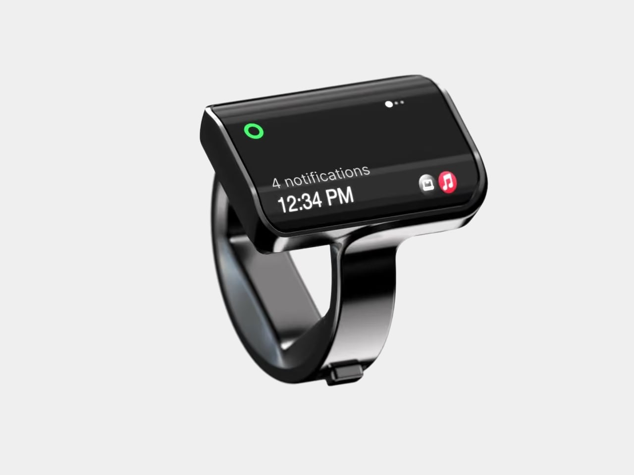
The design doesn’t pretend to be an ordinary piece of jewelry. A rectangular OLED display sits above the index finger, with glass covering its face and rounded edges easing the transition to the band. Four titanium body parts enclose 140 components. Eclipse Black, Amber Gold, Mercury Silver, and Slate Titanium offer different finishes, although none makes that raised screen disappear into a conventional ring.

Designer: Aina

The more interesting detail sits beside your thumb. A joystick-like button on the band accepts seven gesture types, including directional flicks, presses, and holds. Depending on the current task, flicking upward can approve a suggestion, answer a call, or pause music. Displayed hints explain the next action, giving that tiny screen a role beyond repeating notifications from a device you already carry.

Aina calls its suggestions Cues and says its software learns from your routines and calendar. A regular departure time might bring up a ride suggestion; an approaching meeting could offer a shortcut to join. The important design choice is that approval remains yours. Ignore the suggestion and nothing happens, rather than letting a guessed preference quietly become a booking you didn’t request.

Voice provides another route when a flick isn’t enough. Hold the button to dictate a note or set a reminder through the built-in microphone, while a speaker enables calls from the ring. On a Mac, that same control can dictate into applications. It’s a way to catch a thought during a walk, without stopping to compose it on a phone keyboard.

The ring remains an accessory to Apple’s ecosystem, not an independent phone. It requires an iPhone running iOS 18 or later, with macOS 15 or later for Mac features; Android and Windows aren’t supported. Meeting controls depend on the nearby Mac and Aina’s app, so muting from your finger doesn’t mean you can leave the computer behind and keep every function.

Aina claims up to 18 hours per charge, with a cube-shaped dock included for overnight charging. Sizes run from 7 through 13, but only the band changes; the display stays the same. A smaller finger therefore doesn’t get a less conspicuous screen. The IP65 rating allows everyday splashes, although the company says to remove the ring before swimming or showering.

Starting at $399 for early-access preorders, against a $499 list price, Aina is scheduled to ship in early 2027. That leaves the usefulness of its predictions and the comfort of its substantial shape to be established beyond launch demonstrations. A thumb-sized shortcut might save a trip into an app, but wearing it all day needs a better reason than simply having somewhere else to check incoming notifications.

The post Aina’s AI Ring Puts an OLED Screen and Joystick on Your Finger first appeared on Yanko Design.

  • ✇Yanko Design
  • Raven Prism Smart Glasses Put a Linux Computer in the Corner of Your Eye
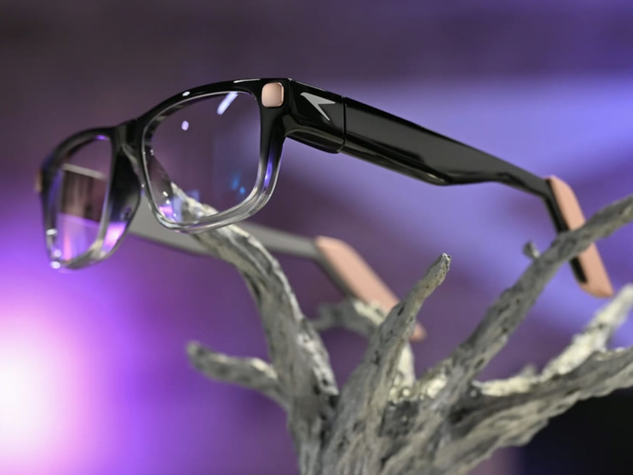
    Checking a recipe with flour on your fingers is a good reminder that a touchscreen isn’t always the most convenient interface. Raven Resonance’s Prism glasses propose keeping those instructions in the corner of your vision instead, with eye controls leaving your hands free. The reservation-stage wearable puts a Linux computer inside familiar-looking frames, rather than simply supplying another screen tethered to your phone. The frames make some concessions to everything packed inside. Thick tem
     

Raven Prism Smart Glasses Put a Linux Computer in the Corner of Your Eye

Par : JC Torres
6 novembre 2026 à 13:20

Checking a recipe with flour on your fingers is a good reminder that a touchscreen isn’t always the most convenient interface. Raven Resonance’s Prism glasses propose keeping those instructions in the corner of your vision instead, with eye controls leaving your hands free. The reservation-stage wearable puts a Linux computer inside familiar-looking frames, rather than simply supplying another screen tethered to your phone.

The frames make some concessions to everything packed inside. Thick temples run back from a dark brow, while clearer lower rims soften the outline around the lenses. Pale end pieces add a contrasting finish without covering the front in conspicuous branding. There’s still more hardware beside your head than ordinary glasses would carry, so familiar styling shouldn’t be confused with proven comfort.

Designer: Raven Resonance

The display occupies the right eye’s periphery, using a full-color waveguide with a 30-degree diagonal field of view. Its position is meant to make a recipe or reference image available when you glance over, rather than filling your central view. That arrangement suits checking the next instruction while cooking, although looking away from your hands still requires choosing a sensible moment to pause.

Eye control gives that arrangement its practical purpose. Raven’s software framework includes buttons you activate by holding your gaze on them, along with gaze-based navigation. You wouldn’t need to tap a temple every time your hands were occupied. The challenge is distinguishing a deliberate selection from an ordinary glance, something the developer guidance acknowledges by recommending large targets and avoiding crowded layouts.

Privacy gets a physical control rather than just a settings menu. A cover must be moved manually before the 13-megapixel camera can operate, and lights in the rims signal when it’s active. Raven also says speech recognition runs locally and cloud sharing requires consent. Those choices make the intended boundaries clearer, but they don’t amount to an independent security audit of the system.

Keeping prescription glasses usable while their electronics recharge takes another physical solution. Raven Wings are removable battery modules, designed to swap without shutting down your apps. Two pairs and a charging case are included, letting one set recharge while you wear the other. That makes the all-day ambition about exchanging batteries, not a published promise of uninterrupted runtime from a single pair.

Underneath that eyewear is Raven OS, running on a quad-core ARM processor with up to 4GB of memory. Developers can connect remotely and build compatible applications, but Linux underneath doesn’t mean every desktop program fits a tiny wearable display. Navigation directions and other phone-supplied information also remain part of the pitch, so standalone computing shouldn’t be mistaken for making your phone redundant.

Prism is priced at $1,499, including supported prescription lenses, with initial US shipments planned for January 2027. New reservations currently fall into a summer 2027 batch, not that first delivery window. Its usefulness will depend on whether these small interactions feel easier than reaching for a phone, and whether you’re comfortable keeping the screen, batteries, and computer on your face all day.

The post Raven Prism Smart Glasses Put a Linux Computer in the Corner of Your Eye first appeared on Yanko Design.

  • ✇Yanko Design
  • Keychron’s $35 Keypad Turns AI Shortcuts Into Four Physical Buttons
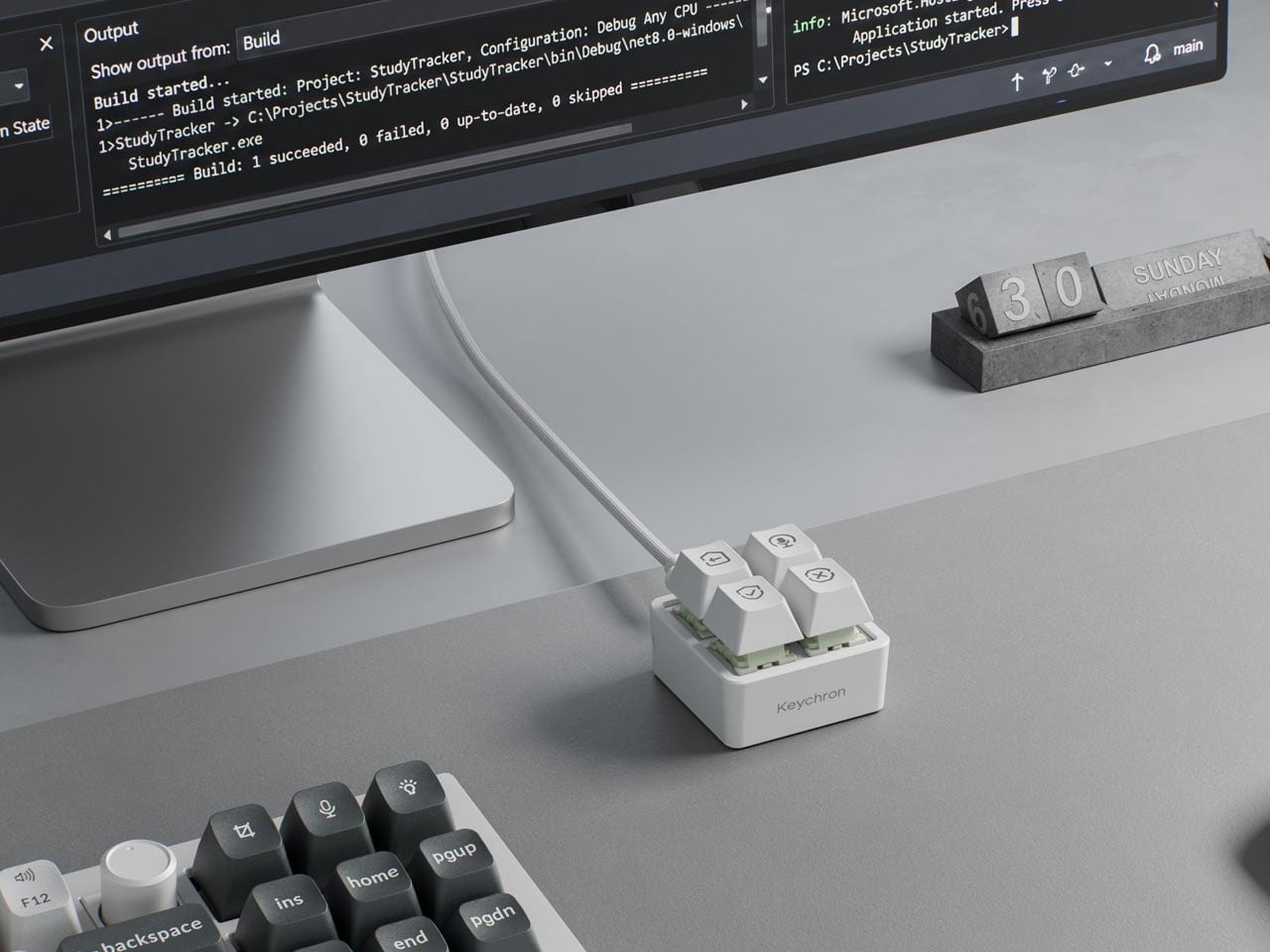
    Working with an AI coding assistant can mean repeating the same handful of commands while your fingers hunt across a keyboard full of other possibilities. Keychron’s F4 HE 8K Vibe Coding Keypad gives those repeated decisions their own little patch of desk. Four programmable keys put prompting, dictation, approval, and rejection within reach, without asking you to replace the keyboard you already use. The square body measures just 1.77 inches on each side, although its tall keycaps bring the hei
     

Keychron’s $35 Keypad Turns AI Shortcuts Into Four Physical Buttons

Par : JC Torres
6 novembre 2026 à 09:20

Working with an AI coding assistant can mean repeating the same handful of commands while your fingers hunt across a keyboard full of other possibilities. Keychron’s F4 HE 8K Vibe Coding Keypad gives those repeated decisions their own little patch of desk. Four programmable keys put prompting, dictation, approval, and rejection within reach, without asking you to replace the keyboard you already use.

The square body measures just 1.77 inches on each side, although its tall keycaps bring the height to 1.35 inches. Available in black or white, it looks like someone neatly cut a corner from a mechanical keyboard. An ABS plastic enclosure surrounds an aluminum plate, leaving the switch housings visible beneath the caps instead of hiding them behind a broad decorative surround.

Designer: Keychron

Those caps do more than supply a place to press. Keychron provides 15 icon options in dye-sublimated PBT, so a microphone, check mark, or cross can identify what you’ve assigned underneath. Per-key RGB adds another cue, letting you color an approval key green and a rejection key red. These are physical labels and configured colors, not screens that update when you switch applications.

The intended routine is familiar if you’ve spent time reviewing generated code. Start a conversation, dictate a change, then accept or reject what comes back, using mappings suited to your software. Keychron supplies Codex and Claude presets through its browser-based Launcher. The microphone icon needs particular attention, though: there’s no microphone inside this little box, so voice input still needs one elsewhere.

Launcher also handles ordinary shortcuts and recorded macros, giving the keypad something to do when you’re finished negotiating with an AI. A meeting mute button or a window-snapping shortcut might earn its place just as easily. Settings save to the device, but the relevant shortcuts still need to work on the next computer. Onboard memory carries your assignments, not the applications they control.

The magnetic switches add a less obvious kind of customization. You can choose how far a key travels before registering, making a shallow press sufficient or requiring a more deliberate movement. Dynamic Keystrokes can assign up to four actions across pressing and releasing one key. That’s extra flexibility, although remembering several hidden actions might undermine the simplicity of having four clearly labeled buttons.

Keychron advertises 8,000 reports per second over USB-C with a suitable cable, a gaming-oriented specification rather than evidence that AI will answer faster. More immediately relevant is another wire trailing from such a small accessory. The listed box contents include the keypad, 11 extra caps, and a manual, but no cable, so you’ll need to provide that part of the setup yourself.

The F4 costs $34.99, but the featured Launcher version remains in beta ahead of its planned November 9, 2026 release. That caveat aside, the question is how often you’re repeating the same commands. Four dedicated buttons are appealing when they remove a daily nuisance, less so when they’re another thing to remember beside your perfectly functional keyboard.

The post Keychron’s $35 Keypad Turns AI Shortcuts Into Four Physical Buttons first appeared on Yanko Design.

  • ✇Yanko Design
  • Razer’s New Hammerhead Earbuds Bring Back the Cable, Not the Headphone Jack
    Wireless earbuds can make a short gaming break depend on whether you remembered to charge their case the night before. Razer’s Hammerhead V3 Chroma takes that worry off the list with a cable that carries audio and power through USB-C. There’s no headphone jack involved in this return to wired listening, and the angled plug has been shaped around the hands holding your phone. The connector has a 90-degree bend, letting the cable run alongside a compatible device rather than sticking straight int
     

Razer’s New Hammerhead Earbuds Bring Back the Cable, Not the Headphone Jack

Par : JC Torres
6 novembre 2026 à 06:07

Wireless earbuds can make a short gaming break depend on whether you remembered to charge their case the night before. Razer’s Hammerhead V3 Chroma takes that worry off the list with a cable that carries audio and power through USB-C. There’s no headphone jack involved in this return to wired listening, and the angled plug has been shaped around the hands holding your phone.

The connector has a 90-degree bend, letting the cable run alongside a compatible device rather than sticking straight into your palm. That matters when you rotate a phone for a game and wrap both hands around its ends. It’s a small adjustment to an unglamorous component, but one that addresses one immediate objection to putting a wire back into a handheld setup.

Designer: Razer

The wire also gives Razer somewhere to put controls that don’t have to share space with an ear tip. An in-line remote handles volume, playback, and active noise cancellation (ANC), with raised controls you can locate by touch rather than tapping an earbud. Its omnidirectional microphone supports calls and team chat, keeping the interactions on the cable instead of behind another phone menu.

Of course, subtlety isn’t really the point of a bright green cable hanging from black earbuds. Circular outer caps carry illuminated Razer logos, with Chroma RGB offering 16.8 million color options. The glossy housings and short stems aren’t particularly dramatic by themselves, but the color makes the whole arrangement unmistakably gaming hardware, even when you’re simply listening to music on the bus.

Inside each earbud, a dynamic driver works alongside a dedicated tweeter, dividing the work between lower and higher frequencies. Razer includes feed-forward ANC, intended to reduce surrounding noise during a commute or a match in a shared room. Noise cancellation brings a familiar wireless-earbud convenience to a wired pair, although neither the driver arrangement nor the connection guarantees great sound on its own.

Four presets cover Gaming, Music, Movies, and Call, alongside a custom equalizer profile for anyone who prefers adjusting the balance themselves. Moving to a PC adds THX Surround Sound 7.1 through Razer Synapse 4. That’s a software-dependent extra, not something the earbuds automatically deliver on every phone, so the same connection doesn’t mean an identical feature set everywhere you plug them in.

The IPX4 rating allows for splashes and sweat, which makes sense for earbuds that might move from a desk to a drizzly commute. It doesn’t turn them into waterproof gear. The cable needs managing: it can catch on clothing or pull against the phone when you reach too far. A bent connector changes its direction, not the distance you’re able to move.

Launched on November 5, 2026, the Hammerhead V3 Chroma costs $79.99 in the US. The trade is straightforward: fewer batteries to remember, but a cable and an occupied USB-C port in return. If that’s your phone’s only charging connection, you’ll need another way to top it up while listening. The earbuds need no charging, but your phone doesn’t get the same night off.

The post Razer’s New Hammerhead Earbuds Bring Back the Cable, Not the Headphone Jack first appeared on Yanko Design.

  • ✇Yanko Design
  • Peak Design’s Charging Station Folds Flat to Charge Two Phones
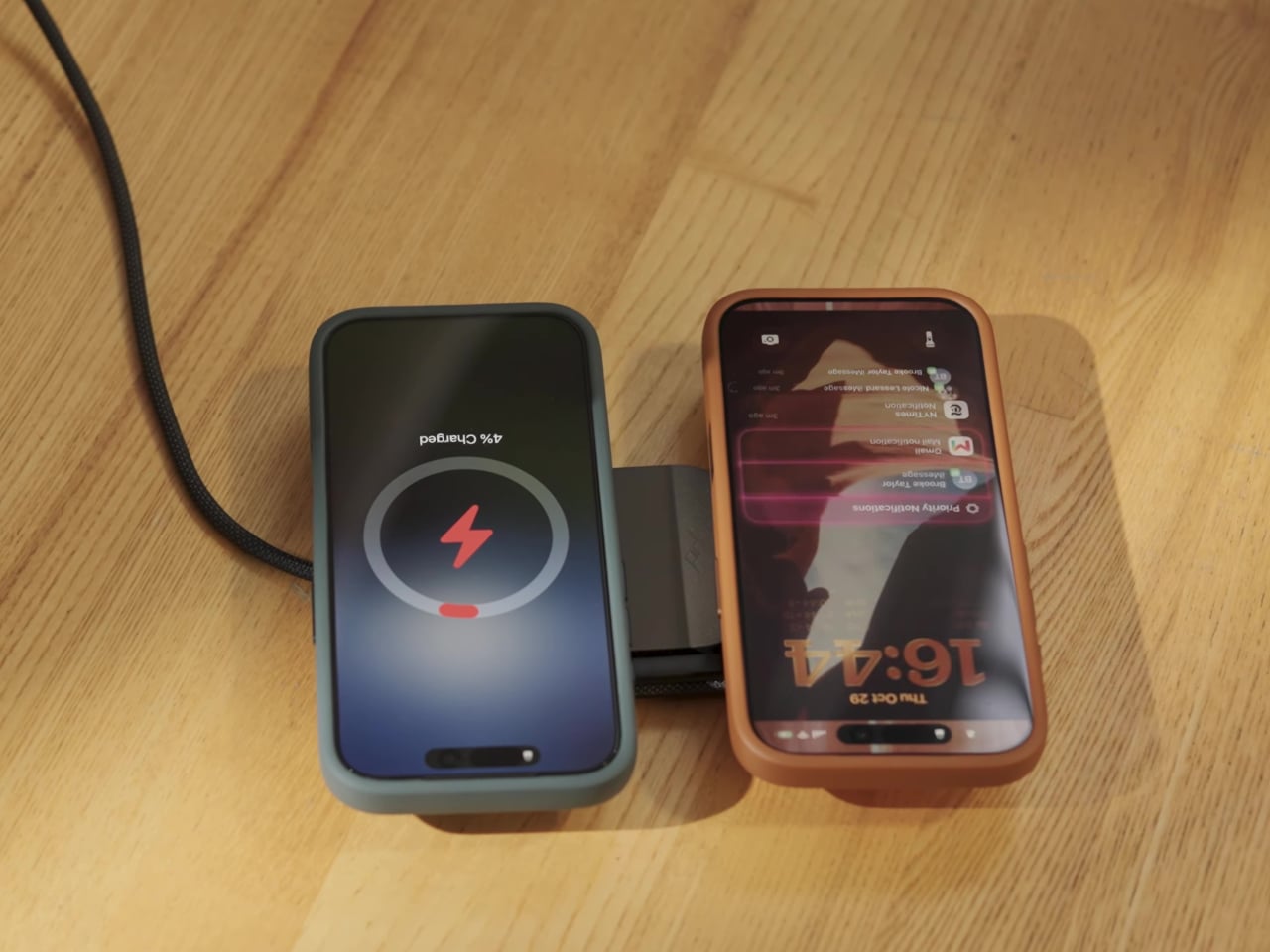
    Charging a phone and a pair of earbuds is easy enough, but sharing that same stand with another phone is a different matter. Peak Design’s new Charging Station addresses that problem with two equally capable magnetic pads and a hinged arm. Stand it up beside your laptop, or lay it flat so two phones can recharge without competing for the better spot. The shape is straightforward, with a narrow metal arm linking two rounded-square charging surfaces. Die-cast aluminum and zinc form the chassis, w
     

Peak Design’s Charging Station Folds Flat to Charge Two Phones

Par : JC Torres
4 novembre 2026 à 10:20

Charging a phone and a pair of earbuds is easy enough, but sharing that same stand with another phone is a different matter. Peak Design’s new Charging Station addresses that problem with two equally capable magnetic pads and a hinged arm. Stand it up beside your laptop, or lay it flat so two phones can recharge without competing for the better spot.

The shape is straightforward, with a narrow metal arm linking two rounded-square charging surfaces. Die-cast aluminum and zinc form the chassis, while the machined aluminum stem provides the moving structure. Laminated Clarino covers the pads, and a non-slip TPU foot sits underneath. Black and Moon finishes keep the color choices restrained, rather than turning your nightstand into a brightly branded electronics display.

Designer: Peak Design

Two hinges let you adjust the arm and upper pad separately, positioning a phone for a video call or a glance at your calendar. Magnetic attachment supports portrait and landscape orientations, so changing what you’re doing doesn’t require another stand. An earbud case can sit on the lower pad while the phone stays raised, keeping both devices within the same small desktop footprint.

The lower pad gets more interesting when you fold the station flat. Peak Design rates both Qi2.2 pads for up to 25W simultaneously, allowing two compatible phones to recharge at once without assigning one a slower accessory spot. That doesn’t mean every magnetically attached phone will receive 25W, though. The device’s own charging support still determines how much power it can accept.

That folding movement also changes how the charger travels. Packed flat, it measures 6.3 by 2.7 by 0.6 inches, with the arm tucked alongside the body instead of projecting into your bag. At 9.7 ounces, it still adds weight to a travel kit, but you aren’t packing a rigid desktop stand just to keep a phone propped up in a hotel room.

A separate USB-C output makes room for a third device, although this connection is wired. Its 7.5W output is suited to smaller accessories rather than replacing a laptop charger. A watch still needs its own charging cable or puck, so this isn’t a dedicated three-device wireless dock. It simply gives that extra cable somewhere to connect without occupying another outlet on the wall.

The $99.95 price also leaves out the wall adapter. Peak Design includes a fabric-wrapped USB-C cable rated for 100W, but specifies at least a 45W power supply to operate the station and 75W or more for maximum dual charging speed. That makes the adapter part of the buying decision, particularly if your existing charger is already committed to powering something else at home.

The post Peak Design’s Charging Station Folds Flat to Charge Two Phones first appeared on Yanko Design.

❌