Vue normale

Il y a de nouveaux articles disponibles, cliquez pour rafraîchir la page.
À partir d’avant-hierFlux principal

Minimalist Pomodoro timer promises distraction-free productivity

Par : JC Torres
26 décembre 2023 à 21:45

There are plenty of productivity techniques floating around the Internet, but one of the most popular ones has actually been around even before the Web as we know now came to be. Named after a tomato-shaped kitchen timer, the Pomodoro technique is so simple that it’s too easy to brush it off as trivial, but its effectiveness has also been known for decades. Of course, that has also led to plenty of apps and gadgets that embrace the hype while forgetting the spirit and actually induce stress and distractions rather than productivity. Fortunately, there are better and more creative ways to design a Pomodoro timer, like this minimalist beauty that allows you to enjoy the simple benefits of the technique without having to rely on a clunky analog timer, especially one that looks like an awkward tomato on your desk.

Designer: Gary Peng

The Pomodoro technique is extremely simple and takes advantage of the fact that the human brain can only concentrate on a single thing for a short period of time. In theory, you do that single thing for 25 minutes and then take a break for 5 minutes before repeating the process. Because it’s that simple, you really don’t need complicated tools other than a timer, whether it’s a mechanical kitchen timer or a smartphone app, both of which come with their pros and cons. That kitchen timer can look odd on your desk and a mobile app risks distracting you with other things on your device.

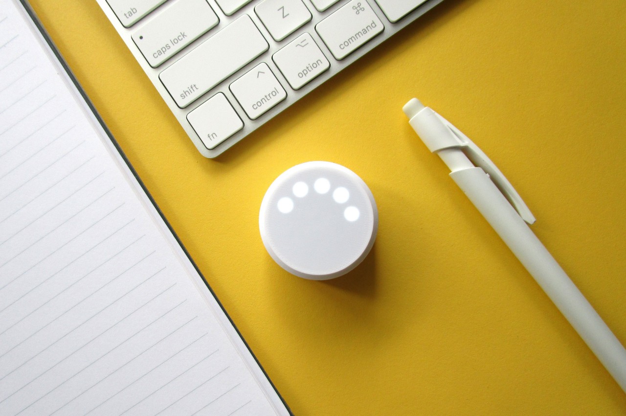
POD is a tool that combines the feeling of an analog timer with the convenience of an electronic device in a simple yet attractive form. It’s nothing more than a small white puck that has five very discreet dot lights on top arranged in an arc. There is no control other than pushing the puck down like a button, which is what starts the countdown.

1

1

Each dot of light represents either five or one minutes, depending on the mode. When you’re in “work” mode, the lights count down to 25 minutes in total, while “break” mode is the usual five-minute period of rest. The POD is also minimally distracting, using only flashing lights to get your attention rather than sounds or vibrations. This means you can easily use it in environments where you need to be very quiet, like in a library.

The POD also relies on trusty CR2032 batteries that you can easily replace, so you won’t have to worry about running out of juice for a long time. Its minimalist charm will make it look at home on any desk, table, or shelf, and doesn’t induce the same tension and stress the same way that a ticking kitchen timer would.

The post Minimalist Pomodoro timer promises distraction-free productivity first appeared on Yanko Design.

Solar-powered coffee truck concept runs on green fuel to bring black fuel anywhere

Par : JC Torres
27 décembre 2023 à 02:45

They say money makes the world go round, but coffee is probably just as critical for some people. Connoisseurs will undoubtedly tell anyone willing to listen to brew their own cup, but not everyone has the luxury of doing that daily. If you don’t know of a local shop you can call your home away from home, you’d probably be at the mercy of the big, expensive chains that put more sugar than you’re going to be comfortable with. Establishing a fixed store in a nook or building isn’t going to be cheap for some businesses, and it also means not being able to reach customers where they are. Coffee trucks can solve the problem of portability, but this concept design takes that idea even further by having the whole operation run on solar power, potentially bringing that coffee experience anywhere, even away from the grid.

Designer: Kyrolos Maged

Although you can see them almost everywhere, big chain stores like Starbucks won’t always please everyone. Some simply don’t like their selection or the way they do business. Others simply prefer to patronize smaller businesses to help them grow and thrive. Either way, the majority of these stores force you to go to their location, which is not a problem unless there isn’t one nearby. It would definitely be great if the coffee could come to where the people are rather than the other way around, which is what coffee trucks are trying to do.

Although they are a viable business model, such mobile coffee dispensing stores have a few logistic issues to iron out, specifically one of power. Sure, you can run the machines on the same battery that drives the truck, but it also risks you running out of fuel when you need it the most. And with some vehicles turning to electric power, such a power source might no longer be feasible. This unnamed concept thus turns toward an ever-present source, at least during the time when people are most likely to chug their black or brown fuel.

The solar-powered coffee truck is exactly as it sounds, an operation that runs on solar energy rather than fuel or car batteries. There’s a single large solar panel on top of the truck, but it’s easy enough to extend the design to have multiple panels on the “wings” that fold out from the sides of the truck. This way, the energy needs of the coffee machines and the truck itself are kept separate and you don’t have to worry about one eating into the reserves of the other.

The design of the truck itself is pretty standard, with sliding tables to let customers put down their cups for a while or enjoy some sandwiches that the mobile cafe might offer. What’s interesting, however, is the idea that the coffee truck would offer all sorts of coffee, including those from capsule machines. It’s a good way to diversify and hit many types of customers while also ensuring the speed of service, though pure-blood coffee lovers might turn their noses up at such a thought.

The post Solar-powered coffee truck concept runs on green fuel to bring black fuel anywhere first appeared on Yanko Design.

Space-inspired everyday products prepare us for a zero-gravity future

Par : JC Torres
5 janvier 2024 à 01:45

Many people these days dream about living on other planets or at least inside orbiting space stations, but few actually consider how very different life would be outside the Earth’s gravity. Of course, Hollywood tends to romanticize a lot of everyday life, but as astronauts will testify, living in space, even if just to reach the Moon or Mars, is no walk in the park. Even the simplest activities like drinking water can be awkward and disorienting in zero-g, at least if you consider using Earth-bound objects to do so. That’s why this trio of designs tries to reimagine some of the most mundane products we use in daily life and transform them into objects that are ready for our space-faring future.

Designers: Subin Kim, Jagyeong Baek, Jaeyeon Lee

Most of us understand that without gravity, things tend not to stay down, but few actually envision the ramifications of that fact. Products designed on Earth naturally presume an amount of stability, and the way they are handled or controlled is limited in the same manner. For example, a lot of everyday things only have handles on one side or work in a single direction, a presumption that doesn’t make much sense or even becomes counterproductive when the objects are floating in space.

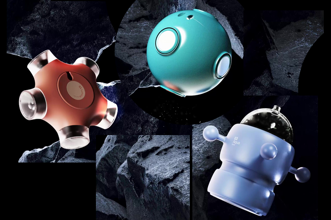
Spatio is a collection of these everyday objects that have been redesigned with zero gravity in mind. Or to put it more simply, it doesn’t make presumptions on where and how it will function, making it work both on Earth, on Mars, or in the International Space Station. Aqua, for example, is a water bottle that replaces a traditional cup that has a single handle on one side only. In contrast, this bottle has four extrusions in cardinal directions that act as handles and a cover that lets you drink by sucking rather than sipping from the lip of a mug.

Sonus is a wireless speaker that really defies the traditional design of speakers. Inspired by the moon’s spherical shape, each of the “craters” on its surface pops up a tiny omnidirectional speaker when pressed. The more units that pop out, the louder it gets, acting is an unconventional form of volume control. The important difference is that you don’t have to shift or move the speaker to one side or the other just to reach those controls.

And then there’s Lumia, a star-shaped flashlight that can shine in any direction. Simply turning the central wheel switches the direction of the light so that it works regardless of how you’re holding it. While these products were designed with space living in mind, it’s not difficult to imagine them working just as well on Terra Firma, proving that truly accessible design benefits everyone everywhere, even if they’re living in outer space.

The post Space-inspired everyday products prepare us for a zero-gravity future first appeared on Yanko Design.

Clicks QWERTY keyboard iPhone case brings back the joy of typing

Par : JC Torres
5 janvier 2024 à 10:00

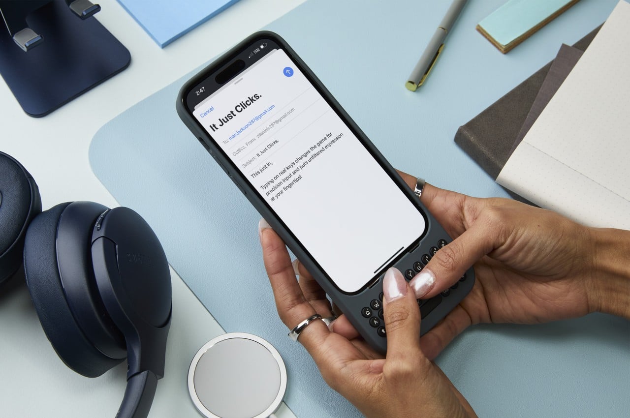
Remember the days when you could swiftly type a long response on your phone in just seconds? Even if you didn’t own a BlackBerry, our amazing human brains managed to evolve to adapt to the esoteric T9 input, resulting in a flurry of thumbs hammering out text at mind-blowing speeds. Just like with pen and paper, there are benefits to having physical keys to type with, including muscle memory, accuracy, and sheer satisfaction. Those are the joys that this new case is trying to bring to the iPhone by snapping on a full yet tiny QWERTY keyboard that gives creators the power to turn text into stories, quickly and accurately.

Designers: Michael Fisher and Kevin Michaluk

Although the BlackBerry is now a footnote in history, there was a time when it was the de facto standard of productivity. It’s a bit ironic that its most iconic feature is all but a memory today when text is even more critical in mobile life. From notes to todos to captions to messages, we type plenty of text on our touchscreen smartphones, which painfully drives home the fact that these smooth, flat surfaces have terrible ergonomics and haptics for such an activity. There have been a few attempts at resurrecting the BlackBerry or at least bringing the physical QWERTY keyboard to smartphones, but Clicks is trying to differentiate itself by projecting a fun and creative character that’s more in line with today’s creators.

For one, the cases distance themselves from the drab and serious styles of business-minded BlackBerry clones by embracing colors and curves, whether it’s the yellow Bumblebee or even the gray London Sky. Perhaps to avoid any litigation like its forebears, Clicks adopts circular keys with some spacing in between, giving the keyboard a more whimsical appearance. Regardless of the design, the Clicks QWERTY case has the same mission as all other QWERTY cases before it, bringing a familiar sensation to upgrade the typing experience. Best of all, the keyboard no longer eats up half your screen, leaving room for more content.

Using the case itself is as simple as pie. You slide the iPhone in from the top, carefully align the Lightning or USB-C connector, and snap the top on. The case doesn’t have a battery of its own, which makes it lighter and cheaper, so it draws power from the iPhone itself. It does support pass-through charging so you don’t have to remove the case just to charge the iPhone. The one drawback of its simple design is that MagSafe accessories won’t stick to it, but you can still enjoy wireless charging on a flat horizontal surface.

The Clicks QWERTY keyboard case is compatible only with the iPhone 14 and iPhone 15 models, though their availability won’t happen all at the same time. The $139 price tag is going to be debatable, especially for those who aren’t yet convinced of the advantages of having a physical keyboard at the cost of making a tall phone even taller. But for creators who find themselves always pecking at their phone’s screen, this quirky accessory is a done deal.

The post Clicks QWERTY keyboard iPhone case brings back the joy of typing first appeared on Yanko Design.

Pad & Quill leather accessories for Apple products live on in new brand

Par : JC Torres
5 janvier 2024 à 16:20

The design and especially the price of Apple’s devices easily mark these products as luxurious goods. Thus it’s not that unusual for owners to be overprotective of their expensive investments, covering them up with protective cases that sometimes trade style for protection. Fortunately, there is a class of accessories that actually add even more class to these devices, particularly through the use of luxurious materials like leather. For more than a decade, the name “Pad & Quill” became synonymous with these leather accessories, offering elegant protection for Apple’s premium products, but it, unfortunately, had to file for bankruptcy last year. The name might be gone, but its legacy now lives on in a new brand from the same founder, continuing the practice of delivering high-end leather products to match your equally high-end iPhone, iPad, or MacBook.

Designer: Brian Holmes

Nothing says stylish luxury better than leather. There will always be arguments regarding the way it’s sourced and produced, but there’s little debate that the material is immediately associated with premium products. Some smartphones even try to ride on that trend by slapping some vegan leather on their backs, but the real deal is harder to pull off unless it’s on an accessory.

Pad & Quill is a name that Apple fans have looked to when it comes to those leather accessories, but due to the recent pandemic, the business had to close down a few months ago. That’s not to say there’s no longer a market for premium leather Apple accessories, just that the brand folded due to circumstances. Thankfully, P&Q’s founder isn’t calling it quits and has started a new endeavor with a new name but with the same mission.

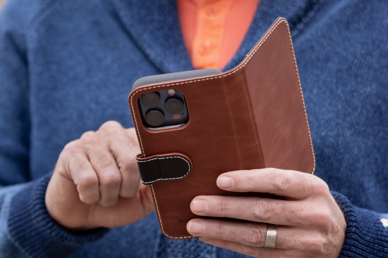
Burton Goods will continue the legacy of offering high-quality leather cases for Apple’s latest products. It isn’t just about using leather, though, and the brand is promoting its precision craftsmanship, attention to detail, and practical functionality alongside the material. Of course, these accessories also serve to protect your precious Apple devices while also being durable products themselves.

At the moment, Burton Goods’ selection of products is limited to Apple’s latest models, from the iPhone to the iPad Pro to the MacBook Pro to even the Apple Watch. There are also plans to include leather bags that will bring these all together, but the exact timeline for their appearance has yet to be revealed. The revival of Pad & Quill’s spirit does also resurrects the question of the sustainability of genuine leather, and it might be a good opportunity for this niche market to reassess that aspect of luxury for the sake of future generations.

The post Pad & Quill leather accessories for Apple products live on in new brand first appeared on Yanko Design.

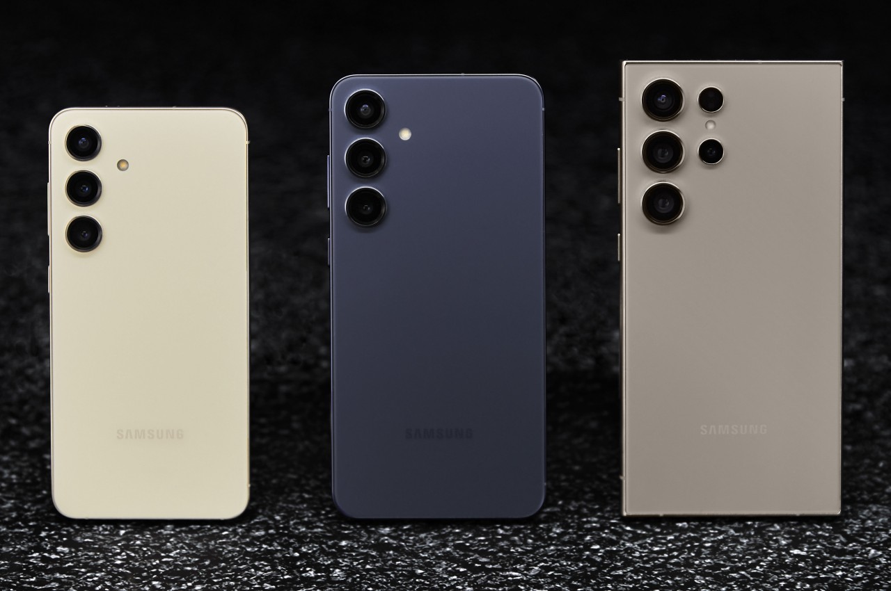
How much is the Galaxy S24: Is it worth the price

Par : JC Torres
18 janvier 2024 à 09:00

Although it didn’t do so at the recently concluded CES 2024 in Las Vegas, Samsung is still starting the year with a bang with its own Unpacked event. To no one’s surprise, the stars of the show are, of course, the new Galaxy S24 trio, though the much-rumored Galaxy Ring also made a very brief appearance as an unambiguous teaser. Samsung’s early 2024 flagships are bringing the expected upgrades in terms of hardware, but they’re also riding on the AI train in their own, unique way. But with every new Samsung phone also comes the question of whether its price is worth its weight in gold. We take a cursory look at what the Galaxy S24, S24+, and S24 Ultra have to offer to bring you that answer.

Designer: Samsung

What’s New

Of course, there are the customary hardware upgrades you’ll see every year, but there are a few surprise twists here and there. All three, for example, are powered by a new Snapdragon 8 Gen 3 “for Galaxy” chipset that’s marketed as a special flavor designed just for Samsung’s newest darlings. It’s presented as being optimized for hard AI work that we’ll get to later, but the exact performance differences between this and a vanilla Snapdragon 8 Gen 3 are probably going to be subtle.

Also subtle are the slightly larger displays on this year’s generation of Galaxy phones, at least for the Galaxy S24 and Galaxy S24+, and only by 0.1 inches. The Galaxy S24 Ultra’s screen remains the same large 6.8 inches, but the design change is actually greater in some other areas, as we’ll soon see. All three get brighter panels, though, so reading under the sun shouldn’t be a problem if it was before.

While most of the features are similar across the three models, differing mostly in screen size, things take a very different turn when it comes to the cameras. Suffice it to say, the Galaxy S24 and S24+ do not get any meaningful upgrade in terms of camera hardware, while the Galaxy S24 Ultra seems to take one step forward and one step back with at least one of four cameras. One of the two telephoto cameras gets a denser 50MP sensor but halves the optical zoom from 10x to 5x. Samsung assures, however, that the quality of a 10x “hybrid” zoom from that new sensor will just be as good, thanks to some AI tricks, of course.

Bold Direction towards Flat Design

The Galaxy S24 series looks nearly identical to its predecessor at first glance, but once you take a closer look, you will notice some subtle yet important differences. The Galaxy S24 and S24+ now adopt a completely flat design on its front, back, and sides, except for the rounded corners that help it avoid a completely boxy appearance. This refinement, though small, does put it in the same boat as many notable premium smartphones these days, particularly the latest iPhones.

The Galaxy S24 Ultra only changes its screen design, but that actually has the biggest repercussion in this generation. Gone are the curved edges that used to mark high-end flagships, with a screen that’s completely flat across the surface. It gives it a more modern look, at least as far as current design trends go, but the more important consequence is that owners now have full access to the entire screen using the included S Pen. No more avoiding or accidentally sliding off the edges because you can now utilize every single inch and pixel on that large screen.

AI for a Price

With AI still reigning as the buzzword in consumer electronics, it was really only a matter of time before Samsung joined the bandwagon in this industry as well. There are plenty of AI-powered features being advertised on the Galaxy S24 and, to Samsung’s credit, they really do show what the technology can do and how we can harness it for our benefit.

Real-time translations are one of the best examples of this artificial intelligence, and both two-way Live Translate and split-screen Interpreter help break down language barriers when communicating with people around the globe. Samsung Notes also gets an AI-assisted Notes Assist for summaries and template creation, while Voice Recorder gets Transcript Assist for transcribing audio recordings. And, of course, there are also tons of AI-powered image editing features in the Camera and Gallery apps.

There is one particular application of AI that also demonstrates the continued cooperation between Samsung and Google, former frenemies on the Android platform. As the name clearly states, Circle to Search lets you simply draw a circle around an image or even a block of text on your screen to initiate a Google Search.

As useful as these may sound, it seems that Samsung will be taking a rather controversial approach to providing AI features on its gallery phones. Samsung’s suite of Galaxy AI features will apparently be available for free on these devices only until 2025, after which it could charge a subscription fee for using them. It doesn’t exactly state how much that will be or which features will be covered by this limitation, though Google’s Circle to Search and other third-party AI features are most likely going to be exempt. Nothing’s set in stone yet, but this will surely lessen the appeal of relying on these features heavily.

Should you buy it or upgrade?

And now for the most critical part of the decision-making process: the price tags. The Galaxy S24 starts at $799.99 for 8GB of RAM and 128GB of storage, while the Galaxy S24+ will go for $999.99 for 12GB RAM and either 256GB or 512GB of storage. These are pretty much the same launch prices as the Galaxy S23 and S23+, which isn’t surprising considering very little has changed.

The Galaxy S24 Ultra, however, is a chunky $100 higher than last year’s model, now starting at $1,299.99 for 12GB of RAM and 256GB of storage. It’s a considerable price jump, especially when you consider you might be asked to pay for those trendy Galaxy AI features in two years. That new telephoto camera might be partly to blame, among other things.

If you’re looking to jump into the Samsung ecosystem for the first time, then it’s really only a choice between the smaller and more affordable Galaxy S24 and the larger, fully-featured Galaxy S24 Ultra. The Galaxy S24+ might sound like it has the best of both worlds, but it’s actually the opposite. Its only winning grace is the larger screen and battery, both of which will set you back $100 more than the Galaxy S24 but still won’t have the better cameras of the Galaxy S24 Ultra at the very least.

Considering all these, it’s going to be tough to recommend upgrading to any of the three models if you still have a perfectly fine Galaxy 23 or even a Galaxy 22. Even the Galaxy S24 Ultra, with a creator-friendlier flat display, is going to be a hard sell considering it’s also more expensive. The jury is still out on the camera improvements, though it’s probably not going to be too mind-blowing compared to the already decent quartet on the Galaxy S23 Ultra. Of course, if you have a Galaxy S21 series or older, then there’s almost no more doubt about making the jump or not.

The post How much is the Galaxy S24: Is it worth the price first appeared on Yanko Design.

Beautiful minimalist Apple accessories inspired by architecture and art

Par : JC Torres
18 janvier 2024 à 16:20

The accessory market for phones and computers is a wide and varied one, with designs that are all over the place and cover almost the entire range of the spectrum. Some try to offer everything, almost including the kitchen sink, resulting in a cornucopia of features and attachments, while others aim for the bare basics to keep things simple yet elegant. Minimalism continues to dominate the design world, and it has also started to grip the tech industry, particularly when it comes to gadgets and accessories. Minimalist design, though sometimes plain-looking, doesn’t exactly mean “boring,” especially when they take inspiration from some of mankind’s creative achievements to give these products an interesting visual and functional spin.

Belkin BoostCharge Pro 3-in-1 Wireless Charging Stand

Some say good things come in threes, and iPhone owners tend to own an Apple Watch and AirPods to complete a functional set. Keeping all three charged has become somewhat of a logistics problem, though thankfully it’s less of a mess now that none of them require charging cables all the time. Apple’s MagSafe technology has opened up a new world of designs, free from the tangles of wires, and it has given birth to a variety of charging docks and stations, including some pretty minimalist ones.

Designer: Belkin

The Belkin BoostCharge Pro really takes minimalism almost to an extreme, being nothing more than a metal post that branches in two, standing on a plain round disc. While there are quite a number of 3-in-1 MagSafe chargers that support a similar combination, Belkin’s design emphasizes keeping a tidy appearance, whether there are devices charging on it or not. The base holds the AirPods case, keeping your desk or shelf clean, while both the iPhone and Apple Watch are held up high for easier visibility.

The charger’s clean and minimalist appearance takes its cue from modern architecture, with well-defined lines and shapes and a simple yet functional design. It distills the whole structure down to its essentials, providing support and a place for your gadgets to call home, without overpowering Apple’s already elegant and stylish aesthetic.

MagSafe Origami Grip Stand

The ancient Japanese art of paper folding has inspired many designs across history, from simple children’s toys to mind-blowing structures even to complex robots. The main pull of origami has always been its ability to change shape from a flat sheet of material like paper to something three-dimensional any moving parts or without removing or adding any part at all. Because of that, something that takes up space can be made to collapse down to almost nothing, like this grip and stand that adds almost no thickness to your iPhone.

Designer: Marcy Arimoto

Click Here to Buy Now: MagSafe Origami Grip Stand ($45)

Thanks to its creative origami-inspired design, the MagSafe attachment transforms from a flat pad into a triangular shape that can do more than just prop up your phone on a table. It gives your fingers something stable to latch onto, making it perfect for taking selfies with confidence. It can even stick to metal posts, walls, and surfaces thanks to that strong magnetic power.

The best thing about its design is that it doesn’t get in the way when you don’t need it. It simply collapses back down to a flat shape that’s no thicker than the iPhone’s own camera bump. Nothing to snag when you slip it into your pocket and nothing to make it wiggle when placed on a table. It’s beautiful, functional, and as simple as it needs to be, nothing more.

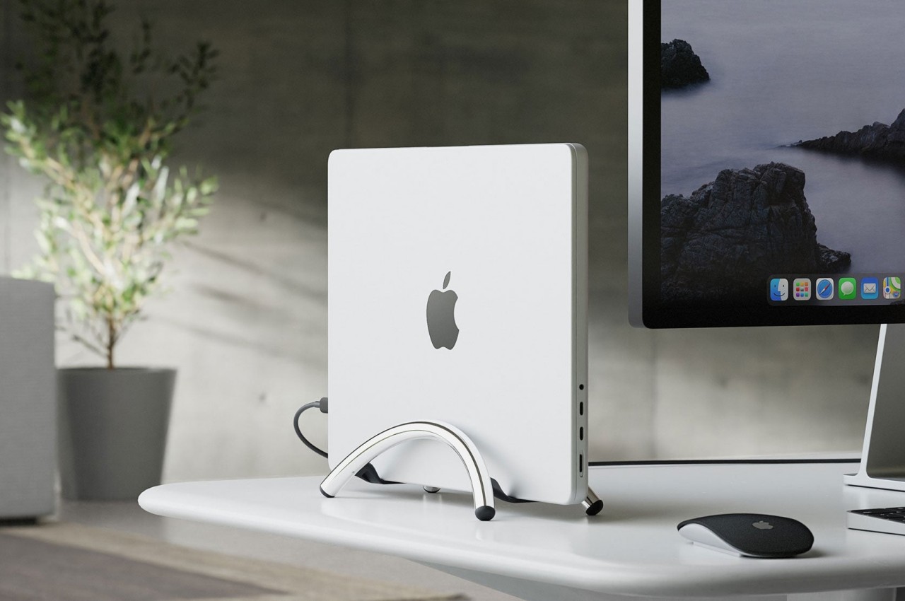
Twelve South BookArc Flex Vertical MacBook Stand

A laptop stand is, more often than not, a horizontal plane meant to hold your laptop while it lies down. Of course, that’s the most common way to use a laptop, but it’s definitely not the only way, especially when you’re using it as a makeshift desktop computer. With the lid always closed and the laptop simply connected to a monitor and other peripherals, having a laptop lying flat or even on a horizontal stand is already a poor use of precious desk space. That’s where a vertical laptop stand comes in hand, and Twelve South just launched what is probably the most minimalist design in that category.

Designer: Twelve South

It might look like two simple metal arcs, but that ultra-minimalist design is what makes the BookArc Flex a work of genius. Designed to hold your closed MacBook vertically, it can save you precious desk space when all you really want to do is connect the MacBook to an external screen and some peripherals while it’s running. It keeps all the mess away without sacrificing any functionality, and you can still easily plug in other USB devices because the MacBook is still within reach.

The design is both simple yet elegant, perfectly complementing Apple’s design language with its bent all-metal rods in matte black, matte white, or premium chrome finishes. It is inspired by modern architecture, particularly the Noisette Creek Pedestrian Bridge in Charleston, South Carolina, in more ways than one. While it does owe its form to that bridge, it also takes a few lessons from a bridge’s structure and use of physics, particularly in how the stand uses the MacBook’s own weight to pull in the arcs and secure the laptop. That means that this simple design is also future-proof, supporting any MacBook or even any laptop that’s only an inch thick, making it a beautiful example of how good, simple design can be universal and timeless as well.

1

The post Beautiful minimalist Apple accessories inspired by architecture and art first appeared on Yanko Design.

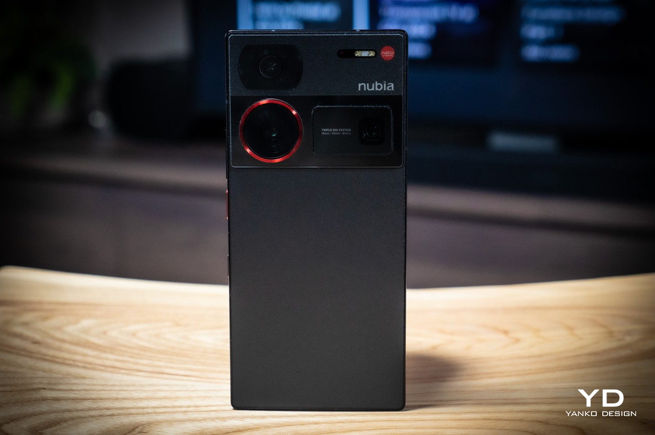
nubia Z60 Ultra Review: Challenging Conventions

Par : JC Torres
19 janvier 2024 à 18:20

PROS:


  • Distinctive boxy design

  • Gorgeous, hole-less screen

  • Large, long-lasting battery

CONS:


  • A bit on the bulky and heavy side

  • "Metallic glass" material attracts dust too easily

RATINGS:

AESTHETICS
ERGONOMICS
PERFORMANCE
SUSTAINABILITY / REPAIRABILITY
VALUE FOR MONEY

EDITOR'S QUOTE:

Taking the road less traveled, the nubia Z60 Ultra's unconventional rectangular design, flawless screen surface, and choice of camera focal lengths are sure to leave a lasting impression on consumers tired of the same old things.

Despite how smartphone manufacturers try to differentiate the designs of their products, most of them still jump on the same trends, like the curved edge screens of the past, today’s flat sides, or camera bumps of different shapes and sizes. The same is true even for features you don’t immediately see, like camera sensors and lenses that everyone is using, just advertised under a different marketing name. It’s almost too easy to just do what everyone else is doing, riding the waves in the hopes of making a large catch as everyone else. Fortunately, there are outliers that dare to take a different path, and the nubia Z60 Ultra easily stands out as a nonconformist, so we take a closer look to see if it has more to offer than just a different yet oddly familiar face.

Designer: nubia

Aesthetics

The design of the nubia Z60 Ultra is admittedly divisive. Some will appreciate a fresh break from the smooth curves of the current breed of smartphones, while others might scoff at the blast from the past. Anyone who still remembers the Sony Xperia of the past might indeed see some resemblance to this late 2023 newcomer, and it’s not exactly a bad light to be in.

The nubia Z60 Ultra is unabashedly flat and angular, giving off an air of maturity and hardness at the same time. Even the camera bump diverges from circles, squircles, and any other round shape found on most smartphones. Two of the three cameras sit on a strip, not unlike the Google Pixel 8’s visor, except it’s also completely flat and more like a thin block stretching across the width of the phone. This boxy aesthetic is going to be subjective, even more so compared to other phone designs, but there’s no denying that it will leave a lasting impression, positive or otherwise.

If the shape and back of the phone are what immediately catch your attention, it will be the large 6.8-inch display that will probably draw you in. Admittedly, it’s not the brightest nor the most colorful panel, but it’s the flawless, unbroken surface of this screen that will really impress you. Under-display cameras (UDC) aren’t exactly novel, but they’re so rarely used that you’d still be surprised to see one up-close. Even better, the nubia Z60 Ultra uses the company’s fifth-generation UDC technology that improves the pixel density of that spot above the front-facing camera. The result is a screen that is full from edge to edge, and thanks to its completely flat surface, also visible and usable in its entirety.

There are different colorways available, including a “Starry Night” that makes no effort to hide its Van Gogh inspiration. nubia introduces an “AG Metallic Glass” material that covers the rear of the phone, and for the most part, it does offer your hand a new sensation that almost feels like metal. Unfortunately, for some reason, it also seems to act as a huge magnet for dust. It may stay free of oily fingerprint smudges, but you’ll still want to put on the included clear case to keep it clean, among other reasons.

Ergonomics

There’s still an ongoing debate on which design is better for your hand and your grip. Curved edges are claimed to be gentler on the skin, but some claim it makes the phone slip more easily from your grasp. Flat edges and sharp angles add a bit more tooth to improve your grip, but there are those who feel uncomfortable with how it bites into their palm. The latter, of course, is what applies to the nubia Z60 Ultra’s sharp figure, and like its design, is going to split camps.

What everyone will agree on, however, is how bulky and heavy the phone feels in your hand. At 8.78mm thick and 246g heavy, it’s definitely going to give your hand a bit of strain when held up for long periods of time. Add that to the phone’s sharp edges, and you might indeed find your hand feeling a bit uncomfortable sooner rather than later, at least with the protective case that makes all those moot. Fortunately, that heft isn’t without good reason, but it’s still something that prospective buyers will need to consider if they prefer phones that are impossibly thin and light instead.

Performance

The nubia Z60 Ultra has been compared to its gaming-focused cousin, the RedMagic 9 Pro, and the comparison isn’t without basis. Both sport top-notch hardware available in the mobile market, starting with the Qualcomm Snapdragon 8 Gen 3 that can be paired with up to 16GB of RAM. In terms of raw performance, the nubia Z60 Ultra is pretty much a gaming phone, sans the bells and whistles like a tiny fan or extra buttons on the edges. In a way, this is the more subdued and stylish version of the RedMagic 9 Pro.

The phone’s extra-large battery definitely supports that use case and then some. Rated at 6,000 mAh, it’s definitely one of the highest capacities in the market today, and while you might not hit that advertised 47-hour uptime with average use, you’ll get pretty close to more than a day’s worth. Charging, however, won’t be blazing fast, given it only supports 80W wired charging, pushing the charging time to a little over 30 minutes. This chunk of power is definitely to blame for the nubia Z60 Ultra’s size and weight, but it’s a price worth paying for those who value battery life over comfort and thin profiles.

It isn’t only in design that the nubia Z60 Ultra bucks the trend. While it does put a heavy emphasis on its cameras like any other flagship smartphone, it’s the details that truly make it unique. In a nutshell, nubia has opted to adopt narrower fields of view compared to most smartphones in an effort to appeal to photography enthusiasts who would be more familiar with these focal lengths.

The main 50MP camera, for example, has that 35mm focal length used by classic camera lenses, which is great for taking sharp photos, especially with a natural bokeh effect. Unfortunately, this field of view will be too narrow for videos that will look cropped at the edges. That’s probably why nubia used an ultra-wide camera with a similar 50MP sensor (though from a different manufacturer) to make the transition to a wider view look more seamless. That said, this ultra-wide camera is also narrower than what you’d find in the market, using an 18mm focal length only.

In practice, the nubia Z60 Ultra’s cameras perform impressively, producing images with rich detail, at least in well-lit environments. The small exception is the 64MP telephoto camera with an equally narrow 85mm focal length, which makes close-up shots less doable. The narrow field of view might find fans among more seasoned photographers, but it is also an odd and awkward detail for those already used to the wider range of camera smartphones, especially when it comes to video recording.

Sustainability

So far, the nubia Z60 Ultra is proving to be quite the nonconformist, embracing designs already eschewed by most manufacturers as well as camera specs more popular among photographers than smartphone users. It would have been even more impressive if nubia also became a rebel and embraced sustainable materials and practices wholeheartedly for this smartphone. Unfortunately, that’s not the case.

In this regard, the nubia Z60 Ultra is pretty typical when it comes to composition, durability, and repairability. It’s your typical mix of plastic, glass, and metal, none of which were made from post-consumer recycled materials, at least none that nubia is telling. The silver lining here is that the phone is IP68 rated, so it’s not going to join the masses of e-waste littering the planet after a slight splash or dive into water.

Value

The nubia Z60 Ultra is a premium flagship through and through, and its extra-large battery, hole-less screen, and pixel-dense camera sensors push it even higher among its peers. For all of that, you’d expect it to cost as much as your next late 2023 or early 2024 high-end handset, but here’s the clincher: it’s almost half that!

While it does start at $599 for a rather modest 8GB of RAM and 256GB of storage, the highest configuration with double that memory is only $779. And it’s not like nubia is a new, unknown, and unreliable brand, so such a price tag is downright crazy. Of course, there’s the matter of being able to buy one in the first place, since nubia isn’t available in all markets, but in those regions it does serve, the nubia Z60 Ultra is bound to make an irresistible proposition to go with its undeniable presence.

Verdict

While there is some wisdom in going with tried and true traditions, it’s never an excuse not to think outside the box. There’s no certainty that you will do better or worse, but what’s certain is that you will make some impact. That’s the kind of legacy that the nubia Z60 Ultra will have with a design that is both fresh yet classic, and features that have a clear purpose, even if it swings away from the mainstream smartphone crowd.

It definitely gets a lot of things right, like its impressive performance, its memorable design, and its blemish-free screen, but it’s far from being perfect. There’s no denying that part of its imposing character is its bulk and weight, and the narrow field of view will probably trip up some mobile shutterbugs. With a head-turning price tag, though, you might be willing to look past these flaws, especially if the flaws are features you actually value. Needless to say, the nubia Z60 Ultra is doing quite a difficult balancing act, and to its credit, it’s doing quite an admirable job in keeping on its toes.

The post nubia Z60 Ultra Review: Challenging Conventions first appeared on Yanko Design.

Mixed Reality Magnifying Glass for Kids Shows the World in a Different Light

Par : JC Torres
17 février 2024 à 21:45

When people talk about augmented or mixed reality, they most likely imagine strapping bulky visors to their heads and blocking their eyes. Although that is definitely the primary way to experience an immersive fusion of the physical and the digital, mixed reality actually goes beyond living in virtual worlds or seeing apps floating in front of you. You could, for example, point your smartphone somewhere in the real world and see a glimpse of digital information through that small window. Limited as that experience might sound, it can actually open up a whole new world to discover, especially if it allows children to learn more about the world they live in, giving them access to flora and fauna that they would have never encountered in the wild.

Designer: Junwoo Lim

To a child’s eyes, the world is both magical and mysterious, and that’s just for the things they can actually see. Our planet has a lot more treasures and oddities than they could possibly imagine, but most of them are out of reach due to urban development and safety considerations. At most, kids can learn about them through books, videos, and other flat media that, while informative, lack the proper context that young minds need to truly appreciate the scale of these earthbound creatures.

Mono is a mixed reality device concept that unlocks that world and allows kids to not only learn but also enjoy discovering these nuggets of knowledge in a way that doesn’t take them away from their current environment. Using mixed reality technologies, the gadget overlays virtual creatures like insects and animals on top of real-world objects, making them look like they’re actually there on the roof or in your hand. This allows kids to see them in their proper scale, observe their natural movement, or even see them interact with each other, all while still having access to additional text information layered on top of this view.

The device comes in a design that looks like a toy magnifying glass, an object that has long been associated with exploration and discovery. Instead of a transparent lens, it has a camera on one side and a screen on the other. Theoretically, the user can put the screen close to their eye the same way they would use a real magnifying glass, though that raises questions about the safety of that method. The controls for the device are simple enough for a child to understand, including a single button for power and a slider for zooming in and out to understand the scale of the creature being observed.

The Mono concept design tries to fill in an educational need for kids to learn more about the world in a safe and engaging environment, but without weighing down their heads with headsets. It demonstrates how mixed reality can be more than just an entertainment medium or a productivity tool for adults, but something that kids can also benefit from. A magnifying glass design definitely carries that exploration vibe, though it’s questionable whether it’s an appropriate one given how kids are likely to put the screen right in front of their eyes.

The post Mixed Reality Magnifying Glass for Kids Shows the World in a Different Light first appeared on Yanko Design.

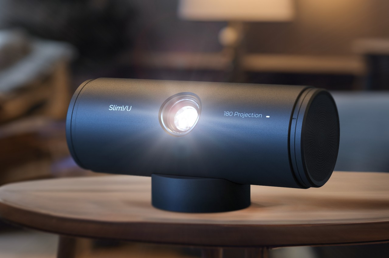
Tumbler-shaped portable projector concept promises entertainment freedom

Par : JC Torres
18 février 2024 à 00:30

Projectors are becoming a popular alternative to extra large screens like TVs, mostly at home but sometimes even outdoors. Product design trends have started to move away from bulky boxes to more compact forms, but most of them are still restricted by a few design considerations. Even projectors that are supposedly designed for portability often come with clunky and sometimes unattractive stands, or worse, require setting up on tripods just to get the perfect angle. This concept design tries to solve that problem in a rather creative way, offering a highly compact and portable projector that can be propped up and angled conveniently, all without using a tripod or even a stand.

Designer: Hana Belassi

Thanks to progress in technology and manufacturing, it’s now possible to cram much of the electronics that powered large, hulking projectors into something the size of a small box or even a cylinder. But despite the smaller designs, or probably because of their more cramped designs, these portable projectors often rely on an external mechanism like a tripod or stand to prop them up at the desired angle. Not only does this ruin the aesthetics of the otherwise beautiful product, it also makes it cumbersome to bring the projector along wherever you go.

The Slim.VU concept tries to offer the ultimate on-the-go entertainment experience by encapsulating all the needed parts and design in a single, compact, and portable package. A projector with a built-in battery is not exactly new, but one that comes with 4G connectivity is still unheard of. That enables the projector to function not only without an external power source but even without a Wi-Fi connection, allowing it to access streaming sources without having to use up your phone’s cellular data.

1

The more interesting aspect of the projector’s design, however, is the built-in stand that looks nothing like a stand. The removable “cap” of this tumbler-like projector functions as this stand, holding the projector in its place magnetically. The curved shape of this stand lets you rotate the cylindrical projector and angle it properly. This way, you don’t need any other accessory to enjoy a video anytime you want, anywhere you go.

The Slim.VU projector concept contains everything you need, freeing you from concerns about power, connectivity, and stability. Of course, actually implementing such a projector is a different matter entirely, and it might need to make a few compromises in exchange for its compact form. Audio and video quality might actually take a hit just to cram this much technology inside a canister shape, making the portable projector less ideal for outdoor use, or even indoor when there’s too much ambient light.

The post Tumbler-shaped portable projector concept promises entertainment freedom first appeared on Yanko Design.

Ergonomic mouse concept oddly looks like a familiar home appliance

Par : JC Torres
18 février 2024 à 14:20

Computer mice have been around for decades, and despite their form making no objective sense, they remain the most basic and most common pointing device that we now use intuitively. The core design of the mouse hasn’t changed significantly since its inception, which unfortunately means they’re still one of the biggest causes of repetitive strain injury or RSI for many people. Ergonomic mice are starting to gain traction, particularly the vertically oriented designs that promise a more natural and comfortable grip for your hand. This device concept builds on that same premise, but the execution is a bit puzzling considering how it looks less like a mouse and more like a miniature clothes iron.

Designer: Pranav Kuber

The rationale behind vertical mice is that the normal orientation of human hands has the palms facing inward rather than downward. With a regular mouse, users are forced to keep their hands at an unnatural angle, whether or not they’re moving the mouse at that moment. Of course, a vertical mouse would still need to provide the basic functions of a conventional mouse, which includes left and right buttons as well as a scroll wheel.

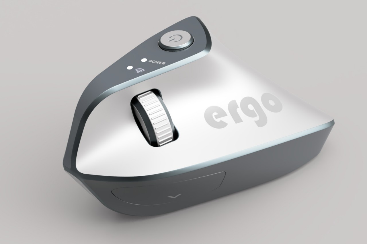
At first glance, the Ergo ergonomic mouse concept is just like any other vertical mouse now available for purchase, but examining its form and silhouette generates a slightly different image. The top plane’s wide surface tapers sharply toward the front, while the wide middle section looks rectangular when viewed from above. If not for the actual bottom of the mouse, which merges two vertical sides like the keel of a ship, the Ergo looks almost like a clothes iron, albeit one without a handle to grip.

Aside from the peculiar shape, the mouse design also raises a few other questions. The buttons on the outer or right side are clearly marked, but they don’t look like buttons you can physically click at first glance. The position of the mouse wheel on the opposite side is even more puzzling, as it will require a lot of swinging movement from the thumb that could actually put more strain on its joint. The rather wide rear might also make it harder to grasp the mouse, potentially resulting in more discomfort in the long run.

The post Ergonomic mouse concept oddly looks like a familiar home appliance first appeared on Yanko Design.

Ultra-minimalist digital clock is actually a pill dispenser in disguise

Par : JC Torres
17 mars 2024 à 11:40

Sooner or later, we will all need to take some pills regularly, whether it’s for medication or even just daily supplements. But unless you live a very disciplined life or have a sharp mind all the time, there will be times that you miss taking the proper dosage at the right time. Pillboxes try to save us time by splitting pills and tablets into their appropriate days, while smartphone apps give us the timely nudges to take them. The distance between these two objects, however, can lead some people to actually forget to drink those pills, especially if they’re stored in a less accessible place to avoid exposure to sunlight. Smart pill dispensers are becoming more common these days, but this twist on that concept proposes a design that is simpler, more aesthetic, and possibly more accessible since it lets you conveniently place the clock exactly where you need to take those pills.

Designer: Chanho Ju

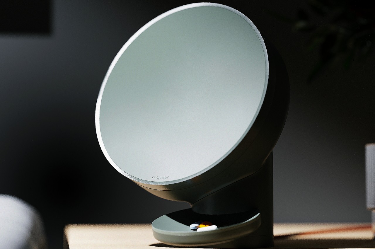
Yes, the design looks like a huge clock, albeit an extremely minimalist one that doesn’t show the conventional numbers around its face. That face is actually an LCD screen that only displays the clock hands as glowing lines, along with the actual number they’re pointing at for a bit of readability. The display does change its contents when it’s time to take those pills, showing the current alarm time and other necessary information.

1

While it might sound a little underwhelming when it comes to constantly telling the time, its real worth shines when it comes to dispensing medicine. Simply twist the front to detach the clock, revealing 28 compartments for 28 days’ worth of medication. There are four buttons that let you set how many tablets you take per day, anywhere from one to four pieces. There’s also a special compartment for silica gel to make sure the interior of the clock remains dry and prevent pills from spoiling in humidity.

1

Combining a clock and a pill dispenser isn’t just some random design decision. Unlike a typical pill box, you can place this +CLOCK concept design anywhere it makes sense, whether it’s near the table, a kitchen counter, or a shelf. Its minimalist aesthetic makes it double as a decorative piece so it won’t exactly stick out like a sore thumb, especially since it also minimally tells the time anyway.

More importantly, however, when it does call your attention, you will be in the right place and at the right time to actually receive the pills that drop from the dispenser. There’s no physical gap between the two actions, so you’re less likely to forget to actually take the pills after you’ve automatically turned off the alarm by habit. It’s a simple yet elegant design that addresses the core problem of forgetting to take medication without having to use sophisticated and ultimately more expensive solutions.

The post Ultra-minimalist digital clock is actually a pill dispenser in disguise first appeared on Yanko Design.

Infinix NOTE 40 phones blend sleek urban aesthetic with super-fast charging

Par : JC Torres
18 mars 2024 à 09:01

Of the many things that smartphone buyers look for, cameras and battery life probably rank the highest, even over display quality. Capturing memories is a very important part of what people use smartphones for, but an extremely short battery life can ruin even the most powerful smartphone. In fact, the more powerful a device is, the faster it will drain its battery. While batteries themselves haven’t evolved as fast as smartphones, charging technologies have been growing in leaps and bounds. In the past, super-fast charging speeds have been exclusive to high-end, premium phones, but the new Infinix NOTE 40 smartphones are bringing that technology and convenience to a wider and younger audience that also cares just as much about style as they do the rest of the phone’s specs.

Designer: Infinix

Although there are research and innovations that attempt to improve the quality of smartphone batteries, they’re pretty much still the same packs that we’ve been using for years. Manufacturers have poured their efforts into improving charging speeds instead, making sure that people spend as little time as possible when they do need to plug the phone in. That’s what Infinix’s new All-Round FastCharge 2.0 technology is trying to accomplish, bringing speed and versatility to users’ charging experience.

Infinix NOTE 40

Infinix NOTE 40

This technology supports rapid charging at 70W for the new Infinix NOTE 40 and NOTE 40 Pro (4G), as well as blazing fast 100W speeds for the Infinix NOTE 40 Pro (5G) and NOTE 40 Pro+ 5G. Thanks to Infinix’s self-developed Cheetah X1 chip, these phones can boast reaching 50% in just minutes (8 minutes for the Infinix NOTE 40 Pro+ 5G, to be precise) while still providing safety and longevity. Additional charging highlights include Bypass Charging 2.0 to minimize heat generation when playing games while the phone is plugged in, 20W wireless charging, and, perhaps most interesting, Infinix’s own brand of magnetic wireless charging technology, MagCharge.

Infinix NOTE 40 Pro (4G)

Infinix NOTE 40 Pro (4G)

Infinix NOTE 40 Pro (5G)

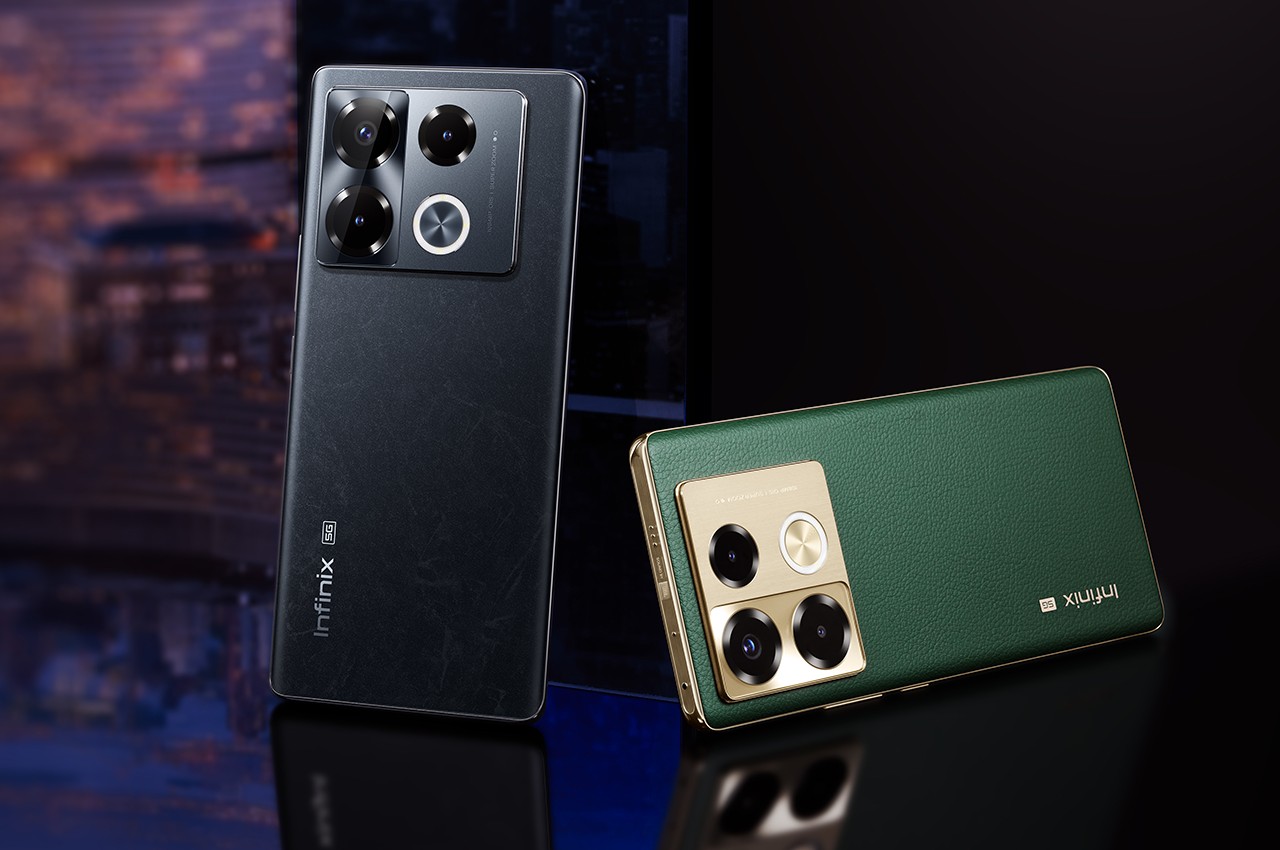
The Infinix NOTE 40 series is designed to cater to a younger audience that appreciates a more distinctive and livelier aesthetic than most gray, black, or even white phones in the market. That’s why Infinix adopted an urban theme for the phone’s designs, creating a sleek and modern appearance through smooth curves, colors, and materials. The Vintage Green, for example, tries to evoke a sense of charm for retro styles and uses vegan leather to add a bit of luxury to the finish. Titan Gold’s mix of blue and yellow tries to capture the image of the sun setting over the city’s horizon.

Infinix NOTE 40 Pro+ (5G)

Infinix NOTE 40 Pro+ (5G)

In terms of hardware, the Infinix NOTE 40 runs on MediaTek’s mid-range chips, paired with 8 or 12GB of RAM. All four models in this series get a 108MP main camera, though only the Pro variants put optical image stabilization (OIS) on it. The brand also introduces an AI-powered Active Halo lighting feature for dynamic notifications and accents to give a little life to your smartphone usage. The Infinix NOTE 40 series launches globally this month, available in Vintage Green, Obsidian Black, and Titan Gold colorways. A special BMW DesignWorks Racing Edition will be coming later this year to truly drive home the phone’s super-fast charging speed.

The post Infinix NOTE 40 phones blend sleek urban aesthetic with super-fast charging first appeared on Yanko Design.

Wireless charger concepts imagine a world free from power cables

Par : JC Torres
18 mars 2024 à 13:20

Although wireless charging has been around for years, it was only until Apple finally joined the fray that the technology really became popular. Of course, it was Apple’s MagSafe spin on wireless charging that really caught on, but it still sparked interest in a future where wires and cables are a thing of the past. We’re still a long way from that future considering how wireless charging works today, but that’s not to say that there is no progress to improve the situation. These wireless charging product designs, for example, are based on such ongoing development and prepare us for a world where desks can be completely devoid of cables, especially those for charging your multitude of devices.

Designer: Sprout Studios

As convenient as wireless charging might be, especially magnetic wireless charging, the requirement to have the device and the charger touching is still quite restricting. Not only that, you still have to make sure that the charging coils are aligned properly, which is what made it necessary for Apple to implement MagSafe in this way. But what if you could get rid of that restriction? Then every surface or anything on your desk can become a wireless charger.

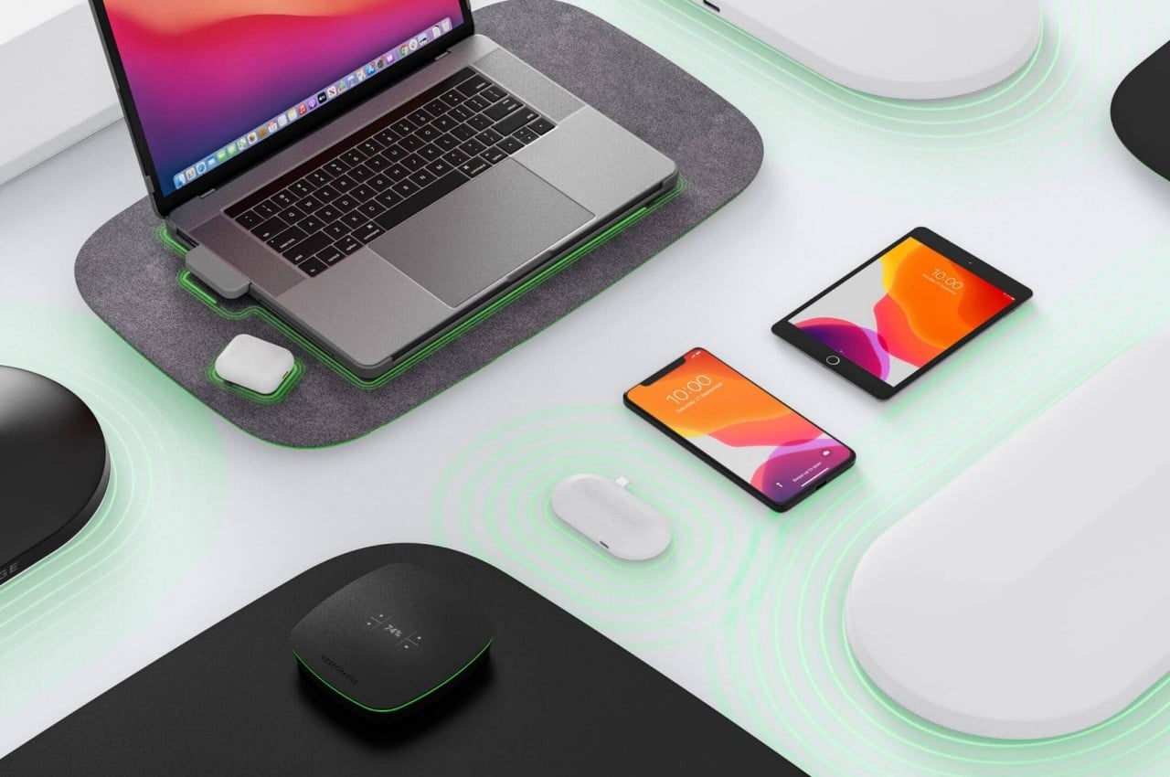
That’s exactly what these designs are proposing, based on technology being developed by startup DeepCharge. Even a laptop mat, for example, can become a wireless charger that can accommodate phones, earbuds, and other devices as well. This Laptop Pad also has extra features like an antimicrobial frantic top and LED lighting to indicate charging status. You don’t have to ensure that devices are in the right area. Simply place them on the mat and watch the LED indicator light up. Another design involves a charging pad that also acts as a landing pad for drones, though that requires attaching some feet to the quadcopter.

A more ambitious design, however, is based on “transmutation” and “energy hopping” technologies that are still being developed. In a nutshell, it could turn any surface, like a desk or a shelf, into a wireless charging area. Then you have small wireless charging stations that can transfer power from a central hub and distribute it even in areas out of reach of your desk. Pretty much like how mesh routers work today, except spreading electrical power instead of data.

Although the concepts in this collection still look like your conventional technical products, the technology it relies on opens the door to even more flexible designs. Anything on your desk or shelf, be it an accessory or even a piece of decoration, can become one of those satellite charging hubs. With wireless computer peripherals and data connections, such a design could lead to cleaner and tidier workspaces, unless of course, you start cluttering your table with even more devices to charge.

The post Wireless charger concepts imagine a world free from power cables first appeared on Yanko Design.

Sony Xperia 1 VI phone design might lose what makes it special

Par : JC Torres
20 mars 2024 à 08:45

It might come as a surprise to some that Sony actually makes smartphones. Actually, it might even come as a bigger surprise that it still makes smartphones at this point in time. Its mobile business has definitely fallen on hard times, forcing the brand to exit some global markets and sell only through online channels in others. Despite all that, Sony still believes that a smartphone has a place in its portfolio, especially as a means to access its treasury of entertainment-related content. That has been the guiding principle behind the design of its premium Xperia 1 smartphone series, but it seems that the product line’s sixth iteration will make some small but significant changes that almost undermine all of that in one fell swoop.

Designer: Sony (via zackbuks on Weibo)

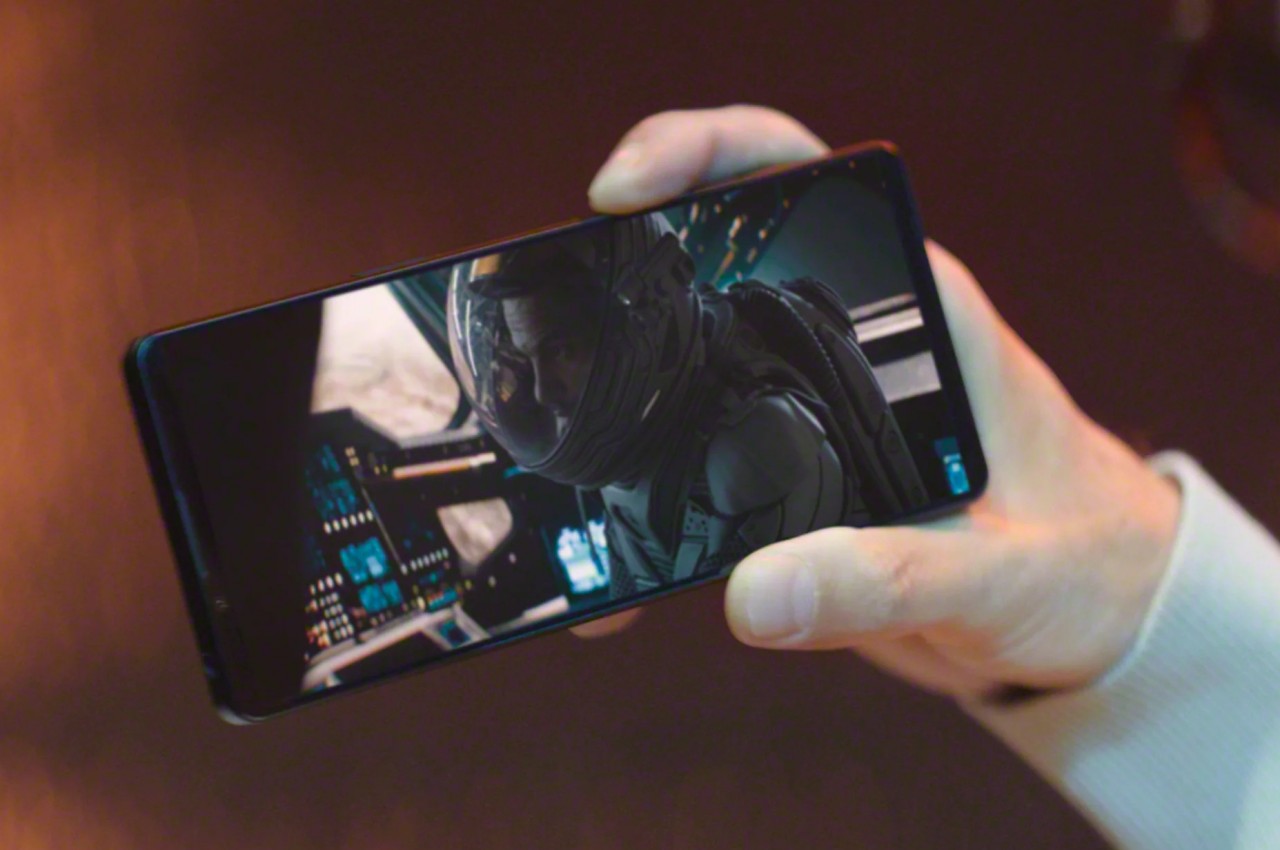
Truth be told, the Sony Xperia 1 design has always been an oddity among its peers even today. It easily stands out from the crowd almost literally because of its extra tall and narrow body, designed to support a 21:9 screen aspect ratio that Sony has been advertising as the perfect format for ultra-wide content. It also distinguished itself with its 4K display resolution when all its competitors continue to play in 2K or even 2.5K figures only.

The latest rumor, however, changes the narrative a bit. According to the source, Sony will be downgrading that 4K resolution to something like 2K+ or QHD+, more in line with other high-end smartphones in recent years. More importantly, it is also making the screen a bit wider and shorter to achieve a more “normal” 19.5:9 aspect ratio, again similar to flagship devices from the likes of Samsung and Apple. It’s by no means going to be significantly smaller, as these leaked images show, but it definitely changes the shape of the phone to be less distinctive.

It sounds perplexing that Sony, which has never really minded smartphone trends and fads, would make such drastic changes, but it might all boil down to price. Sony Xperia phones have been notorious for their higher price tags compared to their peers, so downgrading one of the most expensive and uncommon components could actually do a lot to drive the cost down. Unless, of course, Sony decides to offset those savings by including features and hardware that incur just as much expenses.

That’s not to say that the Xperia 1 VI will be bereft of any notable features. Another selling point of the phone is its use of camera hardware close to Sony’s own Alpha line of mirrorless cameras. That said, its photography prowess has rarely been praised mostly because the phone barely reaches people’s hands, so making the next Xperia flagship more affordable could actually help remedy that situation.

The post Sony Xperia 1 VI phone design might lose what makes it special first appeared on Yanko Design.

FreePower turns your beautiful stone countertop into a wireless charger

Par : JC Torres
20 mars 2024 à 10:07

Wireless charging is finally becoming more common but despite the freedom from tangling cables that the technology offers, wireless chargers still have a few inconveniences, especially when it comes to aesthetics. Only a few of these products can be considered pleasing to look at, especially when mixed with the rest of your room decor. And they still have at least one cable snaking out of their bodies, which might be difficult to hide depending on where you place the chargers. In an ideal future, almost any flat surface can become a wireless charger, immediately juicing up your phone or device the moment you put it down, anywhere you put it down. Part of that future seems to already be here, with a creative wireless technology that can hide that wireless charging space inside stone countertops, seamlessly blending with your choice of interior design.

Designer: FreePower

Wireless chargers remove the messy cables from the charging equation, but the current state of technology requires you to still make physical contact between the device and the surface of the charger. Add to that the hard requirements on materials for the surfaces of wireless chargers and you will find yourself with a few of these products scattered around your house, often sticking out like a sore thumb. Some designs are admittedly more elegant and stylish, but they still add to the visual baggage on what would be an otherwise pristine table or countertop.

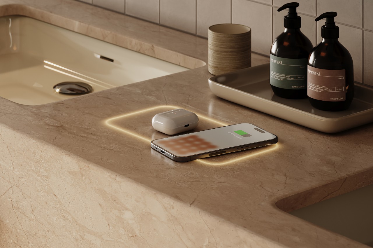
FreePower is a technology that tries to offer the best of both worlds, combining the liberating convenience of wireless charging with a clean and unblemished tabletop surface. In a nutshell, it embeds the wireless charger inside the countertop, and not just any countertop, mind you. It is compatible with different stone materials, including quartz, granite, or even marble, materials you’d never think could be used for wireless chargers. Thanks to this innovative design, you don’t need to actually put a charging mat or stand on your kitchen countertop, side table, or bedside table, because the countertop itself is the wireless charger.

Of course, only a portion of the countertop actually functions as the wireless charging zone, but you don’t have to worry about ugly and conspicuous markings that ruin the aesthetic of your beautiful stone top. A customizable LED halo glows around the area where you can place your devices, and you can even turn this light off when it’s not in use. FreePower does even better than most wireless chargers because you can place your phone or earbuds anywhere within that zone, no need to perfectly align with markers.

FreePower is the latest in a growing number of designs that aim to integrate wireless charging technology into every surface inside your home, completely freeing you from unsightly cables. Of course, such a design is also less flexible in that you have very little choice when you want to change furniture or designs. You’ll have to hope there’s also an invisible wireless charger version available for that or else you’ll have to go back to old-school wireless charging mats.

The post FreePower turns your beautiful stone countertop into a wireless charger first appeared on Yanko Design.

Modular speaker concept creates an immersive audio experience anywhere

Par : JC Torres
20 mars 2024 à 12:40

Portable wireless speakers are becoming quite ubiquitous these days as a way to enjoy your favorite music anywhere you are, whether you’re outside or just in another room. In exchange for their portability, however, the quality of the sound these speakers produce is less impressive compared to bigger and more stationary equipment found at home. It would be nice if you could have the best of both worlds, enjoying an audio system that follows you around the house without missing a beat. You could try to buy multiple wireless speakers and hope they can be connected to each other, or you can hope that this peculiar speaker system concept becomes a reality, allowing you to pick up one or two speakers from their base as easily as you would pick up your takeout meal.

Designers: Junwoo Kim, Yoonjeong Lee, Heeyeol Yang, Jaehoon Jeong

For an audio experience to be considered truly immersive, it has to sound like it’s coming from all around you. More specifically, the right sounds have to come from the correct direction rather than equally from all directions. Making this possible with a single speaker or even a pair of headphones is possible but difficult to accomplish, requiring sophisticated algorithms and precise control to create the illusion of surround sound. Of course, you could set up a surround sound system in your entertainment den, but then that magic only takes effect in that room.

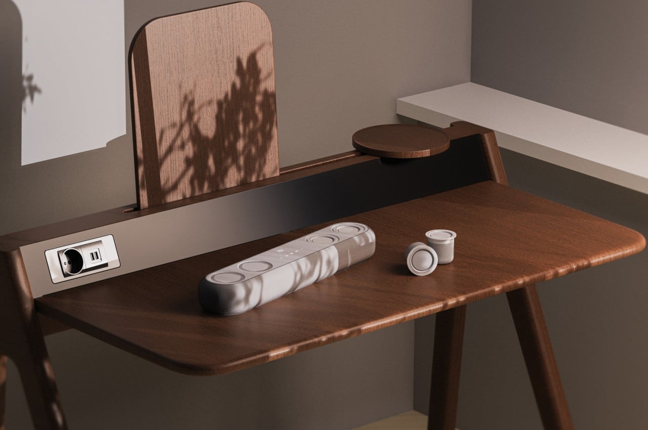
TakeOut is an LG-inspired concept for a modular speaker system that lets you design your own audio space in a snap. At its core is a 360-degree soundbar that tries to bring the sound to you wherever you are in the room by blasting it in all directions. But when you push down on one of the circles on the top of the soundbar, a short cylindrical wireless speaker pops up. It’s not a completely independent speaker and it works in tandem with the soundbar, but its most important feature is that you can take it anywhere with you in the house.

This portability means that you can set up your audio experience just the way you want it, whether you’re listening in the same room or elsewhere. Need to go to your home office for a while? Just pop out one of the speakers and let the music follow you there. You can also create your surround sound setup in a flash by positioning the four “sub-speakers” around the room, though that doesn’t necessarily mean that the system will know which sound needs to come from which speaker.

While the design of TakeOut is quite interesting, there might be some practical issues with it as well. For one, the concept doesn’t clarify if the individual speakers can be used separately from the soundbar or if they’re completely dependent on it. If it’s the latter, it also means that the speakers won’t function properly if they ever go out of range of the soundbar or if the data can’t reach them because of obstacles like walls. Those details, however, could actually be ironed out with some features that don’t take away anything from the spirit of this modular and immersive audio system.

The post Modular speaker concept creates an immersive audio experience anywhere first appeared on Yanko Design.

Huggable robot concept delivers warmth, power, and comfort during disasters

Par : JC Torres
20 mars 2024 à 15:20

Natural disasters can take a heavy toll on life and property, even when we’ve prepared for the worst. Floods, earthquakes, fires, and volcanic eruptions can send people running to evacuation centers where they may be safe but are hardly intact both in the body and especially in the mind. These refuge centers are often only able to provide the bare necessities when it comes to shelter and food, with electric power and heating sometimes taking a lower priority. That’s not even considering the psychological pain that all evacuees experience during these dark times, which often take a backseat because of the state emergency. Of course, all of these are important factors to consider, and this concept for an add but cute robot tries to address them in its own little way to provide both physical and mental comfort to people who have been displaced by these calamities.

Designers: Taejeong Kim, Yeji Jeon

To be fair, such shelters have to focus on what human needs to survive, like food, clothing, and a stable roof over their heads. Electricity often isn’t even viable during natural disasters when power lines are down, but considering how much we rely on electric appliances and devices these days, it has become almost just as critical. Depending on the location and the nature of the disaster, keeping warm is also important, especially if the person is shivering from shock.

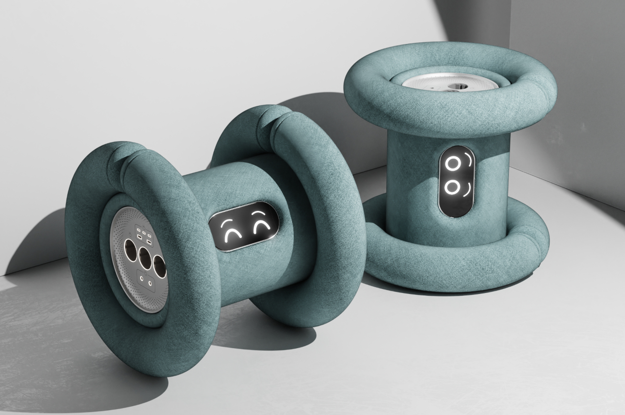
POWER HUG is a product design concept that tries to bring some of that on a personal level, just enough power and warmth to bring a little comfort and ease the worries of the person. It is pretty much a big power bank, one with outlets for both USB cables as well as typical power adapters. It also has a built-in warmer to keep the person toasty, especially at night when temperatures tend to drop drastically.

What makes the design notable, however, isn’t just the features but also its form. POWER HUG comes as a cylindrical robot with two soft, bendable tubes that wrap around each end like a wheel. It has a screen in the middle to show the robot’s face and deliver a more humane touch to the design. Unlike what you might expect from robots, however, this one is covered with a thin cushion and soft fabric so that you can wrap yours around it in an embrace. Paired with its heating capability, it can deliver much-needed warmth, comfort, and perhaps even peace to a troubled person.

Considering its use in emergency situations, it’s almost necessary for POWER HUG to be made accessible and sustainable materials. Its batteries can be sourced from unused electric vehicle batteries, while its fabric can be made from recycled materials. It’s definitely an interesting idea, even if the production of such a device might not be practical, as it emphasizes humans’ need for more than just food and shelter to survive a disaster.

The post Huggable robot concept delivers warmth, power, and comfort during disasters first appeared on Yanko Design.

Wireless earbuds concept turns listening to music into a social experience

Par : JC Torres
21 mars 2024 à 13:20

Headphones, earphones, and earbuds have become a common sight wherever you go. It helps us be more immersed in our music and podcasts even when outdoors, while also respecting others around us who might not share the same preferences as us. At the same time, however, these devices are designed not only to isolate sound but also to isolate us from people, preventing us from actually sharing our favorite tunes with like-minded people. Sure, we can just turn on the loudspeaker, but that also means blasting the sound for everyone to hear, whether they like it or not, turning it into an all-or-nothing kind of deal. It shouldn’t have to be that way, though, especially not with our current technologies, and this concept tries to offer a more social earbud design that can easily share the music we love with a select number of people only.

Designer: Kusi Boateng-Arthur

Earbuds are intentionally designed to keep sound in so that you can enjoy your tunes without worrying about outside noise coming in or your music “leaking out” to others. Nowadays, there are features that do let some ambient sounds through for safety or communication reasons, but it doesn’t work the other way around. Unless you have a poor fit or extremely loud volumes, no one around you will hear what you’re playing, no matter how much you want to share your new favorite album.

“more. than a bud” is a design concept that tries to remedy this unsociable situation by providing a way for earbuds to share music with each other without having to broadcast it over a loudspeaker. We already have the technology available for this, as demonstrated by wireless speakers that support multiroom modes. The idea is the same but on a smaller and more personal scale.

Inspired by the Aslatua Ghanian percussion instrument, these earbuds simply tap each other to establish a connection. Smartphone users might be familiar with a similar gesture that existed a while back to initiate a file transfer between two phones. That’s pretty much all that’s needed to share your music with another person, letting you develop a closer relationship that goes beyond being a bud.

Aside from that special feature, the “more. than a bud” buds also have a distinctive design which is basically just two halves of a sphere. The actual speaker, however, is angled at 30 degrees in order to maximize the path that sound travels in your ear. The concept also claims that the in-ear design offers a secure fit, but some might have reservations because of its small, stemless shape. While the two halves join together to form a sphere when not in use, charging the buds requires them to attach to opposite sides of a small puck, turning the shape into a capsule. It’s definitely an interesting design, though it will probably be more noted for its ability to turn listening to music back to its original form: a social experience.

The post Wireless earbuds concept turns listening to music into a social experience first appeared on Yanko Design.

❌
❌