Vue normale

Il y a de nouveaux articles disponibles, cliquez pour rafraîchir la page.
Aujourd’hui — 3 février 2026Yanko Design

IKEA Just Made a Mouse-Shaped Speaker That Kids Can Actually Carry

Par : JC Torres
3 février 2026 à 18:20

IKEA’s GREJSIMOJS collection started with a dog-shaped lamp that dims when you hold its head for bedtime, turning a light switch into something closer to petting a sleepy puppy. The limited collection is more than just about cute animals, but also about playful behavior baked into everyday objects. That same thinking now shows up in a tiny Bluetooth speaker shaped like a mouse, with four stubby legs and a braided tail that doubles as a carry loop.

The GREJSIMOJS portable Bluetooth speaker is a small, mouse-shaped character IKEA calls a “cute little music friend” for playful people of all ages. It is meant to follow kids from room to room, turning background sound into something they can carry and interact with, while still being a straightforward wireless speaker for parents who just want podcasts in the kitchen or bedtime audiobooks without fumbling with phone speakers.

Designer: Marta Krupińska (IKEA)

Picture a child drawing at a desk, the purple mouse sitting nearby quietly playing an audiobook or favorite songs. Pairing is as simple as connecting a phone over Bluetooth, and the sound is tuned for everyday listening rather than shaking walls. The built-in volume limit protects sensitive ears, so kids can turn it up without parents needing to hover over the controls constantly or worry about hearing damage.

The braided tail makes it easy for small hands to grab and move the speaker from bedroom to living room. Charging happens over USB-C, though the cable and adapter are sold separately, and IKEA says adults should handle that part. The speaker cannot play while charging, which creates a split that lets kids control what they listen to while adults manage batteries and power.

The multi-speaker mode lets the mouse pair with other IKEA Bluetooth speakers supporting the same feature. That means the same music can play from multiple spots, turning a hallway and playroom into one sound zone without complicated app setups. It is an easy way to make dance parties or tidy-up time feel coordinated, even if the tech behind it stays invisible to everyone involved.

The collection’s goal is to inspire play and togetherness across the home, and the mouse fits that mission well. IKEA notes that £1 from every GREJSIMOJS product sold during a set period goes to the Baby Bank Alliance, adding a layer of purposeful giving. More than just decor, the speaker is a small facilitator for shared stories, music, and movement in family spaces without needing complicated setup rituals.

The GREJSIMOJS mouse speaker, like the dog lamp, treats technology as something that should feel approachable and a bit silly rather than cold. Rather than competing with serious audio gear, it is trying to make rooms feel more alive without asking kids to sit still or parents to manage another app. In homes where screens already demand enough attention, a small purple mouse that quietly pipes in sound might be exactly the kind of tech everyone can agree on.

The post IKEA Just Made a Mouse-Shaped Speaker That Kids Can Actually Carry first appeared on Yanko Design.

Donkervoort P24 RS is a counterpunch build for drivers who crave raw speed

Par : Gaurav Sood
3 février 2026 à 17:20

Dutch manufacturer Donkervoort has been handcrafting lightweight performance cars for purists since 1978, and their creations do stand out. The Lelystad-based automaker has all eyes rolling with yet another limited-edition sports car that looks inspired by the clown shoe design that BMW perfected in the 90s.

The newly unveiled car is ultra-agile thanks to the weight reduction achieved by shaving off components like the skid-control, torque-vectoring, or automatic brake-assist. It doesn’t even have power steering, and gives buyers the option to skip the air conditioning unit for weight reduction, making it the ideal fit for raw purists who want to feel every little change happening in the driving dynamics. According to company CEO Denis Donkervoort, “The key to everything we do is about eliminating weight, minimizing inertia, and delivering unforgettable driving experiences.”

Designer: Donkervoort

The Donkervoort P24 RS two-seater analogue supercar that looks like an Aston Martin DB12 with a long hood up front and exposed wheels. Straight out of the Hot Wheels world, the performance car packs a 3.5-liter twin-turbocharged V6 engine delivering 600 horsepower and 590 pound-feet torque. The power-to-weight ratio is high, given the car weighs 2,204 pounds, literally making it a road-legal race car on the streets. The driver can toggle the horsepower via the Power to Choose technology with three different outputs: 00, 500, or 600hp. That means 770hp per ton power-to-weight ratio at the highest settings, something similar to the mighty Bugatti Chiron.

Body components of the P24 RS are made out of carbon fiber and the in-house developed Ex-Core material, which is a combination of foam and carbon fiber. That explains the uniquely shaped body panels that are more flexible yet highly durable to take on the stresses at high speeds. Purists can attach two wings at the rear and a deep front spoiler to enable 198 pounds of downforce at speeds of 155 mph to keep the car glued to the tarmac and maneuver the track with maximum stability. Those cheeky Aero Blade headlights also fold away behind the grille when not in use to maximize airflow, assisting in peak performance at high speeds during daylight. The optional aero package can be easily removed and stored inside the 290 liters boot when not needed.

The interiors are as good as the exterior with matching colored leather trims for the steering wheels, doors, and the gear shifter. Carbon fiber inserts flow down to the inside of the dashboard as well as the side panels to keep the weight down while not compromising on the theme. The racing DNA is apparent in the bucket seat design that only misses one thing: a secure roll cage. The roof can be removed in no time to feel the thrill of speed. Not much has been detailed by the maker about the specific material choices, but it is for everyone to see.

Only 150 examples of the Donkervoort P24 RS will be made, out of which 50 have already been booked by customers in the U.S., Europe, and the Middle East. Deliveries are slated for the April timeline, with the starting price tag set at 298,000 Euros (approximately $354,000). The lightweight driver-focused supercar is a clear manifestation of Denis’ belief that “no supercar is worth the weight.”

The post Donkervoort P24 RS is a counterpunch build for drivers who crave raw speed first appeared on Yanko Design.

This Award-Winning Pen Floats Like a Cloud on Your Desk

Par : Ida Torres
3 février 2026 à 16:20

Remember the last time you picked up a pen and actually stopped to look at it? Most of us don’t. We grab whatever’s lying around, scribble a note, and move on with our day. But designer Leila Ensaniat is challenging that autopilot relationship we have with one of our most familiar tools. Her creation, Pulse, recently snagged the Golden A’ Design Award for 3D Printed Forms and Products, and it’s easy to see why this isn’t your average ballpoint.

Pulse is what Ensaniat calls a “floating pen,” and that description actually makes sense once you see it. Drawing inspiration from the quiet, effortless drift of clouds, the pen feels less like a writing instrument and more like a small sculptural moment on your desk. It’s the kind of object that makes you pause, which is pretty rare when we’re talking about something as mundane as a pen.

Designer: Leila Ensaniat

What makes this design really interesting is how it blends old-school craftsmanship with cutting-edge technology. The pen features biomorphic patterns that look like they grew organically rather than being designed, and they’re created using lost wax casting in aluminum, silver, bronze, and gold. That’s a centuries-old metalworking technique typically reserved for jewelry and art pieces, not everyday writing tools. But that collision of traditional craft and contemporary design thinking is exactly what gives Pulse its unique character.

Ensaniat, who has a background as an industrial designer at Cisco specializing in consumer electronics, brings a tech-world sensibility to object design. Her approach centers on human-centered design, which basically means she’s thinking hard about how we actually interact with objects rather than just how they look on a shelf. With Pulse, that philosophy translates into something that feels natural in your hand while also making you reconsider what a pen can be.

The surface treatments are particularly thoughtful. Those nature-inspired patterns aren’t just decorative, they enhance both the visual appeal and the tactile experience of holding the pen. It’s a detail that matters more than you’d think. When an object feels good to touch, when it has texture and weight that seems intentional, it changes your relationship with it. You’re more likely to keep it on your desk, to reach for it specifically, to actually care about this tool that usually gets treated as disposable.

What’s fascinating about Pulse is how it sits at the intersection of sculpture and utility. The design explores that balance between being something you want to look at and something you actually need to use. Plenty of designer pens lean too hard into the luxury angle and end up feeling precious and impractical. Others focus purely on function and look forgettable. Pulse seems to nail that middle ground where form and function aren’t competing, they’re collaborating.

The project also gave Ensaniat deeper insight into the metal finishing and plating industry, which might sound technical but is actually important. Understanding how materials behave, how different metals can be worked and finished, how surface treatments hold up to actual use, that knowledge separates decorative design from functional design. A beautiful pen that tarnishes after a week or feels unbalanced when you write isn’t really good design, it’s just good marketing.

Created for her brand N I L A, which focuses on integrating technology seamlessly into everyday life, Pulse represents a broader design philosophy about making thoughtful, human-centered objects that solve real problems while also being distinct and meaningful. It’s an approach that feels increasingly relevant as we’re surrounded by more and more identical mass-produced stuff. Pulse won’t revolutionize how we write, and it’s not trying to. But it does suggest that even the most familiar, seemingly finished objects in our lives still have room for fresh thinking. Sometimes all it takes is a designer willing to ask why something has to be the way it’s always been, then having the skill to actually answer that question with something better.

The post This Award-Winning Pen Floats Like a Cloud on Your Desk first appeared on Yanko Design.

Maingear Retro98 Is the 90s Dream PC Finally Built with 2026 Hardware

Par : JC Torres
3 février 2026 à 15:20

Late-’90s desktops hummed under desks in beige towers that always felt heavier than they should. CRTs flickered, CD drives whirred, and somewhere in every PC gamer’s mind lived a fantasy build they only saw in shop windows or magazine ads. The gap between the family PC that struggled with Quake and the dream rig you sketched in notebooks, complete with turbo buttons and drive bays, felt impossibly wide.

Maingear’s Retro98 is that fantasy finally built. The limited-run sleeper PC uses a retro beige SilverStone tower with a working turbo button and keyed power lockout, but hides 2026 hardware inside. The pitch is simple: 1998 on the outside, 2026 inside. It is the machine your younger self would have lost their mind over if they could see past the beige and understood what an RTX 5070 even meant.

Designer: Maingear

Water-cooled Retro98α

Retro98 feels more like a drop than a product line. Maingear limited it to 38 units: 32 standard builds and six water-cooled Retro98α rigs with braided ketchup-and-mustard cables. The brand positions it as something you will not find at a big-box store, and points out that you will not even find a Radio Shack next week. Each system is hand-built by a single technician, making it feel closer to a limited sneaker release than a typical prebuilt.

Even the lowest spec overshoots anything you could have imagined in 1998. The Retro98 5070 pairs an NVIDIA GeForce RTX 5070 with an Intel Core Ultra 7 265K, 32 GB of DDR5 at 6000 MT/s, and a 2 TB NVMe SSD. This is the kind of machine that runs Cyberpunk smoothly while looking like it should be loading StarCraft from a stack of jewel cases on the desk.

Of course, the front-panel rituals matter as much as the internals. The keyed power lock feels like something your parents would have used to keep you off the PC, and the fully functional turbo button now toggles performance profiles instead of pretending to overclock a 486. These physical interactions turn booting up into a tiny ceremony, a reminder of when pressing power felt like entering a different world rather than unlocking another screen.

Behind the retro faceplate, you still get modern conveniences. USB-C on the front, Wi-Fi 7, Bluetooth 5.4, and a clean Windows 11 install without bloatware. The machine is not trying to recreate the pain of driver floppies or IRQ conflicts. It is just borrowing the shell and the attitude. You get the look and the jokes, but you also get quiet fans, instant game launches, and none of the frustration.

Retro98 is not about value per frame but about finally owning the mythical beige tower you stared at in catalogs. It is for people who remember sharing a/s/l in chat rooms and slapping CRTs after another buffer underrun, and who now have the budget to indulge that memory. A beige box with a turbo button probably should not feel fresh in 2026, but somehow it does, which says more about how boring glass-and-RGB towers have gotten than it does about nostalgia.

The post Maingear Retro98 Is the 90s Dream PC Finally Built with 2026 Hardware first appeared on Yanko Design.

ROG Just Built the Gaming Headset Audiophiles Always Wanted

Par : JC Torres
3 février 2026 à 14:20

Gaming headsets tend to lean bass-heavy and closed-back, with flashy branding and mics that sound good enough for Discord but not much else. Planar-magnetic hi-fi headphones sound incredible but usually lack microphones and look out of place next to RGB keyboards. Players who care about both soundstage and winning often juggle two pairs or compromise, because the two worlds rarely meet in one product without awkward concessions.

That is where ROG Kithara comes in. It is ROG’s first open-back planar-magnetic gaming headset, developed with HIFIMAN. The collaboration brings 100mm planar drivers into a headset that still has a proper boom mic, in-line controls, and all the plugs you need for PCs, consoles, DACs, and laptops. It treats games like they deserve hi-fi instead of just tolerating them as background noise.

Designer: ROG (ASUS)

The planar drivers deliver an 8Hz to 55kHz frequency response with very low distortion, which translates into deep, controlled bass and crisp treble without smearing. The open-back design creates a wider, more natural soundstage, so footsteps, reloads, and distant movement sit in believable positions instead of clustering in your head. It helps both immersion and tactical awareness without needing surround processing that usually just muddies everything.

Playing a competitive shooter, you can distinguish a teammate reloading behind you from an enemy stepping on metal two floors up. The fast transient response keeps those cues sharp, and the open-back architecture stops explosions from masking subtle sounds entirely. You react faster because you are not guessing where anything came from. You are actually hearing it placed in space the way the sound designer intended it.

The on-cable MEMS boom microphone covers the full 20Hz to 20kHz range with a high signal-to-noise ratio, so your voice sounds more natural than typical narrow-band gaming mics. Separate signal paths for audio and mic on the dual 3.5mm cable keep game sound from bleeding into chat, which your squad will quietly appreciate even if they never ask what headset you switched to or notice until the crosstalk disappears.

The balanced cable with swappable 4.4mm, 3.5mm, and 6.3mm plugs lets you move from a desktop DAC to a laptop or console without changing headsets. The included USB-C to dual 3.5mm adapter covers modern laptops and handhelds. With 16-ohm impedance, Kithara is easy to drive without a rack of gear just to get it loud enough for late-night sessions.

Of course, the metal frame, eight-level headband adjustment, and two sets of ear pads, leatherette with mesh for focused sound and velour for a softer feel, mean you can tune comfort and tonality. The open-back design leaks sound and is best in quiet rooms, but for players who want one headset that handles ranked matches, long story games, and critical music listening, Kithara feels like a rare crossover that actually respects both sides.

The post ROG Just Built the Gaming Headset Audiophiles Always Wanted first appeared on Yanko Design.

5 Best Valentine’s Grooming Gadgets He Wants, But Won’t Buy Himself

3 février 2026 à 12:40

Every man has a mental wishlist of grooming tools he’s admired from afar but never pulled the trigger on. These aren’t flashy gadgets or unnecessary luxuries. They’re precision instruments that turn daily maintenance into moments of quiet confidence. The kind of gear that makes him feel more put together without saying a word. This Valentine’s Day, skip the predictable gifts and give him the grooming arsenal he’s been eyeing but convincing himself he doesn’t need.

Japanese craftsmanship meets masculine refinement in Kai Corporation’s Auger collection, where every tool is engineered with surgical precision and designed for men who appreciate the details. These aren’t replacements for drugstore basics. They’re upgrades that transform routine into ritual, offering control, sharpness, and durability that cheap alternatives can’t match. Whether he’s meticulous about his appearance or just starting to care about the finer points of grooming, these five essentials will earn their place in his daily rotation.

1. Auger PrecisionFlex Razor

Shaving should be a ritual, not a rush job. The Auger PrecisionFlex Razor transforms daily maintenance into an act of precision with industry-leading engineering that adapts to every angle and contour. The 5-blade system delivers an ultra-close shave that respects the skin while eliminating stubble, and the 3D pivoting head glides effortlessly from the jawline to the neckline. The world-first 30° adjustable head angle changes everything, allowing seamless transitions between shaving directions with a simple lever pull that maintains flow and eliminates awkward repositioning.

Kai Corporation built this razor for men who refuse to compromise on results or experience. The independent suspension mechanism offers the widest pivot range in the industry, ensuring consistent contact even in hard-to-reach areas where lesser razors lose effectiveness. Whether he’s going clean-shaven or sculpting defined beard lines, this razor delivers the control and confidence that comes from tools engineered without shortcuts. This Valentine’s Day, give him the razor that turns a daily obligation into a moment of masculine refinement he’ll actually look forward to.

Click Here to Buy Now: $45.00

What We Like

  • The industry-leading 3D pivoting head with independent suspension provides unmatched contouring ability, ensuring consistent blade contact across every facial angle and curve.
  • The world-first 30° adjustable head angle revolutionizes versatility by enabling effortless transitions between shaving directions without breaking rhythm or repositioning.
  • The 5-blade system delivers an incredibly close shave while minimizing irritation, respecting skin integrity even with daily use.
  • Over 100 years of Japanese blade-making excellence ensure precision-ground edges that maintain sharpness through multiple shaves, delivering consistent performance that justifies the investment.

What We Dislike

  • The advanced engineering and premium materials result in a higher upfront cost compared to disposable razors or basic cartridge systems.
  • The replacement blade refills, while high-quality, represent an ongoing investment that may exceed budget razor alternatives.

2. Auger PrecisionLever Nail Clipper

Most men settle for flimsy clippers that bend under pressure and leave jagged edges. The Auger PrecisionLever Nail Clipper rewrites the standard with a patented rotating lever mechanism that shifts the pivot point closer to the blade. This engineering breakthrough means more cutting power with less effort, making thick nails feel like butter under precision steel. Every press delivers a clean, satisfying click that confirms what you already suspected: your old clippers were doing you dirty.

Kai Corporation didn’t just improve the nail clipper—they perfected it. With over a century of blade-making expertise behind every cut, this compact tool turns a mundane task into something almost meditative. The stainless steel cutlery blades slice through without tearing or splitting, leaving smooth edges that never snag. It’s the kind of tool that makes him wonder why he waited so long to upgrade, and the kind of Valentine’s gift that proves you notice the details that matter to him.

Click Here to Buy Now: $49.00

What We Like

  • The patented rotating lever system maximizes cutting force while minimizing hand strain, making it effortless to tackle even the thickest nails in one clean motion.
  • Precision-ground stainless steel blades crafted by Japan’s premier blade manufacturer deliver cuts so clean they eliminate the need for filing.
  • The compact, ergonomic design fits comfortably in the hand and travels easily without the bulk of traditional clippers.
  • Every element reflects over 100 years of Japanese blade-making mastery, turning a basic grooming task into an experience of mechanical excellence.

What We Dislike

  • The premium engineering comes with a higher price point than standard drugstore clippers, which may give budget-conscious buyers pause.
  • The compact size, while travel-friendly, may feel slightly smaller than expected for those accustomed to bulkier traditional clippers.

3. Auger PrecisionEdge Nail File

Filing nails feels like an afterthought for most men, but skipping this step leaves rough edges that snag on fabric and undermine an otherwise polished appearance. The Auger PrecisionEdge Nail File turns finishing into a deliberate act of refinement with dual filing surfaces and an ergonomic 3D grip that puts complete control in his hands. The coarse side shapes with authority while the fine surface smooths to perfection, creating seamless transitions that feel as good as they look.

Kai Corporation engineered this file for men who understand that grooming doesn’t end at the cut. The precision-etched stainless steel surface glides without catching, and the sculpted handle makes maneuvering intuitive even for beginners. It’s not about vanity—it’s about presenting himself with the kind of attention to detail that separates deliberate from careless. This Valentine’s Day, give him the tool that completes what the clipper started, proving that the final touch is where real refinement lives.

Click Here to Buy Now: $19.00

What We Like

  • Dual-surface design eliminates the need for multiple tools by offering both aggressive shaping and gentle smoothing in one streamlined instrument.
  • The three-dimensional handle structure provides exceptional grip and control, making precise filing effortless even for grooming novices.
  • Corrosion-resistant stainless steel construction with precision etching ensures consistent performance without the dulling or rusting common in cheaper files.
  • The compact form factor makes it ideal for both home grooming and on-the-go touch-ups without sacrificing functionality.

What We Dislike

  • The stainless steel construction may feel heavier than disposable files, requiring a brief adjustment period for those accustomed to lightweight alternatives.
  • The precision etching, while durable, may require periodic cleaning to maintain optimal performance with extended use.

4. Auger PrecisionCurve Scissors

Trimming stray brow hairs or sculpting a crisp beard line demands accuracy that standard scissors can’t deliver. The Auger PrecisionCurve Scissors feature ultra-thin curved blades that follow facial contours with surgical precision, eliminating guesswork and second attempts. The curve isn’t just aesthetic—it’s a functional design that allows for controlled, targeted cuts right at the root without pulling or snagging. Every snip feels deliberate, turning detail work into an exercise in masculine mastery.

Kai Corporation designed these scissors for men who approach grooming with the same attention they apply to everything else worth doing right. The ultra-thin blade profile enables root-level trimming that thicker shears can’t achieve, while the ergonomic design makes extended sessions feel natural rather than forced. These aren’t the scissors he’ll use to open packages—they’re the precision instruments he’ll reach for when presentation matters. Give him the Valentine’s gift that proves sharp looks require sharp tools.

Click Here to Buy Now: $25.00

What We Like

  • The precision-engineered curved blade design enables pinpoint accuracy for shaping brows, refining mustaches, and detailing beard lines with professional-grade control.
  • Ultra-thin blade construction allows for seamless cutting close to the root without the pulling or discomfort associated with standard scissors.
  • Ergonomic handle design reduces hand fatigue during extended grooming sessions, making detailed work feel effortless.
  • Over a century of Japanese blade-making expertise ensures long-lasting sharpness that maintains performance through countless trims.

What We Dislike

  • The specialized curved design may require a brief learning curve for those accustomed to straight-blade scissors.
  • The premium construction commands a higher price than generic grooming scissors, which may seem steep for a single-purpose tool.

5. Auger PrecisionGrip Tweezers

Nothing undermines a sharp appearance faster than stray hairs that standard tweezers can’t quite grip. The Auger PrecisionGrip Tweezers eliminate frustration with ultra-fine angled tips that grab even the finest hairs on the first attempt, delivering flawless removal without slipping or breaking. The patented stopper mechanism prevents the lateral misalignment that plagues cheap tweezers over time, ensuring consistent tension and unwavering stability through countless plucking sessions. This is surgical precision for everyday grooming, designed for men who know that perfection lives in the details.

Kai Corporation engineered these tweezers with the same exacting standards they apply to surgical instruments and professional blades. The ergonomic finger groove reduces hand fatigue and provides absolute steadiness during detailed work, whether shaping brows or eliminating rogue hairs that appear at the worst possible moments. These aren’t the tweezers that will bend or lose grip after a month—they’re lifetime tools built to maintain performance through years of use. Give him the Valentine’s gift that proves you see the effort he puts into looking sharp, even in the smallest details.

Click Here to Buy Now: $29.00

What We Like

  • The ultra-fine angled tip design provides exceptional gripping power on even the finest hairs, eliminating the frustration of repeated attempts and broken strands.
  • The patented stopper mechanism represents genuine innovation by preventing the misalignment and tension loss that render ordinary tweezers useless over time.
  • Precision finger grooves create natural hand positioning that reduces fatigue and enhances control during extended grooming sessions.
  • Japanese engineering excellence ensures the tips remain perfectly aligned and maintain consistent tension through years of regular use, making this a true lifetime grooming tool.

What We Dislike

  • The premium construction and patented features command a significantly higher price than drugstore tweezers, which may seem excessive for a simple tool.
  • The precision-engineered tight grip, while effective, may feel initially unfamiliar to those accustomed to looser, more flexible tweezers.

The Grooming Gear He Deserves

Men rarely invest in themselves the way they should, convincing themselves that good enough is acceptable when it comes to grooming tools. The Auger collection proves that precision engineering isn’t indulgence—it’s the difference between maintenance and mastery. These five tools represent the upgrades he’s considered but postponed, the quality he recognizes but rationalizes away. Valentine’s Day offers the perfect moment to permit him to care about the details that shape how he presents himself to the world.

Japanese craftsmanship meets masculine practicality in every piece, turning routine tasks into rituals worth his time. These aren’t just grooming gadgets—they’re the physical manifestation of attention to detail, built to last and designed to deliver results that cheap alternatives never will. Give him the collection that proves you see the effort behind his appearance, and watch him discover that the right tools don’t just make grooming easier—they make it satisfying.

The post 5 Best Valentine’s Grooming Gadgets He Wants, But Won’t Buy Himself first appeared on Yanko Design.

This New Sofa Compresses Like an Accordion (Fits in Your Cart)

Par : Ida Torres
3 février 2026 à 11:07

Remember when buying a sofa meant measuring doorways, hoping it would fit in the elevator, and bribing friends with pizza to help you haul it up three flights of stairs? Designer Yuqi Wang just made all of that obsolete with the Accordion Modular Sofa, and the concept is as brilliant as it sounds.

The whole design centers on one genius idea: what if you only needed one type of module to create any sofa configuration you could imagine? The Accordion does exactly that with a single base unit that compresses and expands like its musical namesake. Through an internal structure made from high-resilience foam, wooden side panels, climbing ropes, and adjustable knobs, each module can change its size and curvature to fit whatever space you’re working with.

Designer: Yuqi Wang

What makes this really clever is how it solves multiple problems at once. Traditional modular sofas usually require you to buy different shaped pieces (corner units, armrests, middle sections) and hope you’ve guessed right about what you need. With the Accordion system, you’re working with identical modules that transform as needed. Want a compact loveseat for your apartment? Use two modules. Need a sprawling sectional for your living room? Add more units and configure them however you like. The possibilities aren’t just numerous, they’re practically endless.

But here’s where it gets even better. Because these modules compress, the whole thing ships flat-packed in a way that actually makes sense. We’re talking small enough to literally place in a shopping cart and carry out yourself. No more waiting weeks for delivery windows or paying outrageous shipping fees. The compression feature dramatically cuts down on packaging waste, storage costs, and the carbon footprint of transportation. It’s the kind of sustainable design choice that doesn’t require you to sacrifice anything in return.

The inspiration came from watching an accordion player perform, where Wang noticed how the instrument’s bellows compress and expand with such fluidity. That rhythmic movement translated into furniture creates something that feels almost alive, like the sofa adapts to you rather than the other way around. The technical execution involved studying compression mechanisms from various industrial applications before landing on a prototype that was both simple and effective.

For anyone who’s moved apartments multiple times or likes to rearrange furniture seasonally, this is a game changer. Your sofa can literally grow or shrink with your needs. Hosting a party? Expand it. Need more floor space for a home workout? Compress it down. The adjustable knobs make reconfiguring straightforward enough that you won’t need tools or an engineering degree.

The design world has taken notice. The Accordion Modular Sofa won the Golden A’ Design Award in Furniture Design for 2025, one of the most prestigious recognitions in the field. This isn’t just a participation trophy either. The Golden award represents first-rate, outstanding design that genuinely advances the intersection of art, science, and technology. What’s exciting is that this isn’t some far-off concept. The sofa is scheduled to hit the market in October 2025, which means you could actually have one of these in your home soon. It represents a shift in how we think about furniture ownership, moving away from bulky investments that lock you into one configuration toward adaptable pieces that evolve with your lifestyle.

The Accordion Modular Sofa proves that innovative design doesn’t have to be complicated or precious. Sometimes the best ideas are the ones that make you wonder why nobody thought of them sooner. A sofa that compresses for transport, expands for comfort, and reconfigures endlessly from a single module type? That’s the kind of practical magic that makes design truly great.

The post This New Sofa Compresses Like an Accordion (Fits in Your Cart) first appeared on Yanko Design.

Why This Air Conditioner Filter Took Design Cues from Your Toolbox

Par : Ida Torres
3 février 2026 à 09:45

Let me tell you about something that caught my eye recently. When was the last time you actually looked forward to cleaning your air conditioner filter? Yeah, I thought so. But the folks at ZHEJIANG ZHONGGUANG ELECTRICAL CO.,LTD have done something pretty clever that might change how we think about one of home maintenance’s most tedious tasks. Their Snapcool air conditioner just won a Golden A’ Design Award, and here’s why it deserves your attention.

Picture a tape measure. You know that satisfying feeling when you pull out the metal strip and it snaps back into place with a smooth click? Now imagine that same mechanism applied to your AC’s filter system. That’s exactly what the design team behind Snapcool did, and the result is both practical and surprisingly delightful.

Designer: ZHEJIANG ZHONGGUANG ELECTRICAL CO.,LTD

The whole concept flips conventional air conditioner design on its head. Most AC units hide their filters behind awkward panels that require tools, patience, and sometimes a bit of cursing to remove. Snapcool mounts its filter system on the side, where it slides in and out with the ease of extending a measuring tape. This isn’t just about making maintenance easier (though it definitely does that). It’s about turning a chore into something almost fun.

What really makes this design sing is the eye-catching orange filter compartment. It’s not just there to look cool, though it certainly does that. The bold color serves as a constant visual reminder to check your filter status, which means you’re more likely to keep up with maintenance and enjoy better air quality. It’s the kind of thoughtful detail that shows someone actually considered how people interact with these machines in real life, not just in a sterile testing environment.

The aesthetics matter here too. Traditional air conditioners tend to be those white boxes we tolerate but don’t exactly love. Snapcool breaks that mold with its sleek, modern shape that actually looks like it belongs in a contemporary home. There’s something inherently futuristic about its design language. It feels less like an appliance and more like a piece of tech you’d actually want to show off. This project came to life through collaboration between six team members: Jinghong Zhang, Yuxin He, Menglin Xie, Yuhui Xu, Haiping Hou, and Xiaojun Yuan. Their collective vision demonstrates what happens when designers stop treating home appliances as purely functional objects and start seeing them as opportunities for innovation and delight.

The recognition from the A’ Design Award isn’t just a trophy for the mantle. It’s validation of a broader shift happening in product design right now. We’re moving away from the idea that utilitarian objects should be invisible or purely functional. Instead, designers are asking why everyday items can’t be both beautiful and practical, why they can’t spark a little joy even as they perform mundane tasks.

ZHEJIANG ZHONGGUANG ELECTRICAL CO.,LTD, operating under their OUTES brand, has been building a reputation for integrated climate control solutions across hotels, universities, factories, and residential buildings. This isn’t their first rodeo with design excellence either. They’ve racked up six A’ Design Awards, proving that Snapcool isn’t a fluke but part of a consistent commitment to pushing boundaries in HVAC design.

What strikes me most about Snapcool is how it challenges our assumptions. We’ve collectively decided that air conditioners should be forgettable white boxes tucked into corners. But why? There’s no rule that says climate control can’t have personality. There’s no law stating that filter maintenance must be annoying. The tape measure inspiration is genius because it’s so obvious in hindsight. We’ve had this perfectly functional, satisfying mechanism sitting in our tool drawers for decades, and it took creative thinking to realize it could solve a problem in a completely different context.

Snapcool represents a future where even the most utilitarian objects can bring a smile to our faces. Where maintenance becomes less of a burden and more of an experience. Where our living spaces are populated by thoughtfully designed products that respect both our intelligence and our desire for beauty. Sometimes the best innovations aren’t about inventing something entirely new. They’re about looking at old problems through fresh eyes and borrowing brilliance from unexpected places.

The post Why This Air Conditioner Filter Took Design Cues from Your Toolbox first appeared on Yanko Design.

Upgrade Your Victorinox 58mm Army Knife Into a Fully Modular, Snap‑On Multitool Ecosystem in 10 Seconds

Par : Sarang Sheth
3 février 2026 à 02:45

The 58mm Swiss Army Knife has occupied pockets for over a century with the same basic formula: red plastic scales, a handful of tools, and a design language that never needed to change. Victorinox perfected compact utility decades ago, and the format became so synonymous with everyday carry that entire generations never questioned whether it could evolve. But that permanence also created a constraint. Once you chose your tool configuration, you were locked in. Swapping scales meant glue, risk, or permanent modification.

Keyport’s Versa58 system breaks that constraint without breaking the knife. The platform introduces a snap-on interface that attaches to any 58mm SAK’s existing rivets, transforming fixed scales into swappable modules. Add a rechargeable LED light, a mini pen, a USB-C flash drive, or a deep-carry pocket clip in seconds. Remove them just as fast. The knife stays intact, the heritage remains untouched, but the capabilities expand in ways the original designers never imagined. It’s modularity meeting tradition, and somehow both sides win.

Designer: Keyport, Inc.

Click Here to Buy Now: $39 $60 (35% off). Hurry! Only 2 left of 75.

The core of this entire system is a deceptively simple piece of spring steel. This patent-pending interface plate is the result of a full year of development and seven complete revisions, a process that speaks to the engineering challenge involved. The plate is engineered to flex just enough to click securely onto the mushroom-shaped rivets that hold a standard SAK together, the same ones hidden beneath the factory scales. The design had to be robust enough to handle repeated attachment cycles without loosening, yet gentle enough to avoid damaging the knife’s frame. It’s a tool-free, glue-free, and completely reversible process that takes seconds. This single component unlocks the entire platform.

Versa58 operates in two distinct universes. The first is as a direct upgrade to your existing Victorinox. You pop off the original scales and snap on the Versa58 modules you need for the day. The second universe is completely independent of the knife. Using a magnetic connector system called MagMount, any two modules can be attached to each other to create standalone tools. This dual functionality means you can either enhance the classic SAK you already own or build an entirely new, minimalist multi-tool from scratch. The system offers a level of flexibility that the 58mm format has never seen before.

The MagMount system is absolute genius, using three tuned neodymium magnets to create a crisp, satisfying connection. This allows for the quick assembly of pocketable rigs or keychain tools. You could, for instance, snap the flashlight module to the pen module for a compact, non-knife tool perfect for travel or restrictive environments. The magnetic pull is tuned for a secure hold while still allowing for smooth rotation and easy reconfiguration. It also introduces an addictive fidget factor, turning the act of customizing your carry into something tactile and engaging. It’s a smart design that expands the ecosystem beyond the knife itself.

Among the first wave of modules, the Clip Scale is likely to be the most celebrated. Machined from either 6061 aluminum or Grade 5 titanium, it finally adds a clean, low-profile pocket clip to the 58mm SAK. This has been a common request in the EDC community for years. Crucially, the clip is designed to be reversible and does not interfere with the knife’s keyring, a flaw seen in some aftermarket solutions. It’s paired with a V Scale for the front, which includes a multi-use slot designed to hold the original SAK’s toothpick or tweezers, ensuring you don’t lose core functionality.

The Pocket Flare module brings modern illumination to the platform. It’s a compact, USB-C rechargeable light with a beam tuned for close-range tasks. It offers three modes: a 3-lumen low beam with a 12-hour runtime, a 43-lumen high beam that runs for two hours, and a 45-lumen side light that acts as a lamp to brighten a small area. Because it uses the MagMount interface, you can also snap it onto any metal surface for hands-free lighting, which is incredibly useful for repairs or finding something in a dark tent.

Keyport also developed modules that bridge the analog and digital worlds. The Pen Module features a precision mini pen with a premium German Troika refill, offering a smooth writing experience without any rattle. For digital needs, there is a streamlined USB-C 3.0 flash drive module available in 64GB and 256GB capacities. This flip-out drive seamlessly integrates secure, portable storage into your pocket setup for documents, media, or backups. These additions transform the classic pocket knife into a tool that feels much more relevant to modern daily life.

Perhaps the most forward-thinking aspect of the Versa58 platform is its openness. Keyport will be selling standalone interface plates, inviting makers, modders, and machinists to design their own compatible modules. This opens the door for a community-driven ecosystem of custom tools built on the Versa58 standard. It’s a canvas for creativity, allowing anyone with an idea to contribute to the platform. This move could give the system incredible longevity and a range of options far beyond what Keyport could develop on its own.

Keyport has already outlined a roadmap for future modules, showing a long-term commitment to the system. Upcoming additions being explored include a Bluetooth locator, an NFC module for digital access or automation, a craft blade for precision cuts, and even a minimalist carrier for a Bic lighter. The plan is to build Versa58 into a comprehensive platform, not just a single product release. Backer feedback from the initial campaign will help shape which of these new tools get prioritized, making early adopters part of the development process.

The Versa58 system is available for backing on Kickstarter, with special pricing tiers for early supporters. The campaign offers several bundles, including the foundational Origin Bundle with the core scales starting at $39 and the more comprehensive Apex Bundle that adds the Pocket Flare module starting at $77. All modules and scales are available in either machined 6061 aluminum or the more premium Grade 5 titanium. The Versa58 ships globally starting August 2026.

Click Here to Buy Now: $39 $60 (35% off). Hurry! Only 2 left of 75.

The post Upgrade Your Victorinox 58mm Army Knife Into a Fully Modular, Snap‑On Multitool Ecosystem in 10 Seconds first appeared on Yanko Design.

This MIT Prototype Translates Images Into Fragrances That Your Mind Remembers Better

Par : Tanvi Joshi
3 février 2026 à 01:30

At a time when memories are increasingly flattened into folders, feeds, and cloud backups, a new experimental device from MIT Media Lab proposes a far more intimate archive: scent. Developed by Cyrus Clarke, the Anemoia Device is a speculative yet functional prototype that translates photographs into bespoke fragrances using generative AI, inviting users not to view memories, but to inhabit them through the body.

The choice of scent as a medium is deliberate. Among the human senses, smell is widely understood to be the most directly linked to memory and emotion, bypassing rational processing and triggering vivid recall almost instantaneously. Unlike images or text, scent has the ability to summon atmosphere, mood, and feeling without explanation, making it a particularly powerful carrier for both personal and imagined memories. The Anemoia Device is built around this sensory potency.

Designer: MIT Media Lab

Referred to as a scent memory machine, the device operates on the metaphor of distillation. Memory is treated as something dense and layered that can be compressed into an essence. Physically, the prototype is organised as a vertical apparatus with three distinct sections. At the top, users insert an analogue photograph, a deliberate design decision that slows interaction and foregrounds tactility in contrast to screen-based memory consumption. The middle section houses an AI-powered computer that analyses the image using a vision language model. At the bottom, a series of pumps connected to fragrance reservoirs mix and release a custom scent.

Importantly, the Anemoia Device is not designed as a fully automated image-to-scent translator. Instead, it positions the user as an active participant in shaping the final outcome. After the photograph is interpreted, users interact with three tactile dials that guide the AI’s understanding. The first establishes a point of view within the photograph, which could be a person or a non-living element such as a tree, bicycle, or piece of fruit. The second situates that subject within a lifecycle. For people, this may mean childhood or old age. For objects, the range moves from raw to in use to decay. The third dial assigns emotional tone, shaping the fragrance through mood rather than literal accuracy.

Conceptually, the project draws on anemoia, a form of nostalgia for a time one has never personally experienced. While the device can theoretically transform any photographic memory into scent, its design places particular emphasis on unlived or inherited memories. Archival photographs, family collections, and fragments of collective history become interpretive starting points rather than records to be faithfully reproduced. This framing allows the system to move fluidly between the universal and the deeply personal.

Early trial sessions illustrate how this interpretive flexibility plays out. In one example, a participant uploaded an archival photograph depicting a couple eating fruit in a garden. By selecting the fruit as the subject, defining its state as in use, and choosing a calm emotional tone, the system generated a scent combining spiced apple, pear, and earthy musk. The participant associated the fragrance with autumn, demonstrating how scent can evoke emotional landscapes rather than literal scenes.

This range is enabled by a scent library of 50 base fragrances, spanning notes such as sandalwood, pine forest, leather, old books, and sand. Each fragrance is dispensed in one-second increments, allowing for countless nuanced combinations. While the system begins with shared cultural associations, user narrative and emotional framing often push the output beyond predictable or clichéd interpretations.

The Anemoia Device builds on Clarke’s longer-standing interest in making memory tangible. Before joining MIT, he founded Grow Your Own Cloud, which explored storing digital data within the DNA of plants. Across this body of work runs a consistent critique of contemporary memory practices, which externalise experience into digital infrastructure that is accessible but largely disembodied.

Looking ahead, the project suggests multiple future directions. The prototype could evolve into a desktop-sized device for personal use, allowing people to print memories at home, or into a remote service that translates mailed or uploaded photographs into scents. While it relies on advanced technology, its ambition is notably restrained. Rather than competing for attention, the Anemoia Device gestures toward a form of computing that encourages slowness, reflection, and sensory presence.

The post This MIT Prototype Translates Images Into Fragrances That Your Mind Remembers Better first appeared on Yanko Design.

Hier — 2 février 2026Yanko Design

World’s Slimmest AC Power Bank Can Run Appliances And Charge Your Laptop At Just 0.6 Inches Thick

Par : Sarang Sheth
2 février 2026 à 02:45

Digital nomads, field photographers, and mobile creatives share a common frustration: needing wall outlet power in places that don’t have walls. USB power banks handle phones and tablets, but cameras, projectors, and portable monitors still demand actual AC power. The world’s slimmest AC power bank exists because someone finally asked the right question: why do portable power stations look like car batteries instead of something you’d actually pack? The Noomdot N1 brings 70W of pure sine wave AC output to a device thin enough to slip into the laptop sleeve of a standard backpack.

At 16mm thick, it’s built around portability rather than maximum runtime. The semi-solid-state battery delivers approximately 40 minutes of continuous output at full 70W load, or several hours for lower-draw devices like LED lights or camera batteries. That’s not camping-weekend capacity, it’s designed for day trips, flights, and situations where outlets exist but aren’t convenient. The unit stays flight-safe under 100Wh limits, recharges in 90 minutes, and includes both USB-C PD output and pass-through charging. It’s live on Kickstarter at early pricing before the $259 retail launch.

Designer: PB-ELE

Click Here to Buy Now: $169 $259 ($90 off) Hurry! Only 17 of 200 left.

Years ago, a company called Memobottle had a brilliant, simple idea: since our bags are full of flat things like books and laptops, why are our water bottles round? The Noomdot N1 is the Memobottle of portable power, born from that same flash of spatial intelligence. It abandons the dense, pocket-bulging brick in favor of a slim slab of milled aluminum designed to slide into the forgotten spaces of a laptop sleeve or document pouch. This design is not an aesthetic choice; it is a fundamental understanding of the modern carry ecosystem. The N1 is engineered to be a good citizen in a world of flat devices, integrating seamlessly rather than demanding you build your bag around its awkward shape.

The use of a semi-solid-state battery is what enables this form factor without compromising on safety or longevity. While not a true solid-state cell, this hybrid chemistry significantly reduces the amount of volatile liquid electrolyte, leading to better thermal stability and a much slower rate of degradation. The claim of retaining 99% capacity after 100 full charge cycles is a direct benefit of this technology. For anyone who has felt the disappointment of a lithium-ion pack that barely holds a charge after a year, this focus on durability is a welcome and practical innovation. It reframes the device as a lasting piece of essential kit.

The main event is, of course, the 70W AC outlet. Its pure sine wave inverter is the kind of detail that professionals appreciate, ensuring clean, stable power that will not harm sensitive electronics. This is what separates it from cheaper, modified sine wave alternatives that can introduce electrical noise or even damage delicate circuits in cameras and audio gear. The inclusion of a 60W USB-C PD port is a nod to modern workflows, allowing it to charge a laptop directly or be slowly recharged itself. For a quick turnaround, the dedicated DC input remains king, refueling the entire 20,000mAh capacity in a scant 90 minutes.

Packing an inverter into a 16mm-thin chassis is a thermal challenge, and the N1 addresses this with a feature I’ve never seen in a power bank: an active cooling fan. An internal 6000 RPM fan kicks in during AC output to pull heat away from the core components, ensuring the device can sustain its peak performance without overheating. It is a pragmatic, if slightly brute-force, solution. The tradeoff is acoustics. While the fan is likely tuned to be as quiet as possible, it will not be silent… but that’s honestly a tiny price to pay for running a bunch of appliances or charging gadgets off a ‘wall-less power outlet’.

The N1 is a tool for a very specific mission: bridging the gap when AC power is needed for a short, critical period. It is for the wedding photographer who needs to juice up strobe batteries between the ceremony and reception. It is for the consultant who needs to run a projector for a 30-minute pitch in a conference room with no available outlets. Its 40-minute runtime at maximum load defines its purpose clearly. This is not an off-grid power solution for a weekend in the woods; it is a mobile professional’s get-out-of-jail-free card, ensuring a dead battery never becomes a single point of failure.

An IPX4 rating means it can shrug off a sudden rain shower, and passing a 1-meter drop test suggests it can survive being fumbled out of a backpack. These are not features one typically finds on power banks, and they speak to an understanding of the chaotic nature of travel and fieldwork. Combined with its TSA-friendly sub-100Wh capacity, the N1 is one of the few AC power sources truly designed from the ground up to leave the house and see the world, legally and safely.

You get to choose between two variants – 110V and 220V (depending on the country you live in and the rated voltage its appliances operate on). The Noomdot N1 ships along with a DC adapter for charging it, at a fairly discounted price of $169 ($90 less than its MSRP of $259). The device ships globally starting May 2026.

Click Here to Buy Now: $169 $259 ($90 off) Hurry! Only 17 of 200 left.

The post World’s Slimmest AC Power Bank Can Run Appliances And Charge Your Laptop At Just 0.6 Inches Thick first appeared on Yanko Design.

This Steppe Visitor Center Treats a Volcano as Landscape, Not Landmark

Par : Tanvi Joshi
2 février 2026 à 00:30

On the southern edge of the Xilingol Steppe in northern China, architecture does not arrive as an interruption. It emerges as a continuation of the land itself. The Volcano In Visitor Center by PLAT ASIA is embedded within the geological structure of a C-shaped extinct volcano formed nearly 150,000 years ago during the Pleistocene Epoch. Here, design is guided not by monumentality, but by a careful negotiation with time, terrain, and climate, framing architecture as co-growth rather than construction.

Completed in December 2025 as part of the first phase of the Baiyinkulun Steppe and Volcano Tourism Resort, the project occupies a rare and expansive geological context. The Baiyinkulun Steppe and Volcano Area is home to 108 volcanoes and lies approximately 380 kilometers north of Tiananmen Square. The surrounding landscape is a mosaic of ecosystems, including wetlands, forests, lakes, open steppe, sandy land, and seasonal snowfields, where environmental fragility and vast scale exist side by side.

Designer: PLAT ASIA

PLAT ASIA began working in the region in 2021, when early site surveys revealed a large excavated area to the west of the volcanic cone. Exposed for nearly a decade, this disturbed ground had become vulnerable to erosion. Rather than expanding into untouched terrain, the architects deliberately chose to build on this damaged site, using architecture as a stabilizing presence. The visitor center thus becomes part of a broader ecological strategy, limiting further impact while supporting long-term landscape recovery.

Formally, the volcano itself becomes the primary design reference. The architecture follows the existing topography through a continuous curved roof and three circular volumes positioned at different elevations. Together, these elements trace a conical silhouette that echoes the geometry of the volcanic landform. A winding corridor measuring 274 meters connects the volumes into a continuous loop, guiding visitors around the volcanic ash ring. Movement is central to the experience. The project is designed to be walked, circled, and gradually revealed.

As visitors move along the roof corridor, expansive views unfold toward the surrounding steppe, sandy land, lakes, and neighboring volcanoes. In contrast, inward-facing spaces form a crater-like enclosure that houses the program, including visitor services, a cafe, a bookstore, exhibition spaces, administrative offices, and a restaurant. This spatial rhythm shifts between openness and enclosure, mirroring the volcanic landscape itself.

Outdoor spaces are seamlessly integrated into the architectural layout. A visitor service courtyard accommodates temporary events such as art fairs, while an open square between the exhibition and restaurant volumes functions as an outdoor theater. Eco bleachers embedded into the eastern slope provide seating oriented toward both the roof structure and the wider landscape, reinforcing architecture as a viewing framework rather than an isolated object.

Climate plays a defining role in shaping the project. The region experiences a temperate continental climate with strong winds and heavy snowdrifts in winter and spring. Temperatures can drop as low as- 43 degrees Celsius. The building’s curved profile reduces wind pressure and shear forces, while extended roof eaves protect outdoor spaces from snow accumulation and frame expansive views of the steppe. Weather-resistant metal panel cladding improves thermal performance, while glass curtain walls reflect the volcanic terrain and maintain visual continuity between interior and exterior spaces.

Material choices further ground the project in its context. Locally sourced volcanic stone is used across the site to define pathways and public squares through thin stone slabs laid close to the ground. Weathering steel platforms are embedded directly into the terrain, allowing the architecture to age alongside the landscape over time.

Rather than asserting itself as a singular landmark, the Volcano In Visitor Center establishes a spatial framework that responds to geology, climate, and movement. It positions architecture as a restrained extension of the volcanic environment, inviting exploration while preserving a deep and lasting connection between people and the ancient ground beneath their feet.

The post This Steppe Visitor Center Treats a Volcano as Landscape, Not Landmark first appeared on Yanko Design.

The Case for Heirloom Furniture in an Era Obsessed With Biodegradable Everything

Par : Sarang Sheth
1 février 2026 à 23:30

Joe Doucet has always been good at saying uncomfortable things politely. His latest provocation, delivered via Columns, a furniture collection with Bulgarian studio Oublier, is that the design industry’s obsession with biodegradable materials might be missing the point entirely. Furniture made from mycelium or algae can decompose in five years, sure, but a well-made antique armoire outlives empires because no one throws it away. Columns takes that logic seriously. Handcrafted in solid oak, natural leather, and horsehair, the pieces are built to last a thousand years, which sounds like marketing hyperbole until you look at the joinery, the hand stitching, and the material choices. This is furniture designed to be inherited, repaired, and remembered.

Oublier, a studio that typically explores forgetting as a cultural and creative act, seems like an odd partner for a project about permanence. But the contradiction makes sense once you see the work. The collection’s name refers to its columnar bases, two cylinders of oak laid horizontally and bridged by a continuous leather top. There are no fashionable details to anchor it to a specific decade, no finishes that will look dated in ten years. The form is so spare it borders on austere, which may be the entire strategy. If sustainability is about what we keep rather than what we compost, then the object has to earn its place across generations. Columns bets on clarity, craft, and a very patient understanding of time.

Designers: Joe Doucet X Oublier

Looking at the piece itself, the argument becomes tangible. The form is elemental, almost architectural, with the two solid oak drums giving it a grounded, permanent presence. The leather top is stretched over this base with a continuous curve, and the hand stitching along the perimeter is left visible. This small detail is a critical part of the story, acting as a quiet signal of human labor and future repairability. It suggests the piece can be opened, its horsehair padding refreshed, and its leather resewn a century from now. There is a thoughtful honesty in showing the construction, which reinforces the idea that this is a working object, not a sealed artifact. It feels built to withstand use, not just admiration.

The choice of materials is a direct commitment to graceful aging. The solid oak is not a uniform, characterless surface; it has grain and life that will deepen over the decades. Similarly, the natural leather is intended to absorb the evidence of its existence, developing a rich patina from sunlight, touch, and time. This philosophy is the complete opposite of designing for pristine, showroom condition. Instead, Columns proposes that wear is a form of beauty, that an object’s value increases as it accumulates a history. This approach redefines luxury away from novelty and toward endurance, suggesting that the ultimate premium is an object that improves with you.


What Doucet and Oublier have created is a subtle but firm critique of disposability. The project opines that true innovation might lie in looking backward, applying traditional techniques and durable materials to a clean, contemporary form. It challenges the prevailing notion that sustainability requires constant material invention and complex recycling systems. Instead, it offers a simpler, more profound solution: make things that last, and are simultaneously too good to throw away. Columns proposes that the most responsible act of consumption is to buy something once and keep it for a lifetime, passing it on as a functional heirloom rather than a problem for a landfill.

The post The Case for Heirloom Furniture in an Era Obsessed With Biodegradable Everything first appeared on Yanko Design.

Mummy-inspired Paper Towel Holder looks like a Scooby Doo villain brought to your kitchen

Par : Tanvi Joshi
1 février 2026 à 21:45

Tangled Joe is a paper towel holder that refuses to be just another kitchen accessory. Designed like a charmingly tangled mummy, it brings a strong sense of personality, humor, and visual delight into everyday spaces while still delivering excellent functionality. What could have been a purely utilitarian object instead becomes a character-driven design piece that instantly adds life to a countertop, shelf, or dining area.

The form of Tangled Joe is where the design truly shines. The mummy’s wrapped body flows naturally in circular layers, echoing the way paper towels themselves are rolled around the stand. This thoughtful alignment between form and function makes the design feel cohesive and intentional. Rather than simply holding a roll in place, the mummy appears to actively engage with it, as if it is part of the object’s story. The result is playful, clever, and visually satisfying from every angle.

Designer: PELEG DESIGN

Click Here to Buy Now

Made of durable plastic, Tangled Joe is both sturdy and lightweight, striking a balance that makes it practical for everyday use. One of its most intuitive features is the mummy’s head that extends above the paper towel roll. This detail is not only expressive and fun, but also highly ergonomic. It creates a natural grip point, allowing the stand to be lifted and moved easily with one hand, especially useful during busy moments in the kitchen.

Beyond usability, Tangled Joe adds undeniable character to a space. It fits beautifully into interiors that embrace dark, spooky, or quirky aesthetics, yet it never feels over the top. Instead, it feels playful and confident, making it a great conversation starter. It transforms the act of cleaning up into something a little more enjoyable, reminding users that good design can bring joy into even the smallest routines.

A standout aspect of Tangled Joe is how complete it feels, even without a paper towel roll. When empty, it does not look unfinished or purely functional. Instead, it reads as a sculptural object, almost like a small figurine or design showpiece. This makes it ideal for design-conscious homes where every object is expected to contribute visually, not just practically.

The clean white color further enhances its versatility. While the mummy form introduces a spooky twist, the neutral tone allows Tangled Joe to blend effortlessly into a wide range of interior styles. It works just as well in minimal and modern kitchens as it does in playful, eclectic, or themed spaces, making it easy to style without overpowering its surroundings.

Functionally, Tangled Joe is designed with flexibility in mind. It can accommodate two different sizes of kitchen paper towels instead of being restricted to a single fixed size. It can also hold two toilet rolls at once, expanding its usefulness beyond the kitchen and into bathrooms or studio spaces.

Overall, Tangled Joe is a thoughtful blend of function, humor, and design. It proves that everyday objects do not have to fade into the background. By adding character, adaptability, and ergonomic intelligence, this mummy-inspired paper towel holder turns routine cleanup into a small but delightful design experience.

Click Here to Buy Now

The post Mummy-inspired Paper Towel Holder looks like a Scooby Doo villain brought to your kitchen first appeared on Yanko Design.

This LEGO Furby 30th Anniversary Build Comes With Working Eyes and a Secret Agent Hidden in Its Head

Par : Sarang Sheth
1 février 2026 à 20:15

The Furby didn’t just sell 40 million units in its first three years. It created genuine paranoia. Parents whispered about hidden microphones. The NSA had to issue actual statements denying that these fuzzy toys were surveillance devices. Kids would wake up to unprompted Furbish babbling at 3 AM and wonder if their electronic pet had become sentient. Twenty-eight years later, those kids are adults, and one of them just submitted a 1,700-piece LEGO version to Ideas that’s already earned a Staff Pick designation.

Rancor1138’s Furby 30th Anniversary build stands nearly 19 inches tall in classic black and white, complete with working eyelids, articulated ears, and a movable mouth. The back panel opens to reveal the interior, where two Easter eggs wait. One is a brick-built heart, representing what Furbys were supposed to be. The other is a man in black hiding in the head, recording device in hand, representing what everyone feared they actually were. Both are perfect.

Designer: Rancor1138

The build uses helmet pieces from the buildable Buzz Lightyear sets for those opening eyelids, which captures the curved geometry needed even though they’re not available in black yet. Technic ball joints handle the ear articulation, giving them the full range of motion that made Furbys so expressive. The movable mouth works without gearing or complex mechanisms, keeping the design producible. At 46.6 centimeters tall with ears extended and 22.1 centimeters wide, this thing commands shelf space the way the original commanded attention in toy aisles. The 1,700-piece count puts it in the same territory as LEGO’s typewriter or piano, the kind of weekend project that adult collectors actually want to spend time on rather than snap together in an evening.

Tiger Electronics owns the Furby trademark, but this color scheme reads as “generic Furby” in a way that could survive legal review. You see those colors and ear shapes from across a room and your brain fills in the rest without needing specific commercial variants. The decision to include both the heart and the surveillance agent creates tension that reflects how people actually experienced these toys. They were supposed to be companions. They became sources of low-grade technological anxiety. Both truths exist simultaneously, and hiding them inside the build where you have to open the back panel to see them turns the discovery into a reveal rather than a punchline.

Rancor1138’s child developed an obsession with Y2K electronic toys despite being born decades after they mattered, which prompted the designer to build a LEGO version of the toy as a gift for their kid. The build went through three or four versions before landing to what we see now, and LEGO does have a tendency to tweak MOCs (My Own Creations) further before officially launching them, but this one absolutely needs no changing.

So why make a LEGO Furby in 2026 beyond just the fact that your child loves them? Well, Furby’s 30th anniversary hits in 2028, giving LEGO a marketing angle if this clears the Ideas review process. At 1,700 pieces, the probable price point lands somewhere between $170 and $220 based on how LEGO has priced recent Ideas sets. That positions it as a serious display piece for collectors who remember the original phenomenon and want something substantial to build, not an impulse grab for casual fans.

The man in black sitting inside the Furby’s head with recording equipment directly references conspiracy theories that required actual NSA clarification in 1999. These toys couldn’t record speech despite widespread belief otherwise, which feels simultaneously ridiculous and prescient given the smart speaker landscape two decades later. The heart in the chest cavity provides counterweight, acknowledging that underneath the paranoia these were designed to be loved. Both elements work because they’re physically integrated rather than existing as external commentary. Open the back panel and there they are, permanent features that reward closer inspection.

LEGO Ideas runs on a voting system where submissions need 10,000 supporters to enter review for possible production. This Furby currently sits at 2,622 votes with 563 days left to hit the next 5,000 milestone. The platform has produced genuinely strong sets over the years, proving community-driven design can match LEGO’s internal development when the right projects get traction. Anyone wanting to see this become an actual purchasable set needs to head over to the LEGO Ideas website and vote. The Furby deserves to exist as more than a digital render and some studio photos, if only because that man in black Easter egg is too good to stay conceptual.

The post This LEGO Furby 30th Anniversary Build Comes With Working Eyes and a Secret Agent Hidden in Its Head first appeared on Yanko Design.

Realme 16: 7,000mAh battery, iPhone Air ‘inspired’ design, 3-lens camera and a rear selfie mirror

Par : Sarang Sheth
1 février 2026 à 18:20

The horizontal camera bar has officially become the design language of 2025-2026, and Realme just joined the party with the Realme 16. Five months after Apple’s iPhone Air established the aesthetic last September, here comes a mid-range contender wearing the same silhouette like a fashion trend that jumped from runway to high street. The visor-style execution skews closer to Honor’s Magic8 Pro Air, complete with that clean horizontal sweep across the top of the phone. But Realme threw in a wild card: a circular selfie mirror embedded right in the camera module, encircled by a halo flash that adds theatrical flair to an otherwise familiar design.

Calling this phone “Air” anything requires some creative interpretation. The iPhone Air sits at 5.6mm thin, Honor’s version checks in at 6.1mm, and the Realme 16 lands at 8.1mm. That’s practically chunky by comparison, though the 7,000mAh battery inside explains the extra millimeters. At 183 grams, it still feels reasonable in hand despite housing enough power to outlast most flagships by a full day. The mirror feature positions itself as functional, giving you a way to frame selfies using the superior 50MP rear camera instead of the standard front sensor. Whether anyone actually uses it beyond the first Instagram story is the real test.

Designer: Realme

What’s more interesting than the mirror is the engineering required to make it all work. Squeezing a 7,000mAh battery into a body this manageable is no small feat, and it points to some clever internal packaging, what Realme calls an “Aircraft Structure layout” using high-density graphite battery tech. This is the kind of practical innovation that matters in the mid-range space, where two-day battery life is a legitimate killer feature. They even managed to secure an IP66, IP68, and IP69K rating, which means it’s protected against everything from dust to high-pressure water jets. That’s a level of durability you just don’t expect to see on a phone that isn’t a ruggedized brick.

The rest of the package is solidly mid-range. It’s running on a MediaTek Dimensity 6400 Turbo chipset, which is more than capable of keeping things running smoothly on the 6.57-inch AMOLED display. That screen, by the way, boasts a 120Hz refresh rate and an incredibly bright 4,500-nit peak brightness, so it should be perfectly visible even in direct sunlight. The camera system is led by that 50MP Sony IMX852 sensor with OIS, a very respectable piece of hardware for this segment, and it’s paired with a simple 2MP monochrome lens.

So, was the “Air” moniker really necessary? It feels like a stretch when the phone is 1.5x as thick as the devices it’s mimicking. And you have to wonder how much actual design work went into the chassis itself. The silhouette is pure iPhone Air, the camera plateau is straight from Honor’s playbook. Did Realme’s team just slap a mirror on a composite of last season’s hits and call it a day? Maybe. But for a mid-range phone with this much battery, maybe that’s all it needs to be. At its price tag, perhaps nobody minds a design that feels ‘inspired’ as long as it looks the part and lasts for two days.

The post Realme 16: 7,000mAh battery, iPhone Air ‘inspired’ design, 3-lens camera and a rear selfie mirror first appeared on Yanko Design.

This $175 Bike Stand Finally Solved Our Garage Storage Mess

Par : Ida Torres
1 février 2026 à 16:23

If you own a bike, you’ve probably played the garage Tetris game at least once. You know the drill: your bike leans against a wall, falls over at 2 AM with a crash, or blocks the path to literally everything else you need. It’s the kind of everyday design problem that makes you wonder why nobody’s come up with something better.

Well, someone finally has. British industrial designer George Laight created the Flip, a freestanding bike stand that’s so cleverly designed, it makes you question why we’ve been settling for wall hooks and pulley systems all this time.

Designer: George Laight for BikeStow

The origin story is pretty relatable. Laight was studying Product Design Engineering at Loughborough University when he hit a wall, literally and figuratively. He had a bike and a tiny student flat with a strict no-holes-in-the-walls policy. Vertical storage made the most sense for his cramped space, but he couldn’t use traditional wall-mounted solutions without losing his security deposit. So he did what any frustrated design student would do: he invented his own solution.

The Flip is essentially a portable bike stand with wheels that lets you store your bike vertically or horizontally, depending on what works for your space. The genius is in its flexibility. Unlike fixed storage solutions that require you to commit a specific area of your garage or apartment to bike storage forever, the Flip rolls around wherever you need it. Cleaning out the garage? Wheel it aside. Reorganizing your storage shed? Move it in seconds. It’s bike storage that adapts to your life instead of demanding you work around it.

Here’s how it works: you roll your bike into the stand while it’s in the horizontal position, then rotate it upright if you want vertical storage. There’s a slider mechanism that locks the bike in place, keeping it stable in either orientation. The wheels on the base make maneuvering surprisingly easy, even in tight spaces. And when you’re not using it at all, the entire stand folds flat for storage.

That last feature is particularly brilliant for anyone dealing with limited space. Heading out on a bike trip and your bike won’t be home for a week? Fold the stand flat and tuck it away. Living in a city apartment where every square foot counts? Same deal. The Flip essentially disappears when you don’t need it, which is more than you can say for permanent wall hooks or ceiling-mounted systems.

The stand is made from plywood, giving it a clean, modern aesthetic that doesn’t look out of place in contemporary homes. Customer reviews consistently mention that it’s attractive enough to display openly, whether you’re storing your bike in a hallway, office, or living space. One reviewer specifically noted that they’re “more than happy to have it on display in the office, with or without a bike in it.”

The Flip works with pretty much any bike you throw at it: road bikes, mountain bikes, electric bikes, even fat bikes with tires up to five inches wide. Multiple stands can be nested close together if you’ve got a household with several bikes, creating an organized parking area that doesn’t devolve into the usual tangled-handlebars chaos.

At around $175, it’s not the cheapest bike storage option out there, but it’s also significantly more versatile than a basic wall hook. BikeStow backs it with a two-year warranty and includes a custom Restrap securing strap to keep your bike stable. Customer ratings sit at a perfect five stars, with reviewers praising both its functionality and build quality.

Most bike storage solutions fall into two categories: cheap and flimsy, or expensive and permanent. The Flip occupies an interesting middle ground. It’s well-made and thoughtfully designed, but it doesn’t require you to drill holes in your walls or dedicate a chunk of your home to bike storage forever. It’s the kind of practical, human-centered design that solves a real problem without creating new ones.

For anyone tired of tripping over their bike or playing storage Tetris every time they need garage space, the Flip offers a refreshingly simple solution. Sometimes the best designs aren’t revolutionary, they just make everyday life a little bit easier.

The post This $175 Bike Stand Finally Solved Our Garage Storage Mess first appeared on Yanko Design.

When Your Speaker Is Also a Statement: The Tresound Mini

Par : Ida Torres
1 février 2026 à 14:20

Sometimes the best tech isn’t the loudest. It’s the one that makes you pause and actually look at it before you press play. That’s what designers Yong Cao and Jianfeng Lv have managed to pull off with the Tresound Mini, a desktop Bluetooth speaker that refuses to be just another black box on your desk.

At first glance, this compact speaker looks like it wandered in from a modern art gallery. Its cone-shaped design is clean, almost architectural, with a minimalist aesthetic that feels intentional without being precious about it. The form isn’t just for show, either. TRETTITRE, the emerging HiFi brand behind the speaker, describes itself as bridging traditional audio quality with something more forward-thinking, and you can see that philosophy at work here.

Designers: Yong Cao and Jianfeng Lv

The Tresound Mini recently won the Golden A’ Design Award in the Audio and Sound Equipment Design category, which is one of those achievements that signals serious design cred. But awards aside, what makes this speaker interesting is how it thinks about the desktop experience differently. Instead of trying to dominate your workspace with aggressive angles or flashy lights, it takes a more refined approach. The design integrates seamlessly into your environment, whether that’s a home office setup, a creative studio, or just a corner of your apartment where you actually get things done.

Art Director Yong Cao and Designer Jianfeng Lv, both from China, approached this project with a focus on what they call the “deep integration of brand design and product design”. That sounds like design speak, but what it really means is that every element serves a purpose. The cone shape isn’t arbitrary. It contributes to the audio performance while also giving the speaker a distinctive profile that stands out without screaming for attention. It’s the kind of design that works equally well in a carefully curated Instagram photo or just sitting there doing its job.

Let’s talk about the packaging, because this is where things get genuinely clever. Instead of going with the typical cardboard box and foam inserts, the Tresound Mini comes with a carrying bag that’s wet-pressed from bamboo fiber pulp. This isn’t just packaging in the traditional sense. It’s designed to double as a carrying case, making the speaker genuinely portable. The bamboo fiber approach is both environmentally friendly and cost-effective, reducing packaging waste while providing actual protection for the product. It’s the kind of thoughtful detail that shows someone was actually thinking about the full lifecycle of the product, not just the unboxing moment.

The portability factor is key here. Desktop speakers traditionally live in one spot, tethered to your workspace. But the Tresound Mini was designed with the understanding that people move around now. You might want it on your desk in the morning, out on a balcony in the afternoon, or in your kitchen while you’re cooking dinner. The compact size and that bamboo fiber carrying bag make that kind of flexibility possible.

TRETTITRE positions itself as catering to “the new generation of HiFi enthusiasts”, which is a smart read of where audio culture is heading. There’s a growing audience that cares about sound quality but doesn’t want to sacrifice design or deal with the bulk and complexity of traditional HiFi setups. They want something that sounds good, looks intentional, and fits into spaces that might not have room for a full speaker system. The Tresound Mini seems built specifically for that demographic.

What’s interesting about this design is how it challenges the assumption that good audio equipment needs to look technical or industrial. There’s no display screen, no visible screws, no aggressive branding. Just a clean geometric form that happens to deliver quality sound. It’s the audio equivalent of those minimal tech accessories that proved you don’t need to sacrifice aesthetics for function.

The success of the Tresound Mini might signal a broader shift in how we think about desktop audio. As more people work from home or create hybrid living and working spaces, there’s an appetite for products that perform well without dominating the visual landscape. We want our tech to be good at what it does, but we also want it to feel like it belongs in our actual lives, not in a showroom.

Yong Cao and Jianfeng Lv have created something that manages to be both functional and thoughtful. The Tresound Mini proves that when you approach product design with real consideration for how people actually use things, you can create something that transcends its basic function and becomes worth talking about.

The post When Your Speaker Is Also a Statement: The Tresound Mini first appeared on Yanko Design.

5 Smart Lighting Trends That Just Made Traditional Fixtures Look Outdated

1 février 2026 à 12:40

Lighting Design in 2026 has shifted from a background utility to an emotional design language, influencing how spaces are experienced while shaping atmosphere, flow, and everyday comfort. Today, light works quietly in the background, adapting to your routines, responding to natural rhythms, and enhancing your experience of home.

Rather than acting as a static fixture, lighting now plays an active role in creating atmosphere. Soft transitions, layered illumination, and nature-inspired tones help interiors feel calmer, warmer, and more connected to the outside world. Whether you are unwinding after a long day or starting your morning, let’s decode how 2026’s lighting trends support the emotional flow of your space, making the home feel less like a structure and more like a living, responsive environment.

1. Invisible Smart Lighting

In 2026, the most advanced lighting systems are designed to blend effortlessly into your space. Powered by Ambient Intelligence, they use sensors and AI to adjust brightness and tone based on occupancy, daylight levels, and your daily routines. Instead of relying on switches, light flows naturally from one area to another, subtly guiding movement and defining zones without drawing attention to the technology behind it.

This approach focuses on supporting your body’s natural rhythms. Predictive dimming and gentle colour shifts mirror the changing quality of daylight, helping you feel more alert during the day and relaxed in the evening. By working in sync with your internal clock, lighting becomes an invisible wellness tool that improves comfort, focus, and overall quality of living.

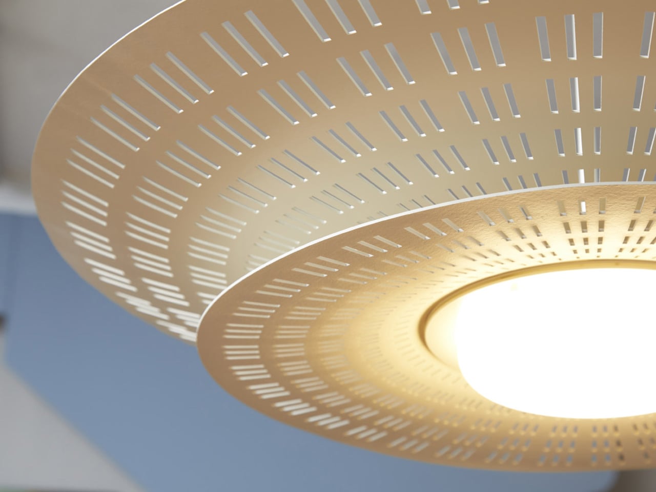
This AI-assisted ceiling light illuminates the lives of the elderly while monitoring their safety

AI-enabled lighting systems for elderly care combine illumination with continuous health and safety monitoring. Integrated sensors and computer vision allow the lamp to detect falls, unusual movement patterns, and prolonged inactivity, while also tracking indicators such as respiration and coughing. Advanced algorithms analyse behaviour over time to predict potential risks before accidents occur. When an incident is detected, the system automatically alerts designated caregivers or emergency contacts, enabling faster response and reducing the severity of injury through timely intervention.

Designed to function as a standard household lamp, this technology integrates seamlessly into residential interiors without appearing medical or intrusive. The familiar form factor encourages acceptance while delivering round-the-clock support through a single device. With low heat emission, energy-efficient LEDs, and autonomous operation, AI lighting solutions provide a scalable approach to assisted living. By combining safety, monitoring, and illumination in one product, these systems offer a practical way to support independent ageing while maintaining comfort, privacy, and dignity.

2. Sculptural Light Forms

Lighting fixtures are increasingly treated as architectural features rather than background utilities. Instead of relying on scattered recessed ceiling lights, spaces now favour bold, sculptural pieces that visually anchor the room. These luminaires are appreciated for their authentic materials, including hand-blown recycled glass, alabaster, and bio-based composites, which add depth and softness while creating a gentle, diffused glow.

Beyond function, such fixtures shape how you perceive space. A large pendant naturally draws the eye, balancing volume and form while adding a sense of rhythm to the interior. Light becomes a focal point that connects design with atmosphere, creating rooms that feel considered, expressive, and emotionally engaging.

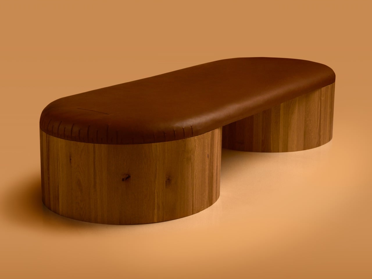
The Arc Lamp by designer Divyansh Tripathi is defined by a single bent wooden arm that curves gracefully to support a suspended light source, creating a strong sculptural identity. The continuous arc forms a balanced structure that distributes weight evenly while guiding the eye from base to bulb. This fluid geometry gives the lamp a sense of motion, turning a functional object into a visual centrepiece suitable for display as much as daily use. The suspended bulb is positioned to provide soft ambient illumination while reducing direct glare.

Material choice is central to the lamp’s character and performance. Bent timber introduces warmth, tactile depth, and visible grain patterns that make each piece visually distinct. Finished with protective natural coatings, the wood maintains its organic appearance while ensuring durability. Paired with a low-profile LED bulb, the lamp delivers even, diffused light that enhances surrounding textures without overpowering the space. Its minimal structure allows it to integrate across interior styles, functioning as a lighting solution and a collectible design object.

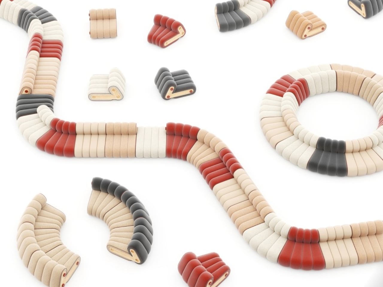
3. Honest Sustainable Materials

Lighting design now places strong emphasis on the full life cycle of a fixture, not just its appearance. You see a growing focus on low-impact production, modular construction, and upgradable LED components that extend usability rather than encouraging replacement. Materials such as repurposed mycelium, salt crystals, and recycled composites are no longer experimental choices but trusted options for those who value responsible design.

This shift brings both ethical and practical benefits. Durable construction and adaptable technology mean fixtures last longer and age more gracefully. When materials are chosen for integrity and longevity, lighting becomes more than décor as it becomes a lasting design investment, valued for craftsmanship and environmental responsibility rather than short-term trend appeal.

The Air suspension light by Contardi Lighting, designed in collaboration with Adam Tihany, is engineered to deliver soft, evenly distributed ambient illumination. Its dual-shade construction houses upper and lower LED light sources that spread light both upward and downward, improving overall spatial brightness while avoiding direct glare. Laser-cut detailing on the shades allows controlled light diffusion, creating subtle shadow patterns that add visual depth without reducing functional output. This configuration supports balanced lighting suitable for dining areas, lounges, and hospitality interiors.

Lighting efficiency is supported by the use of high-performance LED modules that maintain consistent colour temperature and stable light intensity over time. The shade material is designed to transmit and reflect light effectively, ensuring minimal loss while preserving a warm tonal quality. The integrated structure reduces the need for additional ambient fixtures, making the lamp suitable as a primary light source in medium-sized spaces.

4. Power of Shadow

Good lighting design recognises that darkness plays just as important a role as illumination. Instead of flooding every corner with brightness, subtractive lighting uses restraint to highlight key architectural features while allowing other areas to remain calm and visually quiet. This balance of light and shadow adds depth, especially in double-height or open-plan spaces, where contrast helps define structure and scale.

Techniques such as narrow-beam spotlights and subtle floor-level washes guide movement and create visual pauses. As you move through the home, light reveals selected moments rather than everything at once. The result feels intentional and layered, turning everyday interiors into curated, gallery-like environments instead of uniformly lit, commercial-looking spaces.

The Foreshadow Table Lamp is designed to transform direct illumination into patterned ambient light. Its perforated metal shade filters the light source into multiple fine beams, projecting structured shadows across nearby surfaces. This controlled diffusion adds visual depth while maintaining functional brightness for side tables, consoles, and accent lighting applications. The lighting effect varies depending on placement, surface finishes, and surrounding geometry, allowing the lamp to interact with its environment rather than delivering flat, uniform output.

Construction focuses on durability and tactile quality. The metal shade features precision-punched perforations that regulate light distribution while maintaining structural rigidity. The matte finish reduces surface glare and complements both contemporary and transitional interiors. When switched off, the lamp retains a clean, sculptural profile, functioning as a decorative object even without illumination. Designed to operate as a lighting fixture and an ambient feature, the Foreshadow Table Lamp provides atmospheric enhancement while remaining practical for everyday use.

5. Colour and Comfort

Modern lighting is closely linked to energy efficiency and indoor comfort. Advanced LED systems release very little heat, helping reduce strain on cooling and ventilation systems while keeping rooms comfortable throughout the day. This makes lighting an active part of managing how a space performs, not just how it looks.

At the same time, colour temperature is used to influence how warm or cool a room feels. You can shift from soft, golden tones during colder months to cooler, moonlit hues in warmer seasons, subtly shaping your emotional and physical response to the space. By adjusting light colour, interiors feel more adaptable, balanced, and supportive of everyday well-being.

The Wipro EcoLumi Flex is a modular lighting concept designed to function as a table lamp and a suspended ceiling fixture. Its adjustable structure allows users to modify height and angle through a simple twist mechanism, ensuring precise light placement for different tasks. A slidable shade enables directional control and glare reduction, improving visual comfort during focused work. Multiple units can be connected using integrated joints and connectors, allowing customised lighting layouts for desks, workstations, or collaborative spaces.

Lighting performance is enhanced through built-in circadian modes that automatically adjust brightness and colour temperature throughout the day. Warm tones support relaxed morning and evening use, while cooler light promotes alertness and productivity during peak work hours. The modular construction supports part replacement and future upgrades, reducing material waste and extending product lifespan.

Lighting is evolving into a true architectural philosophy in 2026, where atmosphere takes precedence over mere fixtures. Intelligent systems, sculptural forms, and sustainable materials work together to create spaces that are visually compelling.

The post 5 Smart Lighting Trends That Just Made Traditional Fixtures Look Outdated first appeared on Yanko Design.

❌
❌