Vue normale

Il y a de nouveaux articles disponibles, cliquez pour rafraîchir la page.
Aujourd’hui — 25 mars 2026Flux principal

These Ceramic Lamps Look Like 90s Caramel Candy and Stack Any Way

Par : JC Torres
25 mars 2026 à 16:20

The interiors most people aspire to these days tend to share a common trait: they’re clean, restrained, and almost aggressively neutral. Scandinavian minimalism, Japandi aesthetics, and muted palettes have dominated home design for years, and while there’s nothing wrong with a well-curated beige room, a lot of modern spaces have started to feel emotionally flat, like showrooms rather than places where people actually live.

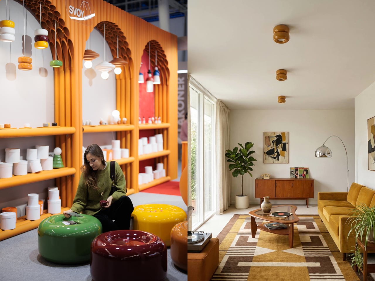
That’s where the Caramel collection comes in. Designed by Moscow-based product designer Maxim Tatarintsev in collaboration with Russian brand Svoy Design, this new series of ceramic lighting and furniture takes a very different approach to interior objects. Rather than adding another understated piece to a polished shelf, it reaches back to a simpler, sweeter time, asking whether a lamp or a side table can carry something as intangible as joy.

Designer: Maxim Tatarintsev

Tatarintsev’s inspiration came from a period of deep personal reflection. Amid what he describes as the noise of contemporary life, he looked inward and found his answer in childhood, specifically in the candy that practically every kid growing up in the 90s and early 2000s would recognize. That small, glossy, jewel-toned caramel sweet became both his muse and his design vocabulary, shaping everything from the forms to the color palette.

The collection spans pendant lights, ceiling fixtures, and wall-mounted lamps, all crafted from semi-porcelain, as well as a low-profile side table made from a proprietary composite material. What stands out is the modular approach: each ceramic unit can be combined and reconfigured, letting you stack or cluster them into different lighting arrangements depending on the mood or corner of the room you’re working with.

Think of it like assembling your own arrangement from a jar of sweets. One configuration might call for a single pendant above a kitchen island; another might cluster a few units along the ceiling of a reading nook. The point isn’t to follow a prescribed layout but to put that creative decision in the hands of the person actually living in the space, not just the designer who furnished it.

The craftsmanship behind the lighting is traditional and deliberate. Each piece starts as a slip-cast semi-porcelain form, drying for several days before being fired at 1,100°C inside a muffle furnace. A coat of glaze and paint follows, giving the finished modules their signature smooth, candy-like sheen. It’s a fairly labor-intensive process for what might look like a simple geometric shape, but that’s precisely what gives each piece its quiet depth.

The side table takes a different manufacturing route altogether. Made from a proprietary composite rather than ceramic, it’s significantly more durable and comes in two versions, one for indoor use and one for covered outdoor settings. At first glance, it reads as a low, rounded ottoman, and people will probably be unable to resist using it as a delicious seat instead.

None of that is accidental. Tatarintsev’s stated goal wasn’t to produce pretty objects but to create what he calls “emotional anchors,” pieces capable of sparking a genuine reaction in whoever encounters them. A set of lamps you can rearrange on a whim, a table that moonlights as a seat, and a color palette borrowed from childhood treats make for a collection that gives any room a personality it actually earned.

The post These Ceramic Lamps Look Like 90s Caramel Candy and Stack Any Way first appeared on Yanko Design.

Galaxy Z Fold 8 Renders: Same Look, Bigger Battery, and S Pen Is Back

Par : JC Torres
25 mars 2026 à 13:20

Foldable phones have reached a point where the form factor itself is no longer the talking point it once was. The big, dramatic “look how it folds” moment has settled into a quieter rhythm of iterative refinement, with each generation tweaking dimensions and chasing thinner profiles. Most buyers know what a modern book-style foldable looks like, and the language of change has shifted from shape to substance.

That’s the situation shaping the Samsung Galaxy Z Fold 8 conversation right now. Leaked CAD-based renders show a design that’s nearly indistinguishable from the Z Fold 7 pictured above: same flat sides, same sharp corners, same camera layout. The cover screen sits at 6.5 inches and the inner display at 8 inches, both unchanged. If you handed someone these renders without context, they’d probably just guess it was another angle of last year’s model.

Designer: Steve Hemmerstoffer/OnLeaks (Renders) via AndroidHeadlines

There’s one notable external difference, though, and it actually goes in the wrong direction. The leaked dimensions put the Z Fold 8 at 4.5mm thick when open and 9mm folded, compared to the Fold 7’s 4.2mm and 8.9mm. That’s a slight regression for a phone that went to considerable lengths to slim down the year prior. It’s not dramatic, but for a device that made a point of its thinness, it’s worth flagging. That said, the 4.5mm figure includes the protruding bezels around the display; it’s actually just 3.9mm thin.

The likely reason for that extra thickness is one of the better leaks so far: the possible return of S Pen support. Samsung dropped the stylus from the Fold 7, and that’s been a consistent complaint from the people who actually used it for note-taking or sketching on that wide inner canvas. If the S Pen does come back, a fraction of a millimeter is a fair trade for most of those users.

The battery theory, however, is probably more probable. A jump from 4,400 mAh to a rumored 5,000 mAh would mark the first capacity upgrade since the Galaxy Z Fold 3, and pairing that with 45W wired charging, up from 25W, addresses one of the more persistent frustrations with this lineup. Spending less time near an outlet matters more on a device you’re likely using across more tasks throughout the day.

The camera is also in line for a significant upgrade, according to the same leak. The main sensor is rumored to still be 200MP, and the ultrawide jumps from 12MP to 50MP. That ultrawide improvement in particular has been a long time coming. The gap between the Fold’s main and ultrawide cameras has been noticeable enough that it’s affected how people use the phone outdoors.

All of this is still leak territory, of course, pulled from CAD renders and a specs tipster ahead of what’s expected to be a July 2026 Unpacked announcement. Samsung hasn’t confirmed any of it, and final specs frequently shift between early renders and launch day. The Z Fold 8 is shaping up to be a phone that looks familiar and updates what actually needs updating, but none of that is official yet.

Galaxy Z Fold7

The post Galaxy Z Fold 8 Renders: Same Look, Bigger Battery, and S Pen Is Back first appeared on Yanko Design.

LG’s World-First 1Hz Panel Gives the Dell XPS 48% More Battery

Par : JC Torres
25 mars 2026 à 10:07

Battery life has been one of the laptop industry’s most persistent design headaches, especially among Windows notebooks. Despite significant gains in chip efficiency, the display consistently ranks among the biggest power consumers in any portable computer. Most laptop screens refresh at a fixed rate regardless of what’s actually on them, which means the panel keeps drawing full power even when you’re sitting completely still, reading a document with nothing on screen changing at all.

LG Display’s new Oxide 1Hz panel is the first mass-produced LCD laptop screen that doesn’t work that way. Rather than holding a fixed rate, it reads what’s on screen and drops to 1 Hz when the content is static, then scales back up to 120 Hz for video or gaming. LG began mass production on March 22, 2026, claiming the first-ever achievement of this at scale.

Designer: LG, Dell

The technology relies on custom circuit algorithms and a new oxide material applied to the panel’s thin-film transistor. That oxide holds an electric charge longer than conventional LCD materials, letting the screen maintain a still image without continuously refreshing it. LG claims the result is up to 48% more use on a single charge versus existing solutions, which is a significant number if it holds up in everyday use.

In practice, this matters most during the parts of a workday you spend the bulk of your time in. Checking emails, reading through documents, and sitting on a static slide during a meeting are all moments where a 60 Hz or 120 Hz screen burns power for no real benefit. The Oxide 1Hz panel handles those scenarios at a fraction of the usual draw without any visible difference.

When you do pull up a video or launch something that demands smooth motion, the panel doesn’t hesitate. It detects the change and jumps back up to 120 Hz automatically. There’s no mode to switch into, no setting to toggle, and no trade-off to manage. It just adjusts based on what’s happening on screen, which is how this kind of feature should work in the first place.

The first laptops to ship with this panel are the Dell XPS 14 and Dell XPS 16 for 2026, both unveiled at CES 2026 in January. The LCD option on both models runs at 1920 x 1200 pixels and 500 nits of brightness. Dell’s OLED option only drops as low as 20 Hz, which means the more affordable LCD configuration actually wins on low-power behavior.

Here’s where it gets interesting from a design standpoint. The display is one of the biggest power consumers in any laptop, so a screen drawing significantly less power during typical use creates real headroom for designers. They can use that headroom to maintain battery size and gain extra runtime, or to trim the battery slightly for a lighter, thinner chassis without giving up the battery life buyers already expect.

Of course, LG is already planning a 1 Hz OLED version of this technology for 2027, which is when things could get more interesting. OLED handles contrast and color in ways LCD can’t match, and pairing that quality with proper low-refresh-rate behavior could push portable laptop design further than it’s been able to go. For now, the Oxide 1Hz LCD is in something you can actually go out and buy.

The post LG’s World-First 1Hz Panel Gives the Dell XPS 48% More Battery first appeared on Yanko Design.

À partir d’avant-hierFlux principal

This E Ink Foldable Phone Concept Punishes Doomscrolling by Design

Par : JC Torres
21 mars 2026 à 17:20

Most smartphones are designed to be impossible to put down. The screen faces up on every table, the display lights up for every notification, and the cost of checking it one more time is exactly zero. That’s not an accident. The hardware removes friction from compulsive use because removing friction is what makes these devices feel indispensable. The tinyBook Flip concept asks a different question entirely: what if the phone were designed to get out of the way?

The tinyBook Flip is a vertical foldable phone concept built around a 6.1-inch E Ink display. Closed, it collapses into a compact, near-square form with rounded corners and a matte white finish, something closer in proportion to a folded notecard than a smartphone. The screen disappears entirely when the device is closed shut. No glowing rectangle sitting face-up on the desk, no ambient reminder that there are things to check. Just a small, quiet object.

Designer: Pixel Dynamics

That folded form is doing more work than it might seem. Opening the phone requires a deliberate physical action, and that small added step changes the behavioral math. A reflexive grab becomes a conscious decision. The friction is minimal in absolute terms, maybe two seconds, but two seconds of resistance is often enough to interrupt the loop. The concept treats that interruption as a design feature, which puts it in genuinely different territory from most phones.

The E Ink display adds a second layer of resistance, and this one is less subtle. E ink refreshes slowly, renders in grayscale or muted colors, and handles fast-moving content poorly. Social media feeds become tedious. Short-form video becomes unwatchable. Anything built around color, motion, and rapid visual feedback stops working the way it was designed to. This is precisely the point. The screen’s limitations aren’t engineering compromises left over from an earlier era of display technology; they’re structural properties that make certain behaviors genuinely unpleasant to sustain.

What E Ink handles well is a shorter list, but a coherent one. Text reading, messaging, calendars, and static interfaces are all comfortable at E Ink’s native pace. The renders of the tinyBook Flip show a UI built around exactly these strengths: a large clock face, a calendar widget, and a grayscale illustrated wallpaper. The interface doesn’t reach for capabilities the display can’t support. The phone isn’t trying to do everything; it’s trying to do a narrower set of things without apology.

Foldable E Ink panels aren’t a speculative technology. The hardware exists at the component level and has already appeared in experimental e-readers, though no consumer phone has shipped with one in any meaningful volume. The tinyBook Flip isn’t imagining impossible components; it’s proposing a form factor that manufacturers haven’t yet committed to producing. The distance between those two things is largely commercial, not technical.

There’s also something worth noticing about how the device reads as a physical object in social space. Closed, the tinyBook Flip looks like almost nothing. No visible screen, no status indicators, no glow. A phone that carries no visual weight when it’s not in use sends a different signal than one that’s always broadcasting its presence. Putting it down means it actually disappears from the environment, not just from your hand.

That said, the concept leaves some real friction points unaddressed, and not the intentional kind. E Ink handles camera use, live navigation, video calls, and authentication apps poorly. A foldable hinge adds mechanical complexity and thickness that clean renders tend to obscure. The tinyBook Flip looks resolved in this form, but a production version would have to make tradeoffs that these images don’t show and the concept doesn’t acknowledge.

Still, the more interesting question isn’t whether this specific device could ship. It’s whether a phone that makes itself harder to misuse is a reasonable design goal at all, or whether that’s just a way of describing a phone that most people wouldn’t actually want. The tinyBook Flip lands firmly on one side of that question. Whether the market agrees is a different problem entirely.

The post This E Ink Foldable Phone Concept Punishes Doomscrolling by Design first appeared on Yanko Design.

XbooK’s $1,999 Triple-Screen Laptop Is One Bag Instead of Three Monitors

Par : JC Torres
21 mars 2026 à 15:20

Anyone who has worked remotely long enough knows the moment a single laptop screen stops being enough. It’s usually the day you’re cross-referencing three documents at once, or the morning you realize your financial model needs a live chart in one window while you edit formulas in another. The standard fix is an external monitor or a portable screen extender, which works fine until you’re hauling a bag that feels like it’s punishing you for being productive.

The XbooK takes a different approach by folding three full 14-inch touchscreens into a single aluminum laptop body that closes to just 1.5 inches thick. At 7.5 lbs, it’s heavier than a typical ultrabook. The tradeoff, though, is straightforward: you’re not carrying a laptop plus accessories. You’re carrying the whole setup in one piece.

Designer: XbooK

All three screens run at 1920×1080 with 400 nits of brightness each. The machine is powered by an Intel Core Ultra 7 with 32GB of DDR5 RAM and a 1TB SSD, with Wi-Fi 7 and Bluetooth 5.0 onboard. That’s capable hardware, though nothing unusual for a mid-to-high-range laptop in 2025. What makes those specs interesting here is what they’re pushing: 42 inches of combined touchscreen that unfolds in seconds without a single cable involved.

In full Workstation Mode, all three screens run simultaneously alongside an embedded mechanical keyboard and a 10-point touchpad. Connectivity covers Thunderbolt 4, two USB-C ports, and an AUX jack, with a 1,600×1,200 front camera that’s sharper than most built-in laptop cameras. The 70Wh battery has to power all of that, and battery life under a three-screen load is something any serious buyer should push the company on before committing.

For days when the full spread is overkill, the XbooK also works in a two-screen mode or as a conventional single-screen laptop. The latter folds everything up and makes the device look surprisingly ordinary from the outside, except for the two thick slabs sitting underneath the keyboard. That adaptability is one of the more genuinely practical aspects of the design: you’re not locked into the workstation configuration every time you open the lid.

At $1,999 (down from a listed $2,999), it’s priced for professionals who already spend that much on monitors and docking stations. XbooK ships from the US with orders promised to be processed within 3 to 5 business days. The refund-before-shipping policy and fulfillment language have the texture of a startup still scaling up. Spending that much on a device from a company with no established hardware track record is a different kind of commitment than buying from a brand with a decade of products behind it.

Screen real estate is one of the last things portable computing has consistently failed to solve, and most multi-screen laptop concepts have been either too fragile or too awkward for daily travel. The XbooK has a cleaner physical premise than anything built around magnets or external rails. How the hinges and chassis hold up after a year on the road, though, is still an open question that no amount of spec-sheet confidence can close.

The post XbooK’s $1,999 Triple-Screen Laptop Is One Bag Instead of Three Monitors first appeared on Yanko Design.

This Fan Made the Sony-Nintendo Handheld the Companies Never Would

Par : JC Torres
20 mars 2026 à 17:20

The retro handheld market has a strange problem. The hardware keeps getting better, the screens get sharper, the processors get faster, and yet most of these devices land looking like prototypes someone forgot to finish. Generic shells, forgettable proportions, and LED lighting as a substitute for actual design thinking. For a category built entirely on nostalgia, very few of these devices actually look like they belong to any era at all.

That tension is what one Reddit user decided to address. Starting with a Retroid Pocket 5, a $199 Android handheld running a Snapdragon 865 and a 5.5-inch AMOLED display, the mod layers Sony and Nintendo branding onto the same shell. Vinyl decals, translucent polycarbonate, a 3D-printed volume rocker from Etsy, and a cable replaced in PS2 color. The result looks less like a sticker job and more like a concept render from an alternate 1999.

Designer: Mitchieyan

The translucent shell is doing most of the work. It pulls from the visual language of the N64’s Funtastic series, those clear and atomic-purple controllers Nintendo released in the late 1990s, where showing the circuitry was the design choice rather than concealing it. Over a piano-black grip body with PlayStation-colored face buttons, the frosted polycarbonate shifts from grey to near-white depending on the light. It shouldn’t feel considered. It does.

The branding placement is where intent becomes clear. The Sony wordmark sits centered on the upper face, exactly where it appeared on a PSOne. Below it, the PlayStation four-color logo. At the bottom bezel, the Nintendo badge mirrors its position on a Game Boy Advance SP. None of it is licensed, of course. These are adhesive vinyls placed by someone who grew up with both systems and wanted their coexistence on one device to feel inevitable rather than absurd.

Not everything here reaches backward. The analog sticks are translucent caps over hall-effect sensors, lit teal on the left and purple on the right, owing nothing to 1999. That generation didn’t have RGB anything. The lighting reads as a concession to the present; the one feature announcing this is still an Android device in 2025, not a prototype from some alternate Sony-Nintendo licensing meeting. Whether it sits comfortably alongside the retro shell is a fair question.

The rear view shifts the frame again. A large dual-grip body in smooth black rubber dominates the back, a clear plastic hinge connecting the screen to grip in full view, structural and unapologetic. The 3D-printed volume rocker at the top edge puts a physical control where fingers naturally land. The back half feels closer to a DualShock than a Game Boy, which is either the point or the problem, depending on what you wanted this thing to be.

Flip to the front screen, and the emulator grid makes the whole thing literal. DuckStation for PS1, Dolphin for GameCube, PPSSPP for PSP, melonDS for Nintendo DS, and a live PS2 wallpaper cycling behind all of it. This device runs both companies’ libraries simultaneously without asking permission from either. The branding on the shell, in that context, stops being a novelty and starts reading as a plain statement of what the hardware already does.

The retro handheld category is large enough now that sameness has become its default. The Retroid Pocket 6, the current flagship from the same manufacturer, drew community criticism for being indistinguishable from competitors: glass front, LED sticks, rounded edges, and no particular character. A fan mod building identity out of borrowed logos is one response to a problem the manufacturers haven’t solved. It’s also just someone enjoying a hobby and being honest about what they want.

The hardware to play PS1, PS2, GameCube, and Game Boy Advance all on one screen already exists and costs under $200. What the market hasn’t resolved is what that device should actually look like, or whose name should go on it. This mod doesn’t answer either question. It just makes the gap between what’s technically possible and what anyone has bothered to design feel a little harder to dismiss.

The post This Fan Made the Sony-Nintendo Handheld the Companies Never Would first appeared on Yanko Design.

This Baby Walker Grows With Your Child for 6 Years in 4 Different Ways

Par : JC Torres
18 mars 2026 à 16:20

Most baby walkers have a shelf life measured in months. A 7-month-old wobbles through the living room gripping the handle, and by the time that same child turns two, the walker is already in a closet somewhere. The furniture cycle in a home with small children tends to follow that rhythm: buy, use briefly, replace with something else entirely.

The Safari Multifunctional Kids Furniture concept tries to interrupt that pattern by designing one piece that stays useful across the first six years of a child’s life. The name “Step-N-Play” gives away two of its functions without mentioning the third or fourth. It is, depending on the child’s age and the day’s agenda, a walker, a climbing unit, a play table and chair, and a toy storage solution.

Designer: Bharti Upadhyay

At its earliest stage, the walker is built for children between 6 and 18 months, with a frame measuring approximately 600 x 400 x 500 mm. The structure combines wood, ABS plastic, and soft silicone grips, with a 95-degree backrest angle designed for infants who are not yet seated with full stability. An anti-tip base and anti-pinch safety gaps cover the more obvious hazards of putting a barely mobile child in contact with a moving object.

As the child grows into the 1-to-3 age window, the same structure becomes a climbable stair unit. From ages 2 to 6, it transitions again into a play table and chair. A built-in storage compartment for toys and books operates across all configurations. The manufacturing approach pairs CNC-cut wood with injection-molded ABS plastic, a combination suited to years of contact with small hands and the occasional harder object.

The safari animal inspiration shows up in organic silhouettes and surface language rather than in literal animal sculptures attached to the frame. Smooth curves, generous fillets, and chamfered grooves define the form. The pastel color palette, wooden handles, and textured sensory balls read as a considered aesthetic choice rather than an afterthought, which matters in a living space where parents also have to look at the thing.

Safari is a student concept at this stage, so the harder questions remain open. How the ergonomics hold across such a wide age range, how the mechanical transitions between configurations actually work in practice, and whether a single object can genuinely serve a 7-month-old and a 6-year-old with equal competence rather than adequacy are things a physical prototype would need to answer.

The post This Baby Walker Grows With Your Child for 6 Years in 4 Different Ways first appeared on Yanko Design.

A Student Built a Pocket Planet Tracker That Works Without Your Phone

Par : JC Torres
18 mars 2026 à 14:20

Most of us have looked up at the night sky at some point and felt that brief, humbling recognition that there is an enormous universe out there, and we have no idea what is happening in it. Then a notification comes in, and the moment passes. Lumen Orbit, a student concept from CEPT University, is a small handheld accessory designed to keep that awareness alive without requiring a telescope, a star chart, or a dedicated app.

The device is disc-shaped and roughly palm-sized, with a two-part body split along its equator by a copper-toned accent band. The upper half is a polished silver-gray cap; the lower sits wider and shallower in a dark matte gunmetal finish. A woven braided lanyard with a hexagonal metal clasp attaches to the body, making it something you can loop around a wrist, hook to a bag, or hang using a built-in fold-out carabiner.

Designer: Kinshuk Agarwal

The primary face carries a circular display showing real-time planetary positions: which planet is currently visible, where it sits in the sky relative to your location, and when it rises and sets. Flip the device over, and a second, smaller screen on the reverse offers a close-up planetary render. The UI uses pixel-art-style graphics for its planet illustrations, landing somewhere between retro charm and deliberate restraint.

The interaction model is equally considered. A flip gesture switches between the two display modes, squeezing the body cycles through planets, and haptic vibration signals astronomical events such as meteor showers, eclipses, and alignments. The idea is that information about the cosmos arrives the same way a text message does, as a quiet nudge rather than something you have to actively seek out.

What the concept is really proposing is a dedicated single-purpose ambient device for astronomical awareness. Smartphones can technically do all of this through apps, but a specialized physical object changes the relationship to the information entirely. Carrying something whose only purpose is to connect you to the solar system is a genuinely different proposition than opening an app between emails.

The open questions are substantial. How the real-time tracking handles connectivity, how the device charges, and how positional accuracy works without confirmed GPS integration are things the concept leaves unspecified. The form is confident, and the interaction logic is coherent. The more interesting problem is whether a working version could fit into a jacket pocket for easy access.

The post A Student Built a Pocket Planet Tracker That Works Without Your Phone first appeared on Yanko Design.

Coleman’s $200 Cooler Chills for 2 Days, Folds Flat in 10 Seconds

Par : JC Torres
18 mars 2026 à 13:20

Coolers are great until the trip ends. Then they become a large, oddly shaped object that takes up the entire trunk on the way home, sits on the garage floor for a month, and eventually gets shoved into whatever corner will take it. For apartment dwellers especially, owning a full-sized hard cooler is less a convenience and more a spatial negotiation that rarely ends well.

Coleman’s Snap ‘N Go is a hard-sided cooler with a patent-pending collapsible design that compresses to one-third of its open volume in under 10 seconds. The mechanism borrows logic from folding storage crates: the body panels snap down in sequence, and the removable interior liner folds flat and stows inside the lid. What was a full-sized cooler becomes a flat slab thin enough to slide under a bed or stand upright on a shelf between uses.

Designer: Coleman

The construction is hard polypropylene, which matters more than it sounds. Soft collapsible coolers already exist, but they sacrifice insulation to achieve that flexibility. The Snap ‘N Go maintains a fully insulated lid and body, rated to hold ice for up to 64 hours. That’s two full days of cold retention from something that, an hour later, disappears into a closet, which is a combination the soft-sided category has never managed.

1

Setup works in reverse, just as quickly. From flat storage to loaded and latched takes under 10 seconds, and the removable liner handles watertight containment once the body is expanded. The liner also makes post-trip cleanup more manageable, since it pulls out separately rather than requiring the whole cooler to be rinsed out and dried upright somewhere. It’s a small detail, but one that addresses one of the more tedious parts of cooler ownership.

Three sizes cover most group sizes: 35 qt at $200, 45 qt at $220, and 55 qt at $240. The 55-qt model holds up to 93 cans without ice and supports 200 lbs. when expanded, though Coleman is careful to note it isn’t intended as a seat. Handles are designed to accommodate both carry orientations, vertical when the cooler is collapsed flat and horizontal when it’s fully open and loaded.

The one question the design raises, and doesn’t fully answer yet, is how the collapsible mechanism ages. The hinges, panel connections, and liner attachment points are all doing repetitive work that a standard molded cooler body never has to perform. Coleman backs it with a three-year limited warranty, which covers the expected lifespan question in practical terms but doesn’t tell you much about what happens in year four after a few dozen collapse cycles on a tailgate.

The post Coleman’s $200 Cooler Chills for 2 Days, Folds Flat in 10 Seconds first appeared on Yanko Design.

This Panda-Faced Action Camera Might Finally Get Kids Off Their Tablets

Par : JC Torres
17 mars 2026 à 16:20

Kids are natural documentarians. Long before anyone hands them a camera, they’re narrating adventures out loud, pointing at bugs, dragging adults toward things worth seeing. The problem is that nothing currently bridges that instinct and an actual usable device. Smartphones are too distracting. Adult action cameras have interfaces that assume familiarity with exposure menus. Yashas Verma’s Cubix concept starts not with specs, but with a face.

The panda reference is obvious and, more importantly, immediately likable. Two large “squircle” apertures dominate the front, one housing the lens and the other a screen, arranged side by side like a pair of wide-set eyes. The body is white with a matte finish, and the front panel is glossy black. That contrast reads less like a colorway decision and more like a character, which is entirely the point.

Designer: Yashas Verma

Verma’s design moodboard places the concept on a spectrum between “tech” and “cute,” and the finished form lands firmly in the middle. Minimal enough to avoid looking like a toy, warm enough not to feel clinical. The rounded-square geometry carries through from the front apertures to the body corners, giving the whole object a visual consistency that student concept work often skips over in favor of surface polish.

The dual-screen setup solves a genuine behavioral problem. Action cameras for adults assume a single rear screen because operators rarely need to see themselves. Kids, who tend toward vlogging more than action sports, want to check the frame constantly. The front screen handles selfie framing, the rear touch screen manages settings and playback. Removing that guesswork is the single most child-appropriate decision in the entire design.

The body is sized for smaller hands, with one-handed operation as the stated goal. That matters when the other hand is holding a bike grip, a climbing hold, or a very interesting stick. Waterproofing and durability are mentioned in the concept brief, though no specific ratings are given. A child’s definition of waterproof tends to involve full submersion and zero warning, and the gap between those expectations and a modest splash rating has disappointed parents before.

The packaging carries the panda-eye graphic, the same black-and-white palette, and the tagline “Climb. Roll. Capture.” The box also shows an age rating of 10+, which quietly shifts the target older than the concept language implies. A ten-year-old and a seven-year-old are very different grip sizes, and the design’s success depends heavily on which end of that range it was actually built for.

The post This Panda-Faced Action Camera Might Finally Get Kids Off Their Tablets first appeared on Yanko Design.

This Wireless Mouse Splits in Half to Reveal a Hidden Game Controller

Par : JC Torres
17 mars 2026 à 10:07

Most people who game on a PC own two things that do roughly the same job at different times: a mouse for the desk and a gamepad for the couch. They live side by side, occasionally getting in each other’s way, and neither one is going anywhere. Pixelpaw Labs, a hardware startup from Bangalore, India, thinks that arrangement is wasteful and has built something to prove it.

The Phase is a wireless mouse that physically separates down the middle into two independent halves. Snapped together, it sits on a desk and works like a normal mouse. Pull it apart, and each half reveals a joystick, triggers, a D-pad on the left side, and face buttons on the right, a split gamepad that was hiding in plain sight the whole time.

Designer: Pixelpaw Labs

That missing scroll wheel is not an oversight. Fitting a traditional wheel in the center of the body would have made the split mechanism impossible, so Pixelpaw replaced it with a capacitive touch strip along the top of the left button. Flicking a finger across it scrolls through documents and web pages, with a glide feature that lets the momentum coast rather than stop abruptly. It’s a trade-off that works around a real geometric constraint.

As a mouse, the Phase is competitive on paper. A 16,000 DPI optical sensor pairs with a 1,000 Hz polling rate when connected via the included 2.4 GHz USB dongle. Bluetooth LE is available for convenience and multi-device pairing across up to three devices, though the polling rate drops to 125 Hz in that mode, a gap that matters in fast-paced PC games.

Up to 18 customizable buttons are mappable through the Pixelplay companion app, and a Layer button doubles each button’s function capacity without adding physical complexity. Battery life is rated at 72 hours per charge over USB-C, which is more than enough to outlast dedicated gaming sessions on either side of its personality.

The controller halves use mechanical tactile switches, which is more than most mobile gaming clip-ons bother with. Pixelpaw also has an accessory called the Phasegrip, a bracket that holds the two separated halves apart with a smartphone mounted in the center, turning the setup into a handheld console for mobile gaming. The Phase works across PC, Android, iOS, iPadOS, and ChromeOS, so switching between devices doesn’t require swapping hardware.

Everything shown so far is pre-production, and the company has been upfront that the final surface finish will differ. That’s a meaningful caveat for a product whose physical fit and feel will determine whether the concept actually holds up. Whether they’ll be able to deliver this Holy Grail of PC gaming, however, is the real question that can only be answered in time.

The post This Wireless Mouse Splits in Half to Reveal a Hidden Game Controller first appeared on Yanko Design.

Spigen Turned Apple’s Iconic Beige Mouse Into an AirPods Pro 3 Case

Par : JC Torres
17 mars 2026 à 08:45

There’s something quietly odd about the era when Apple products were beige. Not bad, just odd. The Macintosh 128K, the boxy rectangular mouse, the Apple Lisa; they were made from a warm off-white plastic that aged into something stranger, a color that collectors now call “Pantone 453 approximately.” Spigen, a brand that usually channels its energy into clear polycarbonate shells, has decided this particular slice of computing history deserves a second life on your keychain.

The Classic LS AirPods Pro 3 case is the latest piece of Spigen’s retro-Mac collection, which launched in January 2026 with an iPhone 17 case modeled after the Macintosh 128K and Apple Lisa. The AirPods case takes a narrower reference: the original Apple mouse, that flat, single-button input device that became an icon despite being spectacularly simple. It joins a phone strap and a MagFit wallet styled as a floppy disk reader, completing a four-piece set.

Designer: Spigen

The case borrows the mouse’s proportions, its warm stone-colored plastic, and its most tactile feature. Spigen built a “Push to Unlock” locking mechanism into the front, positioned where the mouse button would have been. Press it and the hinged lid releases; snap it shut, and it clicks back into place. It’s a small mechanical gesture, but it makes opening and closing feel deliberate rather than accidental.

That security matters more than it sounds. For anyone who has found a lidless AirPods case rattling loose at the bottom of a bag, the locking mechanism is a genuine practical improvement over standard cases. The AirPods don’t pop out unexpectedly, and the lid doesn’t spring open on its own. An adhesive strip inside connects the lid to the top of the AirPods case, so the whole assembly opens cleanly as one unit.

The shell itself is polycarbonate, reinforced with what Spigen calls Air Cushion Technology, an internal structure designed to absorb impact at the corners and edges. The case wraps the AirPods Pro 3 charging case completely, with a cutout at the bottom for USB-C wired charging and a clear path through the back for wireless charging. Both work without removing the case.

A braided lanyard comes included, threading through a loop on the side. This isn’t just a piece of decoration, as small charging cases have a remarkable talent for disappearing into coat pockets and bags, and a physical tether is a more reliable retrieval system than searching by feel. The Classic LS case retails for $44.99, which places it comfortably in the broader collection alongside the $40 MagFit wallet and well below the $60 iPhone case that started it all.

The post Spigen Turned Apple’s Iconic Beige Mouse Into an AirPods Pro 3 Case first appeared on Yanko Design.

This Jellyfish-Inspired Lamp Transforms When You Switch It On

Par : JC Torres
16 mars 2026 à 10:07

Table lamps have a fairly narrow brief: sit on a surface, produce light, and try not to embarrass themselves in the process. Most manage two out of three. The Aurelia table luminaire takes a more considered approach, drawing from the slow, hypnotic movement of jellyfish to build something that works as a light source and as an object worth looking at when it’s switched off.

The reference point is specific, not from a general impression of the ocean, but from the particular way jellyfish tentacles move: slow, layered, and almost meditative in repetition. That quality informs the lamp’s layered construction and the dense organic lattice etched across its translucent shade. The pattern reads quietly in a lit room. Switch the lamp on and the whole surface activates, casting warm amber light through the texture in a way that feels atmospheric rather than task-driven.

Designer: Nizamuddin N.S

That distinction matters for where the lamp is meant to live. Aurelia isn’t designed to light a workspace, and the designer makes no claim that it should. The design targets bedside tables, desk corners, and living spaces where the goal is to soften the mood of a room rather than sharpen its focus. Diffused light changes the quality of a space in ways that sharp overhead sources simply cannot manage, which is the quiet premise the whole lamp is built around.

The physical form carries that logic through. The shade is a tall, slim panel mounted on a dark rectangular base that reads as wood. Unlit, the lamp is restrained and cool, with the etched lattice surface present but not clamoring for attention. Lit, the object shifts register entirely. Warm amber pushes through the pattern, and the base-to-shade contrast, dark below and luminous above, becomes the lamp’s defining visual move.

Beyond the light itself, Aurelia stands as a small sculptural piece meant to give a room some character. That’s a harder claim than it sounds. Most decorative lamps lean entirely on their shades for visual interest and have nothing to offer in the middle of the afternoon. Aurelia’s etched surface is structured enough to hold attention without illumination, which is the minimum requirement for a lamp that wants to be treated as more than a lamp.

There’s also a practical dimension that the jellyfish reference shouldn’t distract from. A lamp that produces soft, diffused warmth rather than direct output is genuinely useful in spaces that already have overhead lighting covered. It fills a secondary role well: the kind of light you turn on at the end of the day, not the kind you read by, and rooms that lack that option tend to feel unfinished in ways that are hard to articulate.

The post This Jellyfish-Inspired Lamp Transforms When You Switch It On first appeared on Yanko Design.

Michael Jantzen’s Garden Retreat Has 30 Panels to Rearrange by Hand

Par : JC Torres
16 mars 2026 à 08:45

Most garden structures ask one thing of you: sit still and enjoy the shade. A pergola is a pergola, a gazebo is a gazebo, and neither one particularly cares what the afternoon light is doing. Michael Jantzen’s Interactive Garden Pavilion operates on a different premise entirely, one where the occupant has as much say over the structure as the designer did.

Built from sustainably grown stained wood and painted a uniform forest green, the pavilion sits on an octagonal support frame fitted with 30 slatted hinged panels across its walls and roof. Each panel pivots independently, sliding and rotating along the frame before locking into position. Open them wide on a hot afternoon, and the interior breathes. Angle them down against the glare, and the space dims considerably.

Designer: Jantzen

That last point is where the design earns its name. Most adjustable outdoor structures offer a single variable, usually an awning or a retractable canopy, within an otherwise fixed form. Here, the entire skin of the building is the variable. The wall panels, roof panels, and ground-level platform extensions can all be repositioned, which means the pavilion can look substantially different from one afternoon to the next.

Pull the panels shut on three sides, and the structure becomes a genuinely private enclosure. Splay them open, and the interior connects fully to the garden around it. In one arrangement, it reads as a dense closed form. In another, the structure opens up entirely, and the slatted framework becomes almost sculptural against the lawn.

Inside, two benches with adjustable backrests run the length of the interior, facing each other. The seating is built into the frame, which keeps the floor plan clean and leaves room to recline fully. When the overhead panels are partially open, sunlight enters in sharp parallel bands that shift across the benches as the day moves, a quality that is either meditative or distracting depending on what you came in for.

The construction logic is also notably practical. The pavilion is a prefabricated modular system, so the components can be scaled before assembly or joined with additional units to form a larger cluster. No foundation is required in most configurations. Given its size and type, a building permit is unlikely to be needed in many jurisdictions, which removes one of the more tedious barriers between an interesting design and an actual garden.

Jantzen has spent decades proposing architecture that responds dynamically to its occupants, much of it remaining on paper. This pavilion is one of the cases where the idea got built, and the result holds up at close range. The slatted wood is honest about what it is, the green paint ties the structure to the garden without trying to disappear into it, and the hinge mechanism does exactly what it promises.

The post Michael Jantzen’s Garden Retreat Has 30 Panels to Rearrange by Hand first appeared on Yanko Design.

LiberNovo Omni Just Won the iF Design Award 2026 for Wellness Design

Par : JC Torres
16 mars 2026 à 01:45

Most office chairs operate on a quiet assumption that sitting is something your body should adapt to, not the other way around. You adjust the height, nudge the lumbar support into roughly the right position, and then spend the rest of the day subtly fighting the chair anyway. The ache between your shoulders, the stiffness in your lower back by mid-afternoon, that’s just part of the deal, apparently, and most of us have accepted it without much argument.

LiberNovo decided not to accept it. The result is the Omni, a chair the company calls a Dynamic Ergonomic Chair, and it just picked up the iF DESIGN AWARD 2026 in the Product Design – Beauty/Wellness category. The iF Design Award has been one of the most internationally respected design recognitions since 1954, with this year’s cycle drawing more than 10,000 entries from over 60 countries. That’s a serious field to stand out in

Designer: LiberNovo

Click Here to Buy Now: $929 $1099 (15% off). Hurry, deal ends in 48-hours!

The core idea behind the Omni is that your posture doesn’t stay fixed throughout a workday, so your chair probably shouldn’t either. The Bionic FlexFit Backrest is built around that logic, using 16 spherical pivot points, 8 adaptive flexible panels, and 14 dual-connection points to follow the natural curve of your spine as it shifts. It covers you from the hips up through the shoulders, spreading pressure across the whole back rather than piling it onto one fixed lumbar point.

What makes this work in practice is the Dynamic Support system, which adjusts automatically to changes in your posture without you having to reach for anything. Lean forward during a focused stretch of work, sit back when you’re thinking something through, the chair tracks those shifts, and responds in real time. It’s the kind of feature that sounds modest until you realize how much of your day you’ve spent adjusting a chair that couldn’t do this.

Then there’s OmniStretch, which is where the Omni starts to feel like something genuinely different. Sitting for long hours compresses the lower spine gradually, and most chairs just let that happen. OmniStretch is a guided decompression feature that gently stretches the lower spine during the workday, designed to actively relieve pressure rather than simply tolerate it. It’s probably why the iF jury placed the Omni in the Beauty/Wellness category: this chair isn’t just holding you up, it’s doing a bit of recovery work along the way.

The Omni also offers four recline positions running from 105 to 160 degrees. The shallower end is built for focused, upright work, while the deep 160-degree Spine Flow position is designed for full spinal decompression between sessions. The two intermediate angles cover the range in between, which gives the chair a kind of daily rhythm that matches how most people actually move through their hours rather than sitting rigidly in one position all day.

The chair was developed by LiberNovo’s team in Shenzhen alongside industrial design firm Kairos Innovation, also based there. Winning an iF award is meaningful external confirmation that the design thinking behind the Omni translates beyond the product brief. For a chair that started from the premise that desk work doesn’t have to hurt, that’s a pretty good place to land.

Click Here to Buy Now: $929 $1099 (15% off). Hurry, deal ends in 48-hours!

The post LiberNovo Omni Just Won the iF Design Award 2026 for Wellness Design first appeared on Yanko Design.

Apple Finally Rounded the MacBook’s Corners After 18 Years

Par : JC Torres
13 mars 2026 à 17:20

For about 18 years, every aluminum MacBook has looked more or less the same. Silver. Angular. Quietly serious. There’s nothing wrong with that. Apple’s unibody aluminum design, introduced in October 2008 and carved from a single block of metal, was genuinely elegant and set the template for an entire industry. But it also retired something along the way: the idea that a Mac laptop could feel chosen rather than just defaulted to.

The MacBook Neo, announced March 4 and starting at just $599, is the first real crack in that template. It comes in four colors (blush, indigo, silver, and a yellow-green called citrus) with enclosure corners that are noticeably softer than any aluminum Mac in recent memory. Whether that adds up to a proper design statement or just smart positioning is worth thinking through.

Designer: Apple

What happened to Apple’s color confidence

iBook G3 Clamshell (courtesy of Wikipedia)

Apple’s fondness for color didn’t always live inside an iPhone. The iBook G3, launched in 1999, came in tangerine and blueberry, and later in indigo and key lime. It was rounded, slightly toy-like, and completely unapologetic about being a consumer product. When the aluminum unibody arrived in 2008, Apple traded that warmth for precision machining and sharp rectilinear edges. Right call for the MacBook Pro. Default for everything else, apparently, for nearly two decades.

The result was a color drought in aluminum Mac laptops that has lasted until now. Silver, space gray, midnight, starlight: all variations on the same mood of professional restraint. The Neo’s citrus and blush aren’t just options on a spec page. They’re a quiet admission that not every laptop buyer wants a device that looks like it belongs in a boardroom. For Apple, that’s actually not a small thing to say at the product level.

Two different stories about corners

M1 MacBook Pro (2021)

There’s a distinction worth making here, because “rounded corners” gets used loosely when describing the Neo. MacBook displays have had rounded screen corners since 2021, which is a display-level detail and nothing new. What’s different on the Neo is the chassis itself. The physical aluminum enclosure is softer at the edges and corners than any aluminum Mac before it, and Apple’s own press materials describe “soft, rounded corners” specifically in terms of how the device feels to hold and carry.

That’s a real shift in the design language. The 2008 unibody was celebrated for machined sharpness, corners you could feel were engineered. The Neo softens that deliberately. It’s not a revival of the iBook, and it’s not trying to be, but the instinct is similar: a consumer Mac that feels a little more like it belongs to you. The notch is also gone, making this the first notchless MacBook since 2020, which quietly tidies up the one thing that made recent Airs feel slightly unfinished.

The repairability angle is actually a design story too

One thing that got a little buried under the color conversation: the Neo is the most repairable Mac laptop in years, and that’s partly a design decision worth noting. Teardowns showed how the whole machine was disassembled in just a few minutes using standard Torx screws throughout. No tape, no adhesive, anywhere inside. That’s a first for a modern Mac. The USB-C ports, speakers, and headphone jack are all modular. The keyboard can be replaced on its own, without swapping the entire top case, which on the MacBook Air currently costs over $370 in parts.

The internal simplicity isn’t accidental. The A18 Pro chip runs so efficiently that the Neo needs no fan at all, which removes a whole layer of thermal engineering that usually clutters a laptop’s interior. The result is a cleaner, more logical internal layout. Whether Apple arrived here from genuine design philosophy or from regulatory pressure (the EU’s right-to-repair push has been building for years) is an open question, but the outcome is real either way.

What it doesn’t fix, and what might come next

It’s not all sunshine and rainbows, of course. The base model has 8GB of non-upgradable RAM, one USB-C port runs at USB 2.0 speeds, and there’s no backlit keyboard. These are calculated trade-offs for the price point, not mistakes, but they matter depending on what you actually need the machine for. And repairability, for all the justified enthusiasm, is still partial: the RAM and storage are fixed at purchase, just like every other current Mac.

Still, the Neo feels like Apple designing for a specific person it had previously ignored: someone who was never going to spend $1,000 on a MacBook Air and wasn’t particularly well served by anything else Apple made. The color, the softer form, the price, the clean internals, all of it points at the same person. What’s genuinely interesting is whether any of this travels upmarket. If a future MacBook Air gets a color story this confident, the Neo might end up looking less like an entry-level product and more like Apple quietly figuring out what comes next.

The post Apple Finally Rounded the MacBook’s Corners After 18 Years first appeared on Yanko Design.

This Brutalist Lounge Chair Is 3D-Printed From Recycled Water Bottles

Par : JC Torres
13 mars 2026 à 16:20

Most furniture sits in a room without saying much. It fills a corner, does its job, and disappears into the background. Nako Baev’s THE OBJECT 01 is not that kind of furniture. The Amsterdam-based designer set out to build a chair that carries the weight of a spatial statement, something that holds its ground without decoration or apology, and in that specific ambition, the object largely delivers.

THE OBJECT 01 is a 3D-printed lounge chair built from recycled PETG, a plastic more commonly found in water bottles than in furniture workshops. At 20kg, it is lighter than its blocky, slab-heavy proportions suggest, though not exactly something you would reposition on a whim. Its dimensions push it closer in scale to a small architectural fragment than to a typical chair, which is likely the whole point.

Designer: Nako Baev

The construction follows a modular panel system, where each 3D-printed block fits into a sequence designed to cut material waste and keep the overall mass structurally lean. Finished in a cold grey Baev calls “Kyoto Fog,” the chair reads somewhere between concrete and matte stone. In a sparse studio or raw loft, it anchors the space with quiet authority. In a more conventional living room, it would likely dominate in ways not every household would welcome.

What makes THE OBJECT 01 genuinely worth attention is how honestly it exposes its own making. The layer-by-layer texture from the printing process is not hidden or smoothed away; it stays visible across the surface, turning the manufacturing method into part of the visual language. That kind of material honesty is far more common in ceramics or cast concrete than in plastic furniture, and it gives the piece a tactile quality that polished renders simply do not convey.

Baev describes the design as sitting between furniture and sculpture, drawing on minimalist brutalism and a quieter Japanese restraint in equal measure. The emotional reference points are more unusual: the designer cites the atmosphere of Silent Hill and Half-Life, those game environments built from silence and abandoned space, as part of what shaped the object’s mood.

The workflow involved AI assistance across early form studies, structural testing, and design refinement, reducing development time considerably. That footnote is becoming standard across the industry, and it doesn’t add or subtract much here. This process might even become the key to sustainable furniture design, as it can help optimize 3D printing, increase efficiency, and reduce waste in the long run.

The post This Brutalist Lounge Chair Is 3D-Printed From Recycled Water Bottles first appeared on Yanko Design.

This Foldable DIY Cyberdeck Has Breadboards Built In and Runs Doom

Par : JC Torres
13 mars 2026 à 13:20

Most portable computers are sealed boxes, which is exactly what makes them frustrating for anyone who wants to experiment with electronics. You can run code on a laptop, but try wiring a temperature sensor or an infrared transmitter directly to it, and you’ll realize that consumer hardware was never designed for that kind of access. A maker who goes by PickentCode got tired of that gap and built something to close it.

The CyberPlug 3.0 is the third iteration of a personal cyberdeck project, the earlier two having usability problems that sent PickentCode back to Blender to redesign. The final build packs a Raspberry Pi 4 Model B, a 4-inch IPS touchscreen, a Rii K06 mini keyboard with a built-in touchpad, and a 5,000 mAh USB-C power bank into a 3D-printed hinged body that folds flat for handheld use or props open at a desk-friendly angle.

Designer: PickentCode

What separates this from a standard Raspberry Pi build is the pair of breadboards soldered directly to the GPIO pins, seated inside the case, and accessible through a removable back panel. Connecting a sensor no longer means hunting for a separate breadboard and a tangle of jumper wires. PickentCode plugged in a temperature and humidity sensor and had it reading live data within minutes, then built an infrared setup that records remote control signals and replays them as single-button macros.

The two form factors each have a distinct locking mechanism rather than just flopping into position. In handheld mode, twin magnets pull the two halves together. In desktop mode, a metal ring on the back grabs the MagSafe-style power bank magnetically, holding the whole thing at a stable upright angle. Both the keyboard and the power bank slide out independently, and the deck keeps working on a desk without either of them.

Extensions are where the project gets more interesting. PickentCode added a PWM-controlled external fan that reads CPU temperature and adjusts speed automatically, and a small speaker module that opened the door to YouTube and older games. Doom, Half-Life, and GTA: Vice City all ran on it, better with an external setup in desktop mode, though workable in handheld after some button remapping.

PickentCode frames this plainly as a testbed for learning electronics, not a replacement for a phone or a real computer. The 3D files are free on Printables, so the main cost is filament, time, and the components. For anyone who has ever stared at a sealed laptop wishing they could just plug something into it, that framing is probably the most relatable thing about it.

The post This Foldable DIY Cyberdeck Has Breadboards Built In and Runs Doom first appeared on Yanko Design.

Carrying a USB-C Hub and SSD? ADAM elements Hub S Does Both

Par : JC Torres
11 mars 2026 à 01:45

Modern laptops aren’t short on power, but they’re increasingly short on ports. One USB-C port ends up doing everything: charging, video out, storage, and peripherals, while a small pile of adapters accumulates next to the keyboard. The setup works, but it doesn’t look like the clean, minimal desk you were going for, and it means carrying more pieces than you’d like when you’re working somewhere that isn’t home.

ADAM elements’ Hub S is a USB-C hub with built-in SSD storage, designed around the idea that a hub and an external drive don’t need to be two separate objects. Instead of plugging in one thing for ports and another for files, you plug in one slim aluminum accessory that handles both. It isn’t trying to replace a full docking station, but it’s the right-sized tool for someone who needs the essentials covered without the clutter.

Designer: ADAM elements

Click Here to Buy Now: $69.30 $99 (30% off, use coupon code “30YANKOHBSN”). Hurry, deal ends in 48-hours!

The built-in SSD is available in 240 GB, 480 GB, and 960 GB capacities, so there’s a size for whether you’re keeping a working project library or just enough space for recent shoots and backups. Having storage physically attached to your hub means it’s always there when you need to dump footage, move large project files, or keep a client’s assets close during a session, without remembering to pack a separate drive.

Transfer speeds are rated at up to 520 MB/s read and 456 MB/s write, which makes moving large files feel routine rather than something you schedule around. That kind of speed isn’t just a spec, though. It’s the difference between waiting through a transfer and forgetting it’s happening. For photographers and video editors working on the road, that matters more than it sounds on a product page.

For Mac users, the ADAM elements Hub S is also Apple Time Machine compatible. That means it can act as a rolling backup target every time you plug in, turning a habit that’s easy to forget into something that happens automatically. Backup isn’t exciting, but having it built into the same accessory you’re already using for everything else makes it feel less like a separate job.

The USB-C port on the hub supports PD 3.0 pass-through charging up to 60W, so your laptop doesn’t lose its charge while the hub is handling storage, display, and peripherals. That’s a meaningful consideration when you’re transferring large files and streaming to an external display at the same time, both of which can pull enough power to make a laptop feel like it’s running a sprint.

The HDMI port outputs up to 4K at 30Hz and supports HDCP 2.2, which is the protocol required for streaming 4K HDR content from services like Netflix. A lot of hubs advertise “4K output” but fail on DRM handshakes, so the HDCP 2.2 compliance isn’t a minor footnote. Whether you’re mirroring for a presentation or extending to a monitor for a proper editing session, the connection holds up where it matters.

Rounding out the port selection is a USB-A 3.1 port rated at up to 5 Gbps for peripherals or flash drives, and a 3.5mm headphone jack that supports 48kHz/16-bit audio. Neither is glamorous, but together they cover the inputs that would otherwise require yet another adapter. The aluminum alloy body is designed to sit flush on a desk surface, and the whole thing weighs about 2.5oz, roughly the weight of a single C battery.

The ADAM elements Hub S works best as the kind of accessory you stop thinking about. You plug it in, your files are there, your display is connected, your laptop is charging, and your headphones are plugged in. That’s it. For people who’d rather carry one considered piece of hardware than a small collection of adapters and drives, consolidating all of that into a single slim object that fits in a jacket pocket feels like the more sensible way to work.

Click Here to Buy Now: $69.30 $99 (30% off, use coupon code “30YANKOHBSN”). Hurry, deal ends in 48-hours!

The post Carrying a USB-C Hub and SSD? ADAM elements Hub S Does Both first appeared on Yanko Design.

❌
❌