Vue normale

Il y a de nouveaux articles disponibles, cliquez pour rafraîchir la page.
À partir d’avant-hierYanko Design

Beyond Bricks and Mortar: How Yanko Design Views the Future of Real Estate

2 mai 2025 à 17:24

The term “real estate” often conjures images of market transactions, property values, and investment portfolios. Viewed through the distinctive lens of Yanko Design, the concept shifts. It becomes less about the commodity and more about the crucible of innovation where architecture, interior design, technology, and sustainability converge to shape how we experience space and how we live. While the platform covers a diverse range of design disciplines, from mood lamps to coffee machines, its exploration of property consistently prioritizes design ingenuity, user experience, and forward-thinking solutions.

Even metaphorical uses of the word, such as describing precious screen space on devices, reinforce a core idea: space is opportunity. Whether physical or digital, real estate reflects evolving interactions between people and their environments.

Living Architecture

Yanko Design consistently highlights architecture that goes beyond shelter. These are intentional environments, grounded in context and built to support life with clarity and purpose. They shape routines, stimulate senses, and adapt across generations.

Mid-century homes offer enduring examples. The Mori House in Oregon frames forested views with cedar and a folded roofline that manages rain while pulling the eye upward. In Texas, the Wine Country Courtyard uses limestone and a breezy courtyard layout to regulate heat and encourage outdoor flow. Palm Springs’ Thunderbird House embraces desert logic with terrazzo flooring, deep eaves, and selective apertures for solar control. Each structure distills the same principle: design should work with, not against, its setting.

These homes last because every decision is grounded in purpose. Form follows function and site.

Frank Lloyd Wright’s Integration

The publication frequently revisits Frank Lloyd Wright, whose work underscores what it means to build with organic awareness. His homes, from Prairie to Usonian, follow the terrain, emphasize horizontality, and integrate custom furnishings to reduce visual noise.

Fallingwater, in my view, captures this mindset. Terraces extend over waterfalls. Stone emerges from the terrain. Interiors unfold around light, proportion, and flow. Wright designed for response, not routine. His aim was to align buildings with place and season.

Nature in the Design Language

Biophilic design is a recurring theme. Yanko Design explores how homes embed nature rather than just face it. Projects like the Portland Japanese Garden extension or Singapore’s PARK ROYAL stack greenery, water, and wildlife across vertical layers.

Green roofs cool interiors, filter water, and restore ecology. Internal gardens, such as those in the Slope House, or dense plantings within urban compounds, reshape how people breathe, see, and move through space. Even structures like Easyhome, integrating over 400 trees, show how density and greenery coexist.

In these examples, form is informed by the environment. Feeling follows the light, air, and material connection to place.

Material Integrity

Material decisions tell stories. Yanko Design focuses on how selections reflect climate, purpose, and endurance. Oregon cedar, Texas limestone, recycled bricks in Shanghai, or cross-laminated timber in contemporary cabins, each reveals logic, not luxury.

Tambour wood panels used in hotels and retail interiors bring warmth and curvature to otherwise flat surfaces. Their application blends texture with acoustic and spatial fluidity. In these examples, the material is never incidental. It drives comfort, character, and continuity.

Small Spaces, Big Ideas

Compact architecture features prominently. These aren’t novelties but testbeds for new ways of living. From corner-lot micro homes in Tokyo to off-grid Scandinavian cabins, the common thread is resourcefulness.

Layouts include sleeping lofts, netted lounges, climbing walls, and rooftop decks. Interior storage tucks beneath stairs, and sliding walls reshape rooms throughout the day. These homes offer mobility, self-sufficiency, and adaptability without design compromise.

Constraints prompt clarity. Yanko Design also highlights downsides such as tight quarters and limited privacy, and treats these as factors to weigh, not flaws to ignore.

Modular and Prefab Approaches

The publication covers modular construction closely. Projects like the Folding Dream House or Octothorpe House show how pre-cut timber panels, container modules, or foldable sections can reduce waste, speed builds, and expand access.

These methods shift the building process from onsite improvisation to offsite precision. The result is scalable, reconfigurable housing that responds to shifting needs and locations.

Smart Design, Integrated Tech

Technology is featured with restraint. Yanko Design focuses on how devices integrate into space, not dominate it. Visual harmony matters: brushed finishes, neutral tones, compact profiles.

Smart lighting, climate control, and audio systems remain hidden until needed. Builders pre-plan wiring routes and system upgrades. Even garden systems such as automated irrigation planters support biophilic integration.

Good tech becomes part of the home’s rhythm. It doesn’t interrupt. It augments.

Virtual Frontiers

The future of real estate includes digital terrain. Yanko Design’s coverage of the Liberland Metaverse, designed by Zaha Hadid Architects, explores the idea of virtual plots with physical implications. These spaces propose new models of ownership, interaction, and permanence.

Concept designs extend this thinking. Visualizations depict stacked cityscapes, tunnel-access mountainside retreats, and moss-filled interiors. Some concepts riff on nature’s geometry. Others critique density, automation, or hyper-urban futures. All provoke thought.

Speculative architecture challenges the limits of what buildings can be. It introduces new ways to think about structure, ownership, and design freedom.

Looking Ahead: How Design Shapes the Way We Live

Real estate, as interpreted here, moves away from transactional value and centers on lived experience. It reflects choices in materials, layout, and environmental awareness.

From Wright’s vision to forest-integrated rooftops, tiny homes to prefabricated experiments, the thread remains the same: how we live is shaped by what we build. And what we build, when done with care, reflects the best of how we hope to live.

The post Beyond Bricks and Mortar: How Yanko Design Views the Future of Real Estate first appeared on Yanko Design.

Curious Couch Concept Sparks Conversation with Awkward Side Table Design

Par : JC Torres
2 mai 2025 à 17:00

Furniture design often walks a fine line between function and form, with couches usually settling into safe, inviting shapes. After all, sofas are made for relaxation, and their shapes tend to echo that sense of comfort. But what happens when a designer throws a little visual tension into the mix, something that stops you in your tracks and makes you look twice?

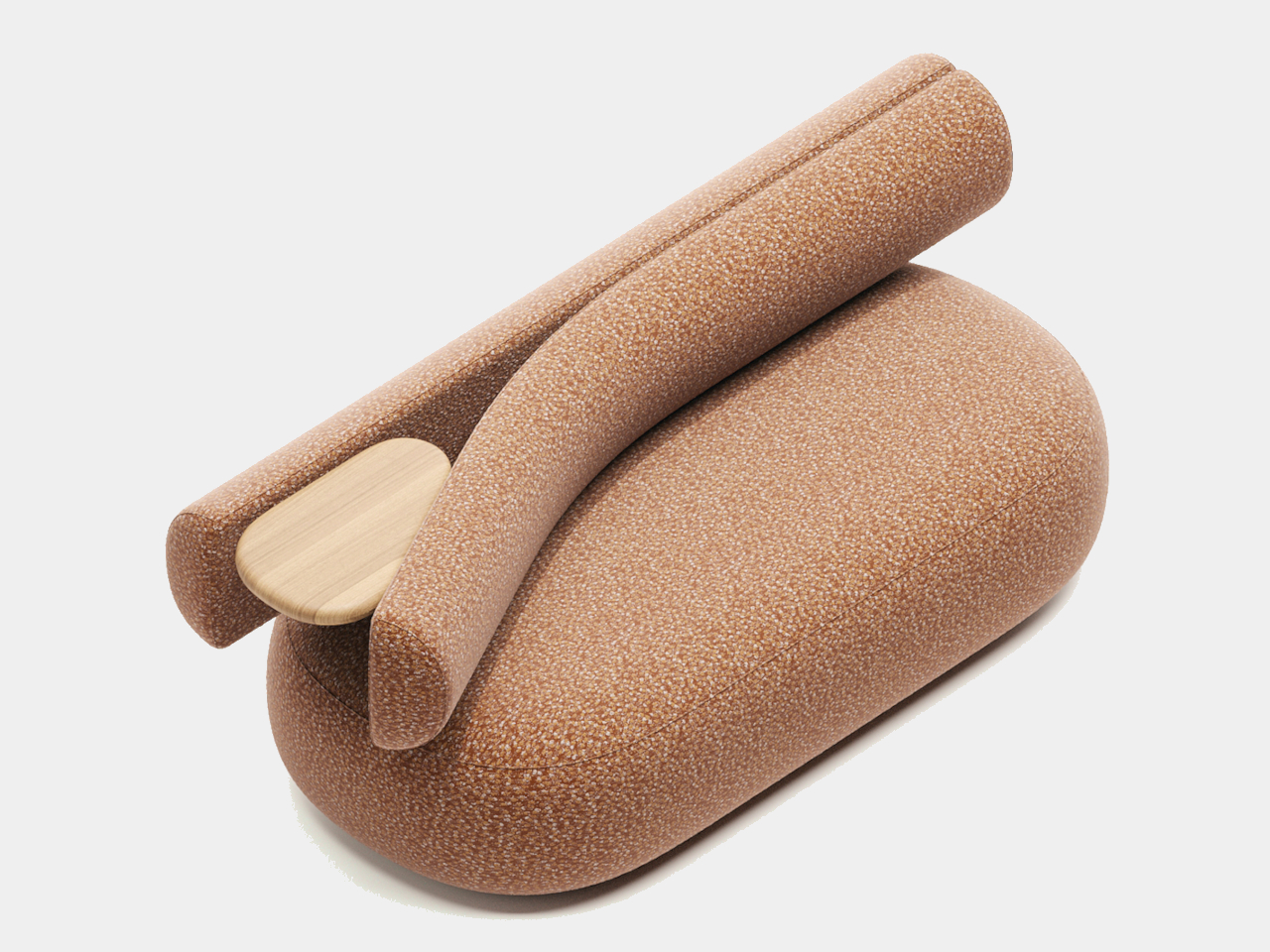
That’s exactly what this concept couch dares to do. From a distance, it might look like the perfect spot to flop down with a book or cup of tea. But then you spot it: a small wooden side table, seemingly wedged right through the plush backrest like an object that’s gotten stuck mid-motion. The arrangement is both amusing and a bit unsettling, tempting you to investigate further.

Designer: Dmitry Kozinenko

Most loungers need a spot to set down a drink, snack, or phone, which is why tables, big or small, often accompany couches. The twist here is that the table isn’t next to the sofa; it’s awkwardly inserted into the backrest, splitting the cylindrical cushion like a zipper caught halfway. There’s no denying it’s practical, but the positioning also disrupts the usual flow of the furniture.

This strange placement tugs at something buried deep in our brains. Humans are wired to want things completed or at rest, and when that doesn’t happen, it creates a low-key tension that’s hard to ignore. The Stuck collection concept plays on that mental itch, drawing the eye and keeping your curiosity buzzing. You half-expect the side table to keep sliding, or to snap back where it came from.

Rather than blend seamlessly with the couch, the table feels like it’s intruding, as if the piece were caught in the middle of transforming or breaking apart. The combination of soft fabric and hard wood, of steady seat and seemingly stuck side table, creates a delightful contrast that keeps you thinking long after you’ve walked away.

Furniture designers looking for inspiration might find the Stuck concept both playful and provocative. It’s a reminder that a dash of awkwardness can transform a familiar form into a statement piece. By introducing a visual puzzle, this couch-and-table duo promises to spark conversation and maybe even a little bit of healthy debate wherever it lands.

The post Curious Couch Concept Sparks Conversation with Awkward Side Table Design first appeared on Yanko Design.

Turntable concept can also serve as Bluetooth speaker and aesthetic table

Par : Ida Torres
2 mai 2025 à 16:20

Most people who move into their own spaces, whether they got married or they got their own apartment or house, would prefer to have furniture and appliances that are both functional and aesthetic. Also, the idea of multi-purpose living devices is gaining significant traction especially for those who live in smaller spaces or who are working on a limited budget. There are a lot of product designers who are taking these into consideration and have come up with concepts that can be pretty useful when they become actual products.

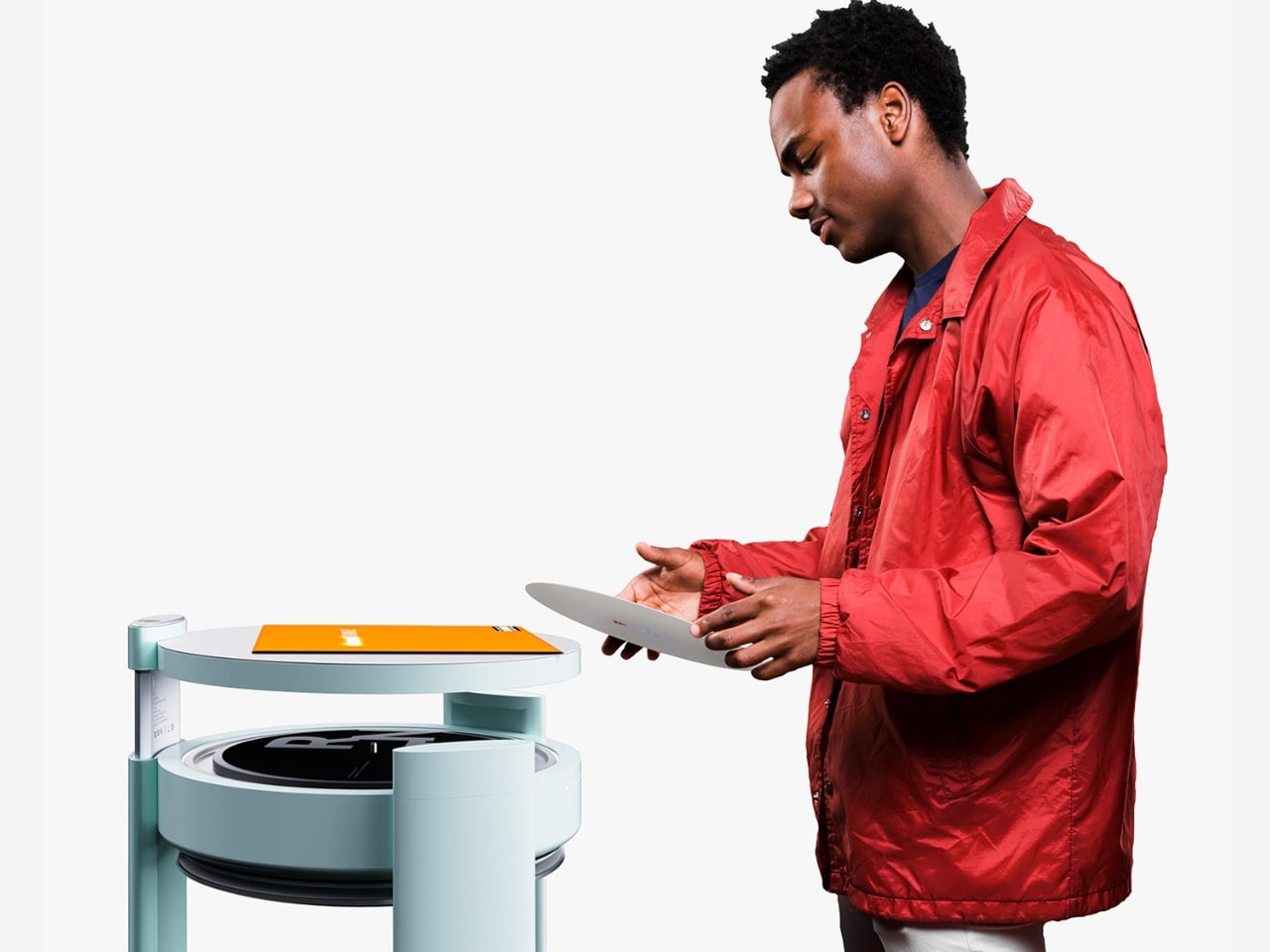
RNT is a living table concept that seamlessly integrates a turntable, a high-quality speaker, and a stylish table into a single, elegant piece of furniture. This innovative concept was designed to transform how we interact with music and our living spaces. Its core functionality revolves around its built-in turntable, allowing users to indulge in the warm, rich sound of vinyl records. The turntable, cleverly integrated into the tabletop, offers a nostalgic yet contemporary way to enjoy music. Beyond its analog capabilities, RNT also embraces modern technology with Bluetooth connectivity, instantly transforming into a wireless speaker for streaming digital music from various devices.

Designer: Minseok Bae

The user experience is thoughtfully considered with a dedicated remote control. This pebble-shaped device, featuring wireless charging for ultimate convenience, provides intuitive control over power, volume, and the turntable’s functions. Its elegant design ensures it sits comfortably in the hand and even has a designated spot on the table’s base, blending functionality with a touch of sculptural beauty.

One of the most distinctive features of RNT is the unique integration of the tonearm and the top shell. Unlike traditional turntables with independently operating tonearms, RNT’s design merges these elements into a single, fluid structure. Opening the top shell gently lifts the tonearm, ready to play an LP, while closing it initiates the music. This innovative approach offers an intuitive and almost ritualistic experience, elevating the act of listening to vinyl.

Beyond its impressive audio capabilities, this concept is also designed with aesthetics in mind. The project’s intention was to transform functional objects into sensorial, furniture-like pieces. The result is a minimalist silhouette built around linear elements, allowing RNT to blend effortlessly into a variety of interior styles. The chosen color palette, featuring a soft celadon green for the main body, adds a touch of calm and sophistication to the space. The careful balance of color tones contributes to a smooth and refined visual impression, ensuring RNT feels like a natural addition to any room.

Positioned as more than just furniture, RNT aspires to be a “living device” that tunes the rhythm and atmosphere of daily life. Its design encourages shared listening experiences in group settings, as the speaker, discreetly housed beneath the table, delivers sound throughout the space. This makes RNT an ideal centerpiece for living rooms or lounges, fostering a communal appreciation for music.

RNT as a concept represents a fresh perspective on how technology and furniture can harmoniously coexist. By seamlessly integrating a turntable, speaker, and table into a beautifully designed unit, it offers an efficient, intuitive, and aesthetically pleasing solution for modern living spaces. It’s a testament to the idea that functional objects can possess both presence and the ability to subtly shape the spaces they inhabit, enriching our lives with both sound and style. Hopefully, someone will be able to manufacture it eventually to see if it can be just as good in the real world as on paper.

The post Turntable concept can also serve as Bluetooth speaker and aesthetic table first appeared on Yanko Design.

QK Alice Duo Split Ergonomic Keyboard Kit Offers Custom Comfort and Style

Par : JC Torres
2 mai 2025 à 15:20

Mechanical keyboard fans know the thrill of discovering truly unique designs, and the Qwertykeys QK Alice Duo is grabbing attention for all the right reasons. This split ergonomic kit is a breath of fresh air for anyone looking to boost comfort and show off a little personality at their desk. Whether you’re a keyboard modder or a die-hard desk setup enthusiast, this one’s bound to spark your curiosity.

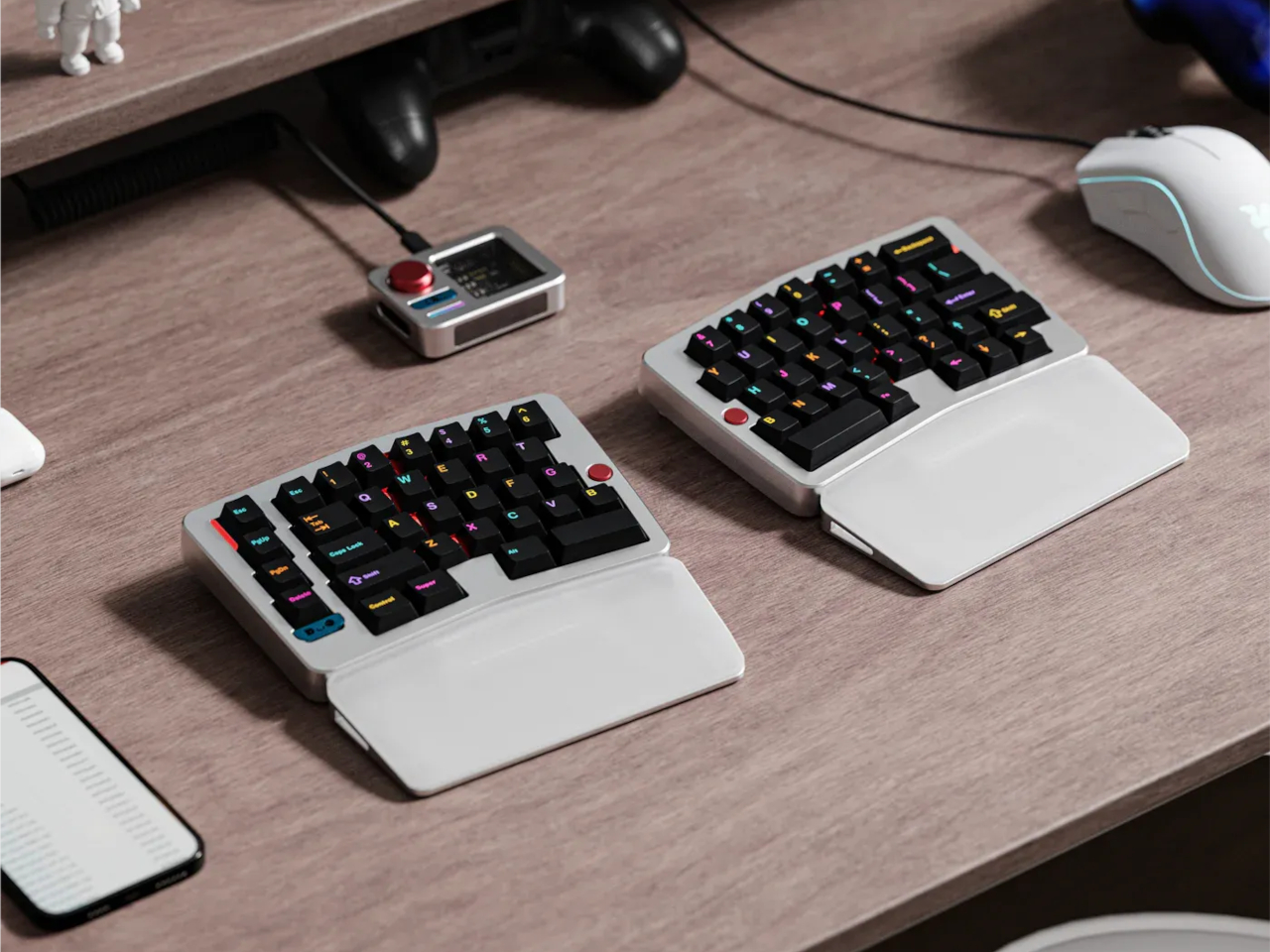
The QK Alice Duo doesn’t just look different; it feels different too. Thanks to its split Alice layout and clever design features, you get complete control over your typing posture. Each half of the board can be independently tilted using a custom dual hinge, letting you dial in either a flat 0° tenting angle for high-paced gaming or a gentle 5° tent for long typing sessions that keep your wrists happy.

Designer: Qwertykeys

1

Wireless performance is another highlight. The included wireless pod isn’t just a practical receiver but a desk accessory with style as well. It provides robust signal processing, keeping your connection strong while displaying battery status, connection mode, and OS compatibility at a glance. The pod also doubles as a stylish accent, making your workspace look even sharper.

Qwertykeys has packed in thoughtful features to make setup and use a breeze. The magnetic charging cable helps keep damage at bay, so you don’t have to worry about rough connections. Despite a compact 3600mAh battery, you can rely on the Alice Duo for about three weeks of wireless use per charge—plenty for everyday work and play.

Customization is at the heart of this kit. It’s available in ten stunning colorways, each with contrasting accents to make your build stand out. The hollowed-back design keeps things lightweight, and a stainless steel weight clicks magnetically into place for that satisfying heft. Adjustable wrist rests are available and match both flat and tented setups, crafted from CNC-machined acrylic and aluminum for an extra dash of quality.

The QK Alice Duo kit comes without switches and keycaps, putting the final touches in your hands. You can mix and match your favorite components for a typing feel and look that’s all your own. Add-on knobs, extra buttons, and badges mean no two Alice Duo setups will ever be quite the same. At $289, it’s a tempting option for serious customizers, though picking your own switches and keycaps means the total cost can climb. For keyboard lovers who want both performance and artistry, the Alice Duo is ready to impress.

The post QK Alice Duo Split Ergonomic Keyboard Kit Offers Custom Comfort and Style first appeared on Yanko Design.

Rocket-inspired 3D Printed Plant Pot Launches Playful Style for Indoor Gardens

Par : JC Torres
2 mai 2025 à 14:20

If you’ve dived into indoor gardening recently, you’re probably no stranger to the endless parade of pots and planters on the market. From starkly minimalist ceramics to high-tech self-watering planters, there’s no shortage of options for every plant lover. Still, so many of these designs play it safe, focusing on pure function or understated looks. Sometimes, your green space just needs a little extra lift-off.

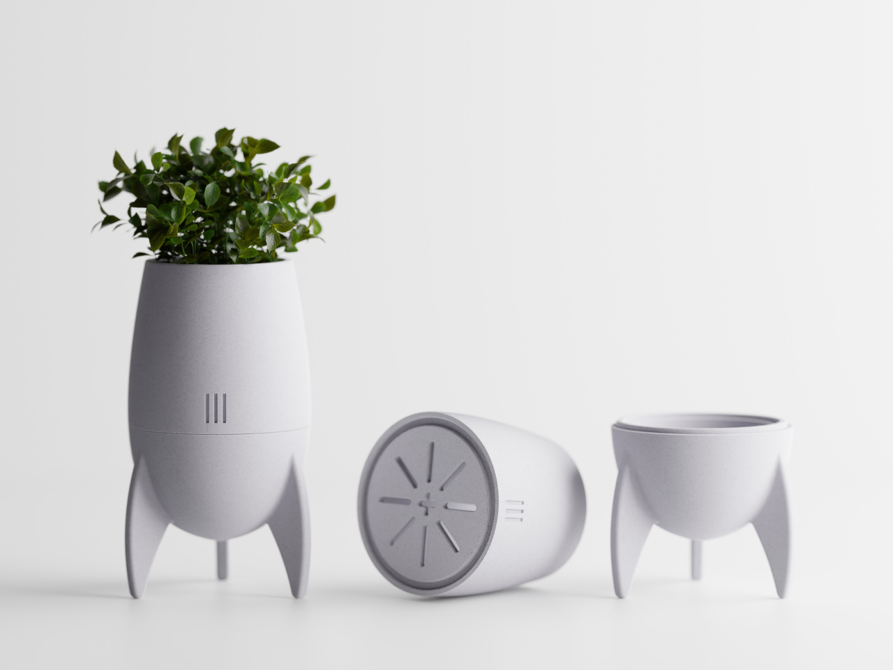
That’s where the RocketPot comes in, ready to propel your plant collection to new heights, literally and figuratively. This rocket-inspired plant pot is all about personality, standing out with a retro-futuristic design that looks straight out of a sci-fi adventure. With RocketPot, your favorite succulent graduates from being a houseplant into a brave explorer, charting new territory from your windowsill or desk.

Designer: HpInvent

The pot’s playful design starts with its three-legged base, giving the whole piece a stable yet dynamic, ready-for-launch stance. The “capsule” top sits right above the “engine” module, so watering, cleaning, and repotting are easier than ever. This two-part construction means you can care for your plants without fuss or mess, and the removable design adds to the fun of assembling your own tiny rocket.

RocketPot doesn’t skimp on the details, either. Look closely and you’ll spot vent-like grooves and sleek, fin-shaped legs—clear nods to classic sci-fi rockets from your favorite movies or cartoons. These touches turn the planter into a little work of art, perfect for anyone who wants their decor to tell a playful story.

Of course, it’s not all about looks. The base includes a well-designed drainage tray, featuring a starburst pattern that keeps roots healthy and your shelves dry. Whether you’re nurturing herbs, succulents, or small leafy plants, RocketPot is available in several sizes to suit any greenery you want to launch into your indoor universe.

For plant fans with a love of space, design, or just a good sense of humor, RocketPot lets you show off your love for growing things in the most imaginative way. It transforms the humble plant pot into a little mission to spark joy, creativity, and maybe even a few conversations whenever friends come over. With RocketPot, your indoor garden can finally reach for the stars, figuratively only, of course.

The post Rocket-inspired 3D Printed Plant Pot Launches Playful Style for Indoor Gardens first appeared on Yanko Design.

Converse Japan brings balletcore to All Star sneakers

Par : Ida Torres
2 mai 2025 à 13:20

Balletcore is one of those fashion and aesthetic trends from the past few years that has taken over social media and in real life. We’ve seen a lot of apparel and shoe brands get into this by releasing products that the faux ballerinas (and maybe even real ballerinas?) want to sport while walking around schools, malls, and the streets. Converse Japan is the latest to join this trend with their take on the ballet sneaker but this time with a thicker and “tougher” look.

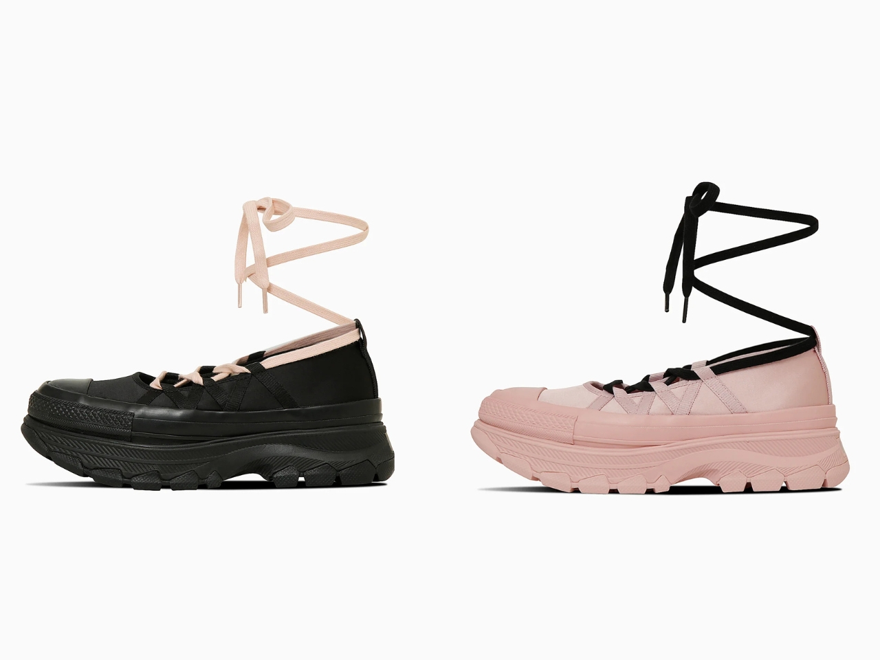
The All-Star Trekwave BL OX reimagines the classic Converse silhouette with a distinctly balletcore influence, particularly evident in its innovative lacing system. Departing from the conventional flat laces that thread through eyelets, this version features luxurious satin ribbons. These ribbons offer a customizable and visually striking alternative, allowing wearers to wrap them gracefully around their ankles and even up their legs, mimicking the look of traditional ballet shoe ties. This elegant detail stands in deliberate contrast to the shoe’s robust foundation: the signature stacked and chunky sole that has become a hallmark of Converse’s recent Trekwave line.

Designer: Converse Japan

This juxtaposition of delicate, flowing ribbons against the sturdy, grounded sole creates a unique and eye-catching aesthetic, perfectly embodying the balletcore trend’s blend of grace and street style. The chunky platform sole together with the ribbon tie-ups gives users a rugged yet fashionable look, with some of the versions offering mud and water resistance. The Ortholite cushioning makes sure that you still stay comfortable the whole day even with the elevated sole that comes with it. And if you feel like sticking with the traditional shoelaces, there is that version available. The pale rose colorway comes with black cotton shoelaces while the black variant has pale rose cotton shoelaces.

The marketing for this newest release features Japanese dancer and model, Aoi Yamada, gracefully showcasing the “Pale Rose” pair alongside a tutu. This unexpected pairing highlights the versatile nature of the chunky silhouette, proving it can transcend traditional streetwear boundaries. It also adds a sort of legitimacy to the balletcore aesethetic that an actual dancer is seen sporting these sneakers.

So, whether you’re channeling your inner ballerina or simply seeking a stylish and comfortable sneaker with a unique twist, the Converse All-Star Trekwave BL OX in its balletcore guise offers a compelling option. The fusion of rugged platform and delicate ribbon ties creates a striking visual, while the comfort features ensure it’s not just about looks. Keep an eye out for these distinctive kicks, and perhaps consider pairing them with your own spin on the ballet-inspired trend – tutus optional, but a sense of playful style is definitely encouraged.

The post Converse Japan brings balletcore to All Star sneakers first appeared on Yanko Design.

5 Best LEGO Creations We Loved In April 2025

2 mai 2025 à 11:40

April 2025 was a month of creativity and nostalgia for LEGO fans, with designs and fan creations that pushed the boundaries of what bricks can do. From pop culture icons to contemporary art, and legendary movie scenes to the ever-expanding universes of sci-fi and gaming, LEGO offered something to spark joy and awe in builders of all ages.

This month, we saw the brick become a window into office satire, urban art, epic adventures, and galaxies far, far away. We have curated a collection of our top five LEGO designs from April 2025, each selected for their inventiveness, craftsmanship, and sheer fun factor. You can build for nostalgia, artistry, challenge, or pure fun – these designs prove that the possibilities with LEGO are as limitless as your imagination.

1. LEGO Severance MDR Office Set

The Severance Macrodata Refinement Office LEGO set is based on the distinctive workplace from the television series “Severance.” This build features a detailed recreation of the Macrodata Refinement (MDR) office, including rows of identical cubicles, a break room designed for employee gatherings, a functional bathroom, and a supply closet. The color scheme is accurate to the show, with sterile green carpets and white walls. The open floor plan is designed to evoke the expansive yet claustrophobic feeling of the series.

The set comes with minifigures representing the main characters: Mark S., Helly R., Irving B., Dylan G., Milchick, and Ms. Cobel. Each minifigure captures specific elements of the characters’ personalities and visual appearance. The inclusion of Kier’s portrait and other atmospheric details enhances the authenticity. The set provides fans with a unique way to relive moments from the show.

2. LEGO Art Set 31216

LEGO’s Keith Haring Dancing Figures Art Set, number 31216, brings the energy and vibrancy of Keith Haring’s famous artwork into brick form. The set contains 1,773 LEGO pieces and allows builders to recreate three distinct versions of Haring’s signature dancing figures. The design cleverly uses a variety of brick types and layering techniques to give the figures a sense of movement, standing out from the background with depth and dimension.

The bold black outlines and bright colors are faithful to Haring’s iconic style. As part of LEGO’s Art series, the set is intended for display, offering collectors and art enthusiasts an engaging building experience and a striking finished piece. Builders can personalize their arrangement by choosing different variations, making the set versatile for different tastes.

3. LEGO Star Wars Day Ultimate Collector Series

For Star Wars Day on 4th May 2025, LEGO has released the Ultimate Collector Series Jango Fett’s Firespray-Class Starship, among several new sets. The starship set includes 2,970 pieces and is the first dedicated, highly detailed model of Jango Fett’s ship in over twenty years. Features include a movable entrance, a detailed cockpit, an opening landing ramp, and a bomb hatch.

The set comes with minifigures of Jango Fett and young Boba Fett and can be displayed on a stand or in flight, or in landing mode. Additional sets released include BrickHeadz figures, an Andor season 2 set, and a series for the 20th anniversary of Revenge of the Sith. The Firespray-Class Starship set was accompanied by exclusive bonuses for direct buyers, such as a commemorative keychain, three Clone cadet minifigures, a patrol vehicle, and weapon racks.

4. LEGO Pokémon Universe

Brickmill’s LEGO Pokémon Universe is an extensive, fan-created collection that brings the world of Pokémon to life using LEGO bricks. Nearly every major Pokémon, including starters like Pikachu, Bulbasaur, Charmander, and Squirtle, is represented, alongside larger and legendary creatures such as Snorlax, Lapras, and Mewtwo. These models are built to scale, so smaller Pokémon appear smaller next to their larger counterparts.

Each figure is carefully crafted, with signature details like Bulbasaur’s bulb, Charmander’s flame-tipped tail, and Blastoise’s water cannons. The collection also includes evolved forms, such as Venusaur’s large flower and Charizard’s wings. Fans can build these models themselves, as Brickmill provides instructions for many of the Pokémon.

5. LEGO Mission: Impossible Vault Descent Set

The Mission: Impossible Vault Descent LEGO set is a fan submission that recreates the well-known CIA vault scene from the original 1996 “Mission: Impossible” film. The build features a white, high-security vault, a ventilation shaft, and computer terminals, all designed to closely match the look of the movie. The floor is rendered to showcase its ultra-sensitive nature, which is a key element in the film sequence.

The centerpiece of the set is a minifigure of Ethan Hunt, suspended by a harness and cable, capturing the precise moment he is lowered into the vault. The set’s details are designed to evoke the tension and complexity of the cinematic scene. The diorama is compact, making it suitable for display, and is appreciated by fans for its accuracy and tribute to one of the most memorable moments in action film history.

The post 5 Best LEGO Creations We Loved In April 2025 first appeared on Yanko Design.

Vase concept design reimagines the vessel as a four-chambered heart

Par : Ida Torres
2 mai 2025 à 10:07

I’m not much of a flower person in a sense that it’s not a priority in my house as decoration. So I don’t really have vases handy in case someone gives me flowers or if I randomly decide to buy some for myself. And even if I did have vases, it would be more for functional purposes and not really as part of my space’s aesthetics. But if you’re the type of person that’s very particular about this accessory, there are a lot of options out there if you’re looking for pretty, decorative, and sometimes, even weird and extraordinary flower vessels.

One option, although it’s still currently a concept, is the Alaska Object 3 – Heart Vase. The designer’s goal isn’t really to just reshape a classic object that can be seen in our daily lives (well, if you’re into flowers and such). The idea is to reimagine its essence and the result is something that doesn’t really look like a vase but retains its main function and enhances what it can do for your flowers. Inspired by the human heart, not as a literal shape but as a conceptual foundation, the Heart Vase draws on the heart’s defining characteristic: its four chambers. This vase is designed as four distinct, interlocking parts. Each can stand alone, holding its own small bouquet, or they can be combined into a larger sculptural piece, bringing multiple flower arrangements together into one unified, striking display.

Designer: Maria Olhovnikova

What makes the Heart Vase stand out isn’t just its modularity, but its visual language. There’s a clear brutalist influence at play: bold, raw, and architectural. The slits in the design aren’t just decorative; they act as functional channels for the flower stems, emphasizing both form and purpose. By bridging emotional symbolism (the heart) with material honesty and industrial aesthetics, the Alaska Object 3 – Heart Vase invites us to see a common object through a fresh, thoughtful lens. It challenges us to consider how the familiar can be reassembled, reinterpreted, and made new. The renders show something that’s more of a pot than a vase with its rectangular shape and unique way of letting you arrange the flowers, leaves, and stems.

This unconventional approach to floral display might just be the conversation starter your space needs, even if you’re not typically drawn to elaborate decorations. It subtly nods to the art of flower arrangement, not by dictating a specific form, but by offering a unique framework for personal creativity and expression. The Heart Vase suggests that even the most utilitarian of objects can be infused with conceptual depth and a touch of unexpected beauty.

The post Vase concept design reimagines the vessel as a four-chambered heart first appeared on Yanko Design.

Rupi Magnetic Wireless Table Lamp Concept Shines with Playful Flexibility

Par : JC Torres
2 mai 2025 à 08:45

Every lamp enthusiast knows the limits of traditional lighting: no matter how bendable an arm might be, the lamp usually ends up stuck in the same handful of angles. Even with creative designs, it’s tough to escape the static feeling of a fixed base and a predictable pool of light. Imagine, though, a small table lamp you could pop onto any spot you wanted—no wires, no hassle, just lighting exactly where you need it.

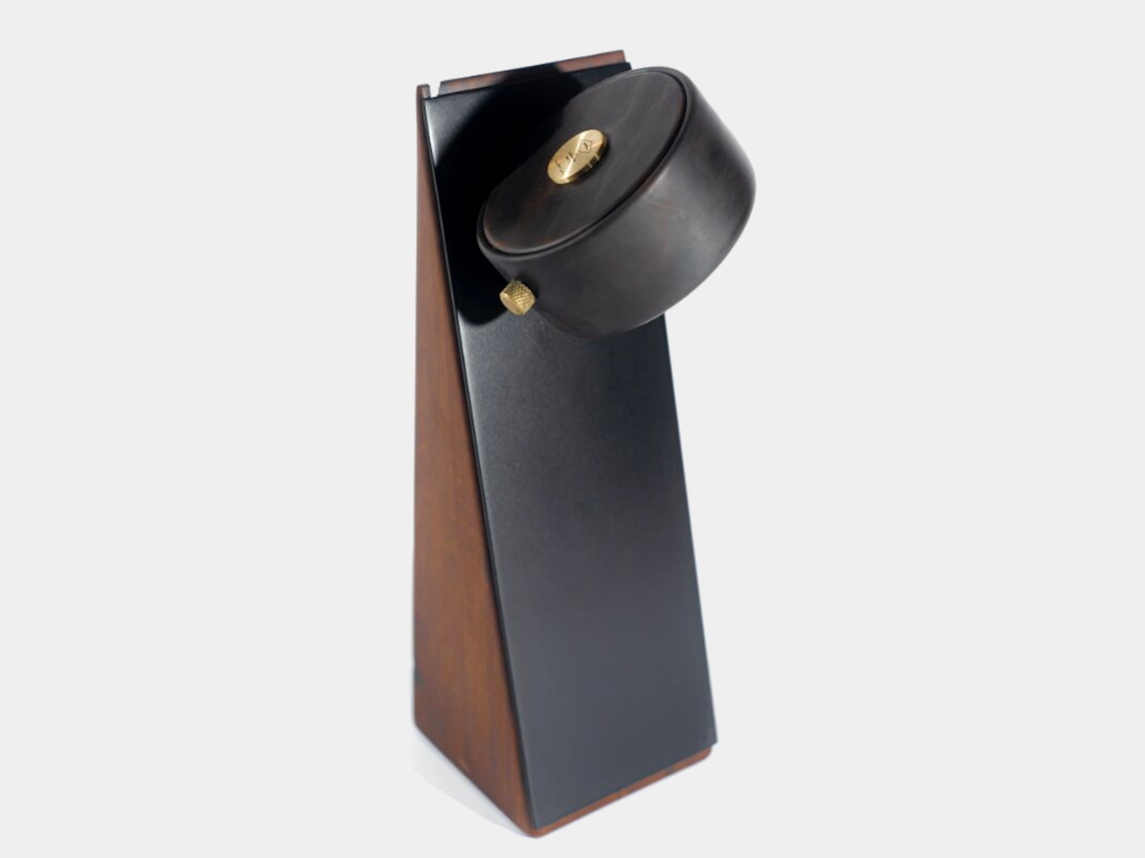
That’s the spark behind the Rupi magnetic wireless table lamp concept. As a playful twist on the standard table lamp, Rupi’s glowing disc can be positioned anywhere on its matching metal plate. The secret is a hidden magnet that lets users snap and slide the lamp about, instantly creating new moods and lighting effects. It’s a liberating approach for those who love experimenting with ambiance at the drop of a hat.

Designer: Dimitrih Correa

A closer look at Rupi reveals the charm of its materials. The lamp body is crafted from reclaimed noble hardwoods, like warm Cabreúva vermelha and striking Peroba Rosa. Their rich, organic textures stand out beautifully against the minimalist, matte-black metal plate, an inviting blend of nature and modern design that’s perfect for lamp devotees seeking something different and personal on their desk or nightstand.

The inspiration for Rupi comes from the Curupira legend, a forest spirit from folklore known for his backward feet and tricky ways. Just as Curupira confuses hunters in the woods, Rupi disrupts the typical expectations of how a lamp should behave. This playful nod to myth is subtle yet brings a sense of wonder and storytelling to the object, making it more than just a source of light.

Another aspect of its flexibility is the freedom to take it anywhere around the house or on your desk. Rupi boasts an internal rechargeable battery that lets it glow for up to fourteen hours without needing a recharge, so you can move it around or set the mood all evening long. And when it’s time to power up again, a full charge takes just one hour—perfect for busy designers who want convenience as much as creativity.

Finally, a built-in dimmer lets you fine-tune the brightness to suit any activity, from gentle evening reading to focused work sessions. The dimmer comes in the form of a knurled knob that adds a tactile flourish to the design. Altogether, Rupi’s modular magnetism, warm wood, and clever nod to folklore set it apart as a table lamp concept ready to spark conversation and new ideas among lamp designers and fans alike.

The post Rupi Magnetic Wireless Table Lamp Concept Shines with Playful Flexibility first appeared on Yanko Design.

TORRAS Ostand Case Adds a Magnetic Twist Apple Didn’t Think Of

Par : Sarang Sheth
2 mai 2025 à 01:45

A good case protects your phone, a better case protects your phone without compromise, and a great case gives it extra features. I’ve seen phone cases that get away with doing the bare minimum. The TORRAS Ostand OFitness case isn’t one of those accessories. Aside from protecting your iPhone against impact, making it feel more ergonomic with rounded edges, retaining its MagSafe and wireless charging abilities, as well as enabling its Camera Control feature, the Ostand OFitness also packs a slim, popout ring that rotates a full 360° to let you prop your phone up without needing an external stand.

We saw the Ostand OFitness and the Ostand OAir at TORRAS’ booth at CES 2025, and the thing with any good company is that it iterates on its best-selling product – the Ostand range. The new Ostand OFitness is more durable and more ergonomic than before – but there’s more. The stand also allows your iPhone to wirelessly charge 30% faster than previous versions, and the MagSafe gets a boost thanks to hidden magnets that reinforce the feature for better accessory attachment. The Ostand OAir has the same features too, except with enhanced AirMax cushioning around the corners that feel like a puffer jacket for your phone. Neat, no?

Designer: TORRAS

Click Here to Buy Ostand OFitness: $36.54 $42.99 (15% off, use coupon code “YDFITNESS15”). Hurry, deal ends in 48-hours!
Click Here to Buy Ostand OAir: $55.24 $64.99 (15% off, use coupon code “YDFITNESS15”). Hurry, deal ends in 48-hours!

Make a product good enough and chances are it’ll get ripped off almost immediately. However, I’m yet to see a ripoff of the Ostand series of cases from TORRAS. The reason being (and I saw this first-hand in 2024), they’re over-engineered to the point of being impossible to replicate without pouring millions into R&D. That O-shaped stand (which is where the series gets its name from), is a technical marvel, with space-grade metallic components small enough for the eye to barely see, magnets so slim they’re almost paper thin – but also incredibly powerful, and a hinge that’s ridiculously sleek, bringing laptop-hinge-level friction into something that’s just a couple millimeters thick.

The Ostand OFitness builds on that stellar R&D with a case that’s somehow even better than before. It comes in five pastel shades that are equal parts subtle yet eye-catching, with a frosted transparent plastic back that’s fingerprint and smudge-proof, and a TPU bumper with built-in Airstrip Airbags that provide extra protection to your phone from drops and bumps. Meanwhile, the outside of the bumper is lined with textural dots that enhance your grip, giving those airbags a run for their money because you’ll probably never accidentally drop your phone. Meanwhile, the camera bump gets its own 1.5mm protective lip to absorb any impact so your phone’s precious lens system remains unscathed.

The star of the show, however, is that O-shaped ring that sits absolutely flush into the case-back. It isn’t like those snap-on rings or pop-sockets that protrude from the back of your phone, absolutely ruining the aesthetic. You barely know it’s there when it’s shut, but tuck your finger into the slight divet, and you can prop open the ring, which can then be used as a grip or a stand. The ring’s hinge is fairly stiff, so it holds its angle like the friction-hinge seen on laptops. This means you can prop your phone up at any angle, going from a mere 20° all the way up to 60°. The ring also rotates on its hub like a hubless wheel (thanks to that incredibly engineered design), allowing you to prop your phone in landscape or portrait.

Built into the ring are a series of magnets that allow the ring to snap shut securely, but they also serve to ‘boost’ your phone’s MagSafe powers. Most cases can sometimes interfere with your iPhone’s MagSafe magnetic array, but with the right boost, the Ostand OFitness actually ‘increases’ the MagSafe power, allowing accessories to snap on way more securely. Meanwhile, all the buttons remain accessible through individual button bumps, although the Camera Control area gets a cutout, allowing your finger to intuitively sit in the groove and control the camera features using the phone’s capacitive touch surface.

Meanwhile, the Ostand OAir has a slightly more unique design thanks to those exaggerated bumpers on the top and bottom, providing an extra layer of edge-protection along with the same features as the Ostand OFitness. Sometimes a case is more than just a protective cover and functional tool for people, it’s also a style statement – that’s where the Ostand OAir comes in, quite literally making your phone look like it’s wearing a classy puffer jacket!

That said, the cases aren’t for a specific demographic. They’re quite literally for everybody because they enhance the iPhone’s usability. The O-ring can be used for functionality or fidget, making it perfect for content creators, consumers, or anyone in between. And hey, don’t worry about these cases turning yellow with time – TORRAS stands behind its cases and has been doing so for the past 16 years. If they can engineer a magnetic ring with a 360° swiveling design, they can ensure their products don’t yellow or patina with time!

Click Here to Buy Ostand OFitness: $36.54 $42.99 (15% off, use coupon code “YDFITNESS15”). Hurry, deal ends in 48-hours!
Click Here to Buy Ostand OAir: $55.24 $64.99 (15% off, use coupon code “YDFITNESS15”). Hurry, deal ends in 48-hours!

The post TORRAS Ostand Case Adds a Magnetic Twist Apple Didn’t Think Of first appeared on Yanko Design.

EcoFlow GLACIER Classic Portable Refrigerator Review: Getting the Basics Right

Par : JC Torres
26 avril 2025 à 01:45

PROS:


  • Compact design with bigger storage capacity

  • Removable battery for extended outdoor use

  • Removable divider for flexible setup between freezer and refrigerator

  • Multiple charging options, including purely solar energy

CONS:


  • Simple ice cooler appearance might not appeal to everyone

  • No wheel add-on for easier transportation

RATINGS:

AESTHETICS
ERGONOMICS
PERFORMANCE
SUSTAINABILITY / REPAIRABILITY
VALUE FOR MONEY

EDITOR'S QUOTE:

The EcoFlow GLACIER Classic focuses on perfecting the basics to deliver an efficient portable refrigerator that isn't weighed down by unnecessary features.
award-icon

Embarking on outdoor adventures often means leaving behind the comforts of home, particularly when it comes to keeping food and drinks fresh. Whether you’re camping in remote locations, road-tripping across the country, or simply enjoying a day at the beach, the challenge of maintaining a reliable cold chain for perishables can quickly turn an exciting expedition into a frustrating experience. Traditional coolers with ice packs might work for a day, but they create a soggy mess and require constant replenishment, making them impractical for extended trips.

The EcoFlow GLACIER Classic Portable Refrigerator aims to solve these common outdoor food storage problems with a practical approach to portable refrigeration. Unlike its predecessor, which featured an integrated ice maker, the GLACIER Classic focuses on maximizing storage space while maintaining impressive cooling performance. Available in three sizes (35L, 45L, and 55L), this portable refrigerator promises to keep your provisions perfectly chilled without requiring constant attention or maintenance. But does this streamlined approach deliver the performance that outdoor enthusiasts need? Let’s dive into the details to find out if this cooling companion deserves a spot in your adventure gear.

Designer: EcoFlow

Click Here to Buy Now: $799 $1199 (Early Bird $100 + $300 extra coupon = $400 off). Hurry, deal ends in 48-hours!

Aesthetics

The EcoFlow GLACIER Classic doesn’t try to win any beauty contests with its straightforward design philosophy that prioritizes function over flashy aesthetics. At first glance, it resembles an oversized cooler with a clean, minimalist exterior that won’t turn heads but won’t embarrass you either. The understated appearance belies the thoughtful engineering underneath, offering practical features that matter to users while eliminating unnecessary frills that would only add to the cost and complexity without providing tangible benefits to the outdoor experience.

What the GLACIER Classic lacks in visual excitement, it makes up for with impressive space efficiency, packing substantial storage capacity into a surprisingly compact footprint. The refrigerator is approximately 40% smaller than comparable models on the market, yet it can accommodate an impressive amount of provisions: the largest 55L model can hold up to 90 standard beverage cans. You don’t even have to repack those 8-pack soda can bundles to fit them inside, making the packing process less of a chore.

Part of the GLACIER Classic’s diet trick is removing unnecessary features. Unlike the original GLACIER model, this Classic version omits the built-in ice maker, a convenience that sounded good on paper but was not used that much in outdoor scenarios after all. Removing it not only significantly increased the interior space but also reduced the overall bulk and weight of the product. It doesn’t hurt that it also helped reduce the price tag, too!

The color scheme sticks to the typical EcoFlow black and silver that won’t show dirt and grime accumulated during outdoor use, a thoughtful choice that outdoor enthusiasts will appreciate after a few dusty trips. The control panel features an intuitive layout with clearly marked buttons and indicators that remain visible even in bright sunlight, allowing for quick temperature adjustments without requiring users to consult the manual repeatedly. All in all, the EcoFlow GLACIER Classic’s simple appearance belies the power it hides, giving credence to the advice not to judge a book by its cover.

Ergonomics

Car Camping

RV Camping

Despite its reduced size, at least compared to other portable refrigerators of the same capacity, the EcoFlow GLACIER Classic is clearly still a heavy unit. Unlike its predecessor, there are no detachable wheels and levers to help you roll the portable refrigerator around. Instead, the design optimizes for the most common use case: keeping the box in the car trunk, whether in transportation or in use.

The GLACIER Classic features thoughtfully designed foldable handles that extend wide for comfortable carrying but tuck away neatly against the body. This clever design element ensures nothing protrudes from the sides when the refrigerator is packed into tight spaces like vehicle trunks or storage compartments, maximizing the efficient use of limited space during transport while still providing ergonomic carrying options when you need to move the unit from your vehicle to your campsite or outdoor gathering spot.

One of the smartest and most practical features is the dual-direction lid that can be opened from either of the long sides, providing flexible access regardless of how the refrigerator is positioned in your vehicle or at your campsite. This seemingly simple design choice eliminates the frustration of having to reposition the entire unit when access is blocked on one side, a common problem with traditional coolers and refrigerators that have single-direction openings.

The EcoFlow mobile app adds another layer of convenience, allowing users to monitor and adjust temperature settings remotely without standing beside the refrigerator all the time. Mirroring its design choices, EcoFlow listened to customer feedback to focus on the essentials and shed off any unnecessary features that burden the users or their pockets.

Performance

The EcoFlow GLACIER Classic comes equipped with a removable 298Wh battery that delivers an impressive runtime of up to 43 hours for the 35L model and approximately 39 hours for the larger 45L and 55L versions. This substantial battery capacity means you can maintain proper food storage temperatures throughout a weekend camping trip without needing to recharge, providing peace of mind when venturing into areas without reliable power sources. The temperature range is equally impressive, spanning from -20°C to 60°C (-4°F to 140°F), keeping drinks cool and ingredients frozen until you’re ready to cook them.

The removable divider system deserves special mention for its clever multifunctionality. Beyond organizing the interior space, it creates configurable temperature zones with up to 4.2°C (39.6°F) difference between compartments, allowing users to store different types of food at their optimal temperatures simultaneously. This means you can configure the unit as a refrigerator, freezer, or combination of both, depending on their specific needs for each adventure and eliminating the need for separate cooling solutions for different types of provisions. The divider even doubles as a cutting board, saving precious packing space by combining two essential camping tools into one multifunctional component that enhances the overall utility of the refrigerator during outdoor meal preparation.

The versatility of the GLACIER Classic extends to its charging capabilities, with multiple options to keep the unit powered in virtually any situation. Users can charge via standard AC outlets, car chargers, compatible solar panels (11-30V input, up to 110W), specialized EcoFlow alternator chargers, or even through the 100W USB-C port. For maximum charging speed, combining the USB-C and XT60 alternator connections can deliver up to 200W of charging power, replenishing the battery in just 1.5 hours.

Beyond its primary cooling function, the unit doubles as an emergency power bank through its 100W USB-C output port, capable of charging laptops, phones, and other devices when traditional power sources are unavailable during extended outdoor excursions. It definitely won’t stand up to EcoFlow’s dedicated solar power stations, especially since it’s also using its power to run the refrigerator, but it’s a nice convenience when you’re out of charging ports to use. That said, it would have been nice if there were two of these, even if it means halving the output when both are in use.

The companion app provides detailed insights into power consumption patterns, allowing users to optimize settings for their specific usage scenarios and remaining battery capacity. The app also gives users a heads-up not only when the battery is low but also when temperatures deviate by 5°C from the set level for over 10 minutes, ensuring that you can take action to keep your food and drinks safe.

Sustainability

The GLACIER Classic demonstrates EcoFlow’s commitment to sustainable design through its user-replaceable battery system, which significantly extends the product’s useful lifespan. Rather than discarding the entire unit or going through an expensive process when the battery eventually degrades, users can simply replace the battery module, reducing electronic waste and maximizing the long-term value of their investment. This approach not only benefits the environment but also provides practical advantages for users who can carry spare batteries for extended trips, swapping depleted batteries for fresh ones to maintain continuous cooling without waiting for recharging during critical food storage situations.

The refrigerator’s compatibility with solar charging further enhances its sustainability credentials, allowing users to power the unit entirely with renewable energy when camping in sunny locations. This solar capability makes the GLACIER Classic particularly valuable for extended off-grid adventures, where traditional power sources are unavailable but sunlight is abundant. By harnessing solar energy, outdoor enthusiasts can maintain proper food storage temperatures indefinitely without consuming fossil fuels or depleting limited battery resources, creating a truly sustainable solution for wilderness food preservation that aligns with environmentally conscious outdoor recreation principles.

Value

35L, 45L, or 55L to suit any vehicle.

The EcoFlow GLACIER Classic delivers impressive functionality at a competitive price point, with the 35L model starting at $799, the 45L at $899, and the 55L at $1,199, though early bird pricing drops these figures to $699, $799, and $899, respectively, from April 25 to May 25. When comparing these prices to similar portable refrigerators on the market, the GLACIER Classic offers exceptional value, particularly considering its versatile temperature zones, substantial battery life, and multifunctional features that eliminate the need for separate cooling solutions. While the original GLACIER model included an ice maker, market feedback suggested this feature wasn’t essential for most users, and its omission in the Classic version allows for more storage space at a lower price point.

The GLACIER Classic isn’t the only game in town, though, but it easily outshines the competition in key areas. Compared to an $800 40L portable refrigerator, the EcoFlow GLACIER Classic 45L is 20% smaller. Even the 55L is still 7% smaller, proving how compact the design really is. It’s also lighter, making it easier to make room for the portable refrigerator and transport it. And, unlike the competition, the GLACIER Classic’s removable divider lets you decide how much space you want to allocate for the freezer or the refrigerator, putting you in charge rather than being at the mercy of the product’s design.

For outdoor enthusiasts who prioritize practical functionality over novelty features, the GLACIER Classic represents a sound investment that will enhance countless adventures for years to come. The combination of ample storage capacity, flexible configuration options, and multiple charging methods ensures the refrigerator can adapt to virtually any outdoor scenario, from weekend camping trips to extended overland expeditions. When factoring in the long-term savings from not purchasing ice, the convenience of always having properly chilled food and beverages, and the extended product lifespan enabled by the replaceable battery, the initial purchase price becomes even more reasonable for serious outdoor enthusiasts who regularly need reliable food storage solutions beyond what traditional coolers can provide.

Verdict

Outdoor adventures should be about creating memorable experiences, not stressing over logistical challenges like keeping food fresh and beverages cold. Too often, travelers find themselves burdened with bulky, inefficient cooling solutions that consume valuable space and require constant maintenance, detracting from the freedom and spontaneity that make outdoor exploration so rewarding. The right portable refrigeration system should fade into the background, quietly performing its essential function without demanding attention or compromising your mobility and flexibility during adventures of any duration or intensity.

The EcoFlow GLACIER Classic Portable Refrigerator successfully achieves this balance, offering reliable cooling performance in a practical package that prioritizes the features outdoor enthusiasts actually need. Its thoughtful design maximizes storage capacity while minimizing external dimensions, its versatile power options ensure functionality in virtually any setting, and its configurable temperature zones accommodate everything from fresh produce to frozen meats. While not without limitations, particularly regarding weight and mobility, the GLACIER Classic represents a significant advancement in portable refrigeration technology that will enhance the outdoor experience for campers, road trippers, and adventure seekers who value fresh food and cold drinks without the hassle of traditional coolers and ice management.

Click Here to Buy Now: $799 $1199 (Early Bird $100 + $300 extra coupon = $400 off). Hurry, deal ends in 48-hours!

The post EcoFlow GLACIER Classic Portable Refrigerator Review: Getting the Basics Right first appeared on Yanko Design.

Expo 2025’s Most Futuristic Pavilion Feels Alive and Responds to Your Presence

Par : Tanvi Joshi
26 avril 2025 à 00:30

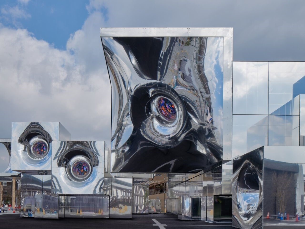
At Expo 2025 Osaka, among the eight Signature Pavilions redefining the architectural dialogue of the future, null² emerges as a standout vision. Designed by Tokyo- and Taipei-based studio NOIZ in collaboration with media artist and researcher Yoichi Ochiai, the pavilion is more than just a building, it’s a living experiment in hybrid space-making, where the boundaries between physical and digital, static and dynamic, dissolve into a shimmering architectural interspace.

Conceived as a speculative model for future architecture, null² occupies a unique conceptual realm: it’s neither fully real nor entirely virtual, but something in between, a meta-environment that interacts with its users and surroundings. Its form is built from voxel-like modules, cubic units of 2, 4, or 8 meters, arranged to create a flowing sequence of exhibition, support, and rest spaces. These modules vary from rigid geometric blocks to more warped, organic shapes, each clad in a newly developed mirrored membrane that shifts with the wind and reflects the changing world around it.

Designer: NOIZ

This tensile membrane does more than just mirror its environment. Designed to be reactive, it shimmers and moves in response to environmental forces, creating a visual rhythm that gives the structure a sense of breath. In doing so, it transforms the building’s presence from a static object to a living system, one that visually and metaphorically blurs into its context.

From its very conception, null² has been designed with agility in mind. In response to the tight timeline and uncertain future beyond Expo 2025, NOIZ developed a modular framework that prioritizes speed, flexibility, and reuse. The structure can be rapidly deployed, easily dismantled, and potentially relocated. The innovative membrane not only enhances the structure’s aesthetics but also offers solar reflectance and thermal insulation, features that hint at sustainable applications beyond the Expo, such as retrofitting existing buildings.

Inside the pavilion, visitors are drawn into a multisensory exhibition experience built around the concept of digital twins. These avatars reflect and respond to the user’s presence, making the act of visiting itself a kind of co-creation. Within select modules, robotic arms and embedded woofers interact with the mirrored surfaces through movement and sound, producing an environment that feels both tactile and intelligent. The building, in this way, becomes a responsive interface, a medium for communication between the visitor and the space.

But null² is not confined to its physical form. It extends into the digital, offering a participatory platform where remote users can engage with the pavilion through robotic avatars or augment their on-site experience using AR overlays. Visitors are encouraged to digitally reinterpret the structure, creating personalized spatial edits and contributing to an evolving archive of user-generated designs. This participatory approach redefines architectural authorship, replacing the singular vision of the designer with a collective, crowd-sourced process.

The post Expo 2025’s Most Futuristic Pavilion Feels Alive and Responds to Your Presence first appeared on Yanko Design.

Saudi Arabia’s Red Sea Island Resort Sets New Standard For Sustainable Tourism & Luxury Living

25 avril 2025 à 23:30

Saudi Arabia has unveiled Laheq, the latest phase of its ambitious Red Sea giga-project, as part of the kingdom’s transformation into a major tourist destination. Laheq will be developed on a luxurious island and feature an artificial ring, offering visitors a unique experience. The project is designed by Foster + Partners, a renowned British architectural firm also linked to other groundbreaking Saudi developments. Described as a “Forever Garden” due to its abundant greenery, Laheq will be situated on an island off Saudi Arabia’s west coast, forming part of an archipelago of 90 islands within the wider Red Sea development.

Designer: Foster + Partners

The island spans 400 hectares (988 acres) and is designed around a distinctive feature called “the Ring,” an 800-meter (approximately 2,600-foot) diameter artificial structure set in the water. This impressive centerpiece will house luxury apartments and hotels, with some residences available for purchase and others offered as vacation rentals. Beyond the Ring, the island resort will feature additional upscale residences, including timber-built homes, alongside amenities such as a bustling market, diverse retail spaces, entertainment zones, a world-class golf course, and a 115-berth marina.

Wellness is a central theme, with dedicated facilities aimed at promoting relaxation and health. Water sports will be a major attraction, especially diving. Visitors will have the opportunity to explore what Saudi officials describe as the world’s fourth-largest barrier reef, located nearby, and encounter over 2,000 species of fish unique to the region, making it a haven for marine life enthusiasts and adventure seekers alike.

Laheq is scheduled for completion in 2028, marking another milestone in Saudi Arabia’s ambitious Red Sea giga-project. Its unveiling comes on the heels of the recently completed Desert Rock resort, further highlighting the rapid pace of development in the region. The developer, Red Sea Global, has pledged that by 2030, all operations within the Red Sea project will be powered entirely by renewable energy. Essential efforts will be made to preserve extensive mangrove areas and restore the natural coastline, demonstrating a commitment to environmental sustainability.

Beyond the Red Sea project, Saudi Arabia is experiencing an impressive construction boom, with several visionary developments underway. Notable among them are The Line, a revolutionary linear city that forms part of the Neom giga-project, as well as Qiddiya, a sprawling entertainment city, the futuristic Mukaab, the towering JEC Tower, and other transformative projects, all contributing to the nation’s ongoing transformation. Saudi Arabia is redefining its skyline but also prioritizing environmental preservation, renewable energy, and unique visitor experiences. As these visionary projects progress toward completion, they promise to transform the region, attract international visitors, and set new standards for sustainable luxury and urban development in the Middle East and beyond.

The post Saudi Arabia’s Red Sea Island Resort Sets New Standard For Sustainable Tourism & Luxury Living first appeared on Yanko Design.

World’s First ‘Splashless’ Urinal keeps the Floor Clean and your Pants Pee-free

Par : Sarang Sheth
25 avril 2025 à 22:30

Somewhere between building nuclear fusion reactors and decoding the human genome, humanity paused… and decided that peeing shouldn’t be a messy ordeal. Enter the Nautilus urinal: a piece of plumbing so thoughtfully engineered that it makes the 100-year-old standard look like a cruel prank played on pants and public floors everywhere.

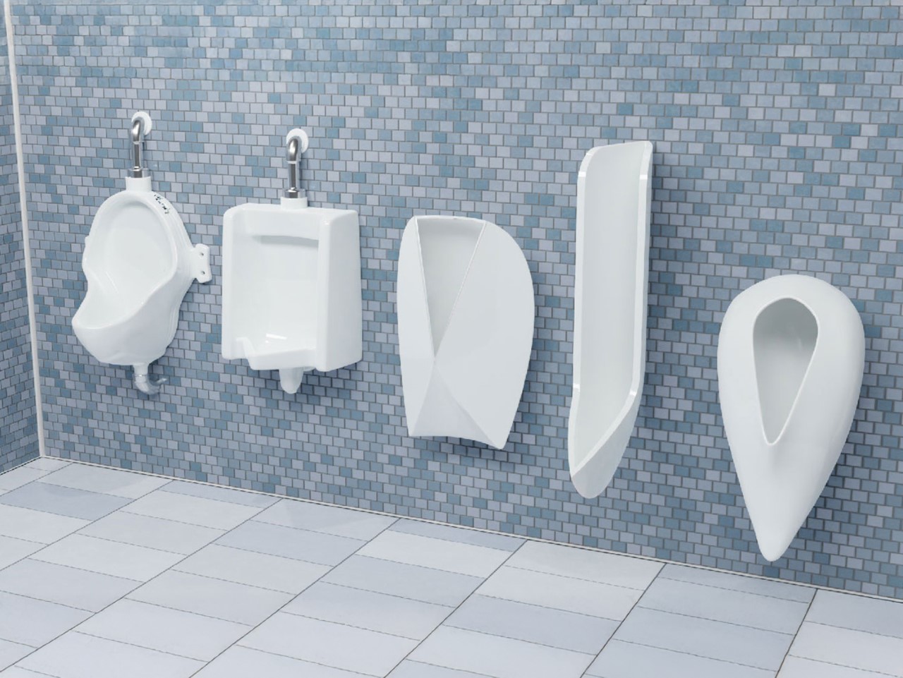
Scientists at the University of Waterloo – yes, fittingly named – approached the urinal problem with the same earnest precision usually reserved for spacecrafts and particle accelerators. They didn’t just eyeball it. They fired a dyed-water jet through a urethra-mimicking nozzle onto test surfaces angled meticulously between 0 and 90 degrees. What they found would make even Newton nod approvingly: angles over 30 degrees are splash factories. Anything shallower drastically tames the wild energy of a stream. That led them to craft the Nautilus, a urinal that captures and channels urine like a fluid dynamics masterpiece, reducing splashback by a staggering 98%.

Designers: Kaveeshan Thurairajah, Xianyu (Mabel) Song, J D Zhu, Mia Shi, Ethan A Barlow, Randy C Hurd, Zhao Pan (University of Waterloo)

Visually, it’s a sleek swirl of ceramic engineering, a tighter, more inviting spiral that looks more like a modernist sculpture than a bathroom fixture. Unlike the brutish slanted walls of traditional urinals, the Nautilus hugs the stream, guiding it along a smooth, gentle curve with the elegance of a Formula 1 racetrack designed purely for liquids. And while there’s a brutalist Cornucopia prototype that looks like it came from Elon Musk’s fever dream, the Nautilus is the undisputed champion, working for users of almost any height, which is kind of a miracle when you realize how unregulated the chaos of public restroom aim usually is.

And this wasn’t just an aesthetic choice. The Nautilus was torture-tested with poor aim scenarios, erratic flow rates, and simulated misfires. Yet, it consistently captured everything with a grace that makes you wonder why we tolerated Jackson Pollock floors for so long. The data is even more satisfying: switching North America over to Nautilus-style urinals could save up to 10 million liters (2.6 million gallons) of water per day. That’s not small change when cities are scraping the barrel for every drop.

It’s easy to romanticize grand challenges – curing cancer, saving the planet – but life is a patchwork quilt stitched from a thousand tiny annoyances. Pee splash isn’t glamorous, but it’s real. It’s the kind of everyday indignity that quietly erodes dignity and comfort without anyone noticing until suddenly, they’re standing in it.

That’s the magic of design thinking at its best: no problem too petty, no dignity too small to preserve. And the payoff is tangible. Imagine cleaner public bathrooms, lower maintenance costs, fewer eco-unfriendly cleaning products being dumped down the drain. Suddenly, a small tweak in geometry feels like it shifts the axis of civilization a few degrees toward better.

Maybe the real sign of a society leveling up isn’t flying cars or robot butlers. Maybe it’s how little urine ends up where it shouldn’t be.

The post World’s First ‘Splashless’ Urinal keeps the Floor Clean and your Pants Pee-free first appeared on Yanko Design.

Incredibly Clever AirPods Case also Doubles as a Kickstand for your iPhone

Par : Sarang Sheth
25 avril 2025 à 20:45

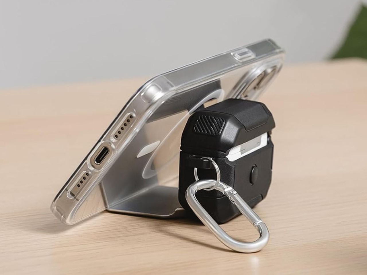
Do the AirPods really need a case? I mean sure, the earbuds themselves come with a broader case, but does that case need an extra protective shell? On most occasions, I’d say no, but this particular case from SwitchEasy drives a hard bargain. Baked into this protective case is a built-in stand that allows you to prop up your phone, whether it’s to watch movies or take video calls… and I absolutely love it.

The SwitchEasy Defender+ (quite a rugged, testosterone-y name if you ask me) was designed to protect your AirPods from any kind of damage they could experience. Falling off a table, falling off two tables, maybe even three. However, that feature seems fairly secondary to the Defender+’s built-in kickstand that gives your phone its very own dock, which you can use even in vertical mode with most regular-sized phones.

Designer: SwitchEasy

Click Here to Buy Now

The Defender+ comes with a TPU construction that absorbs shock, preventing your AirPods case from any impact up to 10 feet. That means your case is more impervious to scuff marks that stand out against its otherwise plain, glossy white exterior. However, there’s that metal plate on the front that does a little more damage protection. You see, aside from working as a kickstand, it works as a clasp that keeps your AirPods case shut, preventing it from accidentally opening.

To access your AirPods, you need to disengage the metal plate to allow the lid to open – sort of like two-factor protection for your earbuds. Pop the earbuds out, wear them, and then prop your phone on the Defender+’s stand and you have a de-facto portable movie theater, complete with Spatial Audio from the AirPods.

The SwitchEasy Defender+ starts at 21.99, and comes with a carabiner clip to accompany the case itself. The case supports wireless charging too, so you could easily place your AirPods face-up on any charging surface and it begins juicing your earbuds. Meanwhile, a nifty hole cut through the metal plate lets you see its charging light, so you’re never left with a pair of dead AirPods because you didn’t see the battery notification.

Click Here to Buy Now

The post Incredibly Clever AirPods Case also Doubles as a Kickstand for your iPhone first appeared on Yanko Design.

Mimic’s hands-on approach to humanoid teaching bridges emotion and AI through wearable input

Par : Gaurav Sood
25 avril 2025 à 19:15

As the boundaries between human experience and artificial intelligence continue to blur, designers are rethinking how we interact with technology on an emotional level. In the rapidly evolving landscape of domestic robotics, the conversation is no longer just about efficiency or automation—it’s about connection. While robots are becoming more capable, their integration into intimate human spaces still sparks discomfort for many. This friction doesn’t stem from technological limitations alone, but from the absence of a natural, empathetic bridge between user and machine. That’s the context in which Mimic emerges—not just as a wearable, but as a reimagined interface for trust-building with humanoid companions.

The next-gen wearable is designed to bridge the emotional and psychological gap between humans and humanoid robots. In a future where household humanoids are commonplace, Mimic enables users to teach robots actions based on their behavior data. Initially, humanoids perform basic functions, but over time, they learn to understand and personalize tasks for the user. Through this process, users actively teach humanoids, forming emotional bonds and overcoming psychological barriers.​

Designer: Dohyuk Joo

By wearing the device and performing desired actions, users provide real-time data that the robot uses to learn and adapt. This hands-on approach fosters a sense of control and agency, reducing feelings of unease and promoting a more harmonious relationship between humans and robots. The device is lightweight and ergonomically designed to be worn during daily activities. Its intuitive interface ensures that users can seamlessly integrate it into their routines without disruption.

The robot can adapt to changes in user behavior over time. By allowing users to wear the device and physically demonstrate tasks they want their robots to perform, Mimic shifts the paradigm from command-based interaction to embodied teaching. For example, if a user is preparing their own version of Korean stew, Mimic enables the humanoid to grasp more than just the recipe—it interprets the specific ingredients, motions, and subtle preferences involved. This context-aware learning gives the robot a far deeper understanding of the user’s world, moving beyond generic presets.

The device comprises two integrated modules: the Vision tracker and the Hand tracker. The Vision tracker collects visual and auditory data using an array of infrared sensors, tracking cameras, and vision-based AI. It maps the environment with Lidar and captures head movement using a 6-DOF camera alongside a front-facing RGB camera, forming a dynamic world model. It’s engineered to adjust comfortably to different body types through an adaptable rail system, ensuring seamless wearability.

Meanwhile, the Hand tracker—worn on the forearm—records nuanced physical data like grip strength, arm angle, and muscle activity through electromyography (EMG) sensors and precision tracking cameras. By analyzing electrical signals and motion patterns, it decodes how users interact with objects on a tactile level. This fusion of data is processed through deep learning to construct a comprehensive behavioral profile. Even passive moments become learning opportunities, as Mimic uses 360-degree and dual-facing cameras to observe environmental structure and object purpose, enabling the humanoid to understand intent even when it’s unstated.

Through these layers of sensory input and contextual modeling, Mimic doesn’t just teach tasks—it conveys intuition. It represents a new approach to robotics, one that leverages embodied cognition to break down psychological resistance and cultivate emotional resonance. As our homes evolve alongside technology, Mimic points to a future where machines don’t just serve—they relate, reflect, and respond.

The post Mimic’s hands-on approach to humanoid teaching bridges emotion and AI through wearable input first appeared on Yanko Design.

The Slate Truck: A Gray Shape for the Future of Freedom

25 avril 2025 à 17:25

The light cuts low across a gravel turnout. Campfire smoke folds into golden haze as someone rinses salt from their face using water from a steel bottle balanced on the Slate’s tailgate. There are no badge glints, no chrome reflections, just flat surfaces the color of dry cement. On paper, it’s a pickup, but in this moment, it’s a bench, a kitchen, a gear table. And in the hush between waves crashing beyond the trees, the silence of its electric heart feels right. No idling hum. No waste heat. Just stillness with a charge port.

Designer: Slate Auto

Slate doesn’t chase power fantasies or luxury posturing. It arrives stripped to the bone. And that’s where the possibilities begin.

Brutal Simplicity, Measured Lines

Compact without apology, the Slate Truck shrinks the bloated dimensions we’ve come to expect from American pickups. The form is a composition of right angles and practical intentions. Short overhangs place it confidently over rough terrain or tight alleys, while chamfered corners break the light in subtle shifts. It’s not trying to be aggressive. It’s trying to be adaptable.

The face is cartoon-clear: round headlights, blocky panels, and a plastic bumper that isn’t pretending to be more. There’s an openness in its expression, one that doesn’t feel defensive. Flared arches hold steel wheels that sit proud and unpolished, the kind that look better with dust caked in their edges.

Where metal would ripple, Slate’s polypropylene skin stays consistent. This choice isn’t about pretending to be premium. It’s about honesty. Every panel has a matte tactility, impervious to light scratches and ready to wear stories like a well-loved duffel. The rear window tilts open like a wink, inviting airflow or a tailgate nap. You can sense how it was built to be used, not curated.

Inside the Absence

Slide into the cabin, and you don’t feel overwhelmed. No stitched leather, no backlit glass panels or screens posing as dashboards. Instead, there’s space. A flat dash stretches wide with analog restraint. The HVAC knobs click with a purpose you can feel in your fingers. The digital gauge cluster is more tool than trophy, and your phone slots in as the interface you already trust.

Door panels are fabric-wrapped where it counts, and the seats wear a heathered textile that speaks softly about dirt, wear, and long drives home from muddy trailheads. There are no power windows here. A crank begs to be spun. It’s familiar and oddly satisfying, like the click of a cassette tape.

Nothing inside tries to impress. Everything tries to work. That clarity brings a different kind of luxury, the kind that comes from knowing what you need and nothing more.

What Plastic Can Feel Like

Touch the body and you’ll find texture with grip. These are not panels polished to a mirror’s edge, but material meant to live outside. It resists fingerprints, shrugs off the path of brambles, and welcomes vinyl wraps like a sketchbook welcomes ink. The base gray isn’t neutral. It’s an invitation.

Each panel is molded rather than stamped. You feel it in the consistency, in the uniform depth and durability. Even the surface noise is different. Tap it and the tone is softer, less metallic, more muted. Less armor, more shell.

Climate knobs are chunky, with a resistance that slows the motion of your wrist. They were made to be turned by gloved hands or wet fingers. The glovebox opens with a slide, not a latch, and swallows bulky objects without complaint. When everything is optional, function becomes the first aesthetic.

A Cabin Tuned for Nature

With no drivetrain rattle and no exhaust drone, you hear things you’ve forgotten in modern cars. The slap of branches. Wind threading through side mirrors. A bird call in stereo. Even the thud of gear hitting the bed feels closer, like it belongs to the vehicle instead of bouncing off it.

The Slate invites you to drive with the windows down, even if you crank them manually. There’s something pure about hearing tires chew gravel without a soundproofed filter. Something intimate about a truck that doesn’t isolate you from the places you’ve gone to find.

Visibility comes not from augmented mirrors or surround-view stitching, but from clean lines and thin pillars. The proportions are honest. The roofline doesn’t droop. The tail doesn’t puff out. You see where it ends because it’s shaped to be seen.

Function You Can Touch

The Slate’s most radical idea isn’t its electric drivetrain or price point. It’s the idea that the vehicle changes as you do. Accessories aren’t bolt-on flair. They’re choices that reflect what you need today and leave space for tomorrow.

A flat-pack SUV kit adds seats, safety hardware, and a fiberglass roof that slots into place with purpose. Want a camper one year and a grocery hauler the next? It’s not a new car, it’s a new configuration. Roof racks and rear carriers clip on without begging for bodywork. Wraps apply like stickers, not paint jobs.

Even the dashboard becomes a canvas. Decorative vents accept clip-on charms, Slatelets, they call them, that mark ownership with whimsy. Like a charm bracelet if charm bracelets came in truck form.

A Different Way Forward

Slate doesn’t preach sustainability through reclaimed materials or carbon offsets. It does it through reduction. Through choosing what doesn’t need to exist. No leather. No built-in speakers you’ll replace anyway. No touchscreen growing obsolete before the battery does.

The idea isn’t to innovate through excess. It’s to invite users back into the making. You can feel it in every crank, every exposed screw, every option skipped. This isn’t minimalism as style. It’s mechanical clarity.

What would happen if the next generation of cars weren’t about computing power or aggressive profiles, but about modularity, ease of repair, and ownership that grows with you? The Slate doesn’t answer that question. It lets you live into it.

And maybe that’s the future worth parking next to a cliffside, listening to the wind press through the conifers, while your board dries in the sun.

The post The Slate Truck: A Gray Shape for the Future of Freedom first appeared on Yanko Design.

Ingenuous Fruitbridge brings you closer to fresher fruits

Par : Ida Torres
25 avril 2025 à 17:00

One of the most wasteful things that happen to me regularly is that I have to throw away some fruits that have spoiled or have become overripe because they are placed together in a fruit bowl. Apples are some of the most common culprits as a rotting apple produces ethylene gas that affects the “decay” of nearby apples. Sure you can just separate them from each other but that’s not the most efficient use of space. There should be a simple design solution for that right?

Designer: Agota Jonas

The Fruitbridge is a simple but inventive solution to this common problem. Instead of a usual bowl where the fruits pile upon each other, this uniquely designed dining room accessory elevates each piece of fruit to promote airflow and also minimize contact with each other. It’s a simple, thoughtful, and even aesthetic solution to a common kitchen problem. The core idea behind the Fruitbridge is simple yet brilliant: each fruit rests on its own individual “bridge,” creating a gap beneath and around it.This elevated positioning allows for crucial air circulation, preventing moisture buildup that can hasten decay. By keeping fruits separated, the risk of bruising from the weight of other fruits is also significantly reduced.

It is a functional object and a stylish addition to your kitchen or dining table, showing off a vibrant orange, a crisp apple, or a bunch of grapes as they “sit” comfortably on their own miniature platform. The materials used in the Fruitbridge likely play a role in its effectiveness and aesthetic. While the specific materials might vary depending on the iteration, the focus seems to be on creating a stable and easily cleanable structure that complements the natural beauty of the fruit. It also uses low-energy fabricating methods like laser cutting, cold rolling, and hand finishing. It is also eco-friendly as the leftover pieces are reused for smaller products like tealight holders and keychains.

The Fruitbridge, as envisioned by Agota Jonas, directly addresses this frustration with an elegant and practical design. It’s more than just a fruit holder; it’s a thoughtful tool that helps bridge the gap between purchase and perfect consumption, ensuring you get the most out of your healthy haul. For anyone seeking a way to extend the life of their fruits while adding a touch of modern design to their kitchen, it is a compelling and innovative solution.It’s also a reminder that sometimes, the simplest ideas can have the most significant impact on our daily lives.

The post Ingenuous Fruitbridge brings you closer to fresher fruits first appeared on Yanko Design.

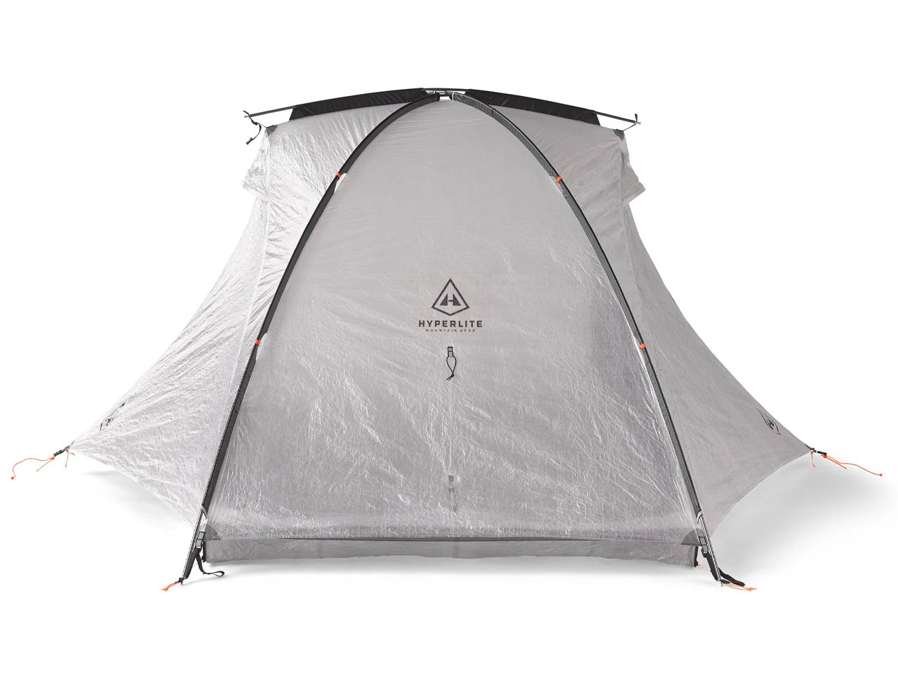
This freestanding tent is perfect for casual adventurers who don’t want to carry extra weight

Par : Gaurav Sood
25 avril 2025 à 16:20

Talk of lightweight tents and Hyperlite is right up there with the best. Their popular options come as functional shelters that are easy to set up, even though they lose out on some features. Perhaps well suited for hikers and adventure seekers who want to keep things minimal and don’t require an extensive setup for creating a makeshift shelter. They’ve now bettered their lightest tent design to craft a lightweight freestanding tent dubbed Crosspeak 2 that weighs just 2 lbs. This outdoor gear brings them right alongside the likes of Durston and Six Moons Design when we talk of the best out there.

The biggest advantage of this outdoor accessory is the quick pitch feature in any kind of terrain without staking in the ground. This makes the tent ideal for casual adventure trips in the backcountry or overnight hikes in pleasant weather without any windy conditions. It can fit two individuals easily, making it an impressive proposition given its compact size that’s easy to haul.

Designer: Hyperlite Mountain Gear

To set up the Crosspeak 2 free-standing tent, all you have to do is create tension with the long crossed poles employing the webbing and ladder locks. Then, just tighten the thing using the small bridge pole on the top. When fully pitched, the tent stands at 42 inches tall, which is enough for most adventure seekers. The floor area of 88 x 48 inches is ample space to fit two sleeping bags. Given it is just 2 lbs, packing in other essentials like a 22-inch Dyneema vestibule area for the bags and boots, two storage pockets, or attachment loops for hanging clothes is nothing less than impressive.

Crosspeak 2 is quite airy on the inside with two doors and an adjustable ventilation system for proper circulation if you are cooking inside. The magnetic tie-backs on the doors make it very easy to close the tent opening when compared to other tents. The tent doesn’t come with any guy lines or hiking poles, which are vital in maintaining structural integrity in case of inclement weather conditions. However, the lack of them also makes the thing ultra-compact and only advised for use in perfect weather. Hyperlite has created two separate Dyneema stuff sacks for stashing the tent body and the pole for convenience.

Looking to create the ideal balance between low weight, weather-resistant features, and the ease of setting up the tent; Crosspeak 2 isn’t affordably priced at $950. The major reason is the use of Dyneema Composite Fiber (DCF) and the lightweight make – both of which add to the overall cost of this outdoor accessory. If this tent perfectly fits your requirements, only then is it advisable to buy this free-standing tent, else other options are more suited for the varying dynamics.

The post This freestanding tent is perfect for casual adventurers who don’t want to carry extra weight first appeared on Yanko Design.

❌
❌