Vue normale

Il y a de nouveaux articles disponibles, cliquez pour rafraîchir la page.
À partir d’avant-hierTechs Design

Everlane’s Everpuff Is The Jacket That Never Dies

Par : Ida Torres
11 octobre 2025 à 19:15

The puffer jacket is a winter staple for a lot of places that experiences really cold weather. But most of the ones in the market aren’t the most eco-friendly. Everlane has just launched what might be the fashion industry’s most sustainable puffer jacket yet. The EverPuff represents a groundbreaking approach to circular fashion design, proving that warmth, style, and environmental responsibility can coexist beautifully.

What makes the EverPuff revolutionary is its commitment to true circularity. Nearly every component of this sleek puffer jacket is crafted from certified recycled materials, from the insulating fill to the outer shell. The only exceptions are three small metal trims, making this jacket 97% recycled content. This isn’t just about using eco-friendly materials; it’s about creating a product designed for multiple lifetimes.

Designer Name: Everlane

The jacket’s exterior features 100% recycled polyester that’s both water-repellent and water-resistant, ensuring you stay dry while maintaining a lighter environmental footprint . The recycled down filling provides exceptional warmth without compromising on sustainability principles. All materials are bluesign certified and PFAS-free, guaranteeing safer chemistry for both workers and consumers while reducing harmful emissions.

But Everlane’s innovation extends far beyond materials. The EverPuff comes with an unprecedented lifetime warranty and comprehensive repair program through their partnership with Tersus Solutions . If your jacket needs fixing, Everlane will repair it for free. If it’s beyond repair, they’ll replace it entirely. This commitment to longevity challenges the fast fashion model by encouraging consumers to invest in pieces that last. The design process itself was revolutionary. Everlane’s team worked closely with Debrand, a specialized recycling company, to ensure the jacket could be easily disassembled at the end of its life . By using mono-materials and avoiding complex stitching, they created a garment that can be completely broken down, with each component recycled into new products.

When your EverPuff finally reaches the end of its usable life, Everlane will take it back and transform it into a new garment. The polyester shell, down filling, and hardware are all separated and sent to specialized facilities for recycling into fresh materials. This closed-loop system represents the future of fashion manufacturing. The EverPuff also integrates with Everlane’s broader sustainability ecosystem. Through their partnership with Poshmark on the Re:Everlane program, customers can easily resell their jackets, extending the product’s life even further. The system automatically populates style details and original pricing, making resale effortless.

Available in five sophisticated colors including navy, black, dark green, peyote, and merlot, the EverPuff retails for $298 for the standard length and $348 for the long version . While the price point reflects the quality materials and comprehensive warranty, it represents a shift toward valuing durability over disposability. The EverPuff isn’t just a jacket; it’s a statement about the future of fashion. By proving that luxury outerwear can be both stylish and completely sustainable, Everlane is setting a new standard for the industry. This innovative approach to circular design shows that consumers no longer need to choose between looking good and doing good for the planet.

The post Everlane’s Everpuff Is The Jacket That Never Dies first appeared on Yanko Design.

Portalgraph Just Killed 3D Glasses With This Award-Winning Display

Par : JC Torres
11 octobre 2025 à 17:20

3D visualization has become a necessary evil that most designers secretly hate. Want to preview your architectural model in three dimensions? Better strap on a sweaty VR headset and hope you don’t bump into furniture. Need to show clients how their product looks from different angles? Good luck explaining why they need to wear bulky goggles for a simple design review.

Portalgraph by Beleve Vision cuts through this nonsense by turning any regular TV or computer monitor into a glasses-free 3D display that actually works. The technology creates convincing three-dimensional visuals without requiring headsets, special glasses, or expensive hardware upgrades. Multiple people can view the same 3D content simultaneously, making collaboration natural instead of awkward.

Designer: Beleve Vision

The system tracks your head movements in real time using a combination of hardware and software that attaches to existing screens. Move around, and Portalgraph adjusts the 3D perspective to maintain depth perception from different viewing angles. The technology converts 2D content into three-dimensional experiences instantly or displays native 3D content with proper depth that doesn’t strain your eyes.

Creative professionals get immediate workflow improvements from this approach. Preview 3D models without switching between programs or dealing with clunky interfaces. Spot proportion problems, lighting issues, and spatial relationships at a glance during normal work sessions. Team meetings become productive when everyone gathers around one screen and discusses specific design elements in a shared 3D space.

Real-world applications make sense across different creative fields. Architects can walk clients through building designs without technical training or comfort with unfamiliar technology. Game developers test character animations and environment layouts while maintaining their regular workflow patterns. Product designers showcase prototypes during video calls where clients examine designs from multiple angles without downloading special software or learning new interfaces.

The technology makes advanced 3D visualization accessible to smaller studios, freelancers, and educational institutions that can’t justify expensive VR investments. Portalgraph works with standard monitors and TVs, eliminating the need for specialized hardware purchases. This democratization opens creative possibilities for designers who previously couldn’t afford or manage complex immersive visualization setups.

Collaboration becomes the standout feature in creative workflows where feedback drives the design process. Traditional VR isolates users in individual experiences, making group discussions feel disconnected and inefficient. Portalgraph enables natural teamwork where designers, clients, and stakeholders examine identical three-dimensional content together while maintaining eye contact and normal conversation flow.

While Portalgraph remains limited in current market availability, the technology represents a significant leap toward making 3D content creation feel intuitive rather than technical. The ability to experience genuine depth perception without barriers could fundamentally change how designers approach their daily work, seamlessly blending 2D sketching with 3D visualization throughout creative processes without switching tools or mindsets.

The post Portalgraph Just Killed 3D Glasses With This Award-Winning Display first appeared on Yanko Design.

Your IKEA Couch Is Dead: 5 Sculptural Pieces That Actually Spark Joy

11 octobre 2025 à 15:20

When designing a home that genuinely reflects your personality, it is natural to focus on color schemes, furniture layouts, and curated decor. These elements shape the foundation of a space, but there is one often-overlooked design element that can completely transform how your home feels, and that is playful furniture design.

This does not mean that you need to fill your space with childish or overly quirky pieces. Instead, it is about choosing furniture with unexpected shapes, bold colors, or whimsical details that spark joy. These thoughtful and personality-driven touches add charm, create visual interest, and infuse your interiors with warmth and wonder.
Let’s understand how playful furniture design can turn ordinary spaces into lively, emotionally uplifting designs.

1. The Psychology of Playful Design

Design goes beyond aesthetics as it influences how people feel and interact with their surroundings. Playful furniture, with its bold colors and unexpected shapes, can spark curiosity and joy, challenging the idea that furnishings must be strictly functional.

By incorporating unconventional pieces, such as a sculptural chair or a whimsical bookshelf, interiors become more engaging and less monotonous. Studies suggest that novel environments can enhance creativity and reduce stress. In this way, playful furniture is not just decorative, but it supports emotional well-being and helps create a home that feels vibrant, inspiring, and deeply personal.

The Fossil Furniture Collection, a collaboration between Ukrainian designer Dmitry Kozinenko and oitoproducts, reinterprets classic furniture forms through the use of sculptural monolithic shapes and bold geometric compositions. Each piece merges simple volumes, both square and round, into a cohesive design language that feels familiar and fresh. The Fossil chair combines two straight, supportive back legs with a rounded front base, creating a dynamic form that serves as a comfortable stool and a visually engaging footrest.

Echoing the chair’s silhouette, the Fossil pouf retains the distinctive base and seat module while omitting the backrest, offering a more casual and adaptable seating option. The bench expands the pouf’s form, featuring an elongated rectangular seat to accommodate two or three individuals, making it suitable for dining areas, entryways, or shared spaces. Together, the collection blends functionality with playful design, demonstrating how geometric reinterpretation can elevate everyday furniture into sculptural statement pieces.

2. Clever Ways to Add Whimsy

Adding playful furniture to a space does not mean giving up comfort or sophistication. It is about selecting pieces with personality, like a bold pouf, a sculptural table, or a quirky-backed chair that injects charm without overwhelming the room. These accents can become focal points and spark conversation.

To make smart selections, one can think about function, proportion, and how each item complements your existing decor. It is important to prioritize quality craftsmanship and sustainable materials, so your fun finds also stand the test of time and infuse a touch of joy.

The Doodle Collection by Ring presents furniture pieces that evoke the whimsical appearance of twisted paper clips, transformed into bold, sculptural forms. Inspired by blind contour drawings brought into three dimensions, each piece is crafted from nickel-plated steel arches, meticulously hand-bent and welded around a cast resin core. The collection includes an abstract table and a pair of chairs that appear impossibly delicate yet remain structurally stable. The table’s cast resin surface, seemingly suspended against gravity, enhances the sense of playful defiance that defines the series.

Ring describes the design approach as “free and exploratory,” resulting in creations that blur the line between functional objects and artistic statements. With their unconventional forms and dynamic silhouettes, these pieces feel more at home in an art gallery than in a traditional showroom. Designed for bold, adventurous collectors, the Doodle Collection serves as a statement against predictable design, offering a lively and imaginative addition to contemporary interiors.

3. Using Playful Materials and Textures

The tactile quality of furniture is just as important as its visual appeal. Designers often use varied materials and textures to make interiors feel more inviting and engaging. Unexpected choices like recycled plastics, woven rattan, or soft felt not only add visual interest but also a sensory layer that enhances the user experience.

Combining textures, such as pairing a smooth metal frame with a plush velvet seat, introduces depth and sophistication. These contrasts keep the eye moving and the space feeling curated. Also, mixing elements like wood, leather, fabric, or metal creates a multi-sensory environment that feels intentional, comfortable, and uniquely welcoming to everyone who enters.

The Moopi chair collection reinterprets the playful spirit of childhood playgrounds into sculptural, ergonomic seating for modern interiors. Inspired by slides, tunnels, and rocking horses, each design captures the posture and sensation of these familiar forms. MOOPI 01 (Blue) evokes the cozy enclosure of a playground tunnel with its circular opening, inviting users to curl up or lounge. MOOPI 02 (Green) features a gentle slope reminiscent of a slide, ideal for relaxed seating or casual conversations. MOOPI 03 (Orange) recalls the backward seating position often found on rocking horses or slide edges, offering both comfort and a whimsical silhouette.

Crafted with smooth contours and vibrant finishes, the collection is designed to be visually striking while remaining functional for all ages. The bold colors reference classic plastic playsets, instantly adding energy to any space. More than just seating, Moopi pieces serve as statement designs that blend nostalgia, creativity, and comfort, making them ideal for living rooms, studios, or curated interiors.

4. Designing for All Ages

Playful furniture offers a smart way to design spaces that are stylish for adults and welcoming for children. Instead of filling rooms with separate items, families can opt for multi-functional pieces that serve everyone. A low, rounded table, for instance, works as a coffee spot and a child’s play surface.

Soft edges enhance safety while maintaining a clean, modern aesthetic. Versatile pieces like storage ottomans or modular seating adapt easily as family needs change. This thoughtful approach proves that a home can be beautiful and practical.

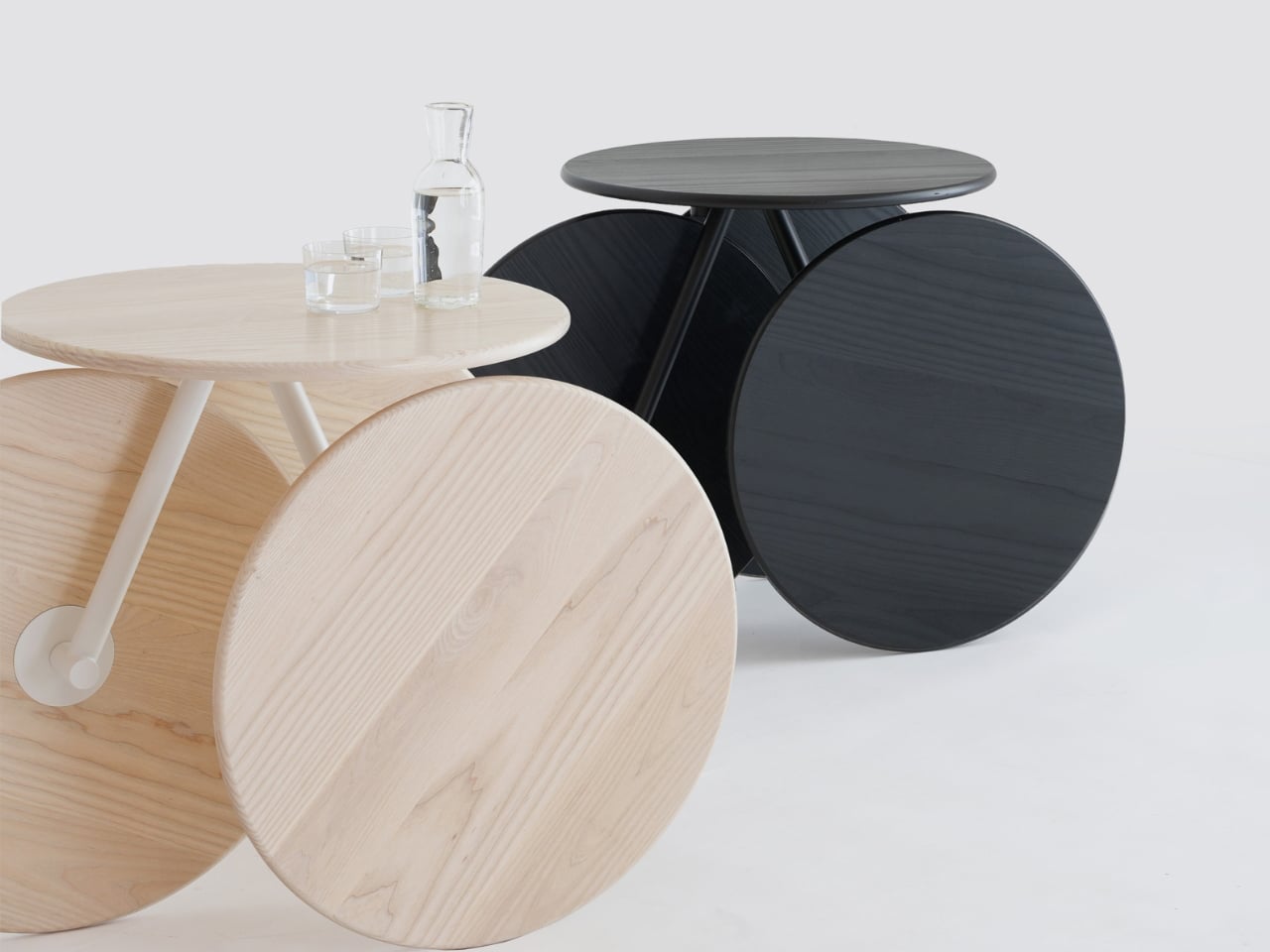
The Rolly table by Mike & Maaike blends functionality with playful design, featuring four identical circles that serve as wheels and visual anchors. Crafted from solid wood or multi-ply, these circles highlight natural grain or bold colors while forming the table’s structural base and mobility. Supported by a minimal steel frame and a clever swivel mechanism, Rolly moves effortlessly across floors. Its swiveling rear wheel offers smooth control, allowing it to function as a stationary side table, portable serving cart, or stylish display stand.

Available in finishes ranging from light Scandinavian-inspired woods to rich stains, vibrant colors, and striking black-and-white stripes, the Rolly table adapts to a variety of interiors. Clean lines, seamless joinery, and a spacious tabletop reflect meticulous craftsmanship. Designed for design lovers and collectors, it turns simple tasks like serving drinks or rearranging a room into enjoyable experiences, making it a standout piece that merges versatility, movement, and modern style.

5. Upcycle for a Personal Touch

Upcycling old furniture or using upcycled materials offers a budget-friendly, eco-conscious way to add personality to any space. A bold coat of paint on a vintage chair or reupholstering with fun fabric can transform overlooked items into standout features.

DIY projects allow for creativity and customization, whether it is painting patterns on drawers, adding colorful legs to a plain table, or making cushions from vibrant textiles. These efforts result in distinctive pieces and a sense of accomplishment. Playful design celebrates imagination and resourcefulness, showing that style can be sustainable and uniquely personal.

The Hana-Arashi (Flower Storm) collection by Paola Lenti showcases a refined approach to sustainable outdoor furniture design, transforming surplus 100% polypropylene mesh fabric into sculptural, functional pieces. This recyclable mono-material, celebrated for its durability, water resistance, and extensive range of approximately 180 colors, is reimagined through a high-frequency thermocompression technique. Leveraging polypropylene’s low melting point, multiple fabric layers are fused without adhesives or threads, selectively hardening certain areas for strength while retaining translucent sections that allow light to pass through, creating a luminous, ethereal effect.

The production process begins with assembling large fabric offcuts into a base, then welding smaller, precisely cut remnants to enhance texture and depth. Rolled and fused into fluid, three-dimensional forms, the resulting pieces evoke the organic beauty of swirling petals. Lightweight yet robust, Hana-Arashi is well-suited for public spaces, parks, and community areas, merging structural integrity with artistic elegance while advancing Paola Lenti’s commitment to eco-conscious innovation.

By selecting pieces that prioritize happiness, you can transform your space into a reflection of your personality and a haven of well-being. It’s about moving beyond the conventional and creating an environment that encourages laughter, creativity, and a little bit of fun.

The post Your IKEA Couch Is Dead: 5 Sculptural Pieces That Actually Spark Joy first appeared on Yanko Design.

MoMA and Mattel give high art masterpieces a pop culture makeover

Par : Ida Torres
11 octobre 2025 à 13:20

Whenever I visit museums, I always enjoy looking at the artworks, of course. But sometimes, I wish I could bring home a replica or even just a postcard or sticker to commemorate it and have a piece of it with me. Not all of them have something accessible like that, though. This new collaboration between the Museum of Modern Art (MoMA) and Mattel is bringing high art and popular culture together so that people can appreciate art more through playing and collecting.

This collaboration isn’t just a one-time thing, as it is a multi-year partnership between the global toy giant and one of the leading cultural institutions. The goal is not just to have something for collectors but also to bring modern and contemporary art to new audiences by creating interactive and accessible experiences. People will be able to view high art not just through the lenses of museums but actually interact with it and even take it home with them.

Designers: MoMA x Mattel Creations

The first capsule collection will be available this coming November 2025 and will feature seven iconic pieces inspired by some of the best masterworks from MoMA’s permanent collection. They will be available in MoMA Design Stores in New York and Japan, and on the MoMA and Mattel websites.

The centerpiece of this collection is a Barbie doll that’s inspired by the iconic “Starry Night” masterpiece by Vincent van Gogh. Barbie is dressed in a gown that serves as the canvas for the ethereal and dreamlike quality of the painting. You’ll see dreamy swirls, blue skies, and stars in the runway ready gown.

If your taste is more surrealist, then you’ll want to take home the Little People Collector featuring a Salvador Dalí duo. One is a self-portrait figure with his famous twirled mustache, while the other is still Dalí but with elements from his painting “The Persistence of Memory.”

Another Little People Collector set, this time, features impressionist master Claude Monet. One of the figures is him working in his studio, while the other is a three-dimensional self-portrait inspired by his “Water Lilies” paintings.

Part of the capsule is also a special edition of the Magic 8 Ball, but instead of the usual colors, you get a vibrant abstract tapestry on its surface by Alma Woodsey Thomas. Out of the twenty usual answers, nine have been updated with custom phrases by Thomas as well.

Car enthusiasts also have something to collect with Hot Wheels die-cast replicas of cars like the Citroën DS 23 Sedan, complete with an opening hood and custom Real Riders wheels. There is also a die-cast replica of the Jaguar E-Type Roadster, which is one of the earliest cars that MoMA exhibited in the 1950s.

Lastly, you can take home works from famed artists like Henri Matisse, Piet Mondrian, Claude Monet, and Vincent van Gogh, but this time in a UNO Canvas deck. The cards also include works by Sonia Delaunay and Liubov Popova for the Wild cards.

As we look ahead to this groundbreaking collaboration, it’s clear that the Mattel x MoMA partnership represents something much larger than a simple product launch. It’s a bold reimagining of how we can experience and connect with art in our daily lives. This five-year partnership promises to continue breaking down the barriers between high culture and everyday life, proving that great art doesn’t have to remain behind velvet ropes to maintain its power and beauty.

For those of us who have wandered through museum halls wishing we could take a piece of that inspiration home, this collection offers exactly that opportunity. Whether it’s displaying a van Gogh-inspired Barbie on your shelf, playing UNO with masterpieces in your hands, or racing Hot Wheels replicas of design icons, these pieces transform passive art appreciation into active, joyful engagement.

The post MoMA and Mattel give high art masterpieces a pop culture makeover first appeared on Yanko Design.

10 Best Smartwatches To Consider In October 2025: Find The Perfect Wearable For You

11 octobre 2025 à 11:40

Smartwatches aren’t just wrist accessories anymore; they’re powerful, purpose-driven extensions of your lifestyle. Whether you’re an athlete, a gamer, a style enthusiast, or simply someone who wants to stay connected, the right wearable can elevate your daily routines. As October 2025 brings fresh innovation and daring new designs, the world of smartwatches is more diverse and exciting than ever.

From minimalist e-paper displays to rugged adventure companions and even a gaming PC for your wrist, this year’s lineup is packed with options that speak to every need and personality. Our list explores the best smartwatches available now, highlighting their unique strengths, standout features, and potential drawbacks. Dive in to find the perfect wearable for your wrist and your world.

1. MSI Gaming PC Watch: A Gaming Rig For Your Wrist

The MSI Gaming PC Watch is a spectacle for anyone who lives and breathes gaming. With its MSI dragon-red theme, transparent façade, and visible hardware, it’s an unmistakable tribute to high-performance rigs. This wearable doesn’t just tell time—it showcases your passion, sparking conversations and envy alike. While it might look like a traditional watch at first glance, its true identity is a full-fledged mini PC strapped to your wrist.

Analog watch hands are visible but understated, hinting at its timekeeping function. Four side pushers let you toggle features, and the construction feels robust with a metal alloy case. Not everyone will need or want a wearable computer on their wrist, but for those who do, nothing else comes close to this level of commitment and flair.

What we like

  • Visually striking design that turns your wrist into a gaming showcase.
  • Unique concept that marries PC hardware and wearable tech in an unprecedented way.

What we dislike

  • Timekeeping is a secondary feature, not the main focus.
  • Likely to be bulkier and less comfortable for daily wear.

2. Apple Watch Ultra 3: The Pinnacle Of Display Technology

Apple’s Ultra 3 brings a new dimension to smartwatch displays, boasting the largest and most advanced screen ever fitted to an Apple Watch. With wide-angle OLEDs and LTPO3 technology, it’s readable at any angle—even in direct sunlight or underwater. Apple’s design team has maximized the display space by shrinking the borders, so you get a bigger, better canvas without a larger watch.

Always-on features are smarter and more efficient, staying visible without draining the battery. Real-time seconds and instant stats make it a must for athletes and adventure seekers. If clarity, screen quality, and high-tech durability are priorities, the Ultra 3 is at the head of the pack.

What we like

  • Expansive display with best-in-class readability in all conditions.
  • Always-on screen with high refresh and low power use.

What we dislike

  • Premium price puts it out of reach for some buyers.
  • Large size may not suit those with slimmer wrists.

3. Pebble Time 2: E-Paper Simplicity, Modern Craft

Pebble’s comeback is all about maturity and minimalism. The Time 2 features a stainless steel case and integrated lugs that create a seamless, intentional flow from the case to the strap. The nearly edge-to-edge 1.7-inch color e-paper display sits flush with the glass, inviting you to run your finger along its perfectly smooth edges. This is a smartwatch for those who crave simplicity and customization without sacrificing style.

Available in Silver, Black, and Champagne Gold, the Time 2 lets you swap out standard 22mm bands, making it adaptable for any look. It’s a refined, user-first foundation that feels both nostalgic and modern. The e-paper display also means longer battery life and easy outdoor readability.

What we like

  • Minimalist, sophisticated design with customizable bands.
  • E-paper display is gentle on the eyes and extends battery life.

What we dislike

  • Lacks the premium sensors and apps found on flagship smartwatches.
  • Refresh rate is slower than traditional OLED or LCD screens.

4. WearPods Hybrid Smartwatch: Earbuds On Your Wrist

WearPods is a clever hybrid, hiding a pair of true-wireless earbuds within the body of a smartwatch. It’s designed for the forgetful and the futuristic, merging two essential devices into one. The 1.93-inch display and smart features are impressive, but the real magic happens when you pop out the earbuds with a satisfying click, ready for calls or your favorite playlist.

This all-in-one approach does come with some trade-offs. Packing both a smartwatch and earbuds into such a compact form means battery life isn’t stellar, and the ergonomics for both components might not suit everyone. Still, for tech lovers who want to reduce pocket clutter, it’s a novel solution.

What we like

  • Ingenious all-in-one design keeps your earbuds always accessible.
  • Appeals to gadget lovers and those prone to losing accessories.

What we dislike

  • Reduced battery life compared to single-function wearables.
  • Fit and comfort may not match dedicated smartwatches or earbuds.

5. Ollee Watch: A Classic Casio, Supercharged

The Ollee Watch turns the classic Casio F-91W into a customizable smartwatch through a mainboard swap. You keep the retro resin case, LCD, and water resistance, while gaining step tracking, notifications, and Bluetooth. It’s a clever, open-source upgrade that bridges nostalgia and modern convenience.

DIY fans will appreciate the upgrade process, which doesn’t require advanced skills. The result is a connected, functional timepiece that feels both familiar and fresh—ideal for those who want to retain the original’s charm while adding new tech.

What we like

  • Maintains the beloved Casio design with modern smart features.
  • Open-source and DIY-friendly for personal customization.

What we dislike

  • Installation requires some technical ability and patience.
  • Not as feature-rich as premium smartwatches.

6. Garmin Instinct 3: AMOLED Or Solar For Every Adventure

Garmin’s Instinct 3 offers versatility with AMOLED and solar-powered variants, each available in two sizes. The AMOLED model delivers vivid visuals for gym goers, while the solar model boasts unlimited battery life in sunlight—ideal for outdoor enthusiasts. Up to 24 days on a single charge sets a new standard for smartwatch endurance.

The Instinct 3 is built tough, with extensive fitness tracking and navigation features. While its rugged look won’t win fashion awards, its performance and battery options make it a reliable companion for any adventure.

What we like

  • Choice between super-bright AMOLED and solar-powered battery.
  • Outstanding battery life and rugged durability.

What we dislike

  • Solar models require regular sunlight for the best results.
  • Functional, utilitarian design isn’t for style seekers.

7. TAG Heuer Connected Calibre E4 45MM x Oracle Red Bull Racing

TAG Heuer’s collaboration with Oracle Red Bull Racing produces a standout luxury smartwatch. The 45mm DLC titanium case, bold racing-themed strap, and dial make it a collector’s item. It’s packed with features for health, fitness, and lifestyle, all wrapped in the prestige of Swiss watchmaking.

This is a watch for motorsport fans and those who appreciate both tradition and cutting-edge tech. While its price and look may not be for everyone, it’s a striking fusion of speed and sophistication.

What we like

  • Luxurious materials and exclusive Red Bull Racing design.
  • Offers comprehensive smart features with top-tier build quality.

What we dislike

  • High price limits its accessibility.
  • Bold styling may not suit everyday wear or all tastes.

8. Apple Watch Series 11: The Ultimate Health Monitoring Device

Apple’s Series 11 sets a new bar for health-focused smartwatches. With advanced sensors, silent killer detection, and always-on ECG, it’s the most feature-packed Apple Watch yet. Hardware upgrades ensure it’s more durable and connected than ever, while seamless integration into the Apple ecosystem makes it a natural choice for iPhone users.

It’s designed for those who want a blend of style, utility, and medical-grade monitoring on their wrist. The only major downside is its battery life, which still requires daily charging.

What we like

  • State-of-the-art health monitoring and medical features.
  • Refined design and perfect compatibility with iPhone.

What we dislike

  • Battery life is only average, requiring daily top-ups.
  • Works best only within the Apple ecosystem.

9. Huawei Watch GT 6 Pro: Built For Endurance

The Huawei Watch GT 6 Pro is built for athletes who need their gear to last. Its sapphire crystal display and titanium case shrug off scratches and impacts, while the 21-day battery life is a game-changer for training camps and expeditions. Peak brightness makes it easy to read outdoors, and pro-grade GPS and tracking features cater to serious runners and cyclists.

While its focus is on endurance and performance, it may not have the app ecosystem or lifestyle features of more mainstream smartwatches.

What we like

  • Ultra-durable with sapphire crystal and titanium construction.
  • Long-lasting battery ideal for extended use and adventures.

What we dislike

  • Limited app selection compared to Apple and Wear OS.
  • More fitness-focused, less suited for general lifestyle use.

10. Ksana Hybrid E-Ink Smartwatch: Essential Information, Always

Ksana’s hybrid smartwatch puts a small E Ink display at the center, overlaying an analog dial with glowing hands. This battery-saving approach means you get only the essential info, without distractions or frequent charging. The analog movement adds classic charm, while the display excels in any lighting.

It’s ideal for anyone who values simplicity and mindfulness over a barrage of notifications. The pared-back approach means you’ll miss out on richer app experiences, but for many, that’s a feature, not a bug.

What we like

  • E Ink display provides superb battery life and readability.
  • Analog-mechanical movement adds timeless appeal and night usability.

What we dislike

  • Limited information display and few smart features.
  • Not for those who want colorful screens or app-rich experiences.

Final Thoughts: Which Smartwatch Fits Your Life?

Choosing the right smartwatch in October 2025 is all about matching your personal style, needs, and habits. This year’s lineup is more diverse than ever, from the boldest gaming wrist rigs to the most subtle hybrid analogs. Whether you crave battery life, health tracking, luxury, or sheer uniqueness, there’s a wearable that aligns with your priorities.

The best smartwatch is the one that disappears into your day and amplifies what you value most, whether that’s adventure, connectivity, or simplicity. As innovation continues to redefine what’s possible on your wrist, you have more freedom than ever to choose a device that feels tailored just for you.

The post 10 Best Smartwatches To Consider In October 2025: Find The Perfect Wearable For You first appeared on Yanko Design.

This Titanium EDC Knife Has 3 Opening Styles and Costs Just $159

Par : JC Torres
11 octobre 2025 à 01:45

The problem with most EDC knives is that they’re either pretty to look at or actually useful, rarely both. Cheap materials make them look tacky, stiff mechanisms make them frustrating to use, and don’t even get started on how quickly they lose their edge. That hasn’t stopped manufacturers from churning out countless variations of the same disappointing formula, leaving users to choose between form and function.

The Scarab 2.0 takes a completely different approach to solving these everyday annoyances. Instead of cutting corners, it brings together aerospace-grade titanium and carbon fiber, paired with an M390 steel blade that knife enthusiasts swear by. The result looks almost too good to use, though that would be missing the point entirely. This is a tool made for daily challenges, not display cases.

Designer: MIH

Click Here to Buy Now: $159 $237 (33% off). Hurry, only 39/60 left!

The visual appeal hits you immediately, thanks to its striking combination of materials and thoughtful design. Red or black carbon fiber inlays catch light in fascinating ways, while the machined titanium frame adds an industrial sophistication that many premium knives try to achieve but few manage to pull off. It’s definitely quite a sight, though the real magic happens when you actually pick it up.

Anyone who has tried to open a knife with cold, wet, or tired hands knows how frustrating it can be. The Scarab 2.0 solves this with not one but three different opening methods. A thumb stud, button lock, and flipper opening mean you’ll never struggle to deploy the blade. The smooth roller bearing system makes each method feel natural and reliable, without the gritty, stiff action common in other knives.

The M390 steel blade is what really sets this knife apart from the crowd. While other knives might stay sharp for a few weeks of regular use, this steel keeps its edge through months of daily tasks. No more torn packages or awkward cuts. The 15-degree edge angle makes every slice clean and precise, whether you’re breaking down boxes or preparing food outdoors.

The handle isn’t just about looks. The GR5 titanium frame, the same material used in aircraft components, provides incredible strength without unnecessary weight. The textured carbon fiber offers a secure grip even with wet hands or gloves. Together, they create a knife that feels as premium as it looks, with every surface engineered for comfort and control.

Practical features make the Scarab 2.0 genuinely useful for everyday carry. A deep carry clip keeps the knife secure and discreet in any pocket, while the lanyard hole offers alternative attachment options. Four tritium slots compatible with glow tubes ensure you can find your knife quickly in low light. At just 4.59 inches when folded, it maintains a compact profile despite its capabilities.

The knife’s durability goes beyond its premium materials. Sweat, rain, and humidity won’t affect the titanium frame or M390 blade. The carbon fiber components add rigidity while keeping the total weight at just 2.9 ounces. It’s the kind of tool that gets better with use, developing character without losing performance.

Even the manufacturing process reflects attention to sustainability. The titanium components can be recycled and reused, while the precision CNC machining minimizes material waste. Every aspect of the Scarab 2.0 is engineered for longevity, reducing its environmental impact through years of reliable service.

The Scarab 2.0 shows what happens when designers prioritize both aesthetics and functionality. It’s a knife that works as well in the office as it does on outdoor adventures, ready for whatever task comes its way. For those tired of compromising between good looks and actual performance, this knife offers something genuinely different.

Click Here to Buy Now: $159 $237 (33% off). Hurry, only 39/60 left!

The post This Titanium EDC Knife Has 3 Opening Styles and Costs Just $159 first appeared on Yanko Design.

DJI Just Launched a Secret Camera Brand to Dodge US Tariffs (Here’s Where To Buy It)

Par : Sarang Sheth
11 octobre 2025 à 00:30

There’s a new camera brand in town called Xtra, and it’s selling cameras that look exactly like DJI’s most popular models, except without the tariff markup. I’m talking functionally identical hardware here. The Xtra Muse is the DJI Osmo Pocket 3. The Xtra Edge is the DJI Osmo Action 4. Same specs, same build, same everything, just different branding on the box and a price tag that doesn’t include the Trump tax that’s been crushing DJI’s US pricing for the past year.

Here’s where it gets wild: Xtra has no history, no visible headquarters, no executives with public profiles, and exists seemingly for the sole purpose of selling rebranded DJI cameras in America. The Verge literally tore down the Xtra Muse and found that the internals are identical to the Osmo Pocket 3, down to the circuit boards and processors. This isn’t some knockoff operation reverse-engineering DJI’s tech. This is DJI’s tech, just with a different name slapped on it. The only logical conclusion is that DJI created Xtra as a shell brand to dodge tariffs and customs scrutiny.

Can you tell the difference without looking at the branding?

Trump’s trade war turned DJI’s US pricing into an absolute disaster. Baseline tariffs on Chinese goods started at 10 percent, then got ratcheted up to 25 percent and higher for electronics. DJI drones and cameras got hammered. The Osmo Pocket 3, which should cost around $500, now sells for $799 in the US after multiple tariff-driven price hikes. Add to that the fact that US Customs has been randomly blocking some DJI shipments entirely, citing vague forced labor concerns even though there’s no actual ban in place. The company has been caught in this bureaucratic nightmare where products either vanish from shelves, show up at inflated prices, or appear through sketchy third-party sellers with no clear connection to DJI.

So DJI ‘allegedly’ decided to get creative. Can’t import cameras under the DJI brand without getting slapped with massive tariffs? Fine, just create a new brand and import them that way. Xtra sells exactly three products, all of which correspond perfectly to DJI’s current consumer camera lineup. The Muse is the Pocket 3. The Edge is the Action 4. There’s another action camera variant that also maps directly to a DJI product. Every single item in Xtra’s catalog is a DJI camera wearing a disguise. The company has zero web presence beyond a barebones storefront, and when journalists ask DJI about any connection to Xtra, the company refuses to comment. That silence is basically an admission.

Sean Hollister’s (Verge) investigation reveals that even the UI is almost identical, along with inner components.

The Verge’s teardown really sealed the case. They pulled the Xtra Muse apart and photographed every component. The sensor, the processor, the gimbal mechanism, the circuit board layout, everything matches the Osmo Pocket 3 exactly. You can’t fake that level of identity through copying. These cameras are coming off the same production line, built to the same specifications, probably in the same Chinese factory. The only differences are cosmetic: different logo, slightly tweaked packaging, maybe some altered serial number formatting. That’s it. You’re buying a DJI camera, you’re just not buying it from DJI, at least not officially.

Xtra products don’t sell through DJI’s official US store, which has been a ghost town for months due to the tariff chaos. Instead, they show up on Amazon through sellers like AeroTech Hubs, which has no existence outside of its Amazon storefront and sells almost nothing but DJI-adjacent gear. AeroTech also sells one random hairdryer for some reason, presumably to look less suspicious. The whole operation feels like a front, and that’s because it probably is. By routing products through Xtra and using different product codes, DJI can potentially avoid the tariff classifications that hit Chinese-branded electronics and slip past customs agents who are specifically looking for DJI shipments. It’s logistical sleight of hand.

Customs enforcement has been wildly inconsistent, which creates the exact conditions for this kind of workaround. Some DJI shipments get blocked. Others go through fine. There’s no clear pattern, no transparent ruleset, just arbitrary decisions made by officials applying vague guidelines. DJI has clearly decided it’s not going to sit around waiting for clarity or hoping tariffs will ease. The company needs to sell cameras in America, so it’s going to sell cameras in America, even if that means inventing a fake brand to do it. The audacity is almost impressive.

Tariffs only work if customs can identify and tax the goods being imported. DJI’s Xtra scheme exposes how fragile that enforcement actually is in the age of global supply chains and e-commerce. Change some branding, tweak the packaging, route things through intermediaries, and suddenly your 25 percent tariff disappears into bureaucratic confusion. The US government can tax DJI cameras all it wants, but if those cameras show up under a different name at the original price, what exactly has the tariff accomplished? It’s performative policy that sounds tough but collapses the moment a company with resources decides to challenge it.

DJI is making a statement here, both to regulators and to customers. To regulators: your tariffs are ineffective and we’ll prove it by continuing to sell our products anyway. To customers: you can still get our cameras, they’ll just arrive in a box that says Xtra instead of DJI, and honestly, does that really matter? The hardware is identical, the performance is identical, and the price is better because you’re not paying the Trump tax. Most buyers won’t care about the brand name as long as the gimbal works and the footage looks good. DJI knows this, which is why the strategy makes perfect sense.

The fact that this is happening so openly is the most brazen part. Xtra isn’t hiding in the shadows or operating through obscure gray market channels. The cameras are right there on Amazon, available for anyone to buy, with product pages that make only minimal effort to pretend they’re not DJI products. The specs match, the design matches, the accessories are compatible, everything about the presentation screams “this is a DJI camera” except for the brand name. It’s DJI basically winking at US customs officials and daring them to do something about it. And so far, customs hasn’t figured out how to respond.

This whole situation reveals the limits of using tariffs to target specific companies in a globalized market. DJI is too big, too sophisticated, and too embedded in worldwide manufacturing and distribution networks to be easily contained by trade policy. The company can pivot, rebrand, reroute, and adapt faster than regulators can write new rules. Xtra proves that. You can slap a 25 percent tariff on DJI products, but if DJI can simply create a shell brand and import the same products under a different name, your tariff is pointless. You’ve created paperwork, not protection.

American consumers are the real winners here, assuming they’re comfortable with the absurdity of buying a DJI camera that pretends not to be a DJI camera. You get the Osmo Pocket 3’s incredible stabilization and 1-inch sensor without paying an extra $300 for the privilege of geopolitical posturing. You get the Action 4’s rugged build and high frame rates without the tariff markup. The cameras work exactly the same because they are exactly the same. DJI’s gamble is that most people will take that deal, and they’re probably right. Brand loyalty matters less than price and performance, especially when the brand in question is basically an open secret.

What happens next is anyone’s guess. US Customs could crack down on Xtra imports once they figure out what’s going on, but that requires resources and enforcement mechanisms that may not exist. DJI could expand the Xtra lineup to include drones and other products if the strategy works. Other Chinese companies facing similar tariff problems could copy the playbook. Or the whole thing could collapse in legal challenges and regulatory scrutiny. For now, though, Xtra exists, DJI cameras are flowing into the US at pre-tariff prices, and the tariff regime looks ineffective and easily gamed. That’s the story.

The post DJI Just Launched a Secret Camera Brand to Dodge US Tariffs (Here’s Where To Buy It) first appeared on Yanko Design.

This Tiny House Looks Impossibly Small Outside But Hides A Full Sewing Studio Inside

10 octobre 2025 à 23:30

Baluchon has done it again. The French tiny house builder, widely regarded as the most innovative craftsman in the industry, has just revealed their latest masterpiece: Nouvelle Danse. This light-filled sanctuary represents everything that makes Baluchon the gold standard in compact living design. Custom-built for a passionate seamstress, Nouvelle Danse transforms the traditional tiny house concept into something extraordinary, seamlessly integrating a dedicated workspace into a surprisingly spacious two-bedroom layout that proves even the most specialized needs can be met within compact dimensions.

The exterior showcases Baluchon’s signature aesthetic mastery through high-contrast natural wood cladding that plays beautifully against matte black insertions flowing across the roof, door, and window frames. The entrance commands attention with modern glass doors framed in striking black paneling, ensuring the home turns heads whether nestled in a tiny house community or positioned in a remote natural setting. Natural light floods every corner of the interior, creating an atmosphere that feels anything but cramped while providing the perfect environment for creative work.

Designer: Baluchon

A Portfolio of Innovation

Nouvelle Danse joins an impressive roster of recent Baluchon creations that continue pushing boundaries in small space design. The Eden tiny house demonstrated how smart design maximizes functionality, serving as both a residence and a remote office, while the minimalist Avalon showcased the builder’s ability to create perfection through restraint, with sleek styling within an ultra-compact footprint. The recent Ivy model boasted 441 square feet of luxury, featuring innovative elements such as raised lounges and direct loft access from the bathroom. In contrast, Leila focused on homey comfort, with enlarged kitchen spaces and charming reading nooks.

The company’s attention to craftsmanship remains uncompromising across all builds, consistently using sustainable materials like red cedar construction, natural insulation including cotton, hemp, and linen, and predominantly natural wood finishes or eco-friendly dyes. These choices reflect a commitment to environmental responsibility without sacrificing aesthetic appeal. Industry observers consistently note that Baluchon homes never look plain or somber on the outside, while interiors maximize every square inch through clever storage solutions and multi-functional design elements.

Setting the Standard for Custom Design

What sets Baluchon apart in the crowded tiny house market is its refusal to create cookie-cutter designs. Every project begins with understanding the client’s specific needs, then crafting a completely personalized solution. The seamstress workspace in Nouvelle Danse exemplifies this approach perfectly, demonstrating how the builder’s reputation encompasses pure artistry and endless creativity. Each Baluchon creation tells a unique story tailored to its owner’s lifestyle, whether addressing accessibility concerns with single-floor layouts or incorporating specialized work areas for creative professionals.

As tiny house living continues gaining popularity worldwide, Baluchon remains at the forefront of innovation. Their latest creation proves that downsizing doesn’t mean compromising on style, functionality, or personal expression. Nouvelle Danse stands as a testament to the possibilities that emerge when masterful craftsmanship meets thoughtful design, creating spaces that truly enhance their owners’ lives rather than simply sheltering them. The French builder continues setting the standard for what tiny house living can become when imagination meets expertise.

The post This Tiny House Looks Impossibly Small Outside But Hides A Full Sewing Studio Inside first appeared on Yanko Design.

IKEA Transforms Its Most Beloved Chair Into Something Completely Different

10 octobre 2025 à 22:31

IKEA has fundamentally reimagined its most enduring furniture icon, and the result is nothing short of transformative. The POANG armchair, a global bestseller that has graced millions of homes since 1977, just received its most significant design evolution in nearly five decades. The late Noboru Nakamura, the chairs original designer, came out of retirement in 2022 to personally oversee this dramatic redesign before his passing in April 2023. His final act was removing the signature headrest entirely, creating a low-back version that prioritizes social interaction over solitary comfort.

Designer: IKEA

The Design Philosophy Behind the Cut

Nakamuras approach to this redesign exemplifies the intersection of form, function, and human behavior that defines exceptional furniture design. Known affectionately as Nacka within IKEA, Nakamura built his reputation on radical simplicity: The Japanese flag only has a circle. Its so simple. I like to approach my design in a similar way. This philosophy guided his most decisive design choice for the POANGs evolution, one strategic cut that fundamentally altered the chairs social dynamic.

The elimination of the headrest serves multiple purposes beyond aesthetics. By lowering the overall profile and opening the back, Nakamura created seating that encourages conversation rather than retreat. The modification transforms the chair from a personal sanctuary into an invitation for interaction, reflecting contemporary living patterns where multipurpose spaces demand furniture that adapts to various social contexts.

Technical Excellence Meets Social Innovation

The low-back POANG retains every technical element that made the original a design classic while introducing subtle improvements that enhance its contemporary relevance. The frame construction uses the same layer-glued birch veneer with clear acrylic lacquer finish that has proven durable across millions of units sold worldwide. The signature cantilever design, with its engineered flex and gentle rocking motion, remains unchanged, preserving what Nakamura called the emotional richness that furniture should provide.

However, the proportional changes are significant. The lower seat height and reduced back create a more approachable silhouette that works particularly well in smaller spaces where the originals commanding presence might overwhelm. The chair now accommodates users up to 242 pounds and comes with IKEAs standard 10-year limited warranty, maintaining the brands commitment to accessible durability.

Material Innovation and Sustainability Integration

The updated POANG incorporates contemporary sustainability practices without compromising on comfort or aesthetics. The cushion system features polyurethane foam comfort filling with recycled polyester wadding comprising a minimum of 80% recycled content. The removable, machine-washable covers come in cotton-linen blends designed for real-world use, addressing one of the primary maintenance concerns of the original design.

Color options reflect both contemporary tastes and historical references. The bold Vissle red pays homage to the vibrant palette that defined 1970s Scandinavian design, while new black and beige options provide versatile neutrals for modern interiors. Frame finishes include natural beige and black-brown, each treated to highlight the natural wood grain that defines the POANGs visual identity.

Historical Context and Design Legacy

The POANGs journey from concept to global icon illustrates the enduring power of thoughtful design. Originally named POEM when it debuted on IKEAs 1977 catalogue cover, the chair underwent construction improvements in 1992 that reduced manufacturing costs while maintaining quality. The rename to POANG, Swedish for point, reflected its refined status as a design statement rather than merely functional seating.

Nakamuras design philosophy centered on furniture as emotional experience rather than static object. A chair shouldnt be a tool that binds or holds the sitter, he explained in 2016. It should rather be a tool that provides us with emotional richness, and creates an image where we can let off frustration or stress by swinging. This philosophy shaped not only the POANGs signature cantilever flexibility but also informed his decision to create a more socially oriented variant decades later.

With approximately 1.5 million POANG chairs sold annually, the design has become one of furniture historys most successful pieces. Even IKEA founder Ingvar Kamprad used the same POANG for 32 years, testament to both its durability and timeless appeal.

Market Positioning and Consumer Impact

The low-back POANGs pricing strategy maintains IKEAs commitment to accessible design while reflecting the enhanced manufacturing precision required for the modified proportions. Basic configurations start at $99, with premium fabric options reaching $139. This pricing positions the chair competitively within both the entry-level market and the mid-range seating category dominated by contemporary furniture brands.

The launch timing as part of IKEAs Nytillverkad collection, celebrating the companys 80th anniversary, provides additional context for understanding this redesigns significance. Rather than simply creating a variant, IKEA positioned the low-back POANG as a tribute to Nakamuras legacy while addressing contemporary living patterns that prioritize flexibility and social interaction.

Expert Analysis: Design Impact and Future Implications

From a design perspective, the low-back POANG represents more than aesthetic modification. It demonstrates how established design can evolve to meet changing cultural needs without abandoning core principles. The chairs success will likely influence other manufacturers to reconsider how traditional furniture forms can be adapted for contemporary social patterns.

The timing of this release, following significant disruptions to home living patterns, suggests IKEAs recognition that furniture must adapt to spaces that serve multiple functions. The low-back design accommodates this need while preserving the design integrity that made the original endure for nearly five decades.

Availability and Long-Term Considerations

The low-back POANG is currently available through IKEAs retail channels and online platform as part of the limited Nytillverkad collection. While IKEA has not specified whether this variant will become a permanent offering, the significant investment in design development and manufacturing tooling suggests potential for ongoing production based on market response.

For consumers considering the low-back versus traditional POANG, the choice ultimately depends on intended use. The original remains superior for reading, relaxation, and solitary activities, while the new version excels in social settings, smaller spaces, and contemporary interiors where furniture serves multiple functions.

The Design Legacy Continues

Nakamuras final design represents the best of Scandinavian design philosophy: purposeful simplicity that enhances human experience. The low-back POANG proves that even icons can evolve when guided by the same principles that made them successful initially. In removing elements rather than adding them, Nakamura created something that feels both familiar and revolutionary, a fitting conclusion to a design career dedicated to furniture that serves not just bodies, but human connection.

The low-back POANG stands as proof that great design transcends trends by focusing on fundamental human needs. As living spaces continue to evolve, furniture that prioritizes adaptability and social connection over static function will likely define the next era of home furnishing. Nakamuras final contribution ensures that the POANG remains relevant for another generation of users seeking furniture that enhances rather than dictates how they live.

The post IKEA Transforms Its Most Beloved Chair Into Something Completely Different first appeared on Yanko Design.

AVG Batmobile Tribute is a Mercedes-Benz CL55 AMG turned into Gotham’s Ultimate Street Machine

Par : Gaurav Sood
10 octobre 2025 à 21:30

In a move that would make Bruce Wayne proud, the AVG Batmobile Tribute roars out of the shadows as a street-legal blend of Gotham grit and German precision. Built upon a Mercedes-Benz CL55 AMG, this one-off creation channels the brooding spirit of Batman’s iconic ride while preserving the mechanical soul of a high-performance AMG coupe. It’s less of a movie prop and more of a real-world vigilante’s dream; honed by equal parts muscle, mystery, and meticulous craftsmanship.

The donor car already had serious credentials. Powered by a 5.4-liter supercharged V8, the second-generation CL55 AMG was tuned by Danish specialist Kleemann to deliver around 600 horsepower. From there, the transformation became an international effort involving AVG Autos in Germany and Specautotuning in Ukraine, both contributing to the complete redesign of the body and systems. The result is a Batmobile that looks like it just rolled out of Wayne Manor’s underground garage.

Designer: Specautotuning and AVG Autos

Visually, the Batmobile Tribute is a pure theatrics saga. Its matte-black composite body features floating wheel arches, dual rear wings, and a network of animated LED lights that bring a futuristic glow to its dark aesthetic. The car sits on enormous wheels that are 400/55-22.5 at the front and 500/60-22.5 at the rear. Wrapped around custom hubs, these boots look ready for Gotham’s roughest backstreets. Details such as vented hoods, faux turrets, and angular armor-like panels give it a cinematic presence, while the underpinnings remain authentically Mercedes.

The Batmobile Tribute packs an array of standout details like floating wheel fenders, twin simulated machine-gun turrets, flip-up doors with integrated windshields, dual rear spoilers, a twin-exhaust setup, and a rear plate proudly emblazoned with “GOTHAM.”

Inside, the cabin mixes AMG luxury with comic-book audacity. Original leather elements are retained but reimagined with carbon-fiber bucket seats, racing harnesses, and digital display screens that add to its high-tech vibe. Analog gauges are recalibrated to a top speed of 320 km/h, hinting that the car’s performance matches its menacing appearance.

The project reportedly cost more than €250,000 ($2,90,500), excluding the base car, which had logged roughly 150,000 km before its reinvention. A third-party inspection was completed in late 2024, ensuring that the finished machine isn’t just for show. In December 2024, it went up for auction through SBX Cars, with bidding starting around $18,000 is a surprisingly modest opening for something so unique.

Whether seen as a tribute to Bruce Wayne’s legendary crime-fighting fleet or as a bold art piece on wheels, the AVG Batmobile Tribute embodies the crossover between fantasy and engineering. It proves that with enough imagination and horsepower, even an ordinary luxury coupe can be reborn as Gotham’s ultimate street machine.


The post AVG Batmobile Tribute is a Mercedes-Benz CL55 AMG turned into Gotham’s Ultimate Street Machine first appeared on Yanko Design.

The 2025 Hyundai Elantra N: Korea’s Performance Statement That Actually Delivers

6 octobre 2025 à 17:31


PROS:


  • Exceptional performance-per-dollar: delivers ~Type R pace for ~$11k less.

  • Front-end grip and composure: e‑LSD reins in torque and keeps line mid-corner.

  • Large performance breaks: strong bite, progressive feel, no fade in spirited use.

  • 8‑speed wet DCT: rapid shifts, smart logic, smooth commuting, robust launch control.

  • Adaptive dampers: real spread from Normal comfort to Sport attack.

CONS:


  • Firm ride and road noise can fatigue on rough pavement in Sport modes.

  • Styling is polarizing; aero and accents won’t suit subtle tastes.

RATINGS:

AESTHETICS
ERGONOMICS
PERFORMANCE
SUSTAINABILITY / REPAIRABILITY
VALUE FOR MONEY

EDITOR'S QUOTE:

Track-ready when you want it, daily-friendly when you need it; performance without the premium tax

The 2025 Elantra N arrived at my driveway on a Monday morning, and within the first five minutes behind the wheel, I understood why Hyundai’s N division has earned its reputation. This is not a compromised daily driver with sporty aspirations. This is a legitimate performance machine that happens to be practical enough for grocery runs.

Designer: Hyundai

At around $33,000, the Elantra N undercuts the Honda Civic Type R by roughly $11,000 while delivering 276 horsepower through a chassis that feels purpose-built for enthusiast driving. That price gap matters, especially when you consider what you’re getting for the money.

Design and Ergonomics: Cohesive Performance Inside and Out

Hyundai’s “circuit sophistication” shows up everywhere: from the functional front intakes and aero management outside to the way your hands, eyes, and torso interface with the car inside. The Elantra N looks planted because it is, and the cockpit is arranged to help you drive it that way.

Air is managed with purpose outside; inputs are managed with equal intent inside. The N-mode buttons live exactly where your thumbs fall, the paddles are immediate, and the thick-rim wheel keeps your hands quiet and steady. Grippy suede on key touch zones favors control over flash. The heavily bolstered seats don’t just photograph sporty. They hold you when lateral loads build, without punishing you in the commute. Seat bolstering and hip-point height align with the car’s low roll attitude, so you feel the chassis working rather than bracing against it.

Information carries the same restraint. The N-specific cluster surfaces telemetry you want when you’re pushing, yet it never overwhelms during a coffee run. Compared to the GR Corolla’s rally bravado or the Type R’s anime aggression, Hyundai’s drama feels purposeful rather than performative. The Volkswagen GTI offers restrained elegance, the Golf R delivers understated menace, but Hyundai targets buyers who want their performance intentions visible from three lanes away.

If you want your performance car to advertise its intent from three lanes over, the Elantra N obliges. If you want the cockpit to back that up with clean ergonomics and low noise-to-signal while you’re actually driving, it does that, too. The N-specific blue accents and geometric wheel design create visual cohesion that feels intentional rather than applied by committee.

Technology That Stays Out Of The Way

The 10.25-inch touchscreen runs Hyundai’s latest infotainment system with Apple CarPlay and Android Auto. The interface is responsive and logical. I never fumbled through menus trying to find basic functions. The navigation system worked reliably, though I primarily used CarPlay during my test week.

Hyundai’s SmartSense safety suite is standard, including forward collision warning, blind-spot monitoring, and lane-keeping assist. The systems work unobtrusively in Normal mode. They’re more intrusive in Sport modes, which makes sense because the car is more aggressive in those settings. You can disable most features if they annoy you.

The sound system is good but not exceptional. It’s clear and reasonably powerful, adequate for daily use but not audiophile-grade. The active exhaust provides most of the soundtrack anyway, especially in Sport mode where it pops and crackles on overrun like a proper performance car should.

Daily Driving Reality Check

I drove the Elantra N for seven days as my only vehicle. I ran errands, sat in traffic, made highway trips, and attacked back roads whenever the opportunity presented itself. The car excelled in all those scenarios without demanding unreasonable compromises.

Fuel economy averaged 25 mpg in my mixed driving, which included plenty of enthusiastic acceleration and some sustained highway cruising. The EPA rates it at 22 city and 31 highway. Those numbers are realistic if you can resist the urge to use all that power constantly.

The ride quality is firm but never harsh. The engine note at highway speeds is present but not intrusive. The wind noise is well-controlled. This is a car you can live with every day without feeling like you’re making sacrifices for performance capability.

The Competition Context

The Honda Civic Type R costs around $44,000 and offers 315 horsepower with more aggressive styling. It’s the benchmark for front-wheel-drive performance, and it holds that crown for good reason. But that $11,000 price gap is significant, especially when the Elantra N delivers 90% of the Type R’s capability at 75% of the cost.

The Volkswagen GTI offers hot hatch refinement at a similar price point but with less power and a softer character. It’s the mature choice where the Elantra N is the enthusiast’s choice.

What Works And What Doesn’t

The Elantra N succeeds because Hyundai committed fully to the performance mission without half-measures. The chassis is properly sorted. The engine delivers usable power across the rev range. The DCT transmission offers performance and convenience in equal measure. The brakes inspire confidence. These fundamentals matter more than any individual feature or specification.

The styling won’t appeal to everyone. It’s aggressive with large intakes, a prominent rear wing, and N-branded blue accents throughout. You’ll either love the look or find it too much. There’s no middle ground, and Hyundai clearly doesn’t care about attracting buyers who want subtle performance.

The ride quality might be too firm for some buyers, particularly in Sport modes. If you prioritize comfort over handling precision, this probably isn’t your car. But if you value dynamic capability and driving engagement, the firm suspension makes sense.

The Bottom Line

The 2025 Hyundai Elantra N with the 8-speed DCT delivers legitimate performance sedan capability at a price that undercuts its primary competition by thousands of dollars. It’s quick, engaging, practical enough for daily use, and genuinely fun to drive hard. Hyundai’s N division has proven it can build cars that satisfy enthusiast drivers without requiring premium pricing.

This is the performance sedan for buyers who want the driving experience without the luxury brand markup. It’s honest, capable, and more enjoyable than its price tag suggests it has any right to be. After a week of driving it in every scenario from rush hour traffic to empty back roads, I came away impressed by how well Hyundai balanced performance and practicality.

The automatic transmission adds a layer of accessibility without compromising the car’s enthusiast credentials. Whether you’re navigating downtown traffic or attacking a favorite back road, the DCT adapts seamlessly to deliver exactly the experience you want.

If you’re shopping for a performance sedan under $35,000, the Elantra N deserves serious consideration. It’s not trying to be everything to everyone. It’s focused on delivering driving enjoyment, and it succeeds without apology.

The Subaru WRX starts around $32,000 with all-wheel drive and 271 horsepower. It’s a different character entirely, built for rally-inspired traction rather than front-wheel-drive dynamics. The WRX feels more utilitarian where the Elantra N feels more refined.

The post The 2025 Hyundai Elantra N: Korea’s Performance Statement That Actually Delivers first appeared on Yanko Design.

SUSA is a visionary AI-powered companion device concept for ASUS

Par : Ida Torres
6 octobre 2025 à 17:00

SUSA is a bold new concept in AI-powered companion devices, designed by Future Facility as a visionary project for ASUS. In a world where artificial intelligence is becoming an integral part of our daily routines, SUSA emerges as a thoughtful reimagining of what it means to live with technology that truly understands and supports its users.

Unlike typical smart speakers or digital assistants, SUSA is designed to serve as an intelligent and emotionally responsive companion. Developed as a conceptual project for ASUS, the device leverages advanced AI to learn routines, preferences, and contexts, adapting its responses to suit the individual. With SUSA, the focus isn’t just on automating tasks or providing answers but on creating a meaningful and intuitive relationship between user and device.

Designer Name: Future Facility

One of SUSA’s most innovative features is its emphasis on emotional intelligence. The device is engineered to recognize subtle cues in voice and behavior, allowing it to respond empathetically. Whether it’s offering calming support during stressful moments or celebrating your achievements, SUSA’s goal is to provide a sense of understanding and companionship that goes beyond typical digital interactions.

The physical design of SUSA reflects the same commitment to user experience. Future Facility has crafted a device that blends seamlessly into any living space, with a minimalist and inviting aesthetic. The interface relies on voice, soft lighting cues, and gentle movements, making interactions feel natural and unobtrusive. This approach ensures that SUSA is not only easy to use but also enhances the atmosphere of the home rather than detracting from it.

SUSA’s conceptual platform is also designed for openness and adaptability. It can connect with a wide range of services, manage schedules, control smart home devices, and deliver reminders, all while learning and evolving to fit a user’s unique lifestyle. Accessibility is at the forefront, with features that ensure people with different needs can benefit from SUSA’s capabilities, making technology more inclusive for everyone.

Privacy and security are fundamental to SUSA’s design. The device incorporates strong data protection measures and gives users control over their information. With capabilities for local processing, sensitive conversations and interactions can remain private, building trust between the user and their AI companion. SUSA represents a new direction for ASUS and Future Facility, showing how AI can move beyond functionality to foster genuine emotional connections. It highlights a future where technology doesn’t just work for us. It works with us, enriching our well-being and supporting us both practically and emotionally.

The post SUSA is a visionary AI-powered companion device concept for ASUS first appeared on Yanko Design.

How the Kirigami Parachute Concept Could Change Drone Deliveries

Par : Ida Torres
6 octobre 2025 à 16:20

Drone delivery technology is advancing quickly, and one of the most intriguing new concepts comes from the Mechanical Engineering department at Polytechnique Montreal. Their design, known as the kirigami parachute, offers a fresh take on how packages might be safely delivered from the sky in the future. Inspired by the Japanese art of kirigami, which involves folding and cutting paper to create patterns and structures, this innovative idea could help solve some familiar challenges in aerial deliveries.

Traditional parachutes have been a staple for many airborne tasks, but they can struggle to control descent in windy or unpredictable conditions. The kirigami parachute concept introduces a clever network of holes and slits, arranged in specific patterns, to regulate airflow and keep the parachute stable. These patterns are designed to help prevent packages from swinging or spinning as they descend, even when the wind picks up.

Designer Name: Mechanical Engineering department at Polytechnique Montreal

What makes the kirigami parachute concept stand out is its potential for highly accurate deliveries. In drone logistics, getting a package to land exactly where it’s supposed to is crucial. A missed drop can lead to damaged goods or safety issues. Early tests and simulations suggest that the kirigami design could help packages land closer to their intended targets compared to traditional round parachutes, thanks to its improved stability.

Another appealing aspect of this concept is how compact it can be. Kirigami parachutes are designed to fold flat, making them easy to store within the limited cargo space on drones. This could make them especially useful for commercial drone delivery systems, where every bit of space and weight matters. Plus, the design is flexible enough to be adapted for different sizes of packages, from small medical shipments to bigger consumer deliveries.

Environmental impact is a growing concern for all delivery systems, and the kirigami parachute concept addresses this as well. By using less material without sacrificing strength or functionality, it has the potential to be more eco-friendly than traditional parachutes. This could help make widespread drone delivery services more sustainable in the long run.

It’s important to note that the kirigami parachute is still a concept, not yet a commercial product. The team at Polytechnique Montreal is continuing to refine their design, and it has caught the eye of both researchers and industry leaders looking for improved solutions for drone deliveries. As interest in fast and contactless delivery services continues to grow, innovative ideas like this could play an important role in shaping the future of package transportation.

The post How the Kirigami Parachute Concept Could Change Drone Deliveries first appeared on Yanko Design.

Storage-savvy Auriga Explorer transforms the Ford Ranger into a wild off-grid adventurer

Par : Gaurav Sood
6 octobre 2025 à 15:20

In general, truck campers are built to be stout. It’s the same with the Auriga Explorer as well. What sets this German camper apart from the others, however, is its finesse, materials, and the ample storage onboard. The Auriga Explorer combines the “freedom of a compact four-wheel drive pickup truck” with the “comfort of a luxurious expedition vehicle,” Frank Haltermann, Design Engineer & Managing Director, informs.

Designed for an unforgettable adventure off the beaten track, the Auriga Explorer is manufactured and assembled in Germany. It’s built on either the back of a Ford Ranger or a Volkswagen Amarok, and features a GRP (glass-fiber-reinforced plastic) body. The high-quality composite combines fiberglass and plastic to offer lightweight construction, weather-resistance, and durability for overland travel in a wide range of climates.

Designer: Auriga Explorer

The Auriga Explorer measures 5.85 m long, 2.25 m high, and 2.10 m wide. The interior is 8 sqm, and features a pneumatic pop-top roof, transforming the otherwise compact interior into a spacious home with 2.05m headroom at the highest point. An electro-pneumatic actuation system lifts the two-panel roof while the three button-activated slide-outs in the camper body make room for storage. The pop-up roof fits in a cozy alcove bedroom comprising split beds, which fold upward individually so one person can continue sleeping, while the other gets down to start their day.

It’s not just the upward space creation; the camper can slide out on the sides and the rear as well. The rear slide-out, for instance, serves as the garage storage to carry your gear. Slide-outs on the left and right sides let you store clothes and everyday travel accessories. A tall wardrobe separating the kitchen from the dinette inside can be used for hanging jackets and other necessities. The seating area with benches and a pull-out table offers space for up to six people, which can be used for dining, playing, or chatting with friends/family during the day. When the night falls, the seating area can be transformed into a comfortable guest bed.

The compact kitchen within the Auriga Explorer is provided with a diesel-powered two-burner hob and oven. Just on the opposite side, the removable floor and fold-out walls make space for a shower cubicle, while a dry separation toilet integrated inside can be pulled out when required. This truck camper is only a prototype at the time of writing. The website notes that Auriga Explorer will be available by the end of 2025, though when and for how much remains a mystery. If you’re someone away from Germany, you can take heart from the fact that the camper is designed to fit into a standard overseas container. So, the company should be able to transport it to any navigable corner of the world.

The post Storage-savvy Auriga Explorer transforms the Ford Ranger into a wild off-grid adventurer first appeared on Yanko Design.

NODE ATOM loudspeakers blend art and audio for the modern home

Par : Ida Torres
6 octobre 2025 à 14:20

NODE Audio, based in Cambridge, UK, has introduced a striking new range that challenges the conventional idea of what a loudspeaker can be. The NODE ATOM series is not just about delivering exceptional sound; it’s about bringing sculptural beauty into the heart of the living space. Designed in collaboration with Studio17 Design, these loudspeakers are carefully crafted as objects of desire and performance.

The ATOM range debuts with two models: the ATOM 525 standmount, which comes with its own custom stand, and the larger ATOM 650 floorstander. Both models are built upon NODE’s patented Helical Transmission Line (HTL) technology. HTL is a unique internal architecture that directs the woofer’s energy through a central chamber and a precisely shaped helical path. This innovation enables these relatively compact speakers to deliver rich, extended bass that feels full and controlled, defying expectations set by their size.

Designer Name: Node Audio Research, Studio17 Design

What makes the ATOM series stand out is the introduction of MonoCell damping. This new lattice structure is created using advanced additive manufacturing, replacing traditional fibrous damping materials. MonoCell isn’t just for sound; it also serves as structural bracing, forming a monocoque shell of impressive strength. With this approach, the cabinet itself becomes almost resonance-free, allowing the music to emerge with remarkable clarity and purity.

The tactile experience is enhanced by the custom textile wrap that covers each loudspeaker. This is no ordinary fabric. Instead, it’s a multi-layered composition of felt, foam, and woven material that not only feels unique to the touch but also serves to control vibrations. The result is a speaker that looks and feels as refined as the sound it produces.

NODE ATOM speakers are visually distinctive. Their flowing, sculpted forms are free from sharp corners or flat surfaces, making them feel as much a piece of contemporary art as a piece of audio equipment. Each cabinet features structural elements machined from solid billet aluminum, then hand-polished to a flawless finish. The attention to detail is evident in every aspect, from the shimmering surfaces to the seamless curves.

NODE Audio’s vision for the ATOM series is clear: to create a loudspeaker that is as emotionally compelling as it is technically advanced. Designed and made in the UK, the ATOM range will be available in January 2026, offered in a curated selection of finishes to complement any modern interior. Unveiled at the UK HiFi Show Live at Ascot, the ATOM series received strong praise from both the public and industry experts, signaling a new era where loudspeakers can be both functional and beautiful.

The post NODE ATOM loudspeakers blend art and audio for the modern home first appeared on Yanko Design.

IKEA ÖDLEBLAD Lamp Puts a Twist on Flatpack Lighting and the Allen Key

Par : JC Torres
6 octobre 2025 à 13:20

The IKEA Allen key has become an unlikely icon of modern DIY culture, synonymous with flatpack furniture assembly and the satisfying challenge of building your own furniture. For decades, this humble hexagonal tool has been the bridge between a box of parts and a finished piece of furniture. Yet despite its essential role in IKEA’s success, the Allen key often represents the barrier between customers and their completed projects.

The ÖDLEBLAD lamp flips this relationship on its head in the most delightfully ironic way possible. This new pendant light draws direct inspiration from the Allen key’s form and function, but eliminates the need for any tools whatsoever during assembly. The lamp celebrates the tool that made IKEA famous while proving that sometimes the best design solutions come from making things simpler rather than more complex.

Designer: David Wahl (IKEA)

The assembly experience feels almost magical in its simplicity. The birch veneer shade arrives as a flat bundle of wooden slats, each piece designed with integrated twist-and-lock mechanisms that mirror the action of an Allen key. You simply twist the pieces into place, creating a layered, sculptural shade without fumbling for tools or hunting for missing screws.

The irony isn’t lost on anyone familiar with IKEA’s assembly process. Here’s a lamp inspired by the very tool that has challenged countless customers, yet it assembles without requiring that tool at all. This playful contradiction makes the ÖDLEBLAD feel like both a celebration of and a gentle joke about IKEA’s flatpack heritage.

Of course, the lighting quality matches the clever assembly method. The layered birch veneer slats create beautiful patterns of light and shadow, casting warm, organic textures across walls and surfaces. The white inner shade ensures even light distribution, while the natural wood adds warmth and character that works beautifully in dining areas, bedrooms, or living spaces.

The sustainable material choices reinforce IKEA’s environmental commitments. The renewable birch veneer and minimal packaging reduce environmental impact, while the tool-free assembly means fewer metal components and simpler manufacturing processes. The flatpack efficiency also reduces shipping costs and storage requirements, making the entire product lifecycle more sustainable.

That said, the real genius lies in how the ÖDLEBLAD democratizes good lighting design. By eliminating tools and complicated assembly steps, IKEA makes quality pendant lighting accessible to anyone, regardless of their DIY confidence or tool collection. The lamp assembles in minutes and can be just as easily disassembled for moving or storage.

You’ll notice how this approach reflects IKEA’s broader design philosophy of removing barriers between people and good design. The ÖDLEBLAD lamp demonstrates how even the most familiar design challenges can inspire fresh thinking. You can appreciate both the clever engineering and the gentle humor of a product that honors the Allen key by making it completely unnecessary.

The post IKEA ÖDLEBLAD Lamp Puts a Twist on Flatpack Lighting and the Allen Key first appeared on Yanko Design.

Top 5 Ways E Ink Displays Are Transforming Modern Design

Par : JC Torres
6 octobre 2025 à 11:40

Traditional screens have become the digital equivalent of energy vampires, constantly draining batteries while bombarding our eyes with harsh blue light that leaves us squinting and tired. LCD and OLED displays demand constant power to maintain their bright, flashy visuals, creating a world where we’re always hunting for charging cables and dealing with screens that become unreadable the moment we step into sunlight.

E Ink displays offer a refreshingly different approach to this screen fatigue problem. By mimicking the look and feel of actual ink on paper, this technology flips the script on what we expect from digital displays. E Ink dominates the ePaper market, though other electronic paper technologies exist alongside it. The result feels like reading a book instead of staring at a glowing rectangle.

What Makes E Ink Different

Unlike traditional displays that blast light at your face, E Ink reflects ambient light just like a printed page would. The technology uses tiny microcapsules filled with charged particles that rearrange themselves to form text and images. Once an image appears, it stays there without using any power at all, which explains why e-readers can last for weeks on a single charge.

The benefits extend far beyond just battery life. E Ink displays remain perfectly readable in bright sunlight, where your smartphone screen would become a useless mirror. The flexible nature of the technology means displays can bend, curve, and even fold without breaking. For designers tired of working around the rigid constraints of glass screens, E Ink opens up entirely new possibilities.

Designer: Montblanc

The Current Limitations

E Ink comes with certain trade-offs that designers need to understand. Colors remain somewhat muted compared to the vibrant displays we’re used to, though recent advances have brought more life to ePaper screens. Refresh rates are slower, so you won’t be watching Netflix on an E Ink display anytime soon. Large panels can still be pricey, though costs keep dropping as production scales up.

These constraints haven’t stopped designers from finding creative ways to harness E Ink’s strengths. Smart product teams have learned to work within these limitations, focusing on applications where the technology’s benefits far outweigh its drawbacks. The results often surprise people with their elegance and practicality, proving that constraints can spark innovation.

Designer: BOOX

Five Industries Embracing E Ink Innovation

The real magic happens when you see E Ink displays in action across different industries. Each sector has found unique ways to leverage the technology’s strengths, creating products that simply wouldn’t be possible with traditional screens. Here are five concrete examples that show how E Ink is changing the design game.

Laptops: Your Lid Becomes a Canvas

Designer: ASUS

Laptop lids have been boring black rectangles for decades, but E Ink is changing that in fascinating ways. ASUS’s Project Dali concept turns the back of your laptop into a customizable display where you can showcase artwork, display your calendar, or show off your company logo during meetings. It’s like having a digital tattoo for your computer that changes whenever you want it to.

Designer: Lenovo

Lenovo took this concept to market with their ThinkBook 13x Gen 4 SPE, which features an actual E Ink display built into the lid. You can switch between personal artwork during coffee breaks and professional branding during client presentations. The display sips so little power that it barely affects battery life, yet it transforms your laptop from anonymous tech into a personal statement piece.

Transportation: Solar-Powered Information That Actually Works

Public transit signs have always been a nightmare to power and maintain, especially at remote bus stops without electrical connections. Boston’s MBTA solved this problem elegantly by deploying solar-powered E Ink signs throughout the city’s bus stops and Green Line stations. These displays show real-time arrival information, service alerts, and schedules without requiring a single wire to be run.

Designer: MBTA, E Ink

The beauty of these installations becomes obvious during New England winters, when the signs keep working despite snow, ice, and sub-zero temperatures. Solar panels provide enough juice to keep the displays running continuously, while the E Ink technology ensures perfect readability whether you’re squinting through morning glare or trying to read in dim evening light.

Makers: DIY Dreams Made Accessible

The maker community has embraced E Ink displays with the enthusiasm typically reserved for new Arduino boards or 3D printing breakthroughs. Waveshare offers dozens of different E Ink modules that work seamlessly with Raspberry Pi, Arduino, and other popular platforms. Suddenly, creating a custom weather station or smart home dashboard doesn’t require a computer science degree or a massive budget.

Designer: Waveshare

Hobbyists use these displays to build everything from digital art installations to battery-powered information kiosks that can run for months without maintenance. The paper-like appearance means these creations blend naturally into homes and offices, avoiding the harsh, obviously digital look of traditional screens. It’s democratized display technology in ways that would have seemed impossible just a few years ago.

Fashion: Accessories That Change With Your Mood

Fashion has always been about self-expression, but E Ink takes personalization to an entirely new level. The Tago Arc bracelet demonstrates this beautifully, featuring a flexible E Ink display that lets you cycle through hundreds of different patterns using your smartphone. One moment you’re wearing geometric shapes, the next you’re sporting flowing organic patterns that match your outfit perfectly.

Designer: LIBR8TECH

The bracelet never needs charging because it draws power through NFC only when changing patterns. This means you get infinite customization without the hassle of yet another device to plug in every night. It’s the kind of accessory that makes people do double-takes, wondering how your jewelry just changed designs right before their eyes.

Consumer Electronics: Devices That Respect Your Attention

Designer: reMarkable

E Ink device like the BOOX Note Max and reMarkable Paper Pro Move have created an entirely new category of devices focused on thoughtful interaction. These tablets feel remarkably similar to writing on paper, making them favorites among designers, writers, and anyone who takes handwritten notes seriously. The screens don’t strain your eyes during long reading sessions, unlike their LCD counterparts.

The BOOX Palma takes this concept in a different direction by creating a phone-sized E Ink device that looks and feels like a smartphone but focuses entirely on reading and productivity. This pocket-sized e-reader runs Android, giving you access to reading apps, note-taking tools, and basic communication functions without the distracting elements that make regular smartphones so addictive. It’s like carrying a digital book that happens to connect to the internet, perfect for people who want to stay connected without getting sucked into endless social media scrolling.

Accessibility Revolution

E Ink technology has become surprisingly accessible to individual designers and small companies over the past few years. Development kits and reference designs are readily available from multiple suppliers, while costs have dropped to levels that make experimentation feasible for creative projects and startup ventures. You no longer need deep pockets or specialized engineering knowledge to explore ePaper possibilities.

This democratization has accelerated innovation across multiple industries. Designers can prototype E Ink applications quickly and affordably, leading to creative solutions that might never have emerged from traditional corporate research and development cycles. The growing ecosystem of compatible components and software libraries continues to lower barriers while expanding creative possibilities for everyone.

Designer: Pedro Luraschi

Designer: Ashtf

Technical Progress Continues

Recent advances have addressed many of E Ink’s early limitations while opening up new application areas. Color reproduction has improved dramatically, though it still requires thoughtful design consideration. Refresh rates have increased enough to support interactive applications, while manufacturing improvements have reduced costs and increased reliability across the board.

Research into advanced ePaper technologies continues at a rapid pace. Flexible displays that can fold, roll, or stretch are becoming practical for commercial applications. Integration with touch sensors and other interactive elements keeps improving, making E Ink displays suitable for sophisticated user interface design that goes beyond simple text and images.

Designer: Sony (FES U Watch)

A Different Design Philosophy

E Ink represents a fundamentally different approach to digital interaction, one that prioritizes sustainability, comfort, and thoughtful engagement over flashy visuals and constant stimulation. This philosophy resonates with designers who want to create products that enhance human experience without competing aggressively for attention. The technology encourages restraint and purposefulness in ways that feel refreshing in our cluttered digital landscape.

Products built around E Ink often exhibit a deliberate, focused quality that stands out from the noise. The constraints imposed by the technology force designers to think carefully about essential functions and user needs, often resulting in elegant solutions. The influence of E Ink thinking extends beyond products that actually use the technology, shaping broader conversations about conscious design practices.

As E Ink continues to mature, these ideas will likely influence how we think about digital interaction across many different product categories and industries. The technology has already proven that displays don’t need to be bright, fast, and power-hungry to be effective. Sometimes the best solution involves stepping back from the latest and greatest to focus on what actually serves people well.

Designer: E Ink

The post Top 5 Ways E Ink Displays Are Transforming Modern Design first appeared on Yanko Design.

Solar Winds Wine Tasting Pavilion Imagines Architecture and Energy Flowing Together

Par : JC Torres
6 octobre 2025 à 10:07

Renewable energy systems in commercial architecture often remain hidden behind facades or tucked away on rooftops, treated as necessary but unsightly additions to building design. This approach misses opportunities to celebrate sustainable technology as part of the architectural experience, particularly in industries like wine making, where connection to natural cycles and environmental stewardship could enhance rather than compromise the visitor experience.

The Solar Winds Wine Tasting Pavilion by Michael Jantzen takes a radically different approach to this challenge. This unbuilt concept transforms renewable energy gathering into the starring feature of a winery pavilion, creating a structure where solar panels and wind turbines become sculptural elements that enhance both the building’s beauty and its environmental mission.

Designer: Michael Jantzen

The pavilion’s form immediately captures attention with its flowing series of curved steel panels that sweep across the structure like frozen waves. These panels, formed with two different radii, create a dynamic, undulating canopy that echoes the rolling hills of wine country. The effect feels both organic and futuristic, as if grapevines themselves had inspired a piece of architectural sculpture.

The steel arches and horizontal supports underneath provide the structural framework, clad with glass panels that can automatically open and close for natural ventilation control. This adaptive system allows the pavilion to respond to changing weather conditions while maintaining the flowing aesthetic. An open-air version could eliminate the glass entirely, creating a purely shaded gathering space.

The renewable energy integration becomes part of the visual spectacle rather than hiding in the background. Many of the curved panels incorporate flexible photovoltaic material positioned for optimal sun exposure, generating electricity for both the pavilion and the main winery. Panels without solar cells are painted to match, maintaining the cohesive flowing appearance while providing essential shade for the interior spaces.

Of course, the vertical-axis wind turbine adjacent to the pavilion adds another layer of energy generation and visual drama. The turbine’s sleek profile complements the pavilion’s sculptural form, while the circular bench built around its base creates a contemplative spot for visitors to observe both the technology and the surrounding landscape.

The interior experience feels equally thoughtful, with the curved panels casting intricate, ever-changing shadow patterns across the floor. Visitors can enjoy wine tastings and special events while surrounded by the gentle play of light and shadow, creating an atmosphere that connects them directly to the natural forces powering the building.

That said, the symbolic inspiration runs deeper than mere aesthetics. The trellis-like structure references the fundamental relationship between grapevines and their supporting framework, suggesting that buildings, too, can grow and adapt in harmony with their environment and energy sources.

You’ll notice how this concept challenges conventional approaches to both winery architecture and sustainable design. Rather than treating energy systems as afterthoughts, Jantzen makes them central to the architectural experience, creating spaces where visitors can appreciate both fine wine and the elegant technology that powers their experience.

The Solar Winds Wine Tasting Pavilion invites us to imagine buildings that celebrate their energy sources as proudly as they display their contents. This approach suggests possibilities for architecture that educates, inspires, and delights while advancing environmental goals through visible, beautiful sustainability.

The post Solar Winds Wine Tasting Pavilion Imagines Architecture and Energy Flowing Together first appeared on Yanko Design.

DIY spinning coffee table turns into storage and ottoman

Par : Ida Torres
6 octobre 2025 à 08:45

Simone Giertz, known for her inventive and often playful creations, has taken furniture design to a new level with her latest project: a spinning coffee table. This unique piece isn’t just a conversation starter; it’s a testament to the creativity and resourcefulness that fans have come to expect from the popular YouTuber and inventor. Inspired by the idea of making everyday objects more fun and functional, Simone’s spinning coffee table brings a dynamic twist to any living room.

The journey of creating the spinning coffee table is documented in a captivating YouTube video where Simone guides viewers through the process, from initial sketches to the final product. The entire project is infused with her signature humor and transparency, revealing not just the successes but also the challenges along the way. The idea stemmed from wanting to make a coffee table that was more than just a static piece of furniture. Simone envisioned a table that could rotate smoothly, allowing users to access items from any side without having to stretch or walk around it.

Designer Name: Simone Giertz

Simone started by designing the table’s structure. She opted for a rectangular tabletop, which naturally lends itself to rotation. The main challenge was figuring out how to make the table spin easily and safely, especially considering the weight of the materials. After exploring several mechanisms, she settled on using a large, industrial-grade lazy Susan bearing, which is typically used for heavy-duty applications. This choice allowed the table to rotate effortlessly while supporting the weight of books, drinks, and even the occasional curious pet.

The construction process was both educational and entertaining. Simone shared her experience with woodworking, metalwork, and problem-solving as she assembled the table. She even highlighted a few mistakes and how she fixed them, making the project feel approachable for DIY enthusiasts. The table’s aesthetic is sleek and modern, featuring a wooden top with a smooth finish and a sturdy metal base. The combination of materials ensures durability while maintaining a minimalist look that fits a variety of interior styles.

One of the most delightful features of the spinning coffee table is its playful functionality. Whether you’re hosting a game night or just relaxing with your favorite snacks, the rotating surface turns the table into an ottoman where you can put your feet up. It also acts as a storage so you can place some stuff that you want to be accessible to you. It has mini shelves and a space under the ottoman where you can put things. It’s a simple idea, but it adds a layer of interactivity that’s both practical and fun.

For those interested in making their own spinning coffee table, Simone’s detailed walkthrough provides plenty of tips and inspiration. She encourages viewers to experiment with their own designs and to embrace the trial-and-error process. The spinning coffee table stands as a shining example of how thoughtful design and a bit of ingenuity can transform ordinary objects into something truly special.

The post DIY spinning coffee table turns into storage and ottoman first appeared on Yanko Design.

❌
❌