Vue normale

Il y a de nouveaux articles disponibles, cliquez pour rafraîchir la page.
Aujourd’hui — 17 mars 2026Yanko Design

8 Best Japanese Spring Home Upgrades That Make Tiny Rooms Feel Like a Wabi-Sabi Sanctuary

17 mars 2026 à 17:20

Spring in Japan is not a season of accumulation. It is a season of editing, of noticing what was already there, of letting a single branch in a ceramic vessel do the work of an entire floral arrangement. The Japanese approach to domestic space has always understood something Western interiors still struggle with: that less does not mean empty, it means deliberate. And in a tiny room, deliberation is everything.

We have rounded up eight products that carry this philosophy without turning it into a marketing exercise. These are not trendy minimalism props or aspirational mood-board fillers. They are functional objects rooted in Japanese craft traditions, seasonal awareness, and the kind of spatial intelligence that makes a 300-square-foot apartment breathe like a room twice its size. Spring is the perfect excuse to start.

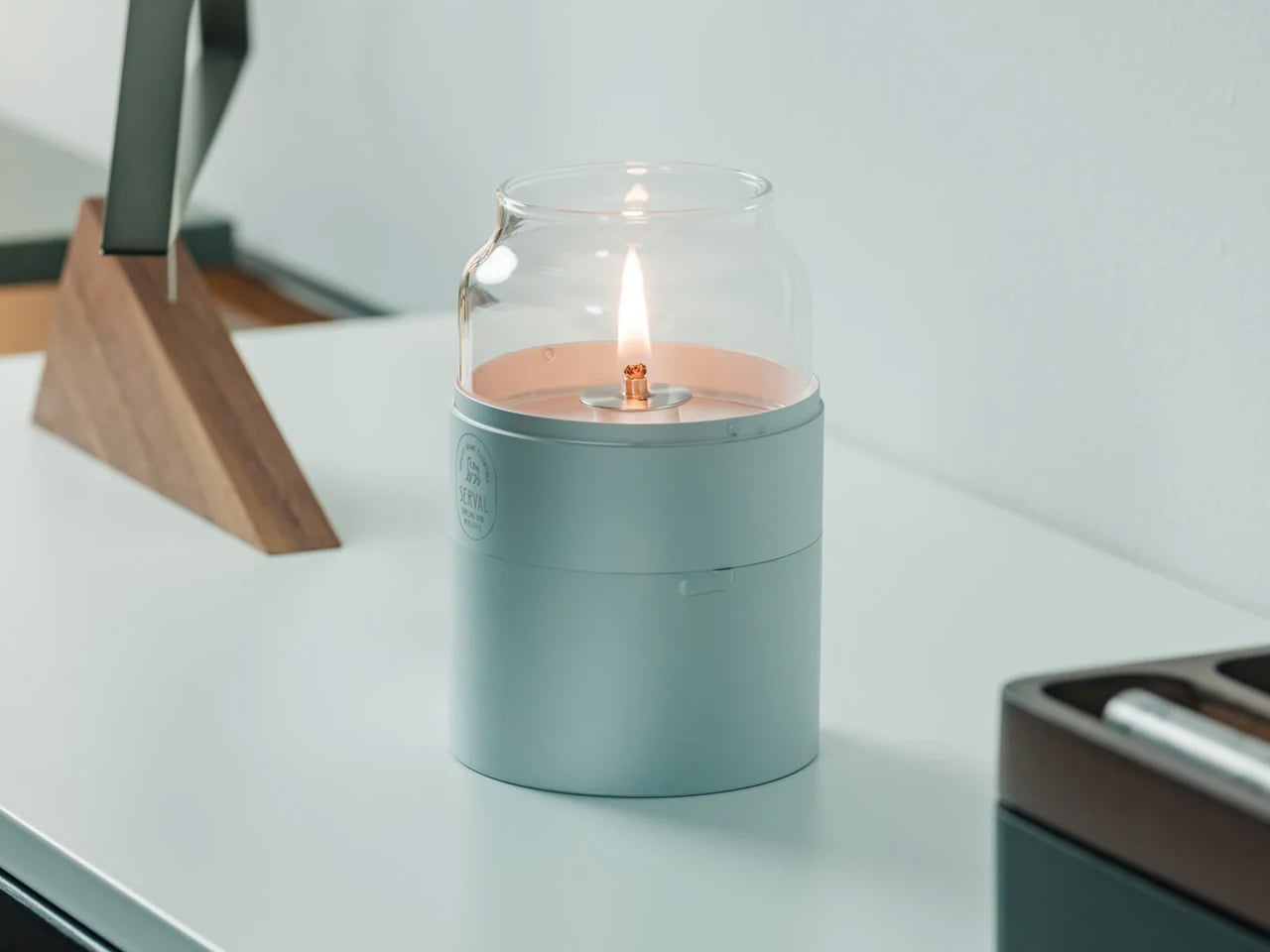
1. Fire Capsule Oil Lamp

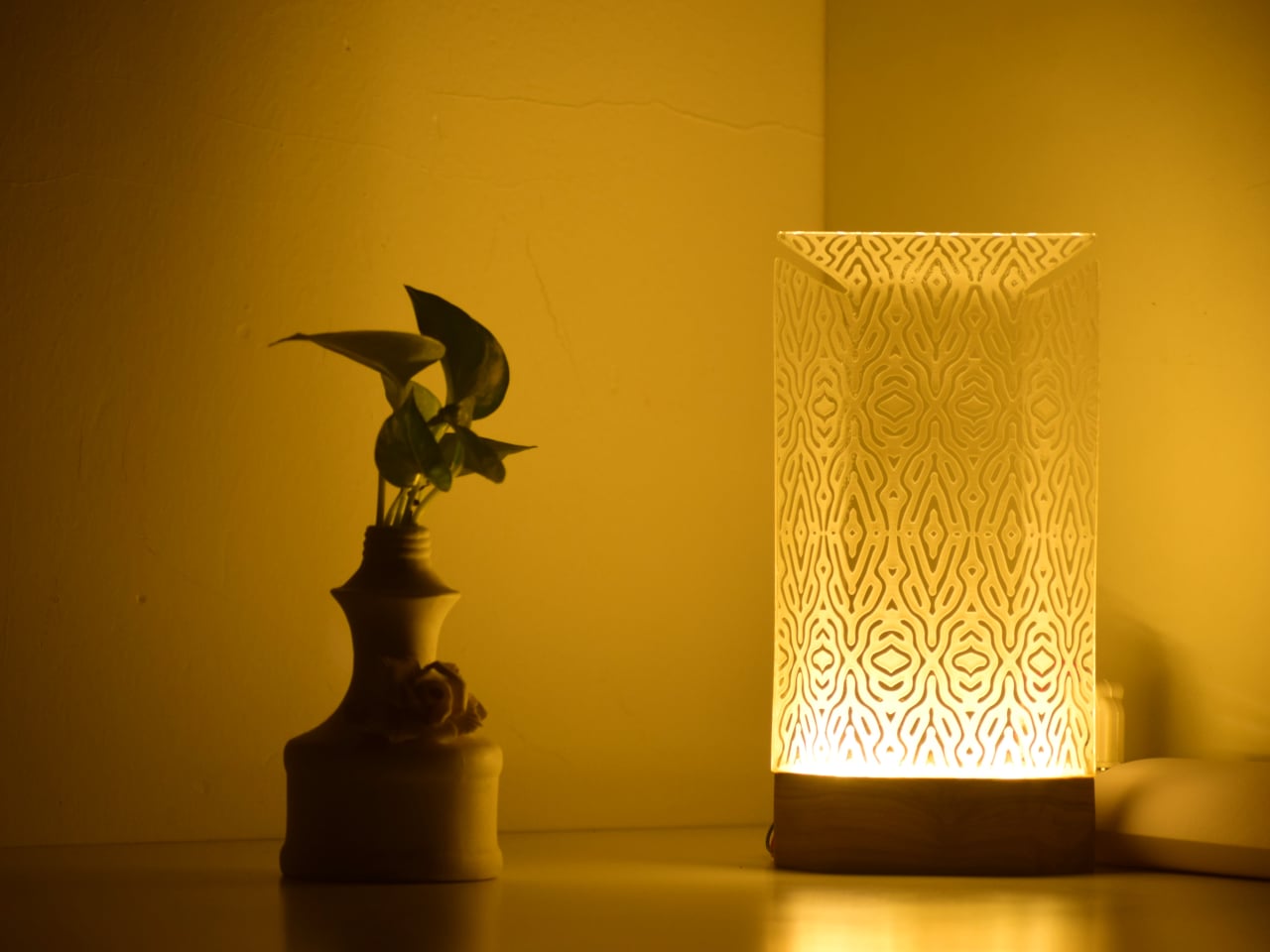
Most ambient lighting products try too hard. They pile on features, app connectivity, color-changing LEDs, and lose the one thing that makes warm light feel warm: simplicity. The Fire Capsule oil lamp goes the other direction entirely. It is a cylindrical glass-and-metal lamp with an 80ml fuel capacity, good for up to 16 hours of continuous flame.

The precision-engineered lid keeps the glass chimney clean between uses, which is a small detail that solves a persistent annoyance with oil lamps (dust settling on the glass and clouding the glow over time). An included aroma plate lets the flame double as a scent diffuser, and the flat-topped design means multiple units stack for storage. The cylindrical form ships with a drawstring pouch for portability, so it works just as well on a campsite as it does on a bedside shelf. In a small room, a single real flame on a low table changes the entire atmosphere without any electrical infrastructure.

Click Here to Buy Now: $89.00

What we like

  • 16-hour burn time from a single 80ml fill is generous enough for an entire evening gathering or a long weekend of ambient use.
  • Stackable design and included carrying pouch make storage painless in apartments where every drawer counts.

What we dislike

  • Open flame in a tiny apartment with limited ventilation requires careful placement and awareness, especially around curtains and textiles.
  • Paraffin oil refills are not always easy to source locally, and the lamp does not work with standard candle wax or tea lights.

2. Kyoto Yusai Linen Noren

A doorway without a door is just a gap. A doorway with a noren is a conversation between two rooms that never quite ends, a soft boundary that lets light, air, and movement pass through while still giving each space its own identity. This linen noren from Kyoto Yusai, printed with a dogwood motif, does precisely that.

What makes the noren so effective in small apartments is its relationship with ma, the Japanese concept of meaningful negative space. The fabric hangs in split panels with intentional gaps, and those gaps become part of the composition. Light filters through. Silhouettes soften at the edges. In a narrow studio where the sleeping area bleeds into the kitchen, a well-placed noren restructures how the whole room reads without touching the floor plan. Swap it seasonally, and it becomes a rotating design object with zero storage cost.

What we like

  • Splits the room without blocking airflow or natural light, which is rare for any room divider at this price point.
  • Seasonal swapping means the interior changes character four times a year with no permanent commitment.

What we dislike

  • Linen wrinkles easily after washing, so it needs careful steaming to maintain that clean drape.
  • The standard sizing may not fit non-Japanese doorframes without minor alterations or a tension rod swap.

3. Brass Ikebana Kenzan


Ikebana looks effortless. A single stem angled just so, a branch suspended at an improbable tilt, a few leaves arranged with the kind of negative space that makes the whole composition feel like a held breath. The kenzan is the hidden mechanism that makes all of it possible, a heavy brass pin frog that sits at the bottom of a shallow vessel and grips stems in place with rows of sharp, fixed needles.

This particular kenzan comes from Sanjo, Niigata Prefecture, a city with metalworking lineage stretching back to the 17th century. The artisans behind it have over 50 years of experience, and the difference shows in the needle sharpness and base weight. Cheap kenzans tip under a heavy branch. This one stays put. The removable rubber gasket protects the vase from scratches and keeps the unit from sliding, and the brass construction means it will outlast the disposable floral foam it replaces entirely. No chemical waste, no single-use plastic, just a solid chunk of metal that holds flowers upright and keeps the water clean longer.

What we like

  • Brass construction from veteran Sanjo artisans means this will last decades without bending, rusting, or losing needle sharpness.
  • Eliminates floral foam, which is a meaningful environmental upgrade for anyone who arranges flowers regularly.

What we dislike

  • A 3.5-inch round kenzan is suited to small-to-medium arrangements only; larger branches or tall statement pieces need a bigger base.
  • Sharp needles require careful handling and storage, especially in households with children or pets.

4. ClearFrame CD Player

Physical media has a specific gravity that streaming cannot replicate. The act of choosing a disc, sliding it into a tray, and watching it spin is a ritual, not a convenience. The ClearFrame CD player leans into that completely, housing the mechanism inside a crystal-clear polycarbonate shell that frames each album cover like a miniature art exhibit, while the black circuit board sits fully exposed behind it.

Bluetooth 5.1 support and a 7-hour rechargeable battery mean it works wirelessly on a shelf, a desk, or mounted on a wall. Multiple playback modes handle full albums and single-track loops. The square silhouette reads more like a design object than consumer electronics, which is the entire point: in a small room, every object occupies visual real estate, and the ClearFrame earns its shelf space by being something worth looking at even when it is not playing. The exposed circuitry is a deliberate aesthetic choice that shares DNA with the wabi-sabi appreciation of process, of letting the inner workings be part of the beauty rather than hiding them behind a seamless shell.

Click Here to Buy Now: $199.00

What we like

  • Wall-mountable and wireless, so it does not consume any surface area in a room where counter space is precious.
  • Transparent body turns the CD cover into wall art and the circuitry into a visual feature, doubling the object’s function.

What we dislike

  • CD collections are increasingly niche, and anyone without a back catalog will need to start buying physical media to get real value from this.
  • Polycarbonate scratches over time, and a transparent shell means every scuff and fingerprint is visible.

5. Oboro Silver Moon Calendar

Wall calendars are usually the first thing to look dated in a room. They pile up with scribbled appointments, faded ink, and a design sensibility that peaked in the office supply aisle. The Oboro moon calendar, a limited-edition 10th-anniversary piece by Japanese brand Replug, operates on an entirely different register. It tracks the lunar cycle on greige paper with reflective silver foil phases and embossed moon textures that shift with the light.

The name comes from “oboro” (朧), a Japanese word evoking the soft, hazy glow of a partially obscured moon. It is a wall piece that functions more like a meditative object than an organizational tool. The silver foil catches and transforms ambient light throughout the day, so the calendar looks different at dawn than it does at midnight. The embossed texture invites touch, which turns checking the date into something tactile and grounding. In a small room, a single well-chosen wall object can set the tone for the entire space, and the Oboro does that with restraint rather than volume.

Click Here to Buy Now: $69.00

What we like

  • Reflective silver foil creates dynamic light play that changes throughout the day, making it feel alive rather than static.
  • Embossed lunar texture adds a tactile dimension that most wall decor completely ignores.

What we dislike

  • A lunar calendar is not a practical replacement for a standard date calendar, so this supplements rather than replaces existing scheduling tools.
  • Limited-edition status means availability is unpredictable, and replacement for the following year is not guaranteed.

6. Pop-up Book Vase

A vase that is also a book. Open the cover and a three-dimensional paper cutout rises from the page, forming a vessel shaped to hold fresh stems. Three different designs sit on successive pages, so flipping through the book changes the vase silhouette and the entire presentation of the arrangement. Turn the whole thing upside down, and the perspective shifts again.

Made from 100% natural pulp with a water-resistant coating, the construction is more durable than it first appears. The paper engineering behind each pop-up is precise enough to support a real bouquet without collapsing, and the book form factor means it folds flat for storage or travel. In a tiny room, where a traditional ceramic vase competes for shelf space with everything else, a vase that disappears into a closed book when not in use is a spatial gift. The playfulness of the form also cuts against the sometimes austere reputation of Japanese-inspired interiors, a reminder that wabi-sabi is not allergic to delight.

Click Here to Buy Now: $39.00

What we like

  • Three vase designs in a single book mean variety without needing three separate vessels taking up shelf space.
  • Folds completely flat when not in use, which is a storage advantage no ceramic or glass vase can match.

What we dislike

  • Water-resistant coating has limits, and prolonged contact with water will eventually degrade the paper over repeated uses.
  • The whimsical form factor may clash with more austere or serious interior styles that lean heavily into earth tones and raw materials.

7. Tosaryu Hinoki Bath Stool

Japanese bathing is not a quick rinse. It is a seated, deliberate process where the stool is as important as the water. Tosaryu’s hinoki cypress bath stools are made by woodworkers in the mountains of Kochi who have been refining their craft since the 1970s. The wood is dried naturally for three to six months without chemical agents, which preserves the aromatic oils that give hinoki its distinctive calming scent.

Place one of these stools in a bathroom, shower room, or home sauna, and the scent fills the space every time steam or warm water contacts the wood. The antibacterial properties of hinoki resin mean the stool resists mold and bacteria without coatings or treatments. Three sizes are available: the Umezawa (10.5 x 7 x 9 inches), the short sauna stool (10.5 x 9 x 11.75 inches), and the tall stool (13.75 x 9.75 x 15.75 inches). Tosaryu operates as stewards of local forests and lakes, using sustainable harvesting methods. In a small bathroom, the stool replaces the generic plastic shower seat with something that smells like a forest and ages like furniture.

What we like

  • Natural hinoki oils provide antibacterial protection and aromatherapy without any chemical treatments or synthetic fragrances.
  • Sustainable production by Tosaryu’s Kochi-based woodworkers means the stool comes with genuine craft lineage, not just marketing copy about nature.

What we dislike

  • Hinoki requires proper drying between uses to prevent cracking; bathrooms without good ventilation will shorten its lifespan.
  • The high stool incurs a $25 shipping surcharge due to its size and weight, which adds to an already premium price.

8. Kintsugi Repair Kit

Kintsugi is the Japanese practice of mending broken ceramics with lacquer and powdered gold, turning the fracture into a visible seam that becomes part of the object’s history rather than a flaw to hide. Poj Studio’s kit packages this tradition into a hands-on experience, providing the materials and master-class guidance needed to repair a chipped or broken plate at home.

The philosophy behind kintsugi aligns with wabi-sabi at its most literal: the acceptance of imperfection, the beauty of age, and the idea that damage does not diminish value. In practice, the kit turns a broken mug or cracked bowl into something more interesting than it was before the accident. For anyone living in a small space where every dish and vessel matters (both functionally and visually), the ability to restore rather than replace is both economical and aesthetically resonant. The gold seams catch light in a way that flat, unblemished surfaces cannot, adding character to a kitchen shelf that could otherwise feel monotonous.

What we like

  • Transforms breakage into a design feature, which fundamentally changes the relationship with fragile objects in a small household.
  • Master-class guidance makes the repair process accessible to beginners, not just experienced ceramicists.

What we dislike

  • Urushi lacquer requires careful handling and curing time, so this is not a quick afternoon fix; patience is part of the process.
  • The standard kit is designed for chips and clean breaks; items with missing fragments need the separate advanced kit.

Where spring takes us from here

The thread running through all eight of these products is not minimalism as deprivation, but minimalism as attention. A noren does not block a doorway. It choreographs how light and bodies move through it. A kenzan does not just hold flowers. It holds the space around them. A kintsugi kit does not fix a broken cup. It reframes what broken even means.

Spring in a tiny room does not need a renovation, a new furniture set, or a Pinterest board full of aspirational layouts. It needs a few well-chosen objects that understand the difference between filling a space and inhabiting it. These eight do that, each in a way that respects the room, the season, and the craft tradition it comes from. The smallest upgrades, when they come from the right place, tend to change the most.

The post 8 Best Japanese Spring Home Upgrades That Make Tiny Rooms Feel Like a Wabi-Sabi Sanctuary first appeared on Yanko Design.

This Panda-Faced Action Camera Might Finally Get Kids Off Their Tablets

Par : JC Torres
17 mars 2026 à 16:20

Kids are natural documentarians. Long before anyone hands them a camera, they’re narrating adventures out loud, pointing at bugs, dragging adults toward things worth seeing. The problem is that nothing currently bridges that instinct and an actual usable device. Smartphones are too distracting. Adult action cameras have interfaces that assume familiarity with exposure menus. Yashas Verma’s Cubix concept starts not with specs, but with a face.

The panda reference is obvious and, more importantly, immediately likable. Two large “squircle” apertures dominate the front, one housing the lens and the other a screen, arranged side by side like a pair of wide-set eyes. The body is white with a matte finish, and the front panel is glossy black. That contrast reads less like a colorway decision and more like a character, which is entirely the point.

Designer: Yashas Verma

Verma’s design moodboard places the concept on a spectrum between “tech” and “cute,” and the finished form lands firmly in the middle. Minimal enough to avoid looking like a toy, warm enough not to feel clinical. The rounded-square geometry carries through from the front apertures to the body corners, giving the whole object a visual consistency that student concept work often skips over in favor of surface polish.

The dual-screen setup solves a genuine behavioral problem. Action cameras for adults assume a single rear screen because operators rarely need to see themselves. Kids, who tend toward vlogging more than action sports, want to check the frame constantly. The front screen handles selfie framing, the rear touch screen manages settings and playback. Removing that guesswork is the single most child-appropriate decision in the entire design.

The body is sized for smaller hands, with one-handed operation as the stated goal. That matters when the other hand is holding a bike grip, a climbing hold, or a very interesting stick. Waterproofing and durability are mentioned in the concept brief, though no specific ratings are given. A child’s definition of waterproof tends to involve full submersion and zero warning, and the gap between those expectations and a modest splash rating has disappointed parents before.

The packaging carries the panda-eye graphic, the same black-and-white palette, and the tagline “Climb. Roll. Capture.” The box also shows an age rating of 10+, which quietly shifts the target older than the concept language implies. A ten-year-old and a seven-year-old are very different grip sizes, and the design’s success depends heavily on which end of that range it was actually built for.

The post This Panda-Faced Action Camera Might Finally Get Kids Off Their Tablets first appeared on Yanko Design.

Chess Hasn’t Looked Like This in a Thousand Years

Par : Ida Torres
17 mars 2026 à 15:20

Chess has been redesigned hundreds of times. Most attempts stay within the same visual vocabulary: carved figures, medieval references, stylized horses and crowns. The king still wears his crown, even when the designer strips everything else away. That iconography is stubborn. It follows the game everywhere it goes. Seoul-based designer Lee Jinwook decided not to follow it.

His Chess Matt Edition doesn’t borrow from that history. It doesn’t nod to it, deconstruct it, or pay ironic homage to it. Each piece is reduced to its essential geometric form, differentiated only by the minimal cuts and angles that distinguish one from another. The king wears a notched crown-like geometry, but it reads more like a Brutalist building than a monarch. The bishop has a diagonal slice through its block. The knight, traditionally the most ornamental piece on any board, is just a rectangle with a curved indent. You’d know each piece by its shape, and you’d know each shape by nothing but itself.

Designer: Lee Jinwook

That restraint is genuinely hard to achieve, and it’s rarer than it looks. Plenty of minimal chess sets still carry the weight of nostalgia by leaning on proportions that echo traditional forms. Lee’s approach feels more rigorous, like the design equivalent of starting with a blank document and refusing to import anything from a previous draft.

The Matt Edition is part of a series, each version produced in a different material. This one uses powder-coated pieces with brushed metal accents along the base. The contrast between the matte surface and the slim metallic band at the bottom of each piece is subtle, but it matters. It gives the set a quiet luxury without announcing it. The board itself doubles as the case cover when flipped, and the entire set packs down into a 115mm cube. That last detail sounds like a footnote but it’s actually the whole point. It means you can take it somewhere. It means the design serves life, not the other way around.

When the pieces are set up and no one is playing, the board looks like a miniature city. A grid of black and white geometric forms at different heights, each one casting its own small shadow. The intention was for the set to read as sculpture between moves, and it absolutely does. The photograph of it mid-game is more compelling than most things sold specifically as decorative objects.

I’ll admit I’m skeptical of design objects that prioritize aesthetics at the cost of function. A beautiful chair that isn’t comfortable is just a sculpture with pretensions. But this set doesn’t ask you to choose. The geometric forms are readable. The scale feels right for actual play. The packaging is considered down to the way the board flips over. The aesthetics and the utility are working in the same direction, which is what good design is supposed to do, and which a lot of objects in this category fail to deliver.

What Lee has also built, whether intentionally or not, is a quiet argument about chess itself. The game doesn’t need its medieval costume to function. Strip away the kings and queens and rooks and what remains is a grid, a set of movement rules, and the cognitive pleasure of solving something in real time. The Chess Matt Edition reminds you of that. It separates the game from its accumulated mythology and puts the focus back on the act of playing.

That’s worth paying attention to right now. The design world is saturated with products that perform a cultural identity rather than express one. This chess set doesn’t perform anything. It just is what it is: precise, considered, and fully confident in its own logic. When you see it sitting on a shelf, black pieces against a white board, matte surface catching a little natural light, it earns the space it occupies. Everything fits into a 115mm cube. The whole set sits in your hand. Not everything that fits in your hand deserves to be considered art, but this one comes close.

The post Chess Hasn’t Looked Like This in a Thousand Years first appeared on Yanko Design.

Oppo Find N6 Review: The Best Foldable Phone Right Now

Par : Aki Ukita
17 mars 2026 à 12:00

PROS:


  • Excellent multitasking experience

  • Nearly invisible and undetectable crease

  • Slim and light form factor for a book-style foldable

  • Powerful performance

CONS:


  • Camera system is good for a foldable, but not truly flagship-level

RATINGS:

AESTHETICS
ERGONOMICS
PERFORMANCE
SUSTAINABILITY / REPAIRABILITY
VALUE FOR MONEY

EDITOR'S QUOTE:

The OPPO Find N6 is one of the few foldables that trades novelty for genuine polish, delivering a device that feels as complete as it does considered.

The Oppo Find N6 arrives at a moment when foldables can no longer rely on novelty alone to justify their place in the premium market. Buyers now expect these devices to feel as polished and dependable as any top-tier flagship, while still delivering the sense of occasion that only a folding design can offer. That is what makes the Find N6 so interesting, because it is not simply trying to look futuristic. It is trying to feel complete.

That question lands differently for me because the Oppo Find N5 has been my daily driver for most of the time since its launch. Living with that phone has given me a clear sense of what Oppo already does exceptionally well in this category, from hardware refinement to the balance between portability and immersion. It also means I came to the Find N6 with real expectations rather than fresh curiosity alone. More than anything, I wanted to see whether Oppo had merely polished an already strong formula or taken a meaningful step forward.

Designer: OPPO

Aesthetics

The Oppo Find N6 does not stray far from the design language established by the Find N5, but it feels like a more polished and disciplined evolution of that formula. The overall look is largely unchanged, yet the Find N6 comes across as more minimalistic and more refined, with a cleaner visual identity that feels calmer and more mature. Rather than chasing a dramatic redesign, Oppo has focused on tightening the details, and that gives the phone a stronger sense of cohesion.

The biggest improvement is in the rear camera treatment. The refined Cosmos Ring camera deco looks more elegant and less ornamental, while the individual camera elements feel more integrated into the overall composition instead of standing apart from it. This makes the back of the phone look tidier and more resolved, which suits the Find N6’s more minimal direction. It still has the visual presence expected of a flagship foldable, but it carries that presence with greater restraint.

What also stands out is Oppo’s color choice. For the first time on one of its foldables, the company is offering a much bolder orange finish, which Oppo calls Blossom Orange, alongside a more classic Stellar Titanium, and the timing does not feel accidental. Ever since the iPhone 17 Pro series introduced orange into the flagship conversation, it feels like other brands have been quick to follow Apple’s lead, and the Find N6 is part of that wave. Even so, the orange works well here, giving the phone more personality, while the gray remains the safer and more traditional option.

Ergonomics

The generous screen real estate of a foldable usually comes with familiar compromises. Thickness, weight, and the crease are often treated as the unavoidable price of admission. The Oppo Find N6, however, feels designed to challenge that assumption in a way that is noticeable the moment you pick it up.

At 8.3 mm when folded and 225 g, the Find N6 feels surprisingly close to a premium flagship bar phone in everyday use. It does not come across as awkwardly bulky or excessively heavy, which makes it more approachable than many devices in this category. That balance matters over time, whether you are using it one-handed, slipping it into a pocket, or simply carrying it through a long day.

That does not mean the form factor is free of trade-offs. If I rest some of the phone’s weight on my pinky, the lower edge can still dig in a bit, especially when the device is open. It is less noticeable than on the Find N5, but not completely gone.

Perhaps the most impressive detail, though, is the crease, or more precisely, how little of it remains. I have never been particularly bothered by creases on foldables, and I was already satisfied with the subtle crease on the Find N5. Even so, the Find N6 feels like a meaningful refinement rather than a minor iteration.

Visually, the crease is practically nonexistent in normal use and only becomes noticeable if the screen is off and viewed from a very specific angle. More impressive still, it also feels nearly absent under the finger when swiping across the display. Our fingertips are quick to pick up even slight ridges or shallow dents, which makes the Find N6’s smooth, uninterrupted surface especially impressive in daily use.

That sense of appreciation only grows once you look at how Oppo arrived at this result. The company refined the hinge architecture itself and paired it with state-of-the-art 3D scanning and 3D printing technologies, a combination that helps explain why the Find N6 feels so polished in the hand.

That same attention extends to the physical controls. In place of the OnePlus-style alert slider on the upper left, Oppo now uses the customizable Snap Key, first introduced on the Find X9 series and now positioned on the upper right side. It can be mapped to quick actions such as launching the camera, turning on the flashlight, starting a voice memo, or opening translation, giving it a broader role than the slider it replaces.

Just below sit the fingerprint reader and volume rocker, both placed lower than they were on the Find N5. That may sound like a minor adjustment, but it makes the controls easier to reach and better aligned with the way the phone naturally rests in the hand. It is a subtle refinement, though one that proves genuinely useful in everyday use.

Performance

With foldables, the screens have to justify the form factor. The Find N6 uses a 6.62-inch cover display and an 8.12-inch inner screen, both with 120Hz LTPO panels. That is the expected hardware at this level, so the more interesting part is how Oppo tries to improve the experience around visibility, comfort, and immersion.

According to Oppo, both displays can reach 1,800 nits in outdoor use, with peak HDR brightness topping out at 3,600 nits on the cover screen and 2,500 nits on the inner panel. In practice, both displays are bright enough to remain comfortably usable even under harsh sunlight. They also support Dolby Vision and HDR Vivid, and content looks rich and vibrant across both panels.

The Find N6 is powered by Qualcomm’s Snapdragon 8 Elite, and it has no trouble keeping up with the kind of multitasking a foldable encourages. Apps open quickly, navigation feels immediate, and even with several windows open at once, the phone stayed smooth and responsive. I also edited a short video on the device, specifically an unboxing of the Find N6 and AI Pen Kit, and the experience was smooth and free of noticeable stutter.

That matters because a device like this only really makes sense if it can handle more than the usual phone workload without feeling strained. Oppo’s software does a good job of making that extra screen space feel useful. Free-Flow Window lets you open up to four apps at once in floating windows, and in practice, it feels less fiddly than it sounds.

Boundless View adds even more flexibility, and the gestures linking the two work naturally enough that moving between layouts never feels like a chore. Resizing windows, shifting focus, and juggling multiple apps all feel smooth and seamless, which makes the Find N6 genuinely effective as a productivity device rather than just a phone with a bigger screen.

Even under sustained use, the phone remained smooth and reasonably controlled, and I also did not notice any stutter while playing Genshin Impact. Gaming feels more like a bonus here than the main point of the device, but the large inner display still gives it a more immersive, almost tablet-like feel than a standard phone can offer.

That same focus on utility extends to the AI Pen Kit, which is one of the more interesting hardware additions. The Oppo AI Pen supports 4,096 levels of pressure sensitivity and works on both the inner and outer displays, which makes the Find N6 more versatile for note-taking, annotation, and quick sketching. Because it connects over Bluetooth, the pen can also double as a remote shutter for both photos and video, which adds a genuinely useful layer of flexibility.

Oppo has also handled the practical side fairly well. The dedicated case gives the pen a proper place to live and keeps it charged through reverse wireless charging from the phone itself. That kind of integration is important because accessories like this are only useful if they are easy to carry and ready when you need them.

The software support around the pen is also fairly thoughtful. Quick Note lets you start writing quickly, a double press switches between writing and erasing, and global annotation makes it possible to mark up content across the interface and export it as an image or PDF afterward. There are also a few more specialized tools, including handwriting optimization, a handwriting calculator, and a Laser Pointer mode for presentations. Not all of these will be essential, but together they make the pen feel more genuinely useful than most stylus add-ons tend to.

Camera

The camera system performs well by foldable standards, but it is not on the level of the best camera-focused flagships. In practice, it feels closer to a solid upper mid-range setup, which is respectable enough for a device like this.

The rear camera system includes a 200MP main camera with a 21mm-equivalent focal length, a 1/1.56-inch ISOCELL HP5 sensor, an f/1.8 aperture, and OIS, a 50MP telephoto at 70mm equivalent with an ISOCELL JN5 sensor, an f/2.7 aperture, and OIS, and a 50MP ultra-wide at 15mm equivalent with another ISOCELL JN5 sensor, an f/2.0 aperture, and autofocus.

In daylight, the Find N6 delivers good detail, pleasing dynamic range, and generally accurate color, even if images tend to run slightly bright. The telephoto and ultra-wide are serviceable, while low light is where the limitations become more obvious, especially when there is movement in the scene.

XPan Mode

Oppo does at least include a healthy set of features, including log video recording and XPan mode. There are also two 20MP selfie cameras, one on the outer display and one on the inner screen, though they feel more useful for video calls than for anything else. Video is also fairly capable, with all three rear cameras supporting up to 4K 60fps Dolby Vision HDR, while the main camera can go up to 4K 120fps Dolby Vision.

Battery and charging

The Find N6 packs a 6,000mAh battery, and in practice, it delivers strong battery life. Unless you are using the camera heavily, it can easily last a full day and more, which is a very good result for a foldable with two high-refresh-rate displays.

Charging is strong as well. The phone supports 80W wired and 50W wireless charging, which makes it easier to top up quickly when needed. That only adds to the sense that the Find N6 is easier to live with day to day than many foldables.

Sustainability

For a foldable, the Find N6 makes a fairly strong durability case. It carries IP56, IP58, and IP59 ratings, and Oppo also points to stronger materials and a more robust hinge design as part of the broader durability story. More importantly, it feels reassuringly solid in hand, which goes a long way in making the device seem built to last.

That is matched by fairly solid long-term support. The phone is TÜV Rheinland certified for one million folding cycles and has minimized crease performance after 600,000 folds, while Oppo promises five years of Android updates and six years of security patches. That may not fully define sustainability, but it does give the Find N6 a more convincing case for longevity.

Value

At a starting price of around $1,440 for 12 GB/256GB configuration ($1,580 for 16 GB/512GB and $1,730 for 16 GB/1TB), the Find N6 is firmly in premium territory, but it also makes one of the strongest value cases in the foldable market. The design is slim and polished, the crease is impressively well controlled, battery life is strong, and the multitasking experience makes the larger display feel genuinely useful. More importantly, it feels like a foldable that gets the fundamentals right rather than relying on novelty alone.

The price is still high, and the camera system does not quite match the best camera-focused flagships, so there are limits to how broadly its value can be argued. But within the foldable category, the Find N6 feels unusually complete and easier to justify than many of its rivals if you already know this is the form factor you want.

Conclusion

After spending time with the Find N6, I came away feeling that Oppo has done more than just refine the formula. This is one of the few foldables that feels designed around everyday use rather than the novelty of unfolding into a larger screen. The ergonomics are better than expected, the crease is remarkably well controlled, battery life is strong, and the software makes the larger display feel genuinely useful.

It is still an expensive device, and the camera system does not quite reach the level of the best camera-focused flagships. Even so, the more I used the Find N6, the more complete it felt. There is a level of polish here that remains rare in this category, and it makes a very strong case for itself as one of the best all-around foldables available right now.

The post Oppo Find N6 Review: The Best Foldable Phone Right Now first appeared on Yanko Design.

Janny Baek’s Ceramics Look Like They’re Still Evolving

Par : Ida Torres
17 mars 2026 à 11:20

Most ceramic art asks you to admire it from a distance. Janny Baek’s work makes you want to lean in closer and check if it’s breathing. Her upcoming solo exhibition, Life Forms, opens at Joy Machine gallery in Chicago on March 20, running through May 9, 2026, and from everything I’ve seen of it, it might be one of the more visually arresting shows to land this spring. The pieces gather across the gallery space like inhabitants of an ecosystem you’ve never visited but somehow recognize. Some forms open outward like blossoms. Others stretch upward with limbs that suggest wings, or stems, or shells. None of them fully commit to being any one thing, and that’s exactly the point.

What makes Baek’s ceramics so compelling is the feeling that the firing process didn’t quite finish the job. The sculptures look caught mid-transformation, as though another hour in the kiln might have resolved them into something more familiar. Instead, they hold their ambiguity like a posture. That deliberate incompleteness is one of the most interesting creative choices an artist can make, and Baek has built an entire body of work around it.

Designer: Janny Baek

Her path to ceramics is almost as unusual as the work itself. Born in Seoul and raised in Queens, she studied ceramics at the Rhode Island School of Design before taking a turn into animation and toy design as a sculptor. Then she earned a graduate degree in architecture from Harvard, co-founded an architecture practice in Manhattan, and spent years designing high-end residential spaces. When the pandemic hit, she returned to clay, setting up a studio in the back of her Flatiron District architecture office. The ceramics world should be grateful for the timing.

That architectural background isn’t incidental. You can see it in the structural logic of the pieces, which begin with coiled bases and build upward through successive additions of clay, each element branching from the last. The result is less like sculpting and more like construction, or perhaps like watching something grow. Her larger work, Plant Life (2025), stoneware with colored sections rising from white shoots, reads almost like a site plan for a garden on a planet where the plants decided to do their own thing.

The technique she relies on is nerikomi, a traditional Japanese method that involves stacking clay of different colors and slicing through it to reveal the pattern within. But Baek’s application of it feels more contemporary than the technique’s origins might suggest. Color, in her hands, is structural rather than decorative. It moves through the clay like a current, not like paint on a surface. She has described color gradients as “the continuous nature of change,” and a multitude of colors as “potential, abundance, and vitality.” That framing matters. It tells you the work isn’t just pretty, it’s philosophic.

The piece titles reinforce this. Micro-organisms, Glow Sticks, and Outer Galaxies. Prismatic Walking Cloud. 5 Eyes (Dream State Series). Cloudbloom. They read like entries in a field guide to a world that hasn’t been discovered yet, which is probably the most accurate way to describe what Baek is building. Her ceramics operate on what one description of the work calls “dream logic, one that accepts incongruity and dissonance as necessary to play and experimentation.” That’s a generous creative framework, and it shows. The work never feels confused or unresolved. It feels deliberate in its strangeness.

What I find most refreshing about Life Forms is that it doesn’t ask you to bring any specific context to it. You don’t need to know the theory behind nerikomi or have an opinion about contemporary ceramics to stand in front of one of these pieces and feel something. They work on a more basic level, the level of looking at something unfamiliar and recognizing it anyway. Like you’ve seen its kind before, somewhere between a dream and a nature documentary.

The post Janny Baek’s Ceramics Look Like They’re Still Evolving first appeared on Yanko Design.

This Wireless Mouse Splits in Half to Reveal a Hidden Game Controller

Par : JC Torres
17 mars 2026 à 10:07

Most people who game on a PC own two things that do roughly the same job at different times: a mouse for the desk and a gamepad for the couch. They live side by side, occasionally getting in each other’s way, and neither one is going anywhere. Pixelpaw Labs, a hardware startup from Bangalore, India, thinks that arrangement is wasteful and has built something to prove it.

The Phase is a wireless mouse that physically separates down the middle into two independent halves. Snapped together, it sits on a desk and works like a normal mouse. Pull it apart, and each half reveals a joystick, triggers, a D-pad on the left side, and face buttons on the right, a split gamepad that was hiding in plain sight the whole time.

Designer: Pixelpaw Labs

That missing scroll wheel is not an oversight. Fitting a traditional wheel in the center of the body would have made the split mechanism impossible, so Pixelpaw replaced it with a capacitive touch strip along the top of the left button. Flicking a finger across it scrolls through documents and web pages, with a glide feature that lets the momentum coast rather than stop abruptly. It’s a trade-off that works around a real geometric constraint.

As a mouse, the Phase is competitive on paper. A 16,000 DPI optical sensor pairs with a 1,000 Hz polling rate when connected via the included 2.4 GHz USB dongle. Bluetooth LE is available for convenience and multi-device pairing across up to three devices, though the polling rate drops to 125 Hz in that mode, a gap that matters in fast-paced PC games.

Up to 18 customizable buttons are mappable through the Pixelplay companion app, and a Layer button doubles each button’s function capacity without adding physical complexity. Battery life is rated at 72 hours per charge over USB-C, which is more than enough to outlast dedicated gaming sessions on either side of its personality.

The controller halves use mechanical tactile switches, which is more than most mobile gaming clip-ons bother with. Pixelpaw also has an accessory called the Phasegrip, a bracket that holds the two separated halves apart with a smartphone mounted in the center, turning the setup into a handheld console for mobile gaming. The Phase works across PC, Android, iOS, iPadOS, and ChromeOS, so switching between devices doesn’t require swapping hardware.

Everything shown so far is pre-production, and the company has been upfront that the final surface finish will differ. That’s a meaningful caveat for a product whose physical fit and feel will determine whether the concept actually holds up. Whether they’ll be able to deliver this Holy Grail of PC gaming, however, is the real question that can only be answered in time.

The post This Wireless Mouse Splits in Half to Reveal a Hidden Game Controller first appeared on Yanko Design.

Spigen Turned Apple’s Iconic Beige Mouse Into an AirPods Pro 3 Case

Par : JC Torres
17 mars 2026 à 08:45

There’s something quietly odd about the era when Apple products were beige. Not bad, just odd. The Macintosh 128K, the boxy rectangular mouse, the Apple Lisa; they were made from a warm off-white plastic that aged into something stranger, a color that collectors now call “Pantone 453 approximately.” Spigen, a brand that usually channels its energy into clear polycarbonate shells, has decided this particular slice of computing history deserves a second life on your keychain.

The Classic LS AirPods Pro 3 case is the latest piece of Spigen’s retro-Mac collection, which launched in January 2026 with an iPhone 17 case modeled after the Macintosh 128K and Apple Lisa. The AirPods case takes a narrower reference: the original Apple mouse, that flat, single-button input device that became an icon despite being spectacularly simple. It joins a phone strap and a MagFit wallet styled as a floppy disk reader, completing a four-piece set.

Designer: Spigen

The case borrows the mouse’s proportions, its warm stone-colored plastic, and its most tactile feature. Spigen built a “Push to Unlock” locking mechanism into the front, positioned where the mouse button would have been. Press it and the hinged lid releases; snap it shut, and it clicks back into place. It’s a small mechanical gesture, but it makes opening and closing feel deliberate rather than accidental.

That security matters more than it sounds. For anyone who has found a lidless AirPods case rattling loose at the bottom of a bag, the locking mechanism is a genuine practical improvement over standard cases. The AirPods don’t pop out unexpectedly, and the lid doesn’t spring open on its own. An adhesive strip inside connects the lid to the top of the AirPods case, so the whole assembly opens cleanly as one unit.

The shell itself is polycarbonate, reinforced with what Spigen calls Air Cushion Technology, an internal structure designed to absorb impact at the corners and edges. The case wraps the AirPods Pro 3 charging case completely, with a cutout at the bottom for USB-C wired charging and a clear path through the back for wireless charging. Both work without removing the case.

A braided lanyard comes included, threading through a loop on the side. This isn’t just a piece of decoration, as small charging cases have a remarkable talent for disappearing into coat pockets and bags, and a physical tether is a more reliable retrieval system than searching by feel. The Classic LS case retails for $44.99, which places it comfortably in the broader collection alongside the $40 MagFit wallet and well below the $60 iPhone case that started it all.

The post Spigen Turned Apple’s Iconic Beige Mouse Into an AirPods Pro 3 Case first appeared on Yanko Design.

7 EDC Upgrades Every Guy Needs Now That Winter Is Finally Over

17 mars 2026 à 01:45

Winter pockets are forgiving. Thick jackets and layered coats offer deep storage, and the cold discourages the kind of outdoor tinkering that puts your gear to the test. Spring strips all of that away. Lighter clothing means fewer pockets, tighter fits, and a sudden reckoning with whatever you have been carrying for the past four months. The transition is a forced audit, and most people discover their loadout has gotten lazy, bloated, or both.

These seven products approach everyday carry from the direction that matters most once the temperature rises: density of function in the smallest possible footprint. No redundant tools. No objects that exist only to look tactical on a desk. Every item here earns its pocket space by solving a specific problem with engineering that is tight enough to disappear into a spring carry without adding bulk—time to swap out the winter loadout for something sharper.

1. ScytheBlade

The curved blade of a scythe does not seem like an obvious candidate for pocket carry, but the ScytheBlade makes it work through radical miniaturization. This titanium folding knife borrows the Grim Reaper’s iconic profile and compresses it into something closer to a tiger claw, creating a blade shape that looks aggressive because it is. At just 46mm when deployed, the ScytheBlade challenges the assumption that effective cutting tools need generous proportions. The curve concentrates force along its edge in ways that straight blades cannot replicate, and that geometry turns a small blade into something disproportionately capable.

Titanium construction keeps the weight to 8 grams, making it barely noticeable when clipped to a pocket. The material also offers corrosion resistance without requiring the constant oiling and maintenance that carbon steel demands, a real advantage for spring carriers when rain and humidity are part of the daily equation. The engineering here is in the confidence to go small. Most EDC knife makers chase longer blades and heavier locks to project seriousness. The ScytheBlade proves the opposite: that an unconventional blade geometry, executed at a micro scale with the right material, outperforms bulk.

What we like

  • At 8 grams in titanium, it disappears into a pocket and removes the excuse to leave a knife at home.
  • The curved blade concentrates cutting force in a way that straight-edge micro knives cannot match, making it more capable than its 46mm length suggests.

What we dislike

  • The 46mm blade length limits what the knife can realistically handle; anything thicker than a zip tie or packing tape will push its limits.
  • The scythe profile is polarizing, and its aggressive look may draw attention in settings where a discreet blade would be preferable.

2. Arcos Driver

Ratchet screwdrivers work well in open spaces. The problem is that screws rarely live in open space. They sit in recessed housings, tucked behind cables, angled into corners where a straight driver either cannot reach or forces an awkward wrist contortion that strips heads. The Arcos Driver addresses this with a folding titanium body that adjusts to 0, 30, 60, or 90 degrees, allowing the tool to adapt its geometry to match the access angle rather than requiring the user to twist around it.

Inside is a three-mode ratchet system: forward for driving with consistent torque, reverse for clean removal, and a fixed-lock mode for stable, precise control when the screw matters more than speed. Integrated bit storage keeps everything in one unit, which is the kind of detail that separates a tool you actually carry from one that lives in a drawer. The titanium build brings strength without the weight penalty that steel ratchets impose, and the folding mechanism locks securely enough at each angle to feel confident under load. Spring means more outdoor projects, more furniture assembly on balconies, and more repairs that winter made easy to postpone. The Arcos Driver fits all of that into a carry-friendly package.

Click Here to Buy Now: $99 $155 (36% off). Hurry, only 15 days left! Raised over $62,000.

What we like

  • Four distinct folding angles mean access to screws in tight, awkward spaces without the wrist strain that straight drivers cause.
  • Integrated bit storage keeps the tool self-contained, so there is no fumbling through a separate bit case mid-task.

What we dislike

  • Kickstarter-funded tools carry inherent delivery uncertainty, and backers should factor in the risk of timeline delays.
  • The folding mechanism adds complexity that could develop play over time, particularly at the 30-degree position where lateral force is highest.

3. Pockitrod

The tactical pen market is full of cylinders that add one feature (usually a glass breaker) to a writing instrument and call it innovation. The Pockitrod is a different animal. Its 6061-T4 aluminum body is machined with a hex cross-section that doubles as a driver grip, and the tool system inside is genuinely modular: a central driver assembly housed within the handle, a box opener with interchangeable 20CV steel tips, an inkless writing implement, and a magnetic-base LED flashlight that threads on as an extension module.

Etched measurement markings along the body function as a built-in ruler, with the zero-reference aligned to the edge for practical, real-world measuring rather than decorative engraving. The pen form factor is the smartest part of the design. A pen lives in a shirt pocket or a bag without raising questions. Nobody looks twice at it. But when work starts, the hex body locks into a bit the same way a proper driver handle would, and the modular extensions transform a pocket pen into a lighting, cutting, and fastening system. It respects the classic pen silhouette while fundamentally expanding what that silhouette can do.

What we like

  • The hex-profile aluminum body works as a genuine driver grip, not a marketing claim; it locks onto bits with the same positive engagement as a dedicated tool.
  • Modular extensions (LED, box opener, driver) thread onto a single pen body, consolidating multiple pocket tools into one.

What we dislike

  • Modularity means more pieces to keep track of, and losing a single extension reduces the tool’s value proposition.
  • The 6061-T4 aluminum is lighter than steel but also softer, meaning the hex edges will eventually round with heavy driver use.

4. AirTag Carabiner

Losing keys is a winter problem that follows people into spring because nobody upgraded their keychain. This carabiner, made from Duralumin composite alloy (the same material used in aircraft and marine construction), is designed to house an Apple AirTag while clipping onto bags, bikes, umbrellas, or whatever tends to wander. The material choice matters because most AirTag holders are silicone or plastic, which means they degrade, stretch, and eventually drop the tag entirely.

Each unit is individually handcrafted from high-quality metal, and the carabiner is also available in untreated brass and stainless steel. The Duralumin version brings water and altitude resistance suited to actual outdoor conditions, not just controlled indoor environments. Spring carry means more time outside, more chances to leave something on a park bench or a cafe table, and a tracking solution that clips seamlessly onto whatever bag or gear you are carrying makes the transition from indoors to outdoors less risky. The lightweight form hides the fact that the alloy underneath is built to handle far harsher conditions than a keychain typically encounters.

Click Here to Buy Now: $129.00

What we like

  • Duralumin composite alloy provides aircraft-grade durability in a form factor that adds almost no perceptible weight to a bag or keyring.
  • Handcrafted metal construction outlasts silicone and plastic AirTag holders, which tend to stretch and lose grip over months of use.

What we dislike

  • Apple AirTag is not included, so the total cost of entry includes both the carabiner and the tag itself.
  • The tracking functionality is Apple ecosystem only, leaving Android users without a compatible option.

5. Fingertip-sized Rechargeable Flashlight

World’s smallest is a claim that usually comes with an asterisk. This flashlight, built as a DIY experiment by YouTube channel Gadget Industry, skips the asterisk. It sits on the tip of a finger. Inside that resin shell: a lithium-polymer battery, a charging circuit, a touch-based control system, and a white LED. That is a fully rechargeable, functional light source condensed into a form factor that most people would mistake for a button.

The scale alone is the point. In a crowded EDC landscape where flashlights compete on lumens, beam distance, and tactical modes, this micro torch takes the opposite approach. It prioritizes presence over power: a light source so small that it will always be with you, because forgetting it is almost impossible. Spring evenings still get dark, and the gap between leaving work and arriving home often involves poorly lit stairwells, parking garages, or bike paths. A light that lives permanently on a keychain or in a coin pocket fills that gap without adding any detectable weight. It is a reminder that miniaturization itself can be the innovation.

What we like

  • The form factor is so small that it can live permanently on a keychain without adding bulk, which means it is always available.
  • Fully rechargeable with touch controls, so there are no disposable batteries and no physical switches to break.

What we dislike

  • As a DIY build from a YouTube channel, it is not commercially available, which limits accessibility to viewers willing to replicate the project.
  • The tiny lithium-polymer battery means the runtime is limited, and the light output is functional rather than powerful.

6. Titaner Swing Ratchet System

Most ratchets need at least 15 to 30 degrees of swing to engage the next tooth. In tight spaces, that range is the difference between completing a turn and stalling. The Titaner swing ratchet compresses that arc to 4 degrees, which means it can operate in gaps where conventional ratchets physically cannot cycle. Both sides of the ratchet core are functional, with CNC-engraved directional markers (one side locks, the other releases) for intuitive control without trial-and-error guessing.

At 29.8 grams, the system weighs 40% less than traditional ratchets while delivering full torque. The modular design allows different driver heads and bit configurations, so the same core handles multiple fastener types without carrying separate tools. Spring projects (tightening deck furniture, adjusting bike components, assembling outdoor gear) tend to involve screws in confined or partially accessible locations. A ratchet that fits those conditions at under 30 grams is the kind of tool that justifies its pocket space every week rather than sitting idle waiting for a big job. The precision here is not about power. It is about access.

What we like

  • A 4-degree swing arc allows the ratchet to function in spaces so tight that standard ratchets cannot even begin to cycle.
  • At 29.8 grams, it is 40% lighter than traditional ratchets, making it realistic for daily pocket carry rather than toolbox-only storage.

What we dislike

  • Ultra-compact ratchet heads can feel less confident under heavy torque loads compared to full-sized counterparts.

7. Cubik

Knife designers typically rely on springs, flippers, or complex bearing systems to get a blade open. The Cubik discards all of that in favor of gravity. Press the trigger, hold it upside down, and the blade drops into position. Release the trigger, and it locks. This mechanism eliminates the springs that rust, bearings that fail, and maintenance cycles that plague traditional folders. The knife works with physics rather than fighting it, and the satisfying weight of the blade swinging into place feels like the mechanism earned its simplicity.

That simplicity does not mean weakness. The Cubik locks firmly enough to pierce hardwood, which puts it in functional territory that most gravity-deploy designs cannot reach. The tungsten carbide glass breaker integrated into the rear end transforms what could be a gentleman’s folder into a legitimate emergency tool. When most EDC knives chase complexity through additional deployment systems, assisted-open mechanisms, and axis locks, the Cubik goes the other direction. One moving part. One material is doing the heavy lifting. The result is a knife with fewer failure points and a deployment method that never gets old to use.

What we like

  • Spring-free gravity deployment means zero mechanical parts that can rust, jam, or wear out over years of daily use.
  • The integrated tungsten carbide glass breaker elevates the knife from an everyday cutter to a genuine emergency tool.

What we dislike

  • Gravity deployment requires the knife to be held upside down, which is slower than a spring-assisted or flipper-based opening in time-sensitive situations.
  • The legal status of gravity knives varies by jurisdiction, and some regions classify them differently from standard folding knives.

Lighter pockets, sharper choices

The shift from winter to spring is not about adding gear. It is about compressing a function into less space. Thinner jackets, shorter pockets, and more time outdoors demand a loadout that earns its presence through utility rather than just occupying real estate. These seven tools share a design philosophy rooted in that compression: titanium, where weight matters; modularity, where versatility matters; and miniaturization, where pocket space is the constraint.

Spring carry is a constraint worth designing for. The tools that survive the seasonal edit are the ones that do their job without reminding anyone they exist, until the moment they are needed. That is the entire point of everyday carry, and these seven understand it.

The post 7 EDC Upgrades Every Guy Needs Now That Winter Is Finally Over first appeared on Yanko Design.

CIGA Design Just Built the Most Interesting Tourbillon Watch of 2026

Par : Sarang Sheth
17 mars 2026 à 00:30

In Mandarin, the phrase 马上 (mǎ shàng) translates literally as “on horseback,” but its common meaning is “immediately” or “without delay.” It’s a concept of swiftness and forward momentum. For its Year of the Horse timepiece, CIGA Design has built an entire watch around this clever piece of wordplay. The design embodies that feeling of instant progress and unstoppable movement, creating a narrative woven directly into the mechanical and aesthetic choices. It is a watch about the philosophy of action.

The central tourbillon is the engine of this idea, its constant rotation a visual metaphor for momentum that the wearer sees with every glance at the wrist. The dial’s concentric grooved rings radiate outward from this spinning core, amplifying the sense of energy in every direction. A 24K gilded horse at six o’clock connects the concept directly to its zodiac inspiration, rendered small and precise, more like a seal than a decoration. CIGA Design, the first Chinese watchmaker to win the Grand Prix d’Horlogerie de Genève, has a track record of treating mechanics as design language, and this is the clearest expression of that philosophy yet. The cultural reference and the engineering are telling the same story, which is rarer in theme watches than it should be.

Designer: CIGA Design

Putting a tourbillon front and center is a serious power move. Most watchmakers tuck it away at the six o’clock position, but CIGA’s in-house CD-12-SI caliber was clearly designed for the spotlight. The entire visual architecture of the watch is built to serve this mechanism. It runs at a modern 28,800 vibrations per hour, which gives the balance wheel a smooth, fluid sweep. A 38-hour power reserve is perfectly serviceable for a manual-wind piece, meaning you get to have that tactile interaction with it daily. It’s the kind of engineering that invites you to look closer, to appreciate the complexity instead of just accepting that it works.

The case material, Grade 5 titanium, is a choice that speaks volumes. At 45.5mm, this watch could have been a heavy, unwieldy piece of metal in steel, but titanium makes it surprisingly light and comfortable on the wrist. The black DLC coating gives it a tough, scratch-resistant finish that feels both modern and understated. Those concentric grooves on the dial are the most impressive part of the case work. They give the flat black dial a sense of depth and texture that plays with light in interesting ways. It’s a very architectural approach that prevents the watch from feeling boring, which is a real risk with monochrome designs.

You solve the problem of telling time without cluttering the main event with a pair of floating diamonds for hands. It’s a brilliant, minimalist solution. Legibility might take a slight hit in certain lighting, but it’s a worthy trade-off for maintaining an unobstructed view of the tourbillon. The strap is shell cordovan, a fantastic, non-porous leather known for its durability and rich patina over time. Pairing it with a hidden butterfly clasp was the right call, preserving a clean, unbroken line around the wrist. These details show a design team that was thinking about the complete ownership experience, not just the initial wow factor.

The $2,699 price fundamentally challenges the idea that an in-house tourbillon must cost as much as a mid-size sedan. This watch appeals directly to the enthusiast buying the complication itself, not the logo on the dial. The 199-piece production run feels like a calculated appeal to a very specific customer who values the engineering over the emblem. With this move, CIGA methodically builds its credibility on accessible complexity and a design language that is unmistakably its own. They are carving out a space by delivering serious horology without the traditional five-figure barrier to entry.

The post CIGA Design Just Built the Most Interesting Tourbillon Watch of 2026 first appeared on Yanko Design.

At $39K, This 16-Foot Tiny Home Has No Business Fitting a Full Kitchen and Loft Inside

16 mars 2026 à 23:30

At just 16 ft (4.9 m) long, the Genesis 16′ from Dragon Tiny Homes is one of the more compact tiny houses on the market. Despite its modest footprint, the layout accommodates a living area, a well-equipped kitchen, a full bathroom, and a lofted bedroom, making it a more complete package than its dimensions suggest.

The Genesis 16′ is part of Dragon Tiny Homes’ Genesis line, built on a double-axle trailer and finished in engineered wood siding. Its ground floor measures 136 sq ft (12.6 sq m), considerably smaller than most European tiny homes and a fraction of the size of larger North American models that can reach up to 52 ft (15.8 m). It’s not designed for family use, but its compact, towable build makes it a practical option for those seeking a mobile living solution.

Designer: Dragon Tiny Homes

Inside, the home is finished in shiplap with vinyl flooring. The living area sits just past the entrance and includes a sofa and a wall-mounted TV. The space is tight, as one would expect, and represents perhaps the most noticeable trade-off of living at this scale. There isn’t room for the kind of comfortable, sprawling seating most people are accustomed to at home.

The kitchen, however, is a highlight. Dragon Tiny Homes describes it as a significant upgrade over previous Genesis models, and the spec list backs that up: an oven, a double induction cooktop, a sink, a full-size fridge/freezer, and ample cabinetry. It won’t accommodate large-scale cooking, but it’s genuinely better equipped than kitchens found in many larger tiny homes.

The bathroom occupies the opposite end of the ground floor. It’s predictably small but efficiently arranged, with a walk-in shower, a vanity sink, and a flushing toilet. Access to the loft bedroom above is via a storage-integrated staircase, a practical design decision that makes good use of space that would otherwise go to waste. The loft itself has the low ceiling typical of tiny house bedrooms and fits a double bed alongside a storage unit that also serves as a privacy divider.

The Genesis 16′ is currently available for purchase at $38,995, a notably affordable price point in the current tiny home market. Dragon Tiny Homes offers delivery across the United States, and prospective buyers are advised to contact the company directly for delivery rates and availability. For those open to a smaller footprint, the Genesis 16′ demonstrates that a thoughtfully designed layout can go a long way in a very limited space.

The post At $39K, This 16-Foot Tiny Home Has No Business Fitting a Full Kitchen and Loft Inside first appeared on Yanko Design.

Hier — 16 mars 2026Yanko Design

Futurewave Just Built a Smartwatch That Works Off the Grid

Par : Ida Torres
16 mars 2026 à 13:20

Most smartwatches are sold on the premise of convenience. They track your steps, ping you when you get a text, tell you to breathe, and remind you to stand up every hour like a politely nagging coworker strapped to your wrist. I don’t say that as a knock on the category. Convenience is genuinely valuable. But somewhere along the way, the smartwatch conversation became entirely about optimization and lifestyle metrics, and we kind of forgot that the wrist is also a really good place to put something that could keep you alive.

That’s where O-Boy comes in. Developed by Brussels-based design studio Futurewave, O-Boy is a satellite-connected smartwatch built specifically for emergencies in places where mobile networks simply don’t exist. No bars. No Wi-Fi. No backup signal. We’re talking mountains, open ocean, remote job sites, the kind of geography that doesn’t care about your carrier plan. In those environments, O-Boy functions as a direct link to satellite communication, allowing the wearer to transmit an emergency alert regardless of terrestrial infrastructure.

Designer: Futurewave

The premise sounds straightforward enough, but the execution is what makes this project interesting. Getting satellite communication hardware into a compact, wearable form factor is not a small feat. Futurewave brought together product designers, electronics engineers, and antenna specialists to make it work, and rethought the assembly system entirely from how conventional wearables are manufactured. That kind of cross-disciplinary collaboration tends to produce things that actually push the category forward rather than just iterating on what’s already there.

Visually, O-Boy reads as deliberate and utilitarian without being overtly tactical or rugged-for-rugged’s-sake. It doesn’t look like a watch that belongs exclusively to climbers or military personnel, which I think is actually the right call. The moment you design something to look extreme, you narrow your audience to people who already identify with that world. O-Boy appears to be reaching for a broader user: anyone who spends time in remote environments, whether for work or adventure, and wants a layer of safety that their phone simply cannot provide.

I’ll be honest about something. I’ve never been fully convinced that the average smartwatch user needs another notification device. The market is crowded, the differentiation is thin, and most new entries end up competing on specs that only matter to enthusiasts. O-Boy sidesteps that conversation almost entirely. It’s not trying to be the smartest watch. It’s trying to be the one you’d actually want on your wrist when a situation becomes life-or-death. That’s a completely different design brief, and it produces a completely different kind of product.

What I appreciate most is that the project seems to understand its context. Conventional mobile networks cover only a fraction of the Earth’s surface. Vast swaths of ocean, mountain ranges, deserts, and rural work sites exist in a communication dead zone that we collectively don’t think about until something goes wrong. The Apple Watch’s satellite SOS feature hinted at this need, but that capability is baked into a device designed primarily for a very different kind of user, sold at a premium price point and wrapped in a broader ecosystem. O-Boy is positioning itself as something more focused, more purpose-built, and arguably more honest about what it’s actually for.

Does it solve every problem in the wearable safety space? Almost certainly not. Satellite communication latency, subscription models for satellite access, and battery constraints are all real questions that any device in this category has to reckon with. Futurewave hasn’t published exhaustive technical specs publicly, so some of those answers remain open. But as a design concept and a signal of where wearables could be heading, it’s genuinely compelling.

The best design doesn’t ask you to change your habits. It meets you exactly where you are, anticipates the moment things go wrong, and gives you a way through. O-Boy feels like it was built with that thinking at its core. Whether it reaches mass production or stays within niche markets, the conversation it’s starting is one worth having.

The post Futurewave Just Built a Smartwatch That Works Off the Grid first appeared on Yanko Design.

7 Best Pocket-Sized Tech Gadgets Built for the Modern Minimalist

16 mars 2026 à 11:40

Somewhere between the overstuffed tech pouch and the empty pocket lies a sweet spot that most gadget makers ignore. The minimalist carry is not about owning less for the sake of it, but about each object earning its place through thoughtful design and genuine daily utility. We have been keeping tabs on pocket-friendly gadgets that manage to pack serious functionality into forms small enough to forget about until the moment they are needed. These seven picks balance portability with purpose, skipping gimmicks in favor of smart engineering.

What ties this list together is a shared restraint. None of these products tries to do everything. Each one solves a specific problem within a compact footprint, and the design decisions behind them reflect a growing shift in how makers approach portable tech. Less bloat, more intention, and a willingness to rethink form factors that have gone unchallenged for too long.

1. OrigamiSwift Mouse

The OrigamiSwift borrows its name from Japanese paper folding, and the comparison holds up. This foldable Bluetooth mouse collapses flat for storage and springs into a full-sized shape in under half a second, making it one of the more clever portable input devices we have come across recently.

At just 40 grams, the mouse is lighter than most pens and thin enough to slip into a jacket pocket without adding bulk. The ergonomic curve that appears when unfolded feels closer to a standard desktop mouse than most travel mice bother attempting, which makes extended work sessions far less punishing on the wrist.

Click Here to Buy Now: $85.00

What we like

  • The origami-inspired folding mechanism is quick and satisfying, going from flat to functional almost instantly.
  • Weighing only 40 grams, it vanishes into a bag or pocket and adds almost zero weight to a travel setup.

What we dislike

  • The folding hinge is a mechanical point of failure that could wear over time with heavy daily use.
  • Bluetooth-only connectivity means no option for a USB dongle, which can be a dealbreaker for users who prefer a dedicated receiver.

2. DuRobo Krono

Reading on a phone screen is a compromise most people accept without questioning. The DuRobo Krono pushes back on that default by squeezing a 6.13-inch E Ink Carta 1200 display into a form factor that fits pockets as easily as a smartphone, but replaces the distraction engine with a focused reading and productivity tool.

The 300 PPI resolution matches what premium Kindles deliver, and the tall 18:9 aspect ratio gives the Krono a narrow, phone-like grip at 154 x 80 x 9mm and 173 grams. Built-in AI capabilities turn it into a note-taking and creative thinking companion, not just a page-turner.

What we like

  • The E Ink display at 300 PPI is sharp and comfortable for extended reading without the eye fatigue that LCD screens cause.
  • AI features baked into the device add a productivity layer that separates it from standard eReaders stuck in single-purpose territory.

What we dislike

  • E Ink refresh rates remain sluggish for anything beyond static pages, making note-taking and navigation feel slower than on a phone.
  • At 6.13 inches, the screen is on the smaller side for PDFs and academic papers that need more real estate to be readable.

3. Pokepad Pocket PC

Most devices aimed at students are either stripped-down tablets or locked-down phones fighting a losing battle against social media. Pokepad takes a different route: a compact learning device shaped like a slim rectangular box, with a flip-out pen and zero gaming apps. The goal is a distraction-free tool that travels from classroom to bus to bedroom.

The design team tested multiple shapes before landing on this box form factor, balancing enough internal volume for a decent battery, speakers, and a pen mechanism without tipping into tablet territory. The deliberate absence of an app store full of entertainment is the product’s sharpest design choice, and its most controversial one.

What we like

  • The flip-out pen integrated directly into the body eliminates the need to carry (and inevitably lose) a separate stylus.
  • A distraction-free software environment means this device stays focused on learning rather than competing with TikTok for attention.

What we dislike

  • This is still a concept, so there are no confirmed specs, pricing, or a release timeline to evaluate.
  • The locked-down software approach assumes students will not simply resist using a device that blocks entertainment entirely.

4. Battery-free Amplifying iSpeakers

In a category drowning in Bluetooth speakers that need charging, the iSpeakers strip things back to pure physics. This metal smartphone speaker amplifies sound using acoustic design alone, with no battery, no electricity, and no pairing process. Slot a phone in, and the Duralumin body does the rest.

The material choice is the interesting detail here. Duralumin is an aluminum alloy used in aircraft construction, chosen for its vibration-resistant properties and its ability to project sound cleanly. The speaker’s proportions follow the golden ratio, which shapes how sound waves travel through the chamber and spread outward. Optional +Bloom and +Jet mods (sold separately) let users direct sound for different room setups.

Click Here to Buy Now: $179.00

What we like

  • Zero power requirement means no batteries to charge, no cables to carry, and no wireless connectivity to troubleshoot.
  • Duralumin construction gives it a premium, lasting feel that ages well and resists the kind of dings that kill plastic speakers.

What we dislike

  • Volume output is inherently limited by passive amplification, so this will not fill a large room or compete with powered speakers.
  • Compatibility depends on phone size and speaker placement, so not every phone model will fit or project sound optimally.

5. Unix UX-1519 NEOM Power Bank

Power banks are the most boring objects in the average carry. The Unix UX-1519 NEOM challenges that assumption by wrapping 10,000mAh of capacity and 22.5W fast charging in an industrial design language that actually looks intentional. This is a real, shipping product, not a concept render.

The retro-modern aesthetic slots neatly alongside devices from brands like Nothing and Teenage Engineering, where exposed design elements and visible construction details are part of the appeal. Under the surface, a high-density Lithium Polymer battery provides a safer, longer-lasting cell compared to standard lithium-ion packs found in most competing power banks.

What we like

  • The industrial design treatment turns a utilitarian object into something worth displaying alongside the rest of a curated collection.
  • 22.5W fast charging keeps compatible devices topped up quickly, cutting the time spent tethered to a power bank.

What we dislike

  • The design-forward approach may command a price premium over functionally identical power banks with plainer exteriors.
  • At 10,000mAh, capacity is adequate for one to two phone charges, but falls short for users who need to power tablets or laptops on the go.

6. Keychron B11 Pro

Portable keyboards have spent years treating compactness as the only variable worth optimizing. The Keychron B11 Pro adds a second priority: ergonomics. It folds in half to a 196.3 x 143 mm footprint (smaller than a paperback) at 258 grams, but unfolds into a 65% Alice layout that angles both key clusters inward for a more natural wrist position.

The Alice geometry is what separates this from every other folding keyboard in its price bracket. Keychron already uses the same split-angle approach in the desk-bound K11 Max, a full mechanical keyboard, so the ergonomic logic is well tested. Putting it into a foldable form at $64.99 is a different proposition, one that treats travel typing as something deserving of the same wrist comfort as a home office setup.

What we like

  • The Alice split layout reduces lateral wrist strain during long typing sessions, a benefit that flat portable keyboards do not offer.
  • At $64.99, the price point is accessible compared to other ergonomic keyboards that cost two to three times as much.

What we dislike

  • A 65% layout means missing dedicated function rows and navigation clusters, which power users may find limiting.
  • The folding hinge adds a visible seam along the middle of the keyboard that could collect dust and affect long-term build quality.

7. Frame CD Player

Streaming killed the CD, but it never replaced the ritual. The Frame CD player leans into that gap with a portable player that does double duty as a display for album jacket art. Pop in a disc, slide the cover art into the built-in frame, and the album becomes an object again instead of a thumbnail on a screen.

Bluetooth 5.0 lets the player connect to wireless speakers and earphones, so it works within modern audio setups without demanding a wired system. A built-in battery makes it portable enough to move between rooms or take on the go, and the minimalist housing is designed to hang on a wall as a piece of functional decor when not in transit.

Click Here to Buy Now: $169.00

What we like

  • The album art frame transforms a music player into a visual display piece, giving physical media a presence that streaming cannot replicate.
  • Bluetooth 5.0 connectivity bridges the gap between vintage formats and modern audio gear without extra adapters or cables.

What we dislike

  • CD collections are shrinking, so the player’s long-term utility depends on how committed a listener is to physical media.
  • Sound quality through Bluetooth compression will not satisfy audiophiles who are drawn to CDs for their lossless audio in the first place.

Less carry, more intent

The common thread running through these seven gadgets is not a spec sheet or a price bracket. It is an attitude toward what portable tech should be: small enough to disappear when not needed, capable enough to perform when called upon, and designed with enough intention that carrying them feels like a choice rather than a burden. Not every product on this list will suit every carry, but each one earned its pocket space.

What makes this current wave of compact gadgets exciting is the refusal to treat portability and quality as opposites. The best pocket-sized tech does not ask for compromise. It simply demands better design thinking, and these seven products deliver on that front in different, often surprising ways.

The post 7 Best Pocket-Sized Tech Gadgets Built for the Modern Minimalist first appeared on Yanko Design.

This Jellyfish-Inspired Lamp Transforms When You Switch It On

Par : JC Torres
16 mars 2026 à 10:07

Table lamps have a fairly narrow brief: sit on a surface, produce light, and try not to embarrass themselves in the process. Most manage two out of three. The Aurelia table luminaire takes a more considered approach, drawing from the slow, hypnotic movement of jellyfish to build something that works as a light source and as an object worth looking at when it’s switched off.

The reference point is specific, not from a general impression of the ocean, but from the particular way jellyfish tentacles move: slow, layered, and almost meditative in repetition. That quality informs the lamp’s layered construction and the dense organic lattice etched across its translucent shade. The pattern reads quietly in a lit room. Switch the lamp on and the whole surface activates, casting warm amber light through the texture in a way that feels atmospheric rather than task-driven.

Designer: Nizamuddin N.S

That distinction matters for where the lamp is meant to live. Aurelia isn’t designed to light a workspace, and the designer makes no claim that it should. The design targets bedside tables, desk corners, and living spaces where the goal is to soften the mood of a room rather than sharpen its focus. Diffused light changes the quality of a space in ways that sharp overhead sources simply cannot manage, which is the quiet premise the whole lamp is built around.

The physical form carries that logic through. The shade is a tall, slim panel mounted on a dark rectangular base that reads as wood. Unlit, the lamp is restrained and cool, with the etched lattice surface present but not clamoring for attention. Lit, the object shifts register entirely. Warm amber pushes through the pattern, and the base-to-shade contrast, dark below and luminous above, becomes the lamp’s defining visual move.

Beyond the light itself, Aurelia stands as a small sculptural piece meant to give a room some character. That’s a harder claim than it sounds. Most decorative lamps lean entirely on their shades for visual interest and have nothing to offer in the middle of the afternoon. Aurelia’s etched surface is structured enough to hold attention without illumination, which is the minimum requirement for a lamp that wants to be treated as more than a lamp.

There’s also a practical dimension that the jellyfish reference shouldn’t distract from. A lamp that produces soft, diffused warmth rather than direct output is genuinely useful in spaces that already have overhead lighting covered. It fills a secondary role well: the kind of light you turn on at the end of the day, not the kind you read by, and rooms that lack that option tend to feel unfinished in ways that are hard to articulate.

The post This Jellyfish-Inspired Lamp Transforms When You Switch It On first appeared on Yanko Design.

Michael Jantzen’s Garden Retreat Has 30 Panels to Rearrange by Hand

Par : JC Torres
16 mars 2026 à 08:45

Most garden structures ask one thing of you: sit still and enjoy the shade. A pergola is a pergola, a gazebo is a gazebo, and neither one particularly cares what the afternoon light is doing. Michael Jantzen’s Interactive Garden Pavilion operates on a different premise entirely, one where the occupant has as much say over the structure as the designer did.

Built from sustainably grown stained wood and painted a uniform forest green, the pavilion sits on an octagonal support frame fitted with 30 slatted hinged panels across its walls and roof. Each panel pivots independently, sliding and rotating along the frame before locking into position. Open them wide on a hot afternoon, and the interior breathes. Angle them down against the glare, and the space dims considerably.

Designer: Jantzen

That last point is where the design earns its name. Most adjustable outdoor structures offer a single variable, usually an awning or a retractable canopy, within an otherwise fixed form. Here, the entire skin of the building is the variable. The wall panels, roof panels, and ground-level platform extensions can all be repositioned, which means the pavilion can look substantially different from one afternoon to the next.

Pull the panels shut on three sides, and the structure becomes a genuinely private enclosure. Splay them open, and the interior connects fully to the garden around it. In one arrangement, it reads as a dense closed form. In another, the structure opens up entirely, and the slatted framework becomes almost sculptural against the lawn.

Inside, two benches with adjustable backrests run the length of the interior, facing each other. The seating is built into the frame, which keeps the floor plan clean and leaves room to recline fully. When the overhead panels are partially open, sunlight enters in sharp parallel bands that shift across the benches as the day moves, a quality that is either meditative or distracting depending on what you came in for.

The construction logic is also notably practical. The pavilion is a prefabricated modular system, so the components can be scaled before assembly or joined with additional units to form a larger cluster. No foundation is required in most configurations. Given its size and type, a building permit is unlikely to be needed in many jurisdictions, which removes one of the more tedious barriers between an interesting design and an actual garden.

Jantzen has spent decades proposing architecture that responds dynamically to its occupants, much of it remaining on paper. This pavilion is one of the cases where the idea got built, and the result holds up at close range. The slatted wood is honest about what it is, the green paint ties the structure to the garden without trying to disappear into it, and the hinge mechanism does exactly what it promises.

The post Michael Jantzen’s Garden Retreat Has 30 Panels to Rearrange by Hand first appeared on Yanko Design.

LiberNovo Omni Just Won the iF Design Award 2026 for Wellness Design

Par : JC Torres
16 mars 2026 à 01:45

Most office chairs operate on a quiet assumption that sitting is something your body should adapt to, not the other way around. You adjust the height, nudge the lumbar support into roughly the right position, and then spend the rest of the day subtly fighting the chair anyway. The ache between your shoulders, the stiffness in your lower back by mid-afternoon, that’s just part of the deal, apparently, and most of us have accepted it without much argument.

LiberNovo decided not to accept it. The result is the Omni, a chair the company calls a Dynamic Ergonomic Chair, and it just picked up the iF DESIGN AWARD 2026 in the Product Design – Beauty/Wellness category. The iF Design Award has been one of the most internationally respected design recognitions since 1954, with this year’s cycle drawing more than 10,000 entries from over 60 countries. That’s a serious field to stand out in

Designer: LiberNovo

Click Here to Buy Now: $929 $1099 (15% off). Hurry, deal ends in 48-hours!

The core idea behind the Omni is that your posture doesn’t stay fixed throughout a workday, so your chair probably shouldn’t either. The Bionic FlexFit Backrest is built around that logic, using 16 spherical pivot points, 8 adaptive flexible panels, and 14 dual-connection points to follow the natural curve of your spine as it shifts. It covers you from the hips up through the shoulders, spreading pressure across the whole back rather than piling it onto one fixed lumbar point.

What makes this work in practice is the Dynamic Support system, which adjusts automatically to changes in your posture without you having to reach for anything. Lean forward during a focused stretch of work, sit back when you’re thinking something through, the chair tracks those shifts, and responds in real time. It’s the kind of feature that sounds modest until you realize how much of your day you’ve spent adjusting a chair that couldn’t do this.

Then there’s OmniStretch, which is where the Omni starts to feel like something genuinely different. Sitting for long hours compresses the lower spine gradually, and most chairs just let that happen. OmniStretch is a guided decompression feature that gently stretches the lower spine during the workday, designed to actively relieve pressure rather than simply tolerate it. It’s probably why the iF jury placed the Omni in the Beauty/Wellness category: this chair isn’t just holding you up, it’s doing a bit of recovery work along the way.

The Omni also offers four recline positions running from 105 to 160 degrees. The shallower end is built for focused, upright work, while the deep 160-degree Spine Flow position is designed for full spinal decompression between sessions. The two intermediate angles cover the range in between, which gives the chair a kind of daily rhythm that matches how most people actually move through their hours rather than sitting rigidly in one position all day.

The chair was developed by LiberNovo’s team in Shenzhen alongside industrial design firm Kairos Innovation, also based there. Winning an iF award is meaningful external confirmation that the design thinking behind the Omni translates beyond the product brief. For a chair that started from the premise that desk work doesn’t have to hurt, that’s a pretty good place to land.

Click Here to Buy Now: $929 $1099 (15% off). Hurry, deal ends in 48-hours!

The post LiberNovo Omni Just Won the iF Design Award 2026 for Wellness Design first appeared on Yanko Design.

Meta Is Turning Its Smart Glasses Into A Mass Surveillance Tool… And You Can’t Stop It

Par : Sarang Sheth
15 mars 2026 à 23:30

If not Palantir, why Palantir-shaped??

Palantir builds spy tech for the CIA, DHS, and ICE. It aggregates data, maps your life, and tells governments who to watch. Meta is building something with the same bones. It’s called Name Tag, a facial recognition feature coming to Ray-Ban smart glasses that lets a wearer look at a stranger in public and have an AI identify them in real time, pulling their name and profile directly from Facebook and Instagram. The surveillance hardware is a $300 fashion accessory, the database was built by 3 billion people tagging photos for free, and the targets are anyone, anywhere, who never agreed to any of it.

A leaked internal memo from May 2025, obtained by The New York Times, laid out the full scope: the feature is planned for every pair of Meta’s glasses, from Ray-Bans to the Oakley Meta HSTN sports line. Meta’s official response was a practiced non-denial: “we’re still thinking through options and will take a thoughtful approach if and before we roll anything out.” Companies that aren’t building something just say they’re not building it. Meta is not saying that.

The Database Was Being Built Before the Glasses Existed

Facebook turned on automatic photo tagging in 2010 with zero opt-in, and for eleven years, every time you tagged a friend’s face in a photo, you were feeding their facial recognition model. When Meta “deleted” over a billion faceprints in 2021 under lawsuit pressure, they kept the photos. They kept the social graph. They kept the engineers who built the whole thing. Name Tag isn’t a new product concept; it’s a previously mothballed capability getting a second run, this time with a camera on your face instead of a server in Menlo Park.

Anyone with a public Instagram account is immediately a potential target (it’s not like making your account private makes you any safer), which covers hundreds of millions of people who signed up to share photos, not to be enrolled in a real-world biometric identification system. Remember Portal, Meta’s smart home display with a face-tracking camera? It launched in 2018 right in the middle of the Cambridge Analytica fallout, and consumers collectively declined to put a Facebook camera in their living room. Meta discontinued it by 2022. The lesson they apparently took wasn’t “don’t build surveillance hardware.” It was “make sure the camera comes in wearing someone else’s face.”

They Know Exactly How We’ll React

“We will launch during a dynamic political environment where many civil society groups that we would expect to attack us would have their resources focused on other concerns.” That’s a sentence directly from an official internal planning document from Meta’s Reality Labs, dated May 2025, reviewed by The New York Times. The company was explicitly planning to exploit civic chaos as a launch window, timing the rollout of a mass surveillance feature to coincide with another crisis-event that occupies our mind so we’re distracted. Sleight of hand, with a dash of corporate evil. There’s no ethical framework in which that sentence represents good-faith product development.

Their original rollout plan was to debut Name Tag at a conference for the blind, wrapping a mass-surveillance tool in the language of accessibility before expanding it to the general public. That plan was eventually shelved, but the thinking behind it is the more revealing part. The accessibility framing was a softening mechanism, a way to generate human-interest coverage before the obvious misuse cases took over the conversation. Privacy advocates, abuse charities, and civil liberties groups were going to come for this feature regardless. The strategy was never to address their concerns. It was to buy a news cycle of goodwill first.

Your Face Is Being Reviewed in a Nairobi Office Park Right Now

Swedish newspapers Svenska Dagbladet and Göteborgs-Posten tracked Meta’s data pipeline from Ray-Ban glasses worn in Western homes to a company called Sama, operating out of an office park in Nairobi, Kenya. Workers there are paid to watch footage captured by glasses users and label what they see, teaching Meta’s AI to understand and interpret the visual world. The footage includes people on the toilet, naked bodies, couples in bed, bank card details accidentally filmed, and intimate conversations being had by people who had no idea they were being recorded, let alone reviewed by a contractor on another continent.

Meta’s defense was to point at a clause buried in their terms of service permitting “manual (human)” review of AI interactions, which is technically accurate and practically worthless as a justification, because no person buying a pair of fashion-forward smart glasses understands that clause to mean workers in Kenya are watching them undress. The April 2025 privacy policy update for the glasses silently expanded Meta’s right to use all captured photos, videos, and audio for AI training, with no prominent notification to existing owners. A class action lawsuit filed in San Francisco federal court in March 2026 argues this constitutes consumer fraud, given that Meta’s own marketing described the glasses as “designed for privacy, controlled by you.” The UK’s Information Commissioner’s Office wrote to Meta characterizing the situation as “concerning,” which in British regulatory language lands somewhere between “deeply troubled” and “genuinely alarmed.”

$2.1 Billion in Fines and Still Going

The fine history reads like a repeat offender’s rap sheet. Meta paid $650 million to settle an Illinois class action over collecting facial geometry without consent through Facebook’s “Tag Suggestion” feature. They paid another $68.5 million for the same BIPA violation in 2023. In 2024, Texas extracted $1.4 billion from them for capturing biometric data on millions of Texans “for commercial purposes” without informed consent, with the lawsuit specifically alleging Meta was disclosing that data for profit. That’s over $2.1 billion in biometric privacy penalties across four years, all for variations of the same violation, against the same company, building the same technology.

None of it changed the product roadmap. The Texas settlement of $1.4 billion represents roughly one percent of Meta’s $134 billion in 2023 revenue. The Electronic Privacy Information Center has filed complaints with the FTC calling Name Tag a direct facilitator of “stalking, harassment, doxxing and worse.” The EU’s AI Act classifies real-time remote biometric identification in public spaces as high-risk AI and prohibits it for most commercial applications. The fines and the regulatory pressure are clearly baked into Meta’s planning rather than functioning as deterrents. They paid $2.1 billion to establish what a decade of biometric data collection actually costs, looked at that number next to their revenue, and decided it wasn’t a fine. It was an investment.

The Glasses Are Just the Beginning

Name Tag as currently designed still requires the wearer to deliberately trigger an identification query. The next product removes even that minimal friction. Internal documents describe “super sensing” glasses with always-on cameras and microphones that record continuously for the entire duration they’re worn, feeding an unbroken stream to an AI assistant that builds a fully searchable log of the wearer’s day. The surveillance model shifts from opt-in query to permanent ambient default. Every person who passes within the glasses’ field of view gets their face processed, regardless of whether they’ve opted out, regardless of whether they even know the technology exists.

The threat model was demonstrated in 2024 by two Harvard students, AnhPhu Nguyen and Caine Ardayfio, using nothing but current, available hardware. They connected Ray-Ban Meta Gen 2 glasses to PimEyes, a commercial facial recognition engine, alongside LLM data extraction tools, FastPeopleSearch, and Cloaked.com for social security lookups. Streaming the feed to Instagram Live, they identified strangers on the Boston subway and pulled names, home addresses, phone numbers, and social security numbers in seconds. They approached a woman on the street, told her they’d met at a Cambridge Community Foundation event, and she believed them. They told a female student her Atlanta home address and her parents’ names; she confirmed they were right. Name Tag doesn’t make this possible. It already is possible. Name Tag just makes it Meta’s official product.

What “Opt-Out” Actually Means

Meta’s proposed safeguards rely on limiting identification to connected contacts or public accounts, and offering an opt-out toggle buried in Instagram settings. The connected-contacts restriction doesn’t address the most statistically common danger. Stalkers, abusers, and harassers overwhelmingly target people they already know. Limiting the feature to existing connections doesn’t reduce the risk to the most vulnerable users; it focuses it on them. Domestic abuse charities in the UK raised this point directly, noting that abusers could use Name Tag to locate survivors who have relocated, changed their appearance, or created entirely new digital identities to stay safe.

The opt-out toggle is available to Instagram’s roughly 2 billion monthly active users, almost none of whom will encounter it organically. Privacy protections that require the potential victim to proactively locate and activate a setting are not privacy protections. They are liability documentation. Abuse survivors, journalists, political dissidents, undocumented individuals, people in witness protection: these are the people with the highest stakes, and also the people with the least bandwidth to hunt through app settings on the off chance that facial recognition has been added to a device they don’t even own. The toggle protects Meta in a courtroom. It protects its users in no meaningful sense at all.

We Were Free Labor All Along

Twenty years of tagging photos, liking posts, following accounts, and uploading selfies. Every interaction trained the model. Every tagged face sharpened the database. Meta framed all of it as self-expression and social connection, and it was, but it was also free labor on the world’s largest biometric mapping project. The glasses are the hardware layer that connects that digital registry to the physical world. The data collection phase is largely complete. The deployment phase is now.

Reddit ran the same playbook with text and nobody stopped them either. In early 2024, Reddit signed a $60 million-per-year deal with Google to license user-generated content for AI training, then struck a separate deal with OpenAI estimated at $70 million annually. Two decades of forum posts, niche expertise, personal advice, and community-built knowledge that users created for each other got packaged and sold to the highest bidder. Users built the database. Reddit sold it. The users got nothing except the knowledge that their words now live inside a model they don’t control. Meta’s version is identical in structure and more intimate in substance, because the asset being extracted isn’t something you typed. It’s your face, your home, and the faces of everyone in your immediate vicinity.

While all of this unfolds on the hardware and data side, Meta is simultaneously stripping privacy from the software side. End-to-end encryption for Instagram DMs dies on May 8, 2026. Meta’s stated justification is that “very few people” were using it, which is a direct consequence of never making it the default and never promoting it. After May 8, Meta retains full technical access to message content, which means any contractor, government request, or legal process with sufficient leverage can access it too. The feature was specifically extended to users in Ukraine and Russia during the war as a safety measure for people in genuine danger. Those users are now being told to download their chats before the cutoff. The facial recognition is the front door. The unencrypted message access is the unlocked safe. At some point the question stops being “is Meta building a surveillance company?” and starts being “why are we still acting like it isn’t one?”

The post Meta Is Turning Its Smart Glasses Into A Mass Surveillance Tool… And You Can’t Stop It first appeared on Yanko Design.

A Hotel in Greece That Hides Inside the Cliff Instead of Sitting on It

Par : Tanvi Joshi
15 mars 2026 à 22:30

On a quiet stretch of coastline on the Greek island of Syros, a new resort seems to almost disappear into the landscape. Designed by the Athens-based firm Ateno Architecture Studio, Olen is a small seven-suite hotel that has been carefully carved into the rocky cliffs overlooking the Aegean Sea. Instead of standing out as a bold architectural object, the project quietly blends into its surroundings, allowing the landscape to remain the star of the show.

The site itself is relatively untouched, with rugged terrain and uninterrupted views across the sea. For the architects, this meant approaching the project with sensitivity. The aim was not simply to build a luxury retreat, but to do so in a way that respected the existing character of the place. Rather than placing a large structure on top of the land, the design tucks much of the building into the hillside so that the architecture feels like part of the terrain.

Designer: Ateno Architecture Studio

What makes Olen particularly interesting is the way the architecture is composed. Instead of focusing on striking building forms, the design is shaped through terraces, retaining walls, and subtle cuts into the earth. These elements create a series of spaces that unfold gradually across the cliff. The result is a composition that feels embedded in the landscape rather than imposed on it.

The resort steps down the slope in what the architects describe as an amphitheatre-like arrangement. As you move through the site, open terraces reveal sweeping views of the Aegean while more private rooms are tucked deeper into the hillside. The walls throughout the project are finished with textured render in warm, earthy tones, which helps the architecture blend naturally with the surrounding rock.

The layout of the resort is organised into three distinct parts called The Plane, The Line, and The Point. These areas are connected by a winding path that gently guides guests down the hillside. As you move lower on the site, the spaces become increasingly private.

At the very top sits The Plane, which acts as the social heart of the resort. A curved retaining wall wraps around a generous terrace that opens out toward the sea. Here, a sculptural pergola shaped like a leaf provides shade while a pool reflects the blue horizon beyond. Beneath this terrace, shared living areas and one bedroom are tucked into the hillside. Nearby, three additional bedrooms extend outward in simple cubic forms that frame the sea views.

The sweeping curve of the retaining wall is one of the most memorable features of the project. It creates a sense of enclosure and protection while still allowing the terrace to remain completely open to the landscape and the vast sea beyond.

Further down the hill is The Line, which contains two larger underground suites. These can operate as separate accommodations or be combined to form a larger living unit. Both open onto a shared terrace with a long, narrow infinity pool that stretches toward the horizon.

At the very bottom of the site lies The Point, the most secluded part of the resort. This independent guesthouse is framed by a curved stone wall and features a small circular pool. The exposed stone here provides a subtle contrast to the rendered walls used elsewhere across the project.

Inside the resort, the interiors are designed to feel calm and light despite the fact that many of the spaces sit within the hillside. Soft off-white tones reflect natural light throughout the rooms, while pale stone flooring connects indoor spaces with the terraces outside. This continuity helps blur the boundary between interior and exterior and keeps the atmosphere relaxed and airy.

In many ways, Olen feels less like a building placed on the landscape and more like an extension of it. The architecture follows the natural slope, opening itself gradually to the sea while remaining quietly anchored to the cliff. Guests move through terraces, shaded paths, and hidden rooms carved into the hillside, constantly aware of the surrounding horizon. The experience becomes less about staying in a hotel and more about inhabiting the landscape itself.

The post A Hotel in Greece That Hides Inside the Cliff Instead of Sitting on It first appeared on Yanko Design.

This Concept Smartwatch Detaches Into an AR Monocular, and It Solves a Problem Meta Can’t

Par : Sarang Sheth
15 mars 2026 à 20:45

Sailors used to carry pocket telescopes. Birdwatchers still carry monoculars. Geologists carry hand lenses. What these instruments share, beyond the obvious optical function, is a deliberate relationship to information: you raise the tool when you choose to engage with it, and the world stays unmediated the rest of the time. That’s actually a pretty sophisticated UX philosophy, and it’s one the entire wearable tech industry has quietly abandoned in favor of always-on overlays, persistent notifications, and the assumption that more access to information is axiomatically better. Yuxuan Hua’s Lens concept is a Silver A’ Design Award winner that makes the counterargument in hardware form.

The concept is a detachable AR smartwatch that splits into two objects: a wrist-worn puck for everyday use and a handheld monocular for AR-enhanced outdoor exploration. The back face of the module houses a dual-lens optical array, a wide camera and LiDAR sensor tucked into a vertical pill recess, while the face doubles as a circular display that overlays navigation prompts, species identification, and star charts over a live feed when held up like a field scope. The band itself is Alpine-loop textile, the lug system simple enough to suggest the module can swap across band styles, and the whole thing comes in at 48mm wide and 68g. The rendering detail is strong: the detached module has the cold, machined look of a quality compass or a classic light meter, the kind of object that rewards handling.

Designer: Yuxuan Hua

Hua interviewed hikers, foragers, and stargazers and found three consistent frustrations: devices were too bulky and fragile for rugged environments, and frequent screen interactions broke the rhythm of being outside. The phone-as-field-guide pattern, pull it out, unlock, navigate to the app, wait for it to load, try to hold it steady while pointing at something, is a sequence of six interruptions where you actually wanted zero. Smart glasses solve the unlock problem but introduce the far more annoying problem of a permanent digital scrim between you and whatever you came outdoors to look at. The monocular is the thing you raise when you want to know something and lower when you don’t, which is precisely how attention works when you’re actually engaged with a landscape.

Most AR concept hardware reaches for science fiction: translucent surfaces, glowing elements, the visual grammar of a prop department. Lens reaches instead for the instrument drawer: the detached module has the proportions and material honesty of a quality compass housing or a Leica light meter, machined aluminum with visible fasteners and a lens array that looks like it belongs in an optician’s toolkit. It doesn’t look like the future. It looks like a very well-made tool, which is a significantly harder design target to hit.

Hua began developing Lens in 2021, during the pandemic, which is useful context. Lockdown-era design projects often reveal what designers actually miss about the physical world when it’s taken away, and what Lens mourns, obliquely, is uninterrupted attention. The whole concept is an argument that the best AR device for outdoor use is one that disappears when you’re not using it, one that earns its presence by staying out of the way until the moment it’s needed, then delivers exactly what the moment requires. Whether the engineering can catch up to that vision, packing AR projection, LiDAR, and a wide-FOV camera into a 68g coin of aluminum, is another question entirely. As a design proposition, it’s already done its job.

The post This Concept Smartwatch Detaches Into an AR Monocular, and It Solves a Problem Meta Can’t first appeared on Yanko Design.

AI Earbuds Designed Like Fine Jewelry, Not Consumer Electronics

Par : Tanvi Joshi
15 mars 2026 à 19:15

In most cases, wearable technology still announces itself as technology. Plastic shells, visible sensors, and utilitarian forms often make devices feel separate from the way people dress or present themselves. The AI Smart Gemstone Earpiece takes a different path. Instead of asking users to accommodate technology, it integrates technology into the language of personal adornment. Designed specifically with female users in mind, the earpiece approaches wireless audio as something that can live comfortably within fashion, jewelry, and everyday styling.

At first glance, the device does not read as a pair of earbuds at all. It looks remarkably similar to earrings. The form, scale, and surface detailing borrow directly from fine jewelry traditions rather than consumer electronics. Each earpiece is constructed from a copper acoustic chamber plated with eighteen karat white gold and inlaid with rare celestial gemstones, including meteorite fragments, tiger’s eye, opal, zircon, and obsidian. These materials introduce depth, color, and subtle light reflections that shift as the wearer moves. The result is a small object that sits on the ear like an accessory rather than a gadget.

Designer: Of Hunger

This shift in visual language matters. For many users, particularly women, accessories are an intentional part of how an outfit comes together. Traditional earbuds often interrupt that balance. They can feel out of place with formal clothing, evening wear, or carefully styled looks. The gemstone earpiece approaches the problem from the opposite direction. Instead of trying to hide technology, it celebrates it through jewelry craftsmanship. The gemstones and polished metal surfaces allow the device to complement clothing choices, hairstyles, and other jewelry pieces. Worn on the ear, it reads as something chosen for style as much as for function.

The experience begins even before the earbuds are worn. The charging case is designed to resemble a jewelry box rather than an electronics case. Opening it feels less like accessing a gadget and more like opening a pair of earrings. The earbuds rest neatly inside the case, echoing the presentation of high jewelry. This small gesture transforms a technical action such as charging into a familiar ritual. It reinforces the idea that the device belongs in the same category as personal accessories, objects that people care for and keep close.

Behind this jewelry-like presence lies a sophisticated technological system. The device operates on Qualcomm Snapdragon Sound architecture and uses thirteen millimeter dual magnet dynamic drivers paired with a HiFi grade composite diaphragm. This combination produces clear, balanced audio with a sense of spatial depth. The system also uses Open Wearable Stereo technology and air conduction sound transmission, allowing users to remain aware of their surroundings while listening. A three-dimensional sound field tuned by a professional acoustic laboratory with more than twenty-five years of experience ensures that the listening experience feels expansive and natural.

Interaction with the device remains simple and discreet. A touch-sensitive back panel on each earbud allows users to control playback or activate artificial intelligence features. The earbuds connect instantly through Bluetooth five point three when removed from the charging case. A spring-loaded mechanical structure allows the device to be worn with a single smooth motion, balancing comfort with stability. Each earbud weighs between twelve and fifteen grams, making it light enough for extended wear.

Artificial intelligence is deeply embedded in the experience. The system integrates ChatGPT and DeepSeek as its neural core, enabling functions that go far beyond music. Through the companion application, users can access real-time translation, intelligent conversation assistance, and meeting transcription. The application also allows users to customize acoustic equalization and connect to larger AI computing systems that power these features.

Battery performance supports everyday use without demanding constant attention. The earbuds offer approximately six to eight hours of listening time, while the charging case extends the total usage to around twenty hours. A ten-minute quick charge provides about one hour of playback, making the device practical for fast-paced daily routines.

The product itself emerged through a foresight-driven design process that explored how women might interact with wearable technology in an increasingly AI-supported world. The development team combined expertise in materials science, industrial design, acoustic engineering, and artificial intelligence. Several technical challenges had to be solved along the way, including integrating precious metals and gemstones with miniature electronics, creating an ergonomic wearing structure, and embedding acoustic modules alongside AI chips within a compact form.

Seen through a design lens, the AI Smart Gemstone Earpiece represents a subtle but meaningful shift in wearable technology. It treats personal devices not simply as tools but as objects that participate in how people dress, move, and present themselves. In doing so, it blurs the boundary between jewelry and electronics, suggesting a future where technology becomes something we wear with the same care and intention as the rest of our style.

The post AI Earbuds Designed Like Fine Jewelry, Not Consumer Electronics first appeared on Yanko Design.

❌
❌